


使用的数据来自R内置的数据集mtcars,可使用data(mtcars)来访问
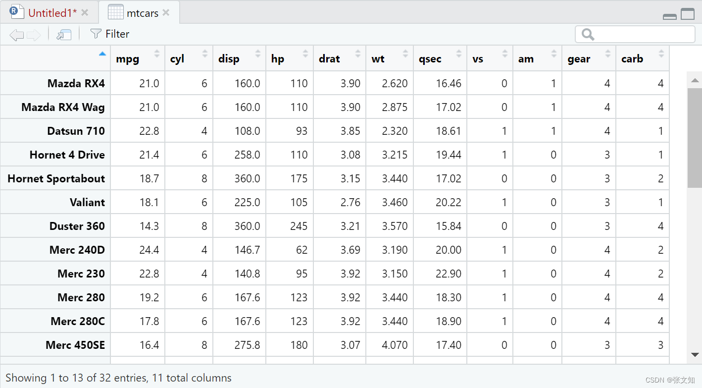
1.基础箱线图的绘制library(ggplot2)
library(ggplot2)
p <- ggplot(mtcars,aes(x=cyl,y=mpg)) +
  geom_boxplot(aes(group = cyl))    #指定cyl作为分组变量
p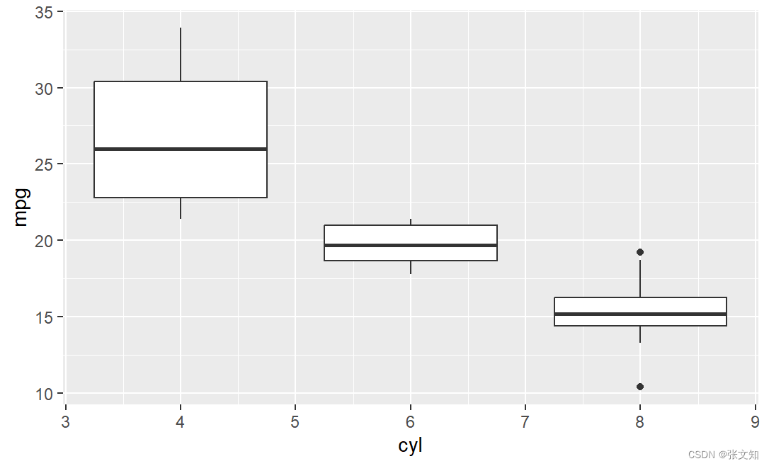
2.添加主标题,X、Y轴标签
p <- ggplot(mtcars, aes(x = cyl, y = mpg)) +
  geom_boxplot(aes(group = cyl)) +
  labs(title = "Car Mileage Data", x = "Number of Cylinders", y = "Miles Per Gallon")
p
将主标题放到中间
p <- ggplot(mtcars, aes(x = cyl, y = mpg)) +
  geom_boxplot(aes(group = cyl)) +
  labs(title = "Car Mileage Data", x = "Number of Cylinders", y = "Miles Per Gallon") +
  theme(plot.title = element_text(hjust = 0.5))     #hjust = 0.5居中,hjust = 0 主标题在左边,hjust = 1 右边
p
修改主标题,X、Y轴标签,X、Y轴刻度的字体,大小
p <- ggplot(mtcars, aes(x = cyl, y = mpg)) +
  geom_boxplot(aes(group = cyl)) +
  labs(title = "Modified Car Mileage Data", x = "Number of Cylinders", y = "Miles Per Gallon") + theme(
    plot.title = element_text(size = 16, face = "bold", hjust = 0.5, family = "serif"),
    axis.title = element_text(size = 14, face = "bold", family = "serif", hjust = 0.5),
    axis.text = element_text(size = 12, family = "serif"),
    axis.title.x = element_text(hjust = 0.5, face = "bold.italic", family = "serif")
  )
# face = "bold"加粗,family = "serif"设置字体,face = "bold.italic"加粗斜体
P 
如果你的标题太长了可用\n来换行
p <- ggplot(mtcars, aes(x = cyl, y = mpg)) +
  geom_boxplot(aes(group = cyl)) +
  labs(title = "Modified Car\nMileage Data", x = "Number of Cylinders", y = "Miles Per Gallon") +
  theme(
    plot.title = element_text(size = 16, face = "bold", hjust = 0.5, lineheight = 1, family = "serif"),
    axis.title = element_text(size = 14, face = "bold", family = "serif", hjust = 0.5),
    axis.text = element_text(size = 12, family = "serif"),
    axis.title.x = element_text(hjust = 0.5, face = "bold.italic", family = "serif")
  )

p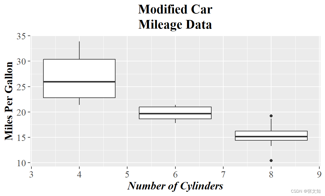
通过添加margin参数,调整主标题和轴标签相对于图形的位置t表示上边距(top),r表示右边距(right),l表示左边距(left),b表示下边距(bottom)
p <- ggplot(mtcars, aes(x = cyl, y = mpg)) +
  geom_boxplot(aes(group = cyl)) +
  labs(title = "Modified Car Mileage Data", x = "Number of Cylinders", y = "Miles Per Gallon") +
  theme(
    plot.title = element_text(size = 16, face = "bold", hjust = 0.5, lineheight = 1, margin = margin(b = 20), family = "serif"),
    axis.title = element_text(size = 14, face = "bold", family = "serif", hjust = 0.5, margin = margin(l = 20)),
    axis.text = element_text(size = 12, family = "serif"),
    axis.title.x = element_text(hjust = 0.5, face = "bold.italic", family = "serif", margin = margin(t = 10))
  )

p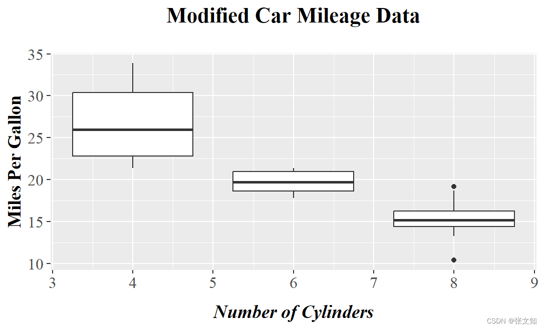
3.异常值处理
p <- ggplot(mtcars, aes(x = cyl, y = mpg)) +
  geom_boxplot(aes(group = cyl)) +
  geom_boxplot(
    aes(group = cyl),
    outlier.shape = 1,  # 设置异常值形状
    outlier.color = "red",  # 设置异常值边框颜色
    outlier.stroke = 0.5,  # 设置异常值边框粗细
    outlier.size = 1  # 设置异常值大小
  )+
  labs(title = "Modified Car Mileage Data", x = "Number of Cylinders", y = "Miles Per Gallon") +
  theme(
    plot.title = element_text(size = 16, face = "bold", hjust = 0.5, lineheight = 1, margin = margin(b = 20), family = "serif"),
    axis.title = element_text(size = 14, face = "bold", family = "serif", hjust = 0.5, margin = margin(l = 20)),
    axis.text = element_text(size = 12, family = "serif"),
    axis.title.x = element_text(hjust = 0.5, face = "bold.italic", family = "serif", margin = margin(t = 10))
  )

p 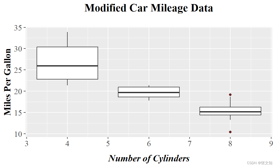
去除异常值
p <- ggplot(mtcars, aes(x = cyl, y = mpg)) +
  geom_boxplot(aes(group = cyl),outlier.color=NA) +
  labs(title = "Modified Car Mileage Data", x = "Number of Cylinders", y = "Miles Per Gallon") +
  theme(
    plot.title = element_text(size = 16, face = "bold", hjust = 0.5, lineheight = 1, margin = margin(b = 20), family = "serif"),
    axis.title = element_text(size = 14, face = "bold", family = "serif", hjust = 0.5, margin = margin(l = 20)),
    axis.text = element_text(size = 12, family = "serif"),
    axis.title.x = element_text(hjust = 0.5, face = "bold.italic", family = "serif", margin = margin(t = 10))
  )

p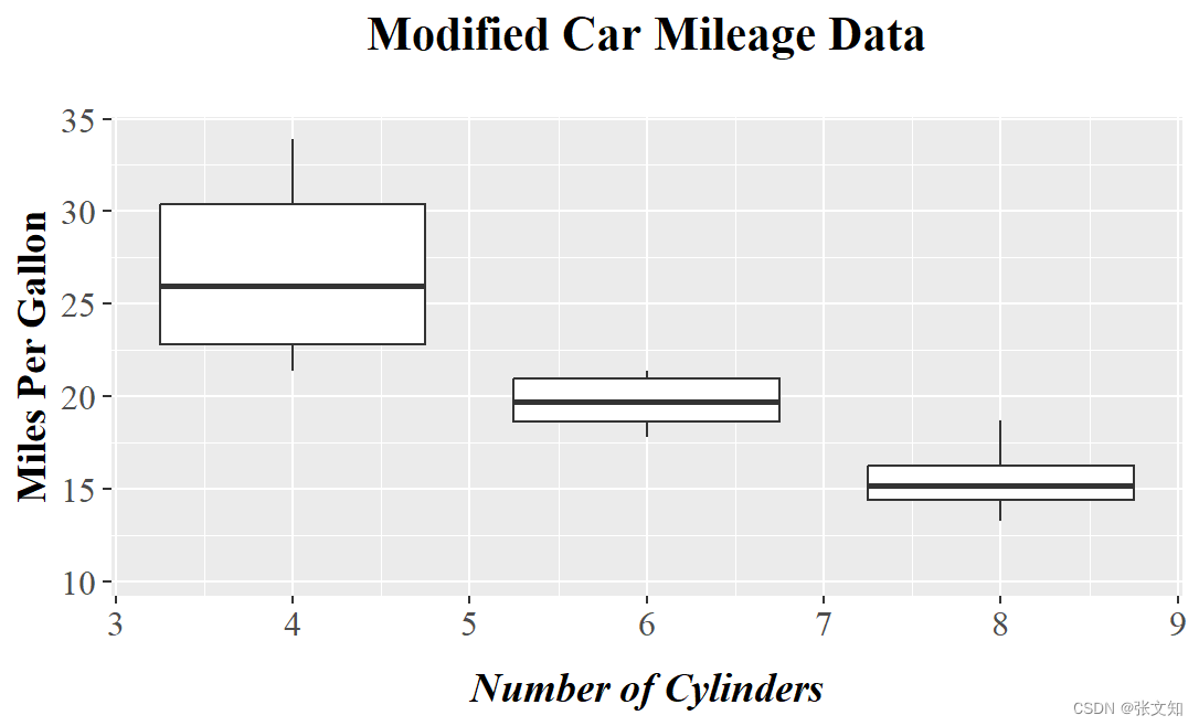
4.颜色修改
p <- ggplot(mtcars, aes(x = cyl, y = mpg)) +
  geom_boxplot(aes(group = cyl), outlier.color = NA, color = "black", fill = "red") + #边框为黑色,填充色为红色
  labs(title = "Modified Car Mileage Data", x = "Number of Cylinders", y = "Miles Per Gallon") +
  theme(
    plot.title = element_text(size = 16, face = "bold", hjust = 0.5, lineheight = 1, margin = margin(b = 20), family = "serif"),
    axis.title = element_text(size = 14, face = "bold", family = "serif", hjust = 0.5, margin = margin(l = 20)),
    axis.text = element_text(size = 12, family = "serif"),
    axis.title.x = element_text(hjust = 0.5, face = "bold.italic", family = "serif", margin = margin(t = 10))
  )

p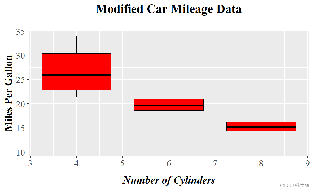
设置不同颜色
p <- ggplot(mtcars, aes(x = cyl, y = mpg)) +
  geom_boxplot(aes(group = cyl), outlier.color = NA, fill = c("#8ECFC9", "#FFBE7A", "#FA7F6F")) +
  labs(title = "Modified Car Mileage Data", x = "Number of Cylinders", y = "Miles Per Gallon") +
  theme(
    plot.title = element_text(size = 16, face = "bold", hjust = 0.5, lineheight = 1, margin = margin(b = 20), family = "serif"),
    axis.title = element_text(size = 14, face = "bold", family = "serif", hjust = 0.5, margin = margin(l = 20)),
    axis.text = element_text(size = 12, family = "serif"),
    axis.title.x = element_text(hjust = 0.5, face = "bold.italic", family = "serif", margin = margin(t = 10))
  )
p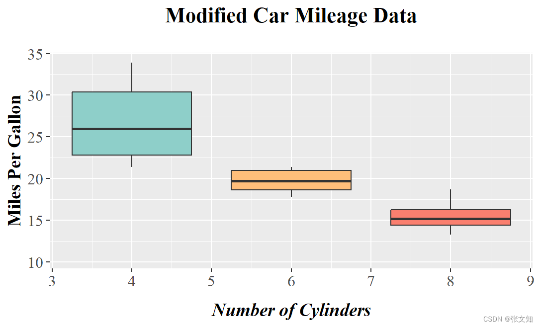
5. 添加最大最小值线横线
p <- ggplot(mtcars, aes(x = factor(cyl), y = mpg, group = cyl)) + #注意在这里要把x 轴变成不连续的离散型变量
stat_boxplot(geom = "errorbar", width=0.1,size=0.7) + # 可通过linetype改变线条类型
geom_boxplot(aes(group = cyl), outlier.color = NA, fill = c("#8ECFC9", "#FFBE7A", "#FA7F6F")) +
labs(title = "Modified Car Mileage Data", x = "Number of Cylinders", y = "Miles Per Gallon") +
theme(
plot.title = element_text(size = 16, face = "bold", hjust = 0.5, lineheight = 1, margin = margin(b = 20), family = "serif"),
axis.title = element_text(size = 14, face = "bold", family = "serif", hjust = 0.5, margin = margin(l = 20)),
axis.text = element_text(size = 12, family = "serif"),
axis.title.x = element_text(hjust = 0.5, face = "bold.italic", family = "serif", margin = margin(t = 10))
)
p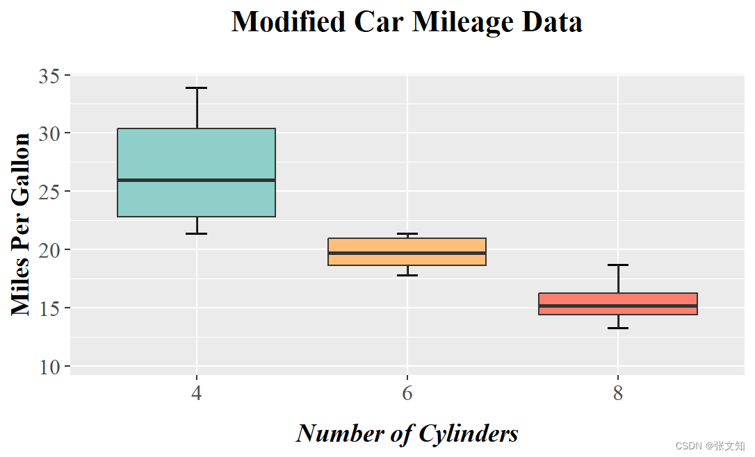 6.修改X轴刻度
p <- ggplot(mtcars, aes(x = factor(cyl, labels = c("bio1", "bio2", "bio3")), y = mpg, group = cyl)) +
  stat_boxplot(geom = "errorbar", width=0.1,size=0.7) +
  geom_boxplot(aes(group = cyl), outlier.color = NA, fill = c("#8ECFC9", "#FFBE7A", "#FA7F6F")) +
  labs(title = "Modified Car Mileage Data", x = "Number of Cylinders", y = "Miles Per Gallon") +
  scale_x_discrete(labels = c("bio1", "bio2", "bio3"))+
  theme(
    plot.title = element_text(size = 16, face = "bold", hjust = 0.5, lineheight = 1, margin = margin(b = 20), family = "serif"),
    axis.title = element_text(size = 14, face = "bold", family = "serif", hjust = 0.5, margin = margin(l = 20)),
    axis.text = element_text(size = 12, family = "serif"),
    axis.title.x = element_text(hjust = 0.5, face = "bold.italic", family = "serif", margin = margin(t = 10))
  )
p
7.添加图例
p <- ggplot(mtcars, aes(x = factor(cyl, labels = c("bio1", "bio2", "bio3")), y = mpg, group = cyl)) +

  stat_boxplot(geom = "errorbar", width = 0.1, size = 0.7) +

  geom_boxplot(aes(fill = factor(cyl, labels = c("bio1", "bio2", "bio3"))), outlier.color = NA) +

  labs(title = "Modified Car Mileage Data", x = "Number of Cylinders", y = "Miles Per Gallon") +

  theme(

    plot.title = element_text(size = 16, face = "bold", hjust = 0.5, lineheight = 1, margin = margin(b = 20), family = "serif"),

    axis.title = element_text(size = 14, face = "bold", family = "serif", hjust = 0.5, margin = margin(l = 20)),

    axis.text = element_text(size = 12, family = "serif"),

    axis.title.x = element_text(hjust = 0.5, face = "bold.italic", family = "serif", margin = margin(t = 10))  #使用legend.text来修改图例中的字体

  ) +

  theme(legend.position = "right") +

  scale_fill_manual(values = c("#8ECFC9", "#FFBE7A", "#FA7F6F"), name = "Legend Title")  #使用breaks来指定图例的顺序

p 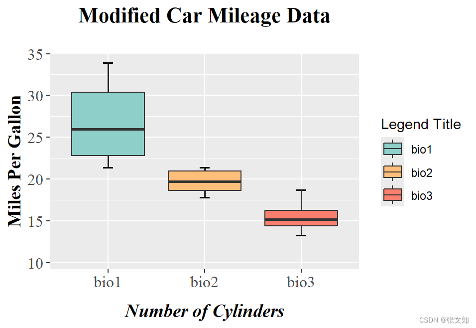
8.显著性检验:
#分组
group1 <- subset(mtcars, cyl == 4)$mpg
group2 <- subset(mtcars, cyl == 6)$mpg
group3 <- subset(mtcars, cyl == 8)$mpg
#正态检验
shapiro.test(group1)
shapiro.test(group2)
shapiro.test(group3)
#非参数检验
kruskal.test(list(group1, group2, group3))

p <- ggplot(mtcars, aes(x = factor(cyl, labels = c("bio1", "bio2", "bio3")), y = mpg, group = cyl)) +
  stat_boxplot(geom = "errorbar", width = 0.1, size = 0.7) +
  geom_boxplot(aes(fill = factor(cyl, labels = c("bio1", "bio2", "bio3"))), outlier.color = NA) +
  labs(title = "Modified Car Mileage Data", x = "Number of Cylinders", y = "Miles Per Gallon") +
  theme(
    plot.title = element_text(size = 16, face = "bold", hjust = 0.5, lineheight = 1, margin = margin(b = 20), family = "serif"),
    axis.title = element_text(size = 14, face = "bold", family = "serif", hjust = 0.5, margin = margin(l = 20)),
    axis.text = element_text(size = 12, family = "serif"),
    axis.title.x = element_text(hjust = 0.5, face = "bold.italic", family = "serif", margin = margin(t = 10))
  ) +
  theme(legend.position = "right") +
  scale_fill_manual(values = c("#8ECFC9", "#FFBE7A", "#FA7F6F"), name = "Legend Title")

p
p +
  annotate("text", x = 2.5, y = 30, label = "p-value = 2.566e-06", size = 5, color = "black")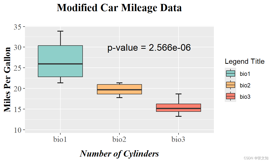
保存
ggsave(filename = "E:/boxplot.png", width = 10,height = 8,units = "in",dpi = 300)


 2191
2191


 被折叠的 条评论
为什么被折叠?
被折叠的 条评论
为什么被折叠?
 到【灌水乐园】发言


