


前言
对于地学研究中,常见的就是画带有地图的空间场,在python中常用的就是基于basemap(好像停止更新了,不太确定)和cartopy(英国气象局开发,越来越完善)进行绘制,本文基于basemap介绍一些入门:画空间场以及多子图。
安装
几年前安装basemap是真的很麻烦,现在已经很简单了,直接一句话:
conda install basemap
主要依赖的绘图库
import matplotlib as mpl
from matplotlib.colors import LogNorm
from mpl_toolkits.basemap import Basemap, cm, shiftgrid, addcyclic
import matplotlib.pyplot as plt
可以直接使用的画图函数 (详细注释版)
这个函数可以直接使用,画每一个子图里面的空间场信息
def Plot2DForsubplots(data2D, lat, lon, DrawingNo, _reverse = True, defaultcamp = True):
    '''
    绘制 多子图空间场
    ----------
    data2D: np.array, 2维变量数据 [lat,lon]
    lat: np.array, 1维, data2D相应的纬度信息
    lon: np.array, 1维, data2D相应的经度信息
    DrawingNo: str, 标号信息
    _reverse: 如果data2D的纬度是是从-90:90, 则需要将纬度反向, 变为90:-90
    -------
    '''
    t0Plot2D= time.time()
    print('*****************函数Plot2D开始*********************')
    if _reverse:
        data2D_plot = data2D[::-1, :]  # 纬度反向  画图要90:-90
    else:
        data2D_plot = data2D# 纬度反向  画图要90:-90
    # ========plot================
    # plt.subplots(figsize=(12, 8))
    mpl.rcParams['font.sans-serif'] = ['Times New Roman']  # 设置matplotlib整体用Times New Roman
    mpl.rcParams['font.weight'] = 'bold'  # 设置matplotlib整体用Times New Roman
    mpl.rcParams['font.size'] = 14  # 设置matplotlib整体用Times New Roman
    ax = plt.gca()
    ax.yaxis.set_tick_params(labelsize=10.0)
    map = Basemap(projection='cyl', llcrnrlat=np.min(lat), urcrnrlat=np.max(lat), resolution='c',
                  llcrnrlon=np.min(lon),
                  urcrnrlon=np.max(lon))  # 所需的地图域(度)的左下角的经度 llcrnrlat The lower left corner geographical longitude
    # map.drawcoastlines(color='grey',linewidth=1)
    map.drawparallels(np.arange(-90, 91., 30.), labels=[True, False, False, True], fontsize=8,
                      fontproperties='Times New Roman',
                      color='grey', linewidth=0.5)  # 画平行线
    map.drawmeridians(np.arange(0., 360, 60), labels=[True, False, False, True], fontsize=8,
                      fontproperties='Times New Roman',
                      color='grey', linewidth=0.5)  # 在地图上画经线

    # map.readshapefile('/newshps/country1', 'country',
    #                   color='grey', linewidth=1)
    #map.fillcontinents(color='silver', zorder=1)
    map.etopo()  # 浮雕
    map.drawcoastlines()
    # ===========自定义color===============
    if defaultcamp:
        norm = mpl.colors.Normalize(vmin=-40, vmax=40)
        cax = plt.imshow(data2D_plot, cmap='seismic', extent=[np.min(lon), np.max(lon), np.min(lat), np.max(lat)], norm=norm,
                         alpha=1)  # clim:色标范围 extent:画图经纬度区域   zorder:控制绘图顺序  vmin=data2D.max(), vmax=data2D.min(),
    else:
        #######==========自己设置colorbar间隔====================
        # mycolors = [(0.52941, 0.7, 1), (0.52941, 0.80784, 0.92157), (0.95,0.55,0.55), (0.98039, 0.50196, 0.44706), (0.99, 0.38824, 0.3),
        #             (1, 0.28, 0.28), (1, 0.15, 0.15), (1, 0, 0)]
        # my_cmap = mpl.colors.ListedColormap(mycolors)
        # clevs = [-12,-8,-6, -4, -2, 0, 2, 4, 6, 8, 10, 12]
        # print(my_cmap.N)
        # norm = mpl.colors.BoundaryNorm(clevs, my_cmap.N)
        # cax = plt.imshow(data2D_plot, cmap=my_cmap,
        #                  extent=[np.min(lon), np.max(lon), np.min(lat), np.max(lat)], norm=norm,
        #                  alpha=1)  # clim:色标范围 extent:画图经纬度区域   zorder:控制绘图顺序
        norm = mpl.colors.Normalize(vmin=-12, vmax=12)
        cax = plt.imshow(data2D_plot, cmap='seismic', extent=[np.min(lon), np.max(lon), np.min(lat), np.max(lat)], norm=norm, alpha=1)  # clim:色标范围 extent:画图经纬度区域   zorder:控制绘图顺序
    # =======添加图号===============
    plt.text(0, 91.5, DrawingNo, fontsize=12, fontproperties='Times New Roman')
    #plt.title(titles, fontsize=15, fontproperties='Times New Roman')
    # =======设置colorbar===============
    # cax = plt.axes([0.35, 0.28, 0.4, 0.02]) #前两个指的是相对于坐标原点的位置,后两个指的是坐标轴的长/宽度  这个设置的colorbar位置
    cbar = plt.colorbar()
    cbar.set_label('Temperature', fontsize=12, fontproperties='Times New Roman')
    ax.spines['bottom'].set_linewidth(2);  ###设置底部坐标轴的粗细
    ax.spines['left'].set_linewidth(2);  ####设置左边坐标轴的粗细
    ax.spines['right'].set_linewidth(2);  ###设置右边坐标轴的粗细
    ax.spines['top'].set_linewidth(2);  ###设置右边坐标轴的粗细
    print('***********************函数Plot2D结束, 耗时: %.3f s / %.3f mins****************' % ((time.time() - t0Plot2D), (time.time() - t0Plot2D) / 60))
完整脚本:
这个脚本是调用不断调用Plot2DForsubplots来实现画多子图,如果不需要画多子图,把循环去掉就行。
import os
import time
import code
import numpy as np
import pandas as pd
import xarray as xr
#=画图需要的包
import matplotlib as mpl
from matplotlib.colors import LogNorm
from mpl_toolkits.basemap import Basemap, cm, shiftgrid, addcyclic
import matplotlib.pyplot as plt
def Plot2DForsubplots(data2D, lat, lon, DrawingNo, _reverse = True, defaultcamp = True):
'''
绘制 多子图空间场
----------
data2D: np.array, 2维变量数据 [lat,lon]
lat: np.array, 1维, data2D相应的纬度信息
lon: np.array, 1维, data2D相应的经度信息
DrawingNo: str, 标号信息
_reverse: 如果data2D的纬度是是从-90:90, 则需要将纬度反向, 变为90:-90
-------
'''
t0Plot2D= time.time()
print('*****************函数Plot2D开始*********************')
if _reverse:
data2D_plot = data2D[::-1, :] # 纬度反向 画图要90:-90
else:
data2D_plot = data2D# 纬度反向 画图要90:-90
# ========plot================
# plt.subplots(figsize=(12, 8))
mpl.rcParams['font.sans-serif'] = ['Times New Roman'] # 设置matplotlib整体用Times New Roman
mpl.rcParams['font.weight'] = 'bold' # 设置matplotlib整体用Times New Roman
mpl.rcParams['font.size'] = 14 # 设置matplotlib整体用Times New Roman
ax = plt.gca()
ax.yaxis.set_tick_params(labelsize=10.0)
map = Basemap(projection='cyl', llcrnrlat=np.min(lat), urcrnrlat=np.max(lat), resolution='c',
llcrnrlon=np.min(lon),
urcrnrlon=np.max(lon)) # 所需的地图域(度)的左下角的经度 llcrnrlat The lower left corner geographical longitude
# map.drawcoastlines(color='grey',linewidth=1)
map.drawparallels(np.arange(-90, 91., 30.), labels=[True, False, False, True], fontsize=8,
fontproperties='Times New Roman',
color='grey', linewidth=0.5) # 画平行线
map.drawmeridians(np.arange(0., 360, 60), labels=[True, False, False, True], fontsize=8,
fontproperties='Times New Roman',
color='grey', linewidth=0.5) # 在地图上画经线
# map.readshapefile('/home/tongxuan/newshps/country1', 'country',
# color='grey', linewidth=1)
#map.fillcontinents(color='silver', zorder=1)
map.etopo() # 浮雕
map.drawcoastlines()
# ===========自定义color===============
if defaultcamp:
norm = mpl.colors.Normalize(vmin=-40, vmax=40)
cax = plt.imshow(data2D_plot, cmap='seismic', extent=[np.min(lon), np.max(lon), np.min(lat), np.max(lat)], norm=norm,
alpha=1) # clim:色标范围 extent:画图经纬度区域 zorder:控制绘图顺序 vmin=data2D.max(), vmax=data2D.min(),
else:
#######==========自己设置colorbar间隔====================
# mycolors = [(0.52941, 0.7, 1), (0.52941, 0.80784, 0.92157), (0.95,0.55,0.55), (0.98039, 0.50196, 0.44706), (0.99, 0.38824, 0.3),
# (1, 0.28, 0.28), (1, 0.15, 0.15), (1, 0, 0)]
# my_cmap = mpl.colors.ListedColormap(mycolors)
# clevs = [-12,-8,-6, -4, -2, 0, 2, 4, 6, 8, 10, 12]
# print(my_cmap.N)
# norm = mpl.colors.BoundaryNorm(clevs, my_cmap.N)
# cax = plt.imshow(data2D_plot, cmap=my_cmap,
# extent=[np.min(lon), np.max(lon), np.min(lat), np.max(lat)], norm=norm,
# alpha=1) # clim:色标范围 extent:画图经纬度区域 zorder:控制绘图顺序
norm = mpl.colors.Normalize(vmin=-12, vmax=12)
cax = plt.imshow(data2D_plot, cmap='seismic', extent=[np.min(lon), np.max(lon), np.min(lat), np.max(lat)], norm=norm, alpha=1) # clim:色标范围 extent:画图经纬度区域 zorder:控制绘图顺序
# =======添加图号===============
plt.text(0, 91.5, DrawingNo, fontsize=12, fontproperties='Times New Roman')
#plt.title(titles, fontsize=15, fontproperties='Times New Roman')
# =======设置colorbar===============
# cax = plt.axes([0.35, 0.28, 0.4, 0.02]) #前两个指的是相对于坐标原点的位置,后两个指的是坐标轴的长/宽度 这个设置的colorbar位置
cbar = plt.colorbar()
cbar.set_label('Temperature', fontsize=12, fontproperties='Times New Roman')
ax.spines['bottom'].set_linewidth(2); ###设置底部坐标轴的粗细
ax.spines['left'].set_linewidth(2); ####设置左边坐标轴的粗细
ax.spines['right'].set_linewidth(2); ###设置右边坐标轴的粗细
ax.spines['top'].set_linewidth(2); ###设置右边坐标轴的粗细
print('***********************函数Plot2D结束, 耗时: %.3f s / %.3f mins****************' % ((time.time() - t0Plot2D), (time.time() - t0Plot2D) / 60))
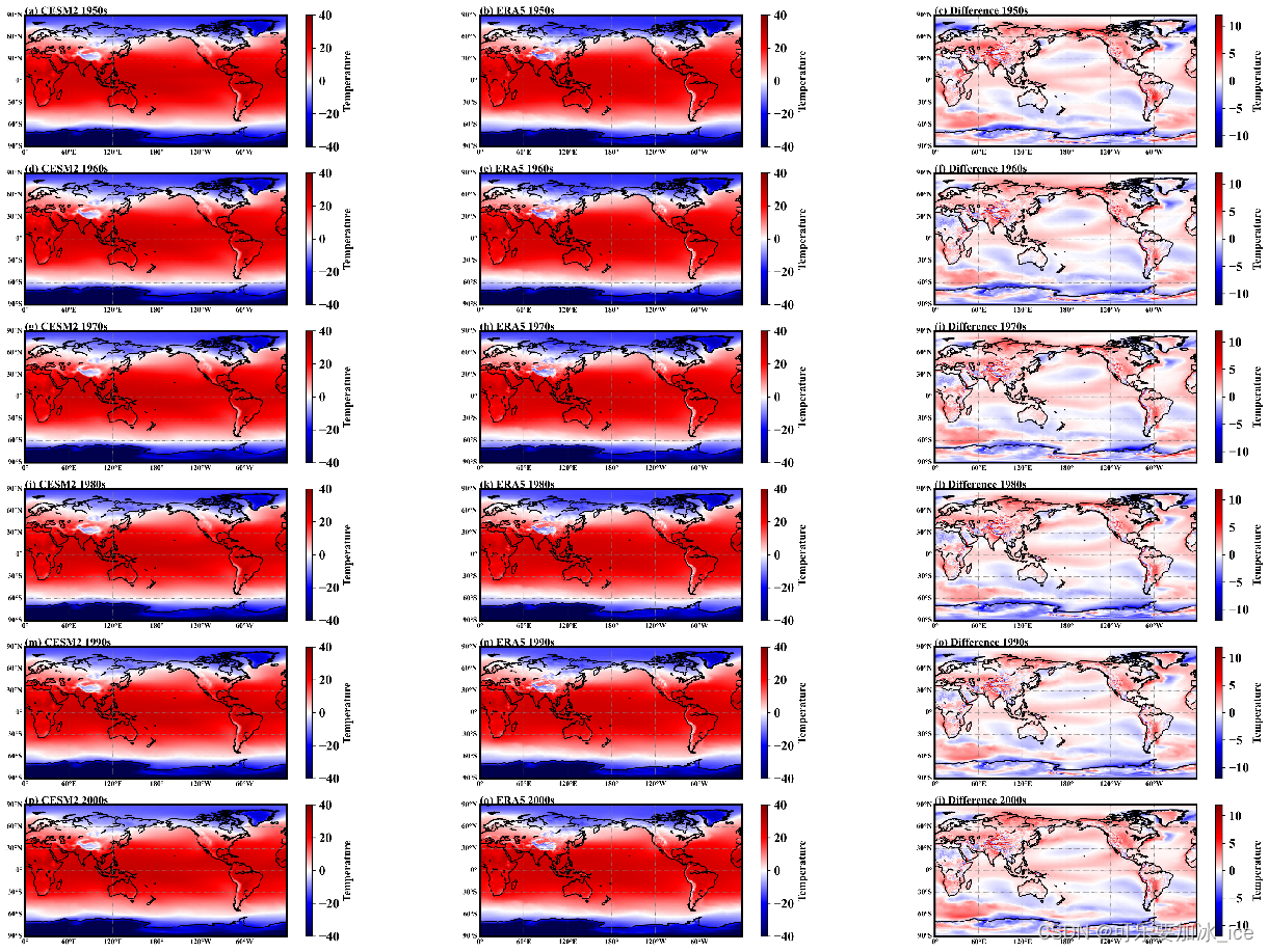
def PlotTenYearAve():
'''
画CEMS2(第二版数据)和ERA5逐十年平均 多子图
:return:
'''
#=加载数据
Cesm2DataAnnual = np.load('/home/Cesm2DataAnnual.npy')#1950-2014 (65, 181, 359) lat:-90:90 lon:0:360
Era5DataAnnual = np.load('/home/ERA5DataAnnual.npy')#1950-2014 (65, 181,360) lat:-90:90 lon:0:360
LonLR = np.arange(0, 358.75, 1)
LatLR = np.arange(-90, 90.5, 1)
YearInterval = 10 #每十年画一张图
DrawNo = ['(a)', '(b)', '(c)',
'(d)', '(e)', '(f)',
'(g)', '(h)', '(i)',
'(j)', '(k)', '(l)',
'(m)', '(n)', '(o)',
'(p)', '(q)', '(i)']
fig = plt.figure(figsize=(25, 18))
fig.subplots_adjust(wspace=0.05)
for i in range((2014-1950)//10):
Yeartitles = str(1950 + i * 10) + 's'
Cesm2DataEach10Year = np.mean(Cesm2DataAnnual[i*YearInterval : (i+1)*YearInterval, :, :], axis=0) # (181, 359) lat:-90:90 lon:0:358
Era5DataEach10Year_ = np.mean(Era5DataAnnual[i * YearInterval: (i + 1) * YearInterval, :, :], axis=0)#(181,360) lat:-90:90 lon:0:360
Era5DataEach10Year = Era5DataEach10Year_[:Cesm2DataEach10Year.shape[0], :Cesm2DataEach10Year.shape[1]]# (181, 359)
Cesm2_Era5Each10Year = Cesm2DataEach10Year - Era5DataEach10Year
plt.subplot((2014-1950)//10, 3, i * 3 + 1)
Plot2DForsubplots(Cesm2DataEach10Year - 273.15, LatLR, LonLR, '%s CESM2 %s' % (DrawNo[i * 3 + 0],Yeartitles), _reverse=True, defaultcamp=True)
plt.subplot((2014 - 1950) // 10, 3, i * 3 + 2)
Plot2DForsubplots(Era5DataEach10Year - 273.15, LatLR, LonLR, '%s ERA5 %s' % (DrawNo[i * 3 + 1],Yeartitles), _reverse=True, defaultcamp=True)
plt.subplot((2014 - 1950) // 10, 3, i * 3 + 3)
Plot2DForsubplots(Cesm2_Era5Each10Year, LatLR, LonLR, '%s Difference %s' % (DrawNo[i * 3 + 2],Yeartitles), _reverse=True, defaultcamp=False)
plt.savefig('/homeTenYearAve.jpg', dpi=600, bbox_inches='tight')
if __name__ == "__main__":
t0 = time.time()
# ===================================================================================
print('*****************程序开始*********************' )
PlotTenYearAve()
print('***********************程序结束, 耗时: %.3f s / %.3f mins****************' % ((time.time() - t0), (time.time() - t0) / 60))
code.interact(local=locals())
效果展示


 1万+
1万+


 被折叠的 条评论
为什么被折叠?
被折叠的 条评论
为什么被折叠?
 到【灌水乐园】发言


