


做数据分析的时候,自己绘制图像的时候总是遇到各种想不起来的代码,总是需要去查,我觉得自己总结一下python的绘图手法,对后面自己能力的构建会很有帮助。
本片总结涉及到的matplotlib绘图的基础内容包括:走势图(也称折线图),直方图,饼图,散点图,柱状图,条形图,堆叠图,以及图标、图例、子图和保存图像的使用方法
绘图之前需要构建一些数据,下面随机构建一群学生的身高、体重、年龄、语文成绩的数据
import numpy as np
import pandas as pd
import matplotlib.pyplot as plt
import random
np.random.seed(20211028)
height = np.random.randint(150,200,100)
weight = np.random.randint(40,100,100)
old = np.random.randint(1,100,100)
grade = np.random.randint(0,100,100)
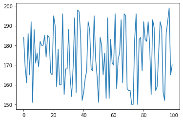
先来绘制最简单的走势图
plt.plot(height)
plt.show()
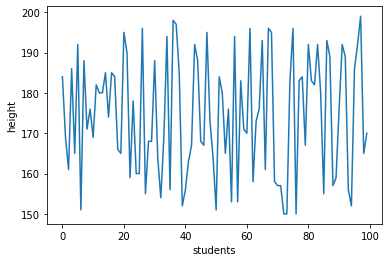
绘图之后我想给图像添加x轴和y轴的说明
plt.plot(height)
plt.xlabel('students')
plt.ylabel('height')
plt.show()
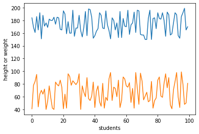
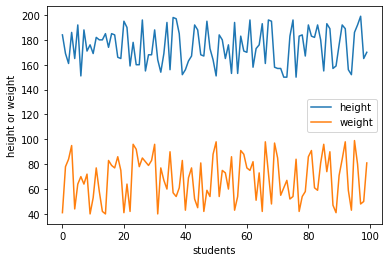
我能不能在一张图像中画两条走势图呢
plt.plot(height)
plt.plot(weight)
plt.xlabel('students')
plt.ylabel('height or weight')
plt.show()
还真可以哦,但是我能不能画三条呢,再试试
plt.plot(height)
plt.plot(weight)
plt.plot(old)
plt.xlabel('students')
plt.ylabel('height or weight or old')
plt.show()
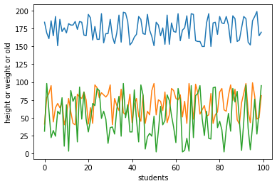
也是可以的,应该在一张图像中可以绘制很多很多条走势图才对。
如果单独看这个图像,没有图像标注的话,我们也不知道哪个颜色的线条对应哪个数据呀,所以我们需要给图像添加图标
plt.plot(height,label='height')
plt.plot(weight,label='weight')
plt.xlabel('students')
plt.ylabel('height or weight')
plt.legend()  # 将图标展示出来
plt.show()  # 将图像展示出来
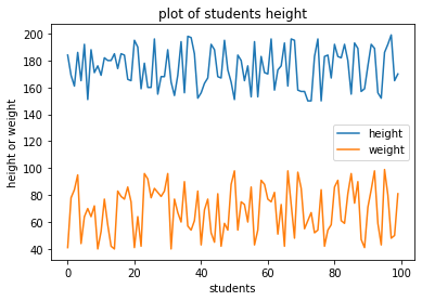
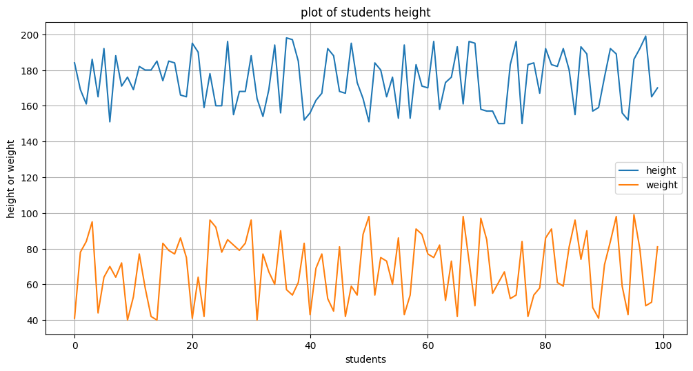
然后一般来说,我们还需要给图像设置一个标题,
plt.plot(height,label='height')
plt.plot(weight,label='weight')
plt.xlabel('students')
plt.ylabel('height or weight')
plt.title('plot of students height')
plt.legend()
plt.show()

如果有需要,我们还需要将图像保存起来
plt.plot(height,label='height')
plt.plot(weight,label='weight')
plt.xlabel('students')
plt.ylabel('height or weight')
plt.title('plot of students height')
plt.savefig('./plot_of_students_height.png')
plt.legend()
plt.show()
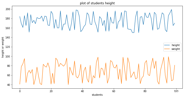
先我们画的图像,都是默认的画布大小,我们没有指定所需要的画布大小,那么画布大小该如何指定呢
plt.figure(figsize=(12,6))  # 指定画布大小(长、宽)
plt.plot(height,label='height')
plt.plot(weight,label='weight')
plt.xlabel('students')
plt.ylabel('height or weight')
plt.title('plot of students height')
plt.legend()
plt.show()
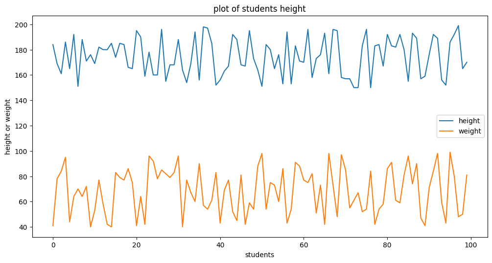
画布变大之后,感觉图像变模糊好多,那我们怎么让图像分辨率变高一点呢,可以指定dpi这个变量
plt.figure(figsize=(12,6),dpi=100)  # 指定画布大小(长、宽),指定分辨率为100,变清晰好多
plt.plot(height,label='height')
plt.plot(weight,label='weight')
plt.xlabel('students')
plt.ylabel('height or weight')
plt.title('plot of students height')
plt.legend()
plt.show()
为了数据更加明显,我们还可以给图像添加网格线,这样子,对于数据落在那个范围就心中有数啦
plt.figure(figsize=(12,6),dpi=100)  # 指定画布大小(长、宽),指定分辨率为100,变清晰好多
plt.plot(height,label='height')
plt.plot(weight,label='weight')
plt.xlabel('students')
plt.ylabel('height or weight')
plt.title('plot of students height')
plt.grid() # 生成网格
plt.legend()
plt.show()

总结一下,我们使用plt画图一般需要的步骤,完整代码
plt.figure(figsize=(12,6),dpi=100)  # 1、指定画布大小
plt.plot(height,label='height') # 画图,如果你想话直方图就换乘直方图,自由性在这里
plt.plot(weight,label='weight') # 画图,如果你想话直方图就换乘直方图,自由性在这里
plt.xlabel('students') # 指定x轴说明
plt.ylabel('height or weight') # 指定y轴说明
plt.title('plot of students height') # 指定图像名字
plt.grid() # 生成网格
plt.savefig('./plot_of_students_height.png')  # 根据自己需求是否保存图像
plt.legend() # 显示图例,图例包括图标等
plt.show()  # 展示图片
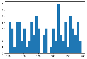
现在来试一下如何绘制分布直方图,这个也是用得最多的一类了吧
plt.hist(height) # 绘图
plt.show() # 展示

不难看出,模型画出来的直方柱子只有10条,为了看清分布的细节,我们尝试调节一下直方柱子的数量
plt.hist(height,bins=30)
plt.show()
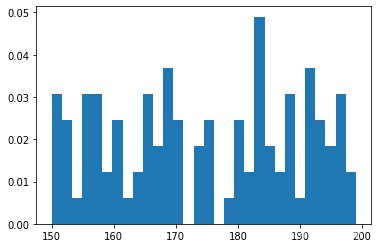
直方图的横轴表示身高值,竖轴表示该身高值的频数。我们能不能将频数变成频率呢,答案是可以的
plt.hist(height,bins=30,density=True)
plt.show()
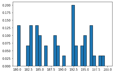
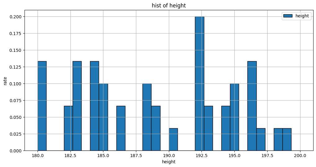
假设现在我只想研究身高在180到200范围内数据的分布情况,我们能不能限制范围来绘制直方图呢,答案也是可以的
plt.hist(height,bins=30,density=True,range=(180,200))
plt.show()

可以看到,192.5身高的人数量是最多的。但是这些数据看起来不太美观,我想给直方柱子添加一个边界线
plt.hist(height,bins=30,density=True,range=(180,200),edgecolor = 'k')
plt.show()
总结一下画直方图的步骤。
plt.figure(figsize=(12,6),dpi=100)  # 1、指定画布大小
plt.hist(height,bins=30,density=True,range=(180,200),edgecolor = 'k',label='height') # 2、画图,画直方图
plt.xlabel('height') # 指定x轴说明
plt.ylabel('rate') # 指定y轴说明
plt.title('hist of height') # 指定图像名字
plt.grid() # 生成网格
# plt.savefig('./plot_of_students_height.png')  # 根据自己需求是否保存图像
plt.legend() # 显示图例,图例包括图标等
plt.show()  # 展示图片
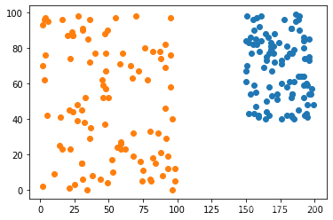
接下来,画散点图。观看身高和体重的关系。从图像中的数据来看,数据完全是随机的,因为我们原始数据就是随机的。
plt.scatter(height,weight)
plt.show()

同理,如果有需要,可以在一张画布图像中多画几个散点图
plt.scatter(height,weight)
plt.scatter(old,grade)
plt.show()
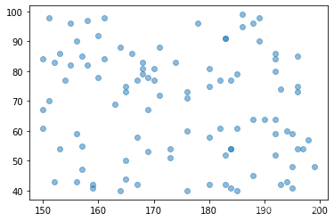
除了模型的形式,我们还可以改变散点图点的透明度
plt.scatter(height,weight,alpha = 0.5)
plt.show()
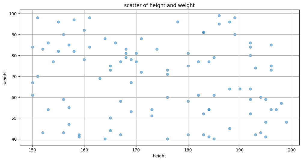
同样,我们整理一下散点图的全部流程。
plt.figure(figsize=(12,6),dpi=100)  # 1、指定画布大小
plt.scatter(height,weight,alpha = 0.5) # 2、画图,画散点图
plt.xlabel('height') # 指定x轴说明
plt.ylabel('weight') # 指定y轴说明
plt.title('scatter of height and weight') # 指定图像名字
plt.grid() # 生成网格
# plt.savefig('./plot_of_students_height.png')  # 根据自己需求是否保存图像
# plt.legend() # 显示图例,图例包括图标等
plt.show()  # 展示图片
接下来我们看一下最简单的饼图如何绘制
data = [2,5,8,13,7]
plt.pie(data)
plt.show()

上面的饼图没有灵魂,一来没有图标,二来没有数据,让我们把需要的要素添加进来
data = [2,5,8,13,7]
plt.pie(data,
        labels = ['apple','banane','gredd','egg','compt'], # 指定每一类的标签
       )
plt.show()

然后我想把所占比例的大小也在图像中体现出来
data = [2,5,8,13,7]
plt.pie(data,
        labels = ['apple','banane','gredd','egg','compt'], # 指定每一类的标签
        autopct='%1.1f%%',
       )
plt.show()

到这里感觉这个饼图就差不多有模有样了,现在也将例子总结一下
plt.figure(figsize=(12,6),dpi=100)  # 1、指定画布大小
data = [2,5,8,13,7]
plt.pie(data,
        labels = ['apple','banane','gredd','egg','compt'], # 指定每一类的标签
        autopct='%1.1f%%',
       )
# plt.xlabel('height') # 指定x轴说明,饼图没有x轴
# plt.ylabel('weight') # 指定y轴说明,饼图没有y轴
plt.title('pie of data') # 指定图像名字
# plt.grid() # 生成网格,饼图没有表格
# plt.savefig('./plot_of_students_height.png')  # 根据自己需求是否保存图像
# plt.legend() # 显示图例,图例包括图标等
plt.show()  # 展示图片

接下来看一下最简单的箱形图如何绘制
plt.boxplot(height)
plt.show()
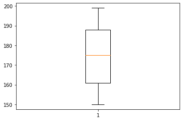
初看,好简单呀,二看,这是啥东西,三看,我们还是来看一下什么是箱线图吧。
箱线图一般用来展现数据的分布(如上下四分位值、中位数等),同时,也可以用箱线图来反映数据的异常情况。
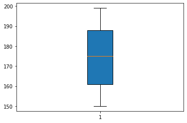
为了美观,给箱体填充颜色,
plt.boxplot(height,patch_artist=True)
plt.show()
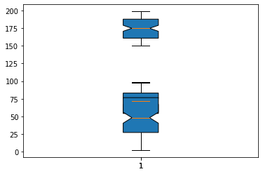
为了更加清晰,我给箱体中均值的位置切一个口,这样就更加好看了
plt.boxplot(height,patch_artist=True,notch=True)
plt.show()

我还想一次性将身高、体重、年龄、成绩四种数据一次性画在一张图上面,怎么办呢,先来个反面教材
plt.boxplot(height,patch_artist=True,notch=True)
plt.boxplot(weight,patch_artist=True,notch=True)
plt.show()

plt.boxplot(height,patch_artist=True,notch=True)
plt.boxplot(weight,patch_artist=True,notch=True)
plt.boxplot(old,patch_artist=True,notch=True)
plt.show()
正常人都可以看出来,这样太丑了,也不能很好体现出数据的情况,所以我们换种方式画,添加一个变量vert=True
plt.boxplot([height,weight,old,grade],patch_artist=True,notch=True,vert=True)
plt.show()
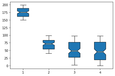
因为身高、体重、年龄、成绩的量纲都不一样,工作中不会将数据进行这样的对较。
真正会比较的情景是四个店铺一年内每日的销售额,这种拿来比较是合适的
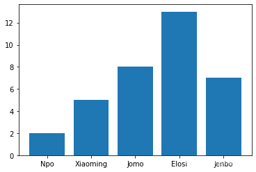
接下来看一下柱状图的最简单绘制,展示五个学生每个人拥有的朋友的个数。
friends = [2,5,8,13,7]
plt.bar(['Npo','Xiaoming','Jomo','Elosi','Jenbo'],friends)
plt.show()
如果我还想将这五位同学家里兄弟姐妹的人数也画在同一副画里面,该怎么画呢
friends = [2,5,8,13,7]
famrily = [1,4,3,2,5]
plt.bar(np.arange(len(friends)), friends, tick_label=['Npo','Xiaoming','Jomo','Elosi','Jenbo'],width = 0.35,label='friends')
plt.bar(np.arange(len(famrily))+0.35, famrily, tick_label=['Npo','Xiaoming','Jomo','Elosi','Jenbo'],width = 0.35,label='famrily')
plt.legend()
plt.show()

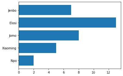
现在画的是横轴的柱状图,怎么画竖轴的柱状图呢。只需将bar函数变成barh函数即可
friends = [2,5,8,13,7]
plt.barh(['Npo','Xiaoming','Jomo','Elosi','Jenbo'],friends)
plt.show()
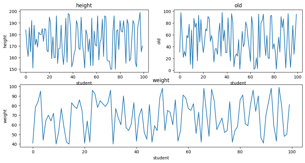
最后补充一点如何绘制子图,当我们需要同时呈现数据的时候很有用,绘制子图的架构如下:
fig = plt.figure(figsize=(12,6),dpi=100) # 第一步,创建画布

ax = fig.add_subplot(2,2,1)  # 指定子图,(第二步,指定子图),接下去就会绘制了
ax.plot(height)
ax.set_xlabel('student')  # 设置x轴的标注
ax.set_ylabel('height')  # 设置y轴的标注
ax.set_title('height')  # 设置图像的名字

ax1 = fig.add_subplot(2,2,2)  # 指定子图
ax1.plot(old)
ax1.set_xlabel('student')
ax1.set_ylabel('old')
ax1.set_title('old')

ax2 = fig.add_subplot(2,1,2)  # 指定子图
ax2.plot(weight)
ax2.set_xlabel('student')
ax2.set_ylabel('weight')
ax2.set_title('weight')


plt.show()
接下来展示一个绘制堆叠图的例子,先看一下最简单的堆叠图是什么样子的。
堆叠图用于显示『部分对整体』随时间的关系。 堆叠图基本上类似于饼图,只是随时间而变化。
让我们考虑一个情况,我们一天有 24 小时,我们睡觉,吃饭,工作和玩耍的时间如下所示
days = [1,2,3,4,5]

sleeping = [7,8,6,11,7]
eating =   [2,3,4,3,2]
working =  [7,8,7,2,2]
playing =  [8,5,7,8,13]
plt.stackplot(days, sleeping,eating,working,playing)
plt.show()

这样看的话,我们看不清楚哪一块区域属于哪个活动,所以我们需要添加图标。
plt.plot([],[],color='m', label='Sleeping', linewidth=5)
plt.plot([],[],color='c', label='Eating', linewidth=5)
plt.plot([],[],color='r', label='Working', linewidth=5)
plt.plot([],[],color='k', label='Playing', linewidth=5)

plt.stackplot(days, sleeping,eating,working,playing, colors=['m','c','r','k'])
plt.legend()
plt.show()
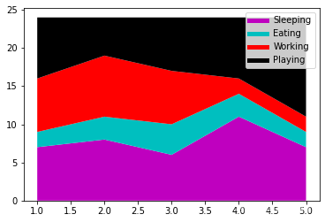
我们在这里做的是画一些空行,给予它们符合我们的堆叠图的相同颜色,和正确标签。
我们还使它们线宽为 5,使线条在图例中显得较宽。 现在,我们可以很容易地看到,我们如何花费我们的时间。
从图中一目了然看出,工作时间五天一来,时间越来越少,反而娱乐的时间越来越多。
觉得有用的话,给我点个赞吧!


 949
949


 被折叠的 条评论
为什么被折叠?
被折叠的 条评论
为什么被折叠?
 到【灌水乐园】发言


