


MS系列最后一课 数据的可视化
Visualization(matplotlib)
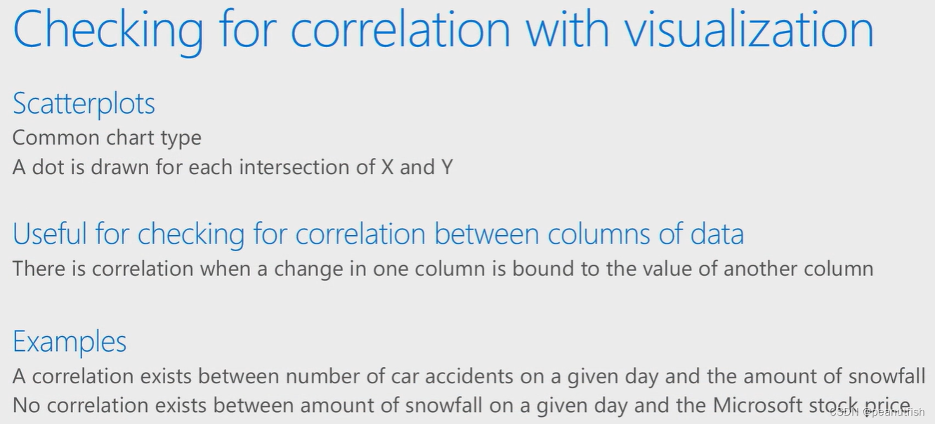
Both linear and scatterplot can show how data is distributed and what the correlation between them
import pandas as pd
from sklearn.model_selection import train_test_split
from sklearn.linear_model import LinearRegression
# 用到matplotlib
import matplotlib.pyplot as plt
# 先加载CSV
defer_df = pd.read_csv('Data/Lots_of_flight_data.csv')
defer_df.dropna(inplace=True)
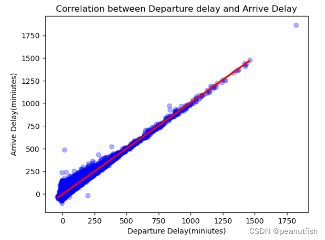
# 要建立departure delay 和 arrive delay关系
x = defer_df.loc[:,['DEP_DELAY']]
y = defer_df.loc[:, ['ARR_DELAY']]
# train 两者model
x_train,x_test,y_train,y_test = train_test_split(x, y, test_size=0.3, random_state=42)
regressor = LinearRegression()
regressor.fit(x_train,y_train)
# 得到y_predict
y_pred = regressor.predict(x_test)
# 定义图的x,y,title信息
plt.xlabel('Departure Delay(miniutes)')
plt.ylabel('Arrive Delay(miniutes)')
plt.title('Correlation between Departure delay and Arrive Delay')
# 利用x_test, y_pred画一个直线关系图
plt.plot(x_test, y_pred, color='RED', linewidth=2)
# 画departure delay 和 arrive delay的散点图,alpha表示点的颜色深浅,范围0~1,1表示完全黑点,用浅色更能表现出数据严重程度的高低
plt.scatter(x, y, color='blue', alpha=0.3)
# 两个图同时显示
plt.show()
附上另一种画散点图的方法:
defer_df.plot(
    	kind='scatter',
    	x='DEP_DELAY',
    	y='ARR_DELAY',
    	color='blue',
    	alpha=0.3,
    	title='Correlation between distance and arrive delay')
plt.show()


 3377
3377


 被折叠的 条评论
为什么被折叠?
被折叠的 条评论
为什么被折叠?
 到【灌水乐园】发言


