


目录
一、CSS单位
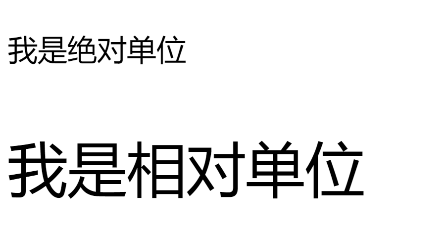
- px 绝对单位
- em 相对单位 基准点为父节点字体的大小 60px(60*1=60)
- rpx 是微信小程序中css的尺寸单位
- 1rpx等于屏幕宽度的375分之1
例:
    <style>
    .text1 {
        font-size: 30px;
    }

    body{
        font-size: 60px;
    }

    .text2{
        font-size: 1em;
    }

    </style>
</head>
<body>

        <p class="text1">我是绝对单位</p>
        <p class="text2">我是相对单位</p>
</body>
效果图:
二、flex布局
1. flex-direction属性
flex-direction属性⽤于设置主轴⽅向,通过设置主轴⽅向可以规定项⽬的排列⽅向。 *
- row:默认值,主轴为从左到右的⽔平⽅向。
- row-reverse:主轴为从右到左的⽔平⽅向。
- column:主轴为从上到下的垂直⽅向。
- column-reverse:主轴为从下到上的垂直⽅向。
flex-direction: row;
flex-direction: row-reverse;
flex-direction: column;
flex-direction: column-reverse;
2. justify-content属性
justify-content属性⽤于设置项⽬在主轴⽅向上的对⻬⽅式,能够分配项⽬之间及其周围 多余的空间。
- flex-start:默认值,表示项⽬对⻬到主轴起点,项⽬间不留空隙。
- flex-end:项⽬对⻬到主轴终点,项⽬间不留空隙。
- center:项⽬在主轴上居中排列,项⽬间不留空隙。主轴上第⼀个项⽬离主轴起点的距离等 于最后⼀个项⽬离主轴终点的距离。
- space-between:两端对⻬,两端的项⽬分别靠向容器的两端,其他项⽬之间的间隔相等。
- space-around:每个项⽬之间的距离相等,第⼀个项⽬离主轴起点和最后⼀个项⽬离终点的 距离为中间项⽬间距的⼀半。
3.align-items属性
align-items属性用于设置项目在交叉轴上的对齐方式。
- center:项目在交叉轴的中间位置对齐。
- flex-start:项目顶部与交叉轴起点对齐,
- flex-end:项目底部与交叉轴终点对齐。
- baseline:项目的第一行文字的基线对齐。
例:若要设置元素水平垂直居中:
display: flex;

justify-content: center;

align-items: center;
<body>
<!-- 行内元素 块级元素
块级元素会独占一行 默认的宽度占满父级元素,行内元素不会换行。-->
<div class="demoOne">
<div class="boxOne">1</div>
<div class="boxTwo">2</div>
<div class="boxThree">3</div>
</div>
</body>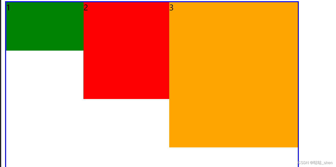
三、 元素定位
通过定位属性position可以实现元素的定位标准
- fixed:固定地位
- relative 相对定位 相对于原文档流的位置进行定位
- absolute 绝对定位 相对于上一个已经定位的父元素进行定位
- static 静态定位 (默认定位方式)
上( top) 下 (bottom ) 左 (left) 右(right)
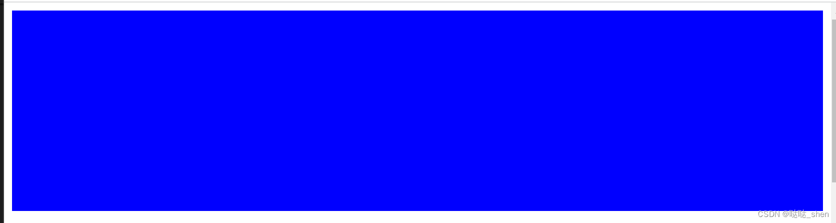
例1:固定定位
<div class="fix"></div>
样式:
       .fix {
            width: 100%;
            height: 200px;
            background-color: blue;
            position: relative;
            bottom:0px;

        }
样图:
例2:相对定位
<div class="rel-father">
       <div class="rel-child01">child01</div>
       <div class="rel-child02">child02</div>
       <div class="rel-child03">child03</div>
    </div>
样式:
  .rel-father{
            width:300px ;
            height: 300px;
            background-color: blue;
            border: 5px solid black;
            /* 外边距 */
            margin: 50px auto;

        }
        .rel-child01,.rel-child02,.rel-child03{
            width: 100px;
            height: 50px;
            background-color: yellow;
            border: 2px solid black;
            margin:10px 0px;
        }
        .rel-child01 {
            position: relative;
            left: 0px;
            top:-10px;
        }
        .rel-child02 {
            position: relative;
            left: 200px;
            top:-74px

        }
        .rel-child03{
            position: relative;
            top: 110px;

        }
样图:
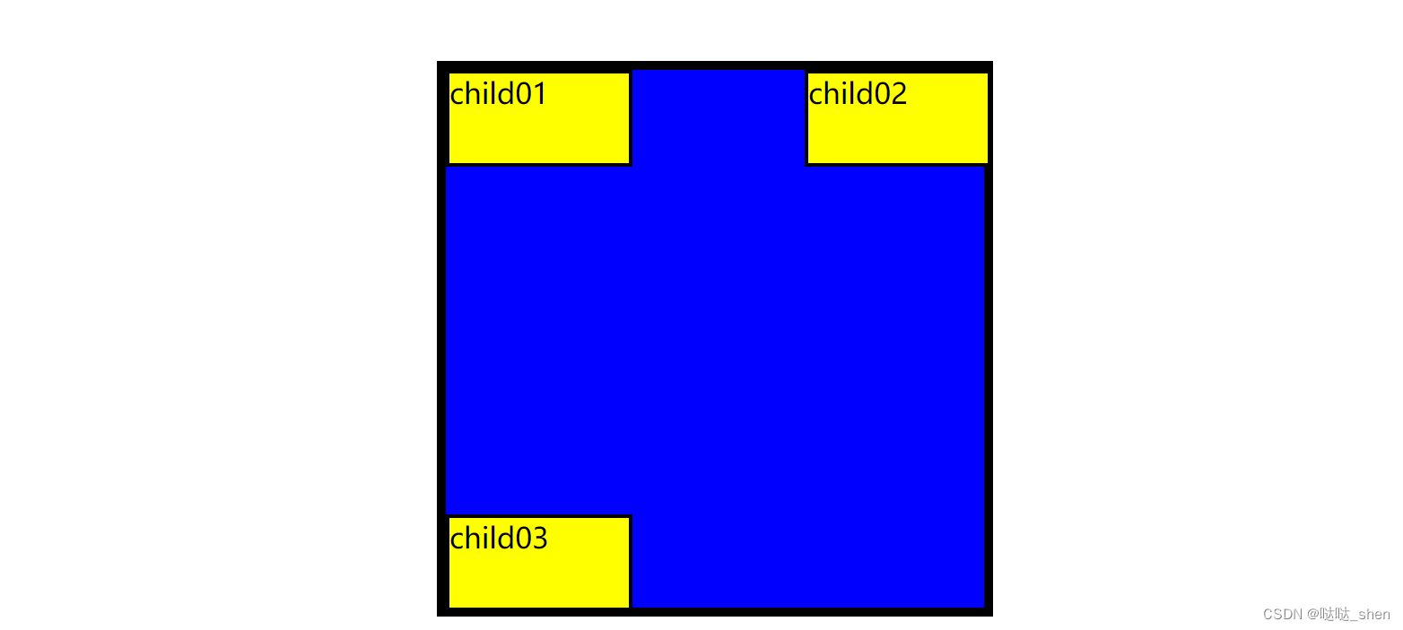
例3:绝对定位
<div class="abs-father">
        <div class="abs-child01">abs-child01</div>
        <div class="abs-child02">abs-child02</div>
        <div class="abs-child03">abs-child03</div>
    </div>
样式:
 /* 绝对定位 */
        .abs-father {
            width: 300px;
            height: 300px;
            background-color: blue;
            /* 边框 */
            border: 5px solid black;
            position: relative;
        }

        .abs-child01 {
            width: 100px;
            height: 100px;
            background-color: brown;
            position:absolute;

        }

        .abs-child02 {
            width: 100px;
            height: 100px;
            background-color: brown;
            position:absolute;
            bottom: 0px;
        }

        .abs-child03 {
            width: 100px;
            height: 100px;
            background-color: brown;
            position:absolute;
            right:0px;
        }
样图: 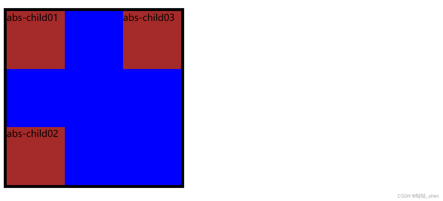
四、伪元素选择器
所谓“伪元素”,就是在dom结构中本来是不存在的,但是通过css创建出来的元素。
::before ::after
用于向指定元素的前面或者加入特定的内容。
例:
 <h1>《正反话》</h1>
    <p>相声是一门艺术</p>
    <P>对对对</P>
    <p>相声演员讲究说学逗唱。</p>
    <p>对对对对对对。</p>
    <p>相声演员怎么怎么怎么样。</p>
    <p>对对对对。</p>
样式:
<style>
//odd 单数前
        p:nth-of-type(odd):before {
            content: "甲:";
        }
//even 双数前
        p:nth-of-type(even):before {
            content: "乙:";
        }
    </style>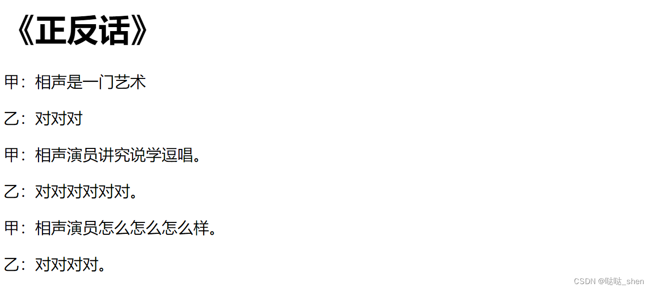
五、元素的浮动
如何解决浮动引起的父元素高度塌陷:
父容器的高度是内部容器撑开的,当子元素元素浮动后,脱离了正常文档流,导致父容器的高度塌陷,高度变为0px。直接为父级div定义height
CSS中有一个float属性,默认值是none。
如果将float属性设置为left或right 元素就会向其父元素的右侧或者左侧靠近
<div class="father">
        <div class="son1">Box-1</div>
        <div class="son1">Box-2</div>
        <div class="son1">Box-3</div>
        <p>文本文本文本文本文本文本文本文本文本</p>
      </div>
样式:
<style>
        body{
            margin: 15px;
        }
        .father {
        background-color:aqua;
        border: 1px solid black;
        padding: 5px;
                }
        .father div {
        padding: 10px;
        margin: 15px;
        border: 1px solid black;
        background-color: pink;
        }
        .father p {
        background-color:beige;
        border: 1px solid black;
        }
        .son1 {
        float: left;
        }
        .son2 {
        float: left;
        }
        .son3 {
        float: left
        }
    </style>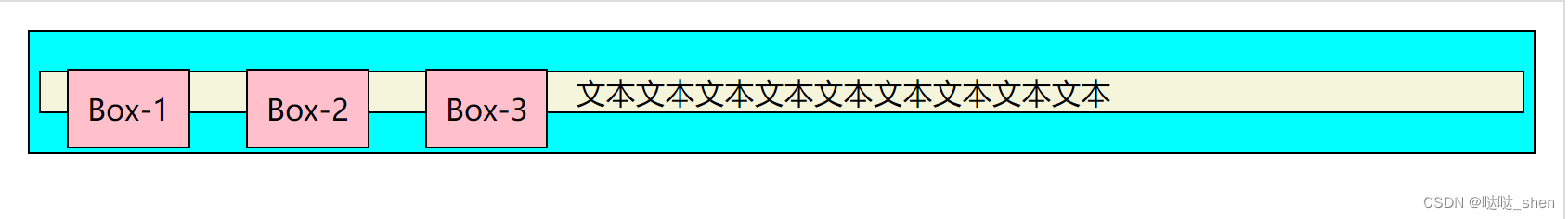


 1491
1491


 被折叠的 条评论
为什么被折叠?
被折叠的 条评论
为什么被折叠?
 到【灌水乐园】发言


