


1 2D转换
1.1 2D转换之translate
语法格式:transform:(x,y);
x就是x轴上移动位置,y就是y轴上移动位置,中间用逗号隔开。
如果只移动x坐标:
transform: translate(100px 0);
transform: translateX(100px);
如果只移动y坐标:
transform: translateY(100px);translate的最大优点:
- translate最大优点:不会影响其他元素的位置
- translate中的百分比单位是相对于自身元素的translate
- translate对行内标签没有效果
实用案例:让盒子实现水平和垂直居中
<div><p></p></div>利用translate实现盒子水平和垂直居中,以下是步骤:
- 利用绝对定位,前左各百分之50%
position: absolute; top: 50%; left: 50%; - 再利用translate,最后实现居中
transform: translate(-50%,-50%);
2.2 2D转换之rotate
语法格式:rotate(degree); (degree是度数,单位为deg)
顺时针为正,逆时针为负,默认的旋转中心点是元素的中心点。
<!DOCTYPE html>
<html lang="en">
<head>
    <meta charset="UTF-8">
    <meta name="viewport" content="width=device-width, initial-scale=1.0">
    <title>旋转</title>
    <!-- 语法:transform:rotate(度数) -->
    <!-- 重点:rotate里面跟度数,单位是deg -->
    <!-- 角度为正时,顺时针,负时,为逆时针 -->
    <!-- 默认旋转的中心点时元素的中心点 -->
    <style>
        div {
            width: 100px;
            height: 100px;
            background-color: blue;
            /* 顺时针旋转45 */
            /* border-radius: 50%; */
            border: 1px solid red;
            transition: all 0.5s;
        }
        div:hover {
            transform: rotate(200deg);
        }
    </style>
</head>
<body>
    <div>

    </div>
</body>
</html>
实用案例:下拉小三角,鼠标经过时划上去
<!DOCTYPE html>
<html lang="en">
<head>
    <meta charset="UTF-8">
    <meta name="viewport" content="width=device-width, initial-scale=1.0">
    <title>2D转换之旋转rotate案例</title>
    <style>
        div {
            position: relative;
            width: 249px;
            height: 35px;
            border: 1px solid #000;
        }
        div::after {
            content: '';
            position: absolute;
            top: 7px;
            right: 15px;
            width: 10px;
            height: 10px;
            border-right: 1px solid #000;
            border-bottom: 1px solid #000;
            transform: rotate(45deg);
            transition: all 0.3s;
        }
        div:hover::after {
            transform: rotate(225deg);
        }
    </style>
</head>
<body>
    <div></div>
</body>
</html>
设置转换中心点:
利用transform-origin设置转换中心点:transform-origin: x y
<!DOCTYPE html>
<html lang="en">
<head>
    <meta charset="UTF-8">
    <meta name="viewport" content="width=device-width, initial-scale=1.0">
    <title>设置转换中心点</title>
    <!-- 利用transform-origin设置元素转换的中心点 -->
    <!-- transform-origin:x y; -->
    <style>
        div {
            width: 200px;
            height: 200px;
            background-color: blue;
            margin: 100px auto;
            transition: all 0.5s;
            /* 可以跟方位名词 */
            /* transform-origin: left bottom; */
            /* 默认的是50% 50% 即center*/
            /* 可以跟px */
            transform-origin: 50px 50px;
        }
        div:hover {
            transform: rotate(360deg);
        }
    </style>
</head>
<body>
    <div>

    </div>
</body>
</html>
旋转案例:
<!DOCTYPE html>
<html lang="en">
<head>
    <meta charset="UTF-8">
    <meta name="viewport" content="width=device-width, initial-scale=1.0">
    <title>旋转案例</title>
    <style>
        div {
            overflow: hidden;
            width: 200px;
            height: 200px;
            border: 1px solid red;
            margin: 100px auto;
        }
        div::before {
            content: '黑马';
            display: block;
            width: 100%;
            height: 100%;
            transform: rotate(180deg);
            transform-origin: left bottom;
            background-color: hotpink;
            transition: all 0.2s;
        }
        /* 复原 */
        div:hover::before {
            transform: rotate(0deg);
        }
    </style>
</head>
<body>
    <div>

    </div>
</body>
</html>
2.3 2D转换之scale
语法格式:transform:scale(2,1);
注意:
- 里面写的数字不跟单位,只能写倍数,1就是1倍,2就是2倍
- 同时修改宽度和高度,有简单写法,以下是宽度修改了2倍 高度默认和第一个参数一样
transform: scale(2); - 我们可以进行缩小,小于1,就是缩小
- scale优势:不会影响其他盒子,而且可以设置缩放的中心点
2.4 分页按钮案例
<!DOCTYPE html>
<html lang="en">
<head>
<meta charset="UTF-8">
<meta name="viewport" content="width=device-width, initial-scale=1.0">
<title>分页按钮案例</title>
<style>
li {
float: left;
width: 30px;
height: 30px;
border: 1px solid pink;
margin: 10px;
text-align: center;
line-height: 30px;
list-style: none;
border-radius: 50%;
/* 鼠标样式 */
cursor: pointer;
transition: all 0.5s;
}
li:hover {
transform: scale(1.2);
}
</style>
</head>
<body>
<ul>
<li>1</li>
<li>2</li>
<li>3</li>
<li>4</li>
<li>5</li>
<li>6</li>
<li>7</li>
</ul>
</body>
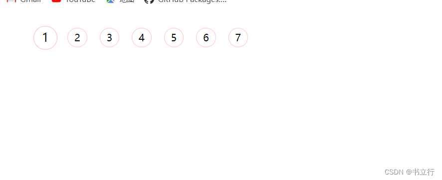
</html>效果如下:
2.5 2D转换综合写法
同时使用多个转换,其格式为transform:translate() rotate() scale(),其顺序会影响转换的效果,先旋转会改变坐标轴方向,当我们同时有位移和其他属性的时候,记得要将位移放到最前面
<!DOCTYPE html>
<html lang="en">
<head>
    <meta charset="UTF-8">
    <meta name="viewport" content="width=device-width, initial-scale=1.0">
    <title>2D转换综合写法</title>
    <style>
        div {
            width: 200px;
            height: 200px;
            background-color: blue;
            transition: all 0.5s;
        }
        div:hover {
            transform: translate(150px,50px) rotate(180deg);
        }
    </style>
</head>
<body>
    <!-- 注意:同时使用多个转换,其格式为transform:translate() rotate() scale() -->
    <!-- 其顺序会影响转换的效果,先旋转会改变坐标轴方向 -->
    <!-- 当我们同时有位移和其他属性的时候,记得要将位移放最前面 -->
    <div></div>
</body>
</html>
2 c3动画
动画是c3中具有颠覆性的特征之一,可通过设置多个节点来精确控制一个或一组动画,常用来实现复杂的动画效果。相比较过渡,动画可以实现更多变化,更多控制,连续自动播放等效果。
制作动画分为两步:
- 先定义动画
- 使用动画
2.1 我们想要页面一打开,一个盒子从左边走到右边
<!DOCTYPE html>
<html lang="en">

<head>
    <meta charset="UTF-8">
    <meta name="viewport" content="width=device-width, initial-scale=1.0">
    <title>css3动画基本使用</title>
    <!-- 动画是c3中具有颠覆性的特征之一,可通过设置多个节点来精确控制一个或一组动画,常用来实现复杂的动画效果。 -->
    <!-- 相比较过渡,动画可以实现更多变化,更多控制,连续自动播放等效果 -->

    <!-- 制作动画分为两步:
    1.先定义动画
    2.使用动画 -->
    <style>
        /* 我们想页面一打开,一个盒子就从左边走到右边 */
        div {
            width: 200px;
            height: 200px;
            background-color: red;
            /* 调用动画 */
            /* 动画名称 */
            animation-name: move;
            /* 持续时间 */
            animation-duration: 2s;
        }
        /* 1.用keyframes定义动画(类似于定义类选择器) */
        @keyframes move{
            /* 开始状态 */
            0% {
                transform: translateX(0px);
            }
            /* 结束状态 */
            100% {
                transform: translate(1000px);
            }
        }
    </style>
</head>

<body>
    <div></div>
</body>

</html>
2.2 动画序列
- 可以做多个状态的变化 keyframe 关键帧
- 里面的百分比要是整数。其中,from和to相当于0%和100%。
@keyframes move {
           from{
                transform: translate(0,0);
            }
            to {
                transform: translate(1000px,0);
            }
以下是状态属性:
- animation-name规定动画名称
- animation-duration规定持续时间
- animation-timing-function规定运动曲线
- animation-delay规定动画何时开始,默认是0
- animation-iteration-count规定动画被播放次数,默认是1,还有infinite是重复播放
- animation-dirction规定动画是否在下一个周期逆向播放,想要反方向,写alternate
- animation-fill-mode规定动画结束后状态,保持forwards 回到起初backwards
- animation-play-state配合hover, 默认running 停止的话用paused
2.3 c3动画简写
格式:animation:动画名称 持续时间 运动曲线 何时开始 播放次数 是否反方向 动画起始或者结束的状态
animation: move 2s ease 0s infinite alternate forwards;2.4 热点图案例
<!DOCTYPE html>
<html lang="en">

<head>
    <meta charset="UTF-8">
    <meta name="viewport" content="width=device-width, initial-scale=1.0">
    <title>热点图案例</title>
    <style>
        body {
            background-color: #333;
        }

        .map {
            position: relative;
            width: 747px;
            height: 616px;
            background: url(media/map.png);
            margin: 0 auto;
        }

        .city_beijing {
            position: absolute;
            top: 227px;
            right: 193px;
            color: #fff;

        }

        .dotted {
            width: 8px;
            height: 8px;
            background-color: #09f;
            border-radius: 50%;
        }

        .city_beijing div[class^="pulse"] {
            /* 保证我们小波纹在父盒子里面水平垂直居中,放大之后就会中心向四周发散 */

            position: absolute;
            top: 50%;
            left: 50%;
            transform: translate(-50%, -50%);
            width: 8px;
            height: 8px;
            /* 如果利用scale缩放,阴影也会跟着变大,所以不好看 */
            box-shadow: 0 0 12px #009dfd;
            border-radius: 50%;
            /* linear是匀速 */
            animation: pulse 1.2s linear infinite;
        }

        .map .city_beijing .pulse2 {
            animation-delay: 0.4s;
        }

        .map .city .pulse3 {
            animation-delay: 0.8s;
        }

        .city_taibei {
            position: absolute;
            top: 500px;
            right: 83px;
            color: #fff;

        }
        .city_taibei div[class^="pulse"] {
            /* 保证我们小波纹在父盒子里面水平垂直居中,放大之后就会中心向四周发散 */

            position: absolute;
            top: 50%;
            left: 50%;
            transform: translate(-50%, -50%);
            width: 8px;
            height: 8px;
            /* 如果利用scale缩放,阴影也会跟着变大,所以不好看 */
            box-shadow: 0 0 12px #009dfd;
            border-radius: 50%;
            /* linear是匀速 */
            animation: pulse 1.2s linear infinite;
        }

        .map .city_taibei .pulse2 {
            animation-delay: 0.4s;
        }

        .map .city_taibei .pulse3 {
            animation-delay: 0.8s;
        }
        @keyframes pulse {
            0% {}

            70% {
                width: 40px;
                height: 40px;
                /* 透明度 */
                opacity: 1;
            }

            100% {
                width: 80px;
                height: 80px;
                opacity: 0;
            }

        }
    </style>
</head>

<body>
    <div class="map">
        <div class="city_beijing">
            <div class="dotted"></div>
            <div class="pulse1"></div>
            <div class="pulse2"></div>
            <div class="pulse3"></div>
        </div>
        <div class="city_taibei">
            <div class="dotted"></div>
            <div class="pulse1"></div>
            <div class="pulse2"></div>
            <div class="pulse3"></div>
        </div>
    </div>
</body>

</html>
效果图如下:

2.5 速度曲线之steps步长
速度曲线的细节:
- animation-timing-function:规定动画的速度曲线,默认是ease
- linear动画从头到尾的速度是相同的,匀速
- ease:默认,动画以低速开始,然后加快,在结束前变慢
- ease-in动画以低速开始
- ease-out动画以低速结束
- ease-in-out动画以低速开始和结束
- steps()指定了时间函数中的间隔数量(步长)
以下是一个案例,通过步长动画来显示文字。
<!DOCTYPE html>
<html lang="en">
<head>
    <meta charset="UTF-8">
    <meta name="viewport" content="width=device-width, initial-scale=1.0">
    <title>速度曲线之steps步长</title>
    <!-- 速度曲线细节: -->
    <!-- animation-timing-function:规定动画的速度曲线,默认是ease -->
    <!-- linear动画从头到尾的速度是相同的,匀速 -->
    <!-- ease:默认。动画以低速开始,然后加快,在结束前变慢 -->
    <!-- ease-in动画以低速开始 -->
    <!-- ease-out动画以低速结束 -->
    <!-- ease-in-out动画以低速开始和结束 -->
    <!-- steps()指定了时间函数中的间隔数量(步长) -->
    <style>
        div {
            overflow: hidden;
            font-size: 20px;
            width: 0;
            height: 30px;
            background-color: pink;
            /* 让我们的文字强制一行内显示 */
            white-space: nowrap;
            /* steps就是分几步来完成我们的动画,有了steps就不要写ease或者linear */
            animation: w 4s steps(10) forwards;
        }
        @keyframes w {
            0% {
                width: 0;
            }
            100% {
                width: 200px;
            }
        }
    </style>
</head>
<body>
    <div>
        世纪佳缘我在这里等你
    </div>
</body>
</html>
2.6 案例---奔跑的熊大
<!DOCTYPE html>
<html lang="en">
<head>
    <meta charset="UTF-8">
    <meta name="viewport" content="width=device-width, initial-scale=1.0">
    <title>奔跑的熊大</title>
    <style>
        body {
            background-color: #ccc;
        }
        div {
            position: absolute;
            width: 200px;
            height: 100px;
            background: url(media/bear.png) no-repeat;
            /* 我们元素可以添加多个动画 用逗号分隔 */
            animation: bear 1s steps(8) infinite,move 3s forwards;
        }
        @keyframes bear {
            0% {
                background-position: 0 0;
            }
            100% {
                background-position: -1600px 0;
            }
        }
        @keyframes move {
            0% {
                left: 0;
            }
            100% {
                left: 50%;
                transform: translateX(-50%);
            }
        }
    </style>
</head>
<body>
    <div></div>
</body>
</html>
3 3D转换
三维坐标其实就是指立体空间,立体空间就是由3个轴共同组成的
x,y,z中,x往后是正值,y往下面是正值,z往外面是正值
主要知识点:
- 3D位移:translated3d(x,y,z)
- 3D旋转:rotate3d(x,y,z)
- 透视:perspective
- 3d呈现transform-style
3.1 translate3d
transform:translateZ()沿着z轴移动,后面单位一般跟px
transform: translateX(100px) translateY(100px) translateZ(100px);切记,xyz不能省略,如果没有就写0
3.2 perspective
-
在2D平面产生近大远小视觉立体,但是只是效果二维
-
如果想要在网页产生3D效果需要透视(理解成3D物体投影在2D平面内)
-
模拟人类的视觉位置,可认为安排一只眼睛去看
-
透视我们也成为视距:视距就是人的眼睛到屏幕的距离
-
距离视觉点越近的在电脑平面成像越大,越远成像越小
-
透视的单位是像素
透视写在观察元素的父亲上面
<!DOCTYPE html>
<html lang="en">
<head>
    <meta charset="UTF-8">
    <meta name="viewport" content="width=device-width, initial-scale=1.0">
    <title>3D转换之透视perspective</title>
    <!-- 在2D平面产生近大远小视觉立体,但是只是效果二维 -->
    <!-- 如果想要在网页产生3D效果需要透视(理解成3D物体投影在2D平面内) -->
    <!-- 模拟人类的视觉位置,可认为安排一只眼睛去看 -->
    <!-- 透视我们也成为视距:视距就是人的眼睛到屏幕的距离 -->
    <!-- 距离视觉点越近的在电脑平面成像越大,越远成像越小 -->
    <!-- 透视的单位是像素 -->
    <style>
        /* 透视写在被观察元素的父亲上面 */
        body {
            perspective: 200px;
        }
        div {
            width: 200px;
            height: 200px;
            /* margin: 0 auto; */
            background-color: red;
            transform: translate3d(400px,100px,100px);
        }
    </style>
</head>
<body>
    <div></div>
</body>
</html>
3.3 rotate3d
对于元素旋转方向的判断需要先学习左手准则:大拇指指向特定轴正值方向,其他手指握拳,其指的方向即为旋转方向。
<!DOCTYPE html>
<html lang="en">
<head>
    <meta charset="UTF-8">
    <meta name="viewport" content="width=device-width, initial-scale=1.0">
    <title>3d旋转rotate3d</title>
    <style>
        body {
            perspective: 400px;
        }
        img {
            display: block;
            margin: 100px auto;
            transition: all 0.5s;
        }
        img:hover {
            /* 对于元素旋转方向的判断我们需要先学习一个左手准则 */
            /* 沿x轴旋转 */
            /* transform: rotateX(360deg); */
            /* 沿y轴旋转 */
            /* transform: rotateY(180deg); */
            /* 沿z轴旋转 和2D基本上是一样的*/
            /* transform: rotateZ(45deg); */
            /* 沿着x轴旋转45 */
            /* transform: rotate3d(1,0,0,45deg); */
            transform: rotate3d(1,1,0,45deg);

        }
    </style>
</head>
<body>
    <!-- 3D旋转可以让元素在三维平面内沿着x轴,y轴,z轴或者自定义轴进行旋转 -->
    <!-- transform:rotatedX(45deg) -->
    <img src="media/pig.jpg" alt="">
</body>
</html>
3.4 transform-style
作用:
-
控制子元素是否开启三维立体环境 -->
-
transform-style:flat子元素不开启3d立体空间 默认的
-
transform-style:preserve-3d;子元素开启立体空间
代码写给父级,但是影响的是子盒子,这个属性很重要,后面必用!!!
<!DOCTYPE html>
<html lang="en">

<head>
    <meta charset="UTF-8">
    <meta name="viewport" content="width=device-width, initial-scale=1.0">
    <title>3D呈现transform-style</title>
    transform-style:
    <!-- 1.控制子元素是否开启三维立体环境 -->
    <!-- 2.transform-style:flat子元素不开启3d立体空间 默认的 -->
    <!-- transform-style:preserve-3d;子元素开启立体空间 -->
    <!-- 代码写给父级,但是影响的是子盒子 -->
    <!-- 这个属性很重要,后面必用 -->
    <style>

        .box {
            /* 只能给父元素加了,之前可以给祖父元素加,现在不行 */
            perspective: 500px;
            transform-style: preserve-3d;
            position: relative;
            width: 200px;
            height: 200px;
            margin: 100px auto;
            transition: all 2s;
            /* background-color: red; */
        }
        .box:hover {
            transform: rotateY(60deg);
        }
        .box div {
            position: absolute;
            top: 0;
            left: 0;
            width: 100%;
            height: 100%;
            background-color: red;
        }

        .box div:last-child {
            background-color: green;
            transform: rotateX(60deg);
        }
    </style>
</head>

<body>
    <div class="box">
        <div></div>
        <div></div>
    </div>

</body>

</html>
两面反转盒子案例
代码如下:
  <!DOCTYPE html>
<html lang="en">

<head>
    <meta charset="UTF-8">
    <meta name="viewport" content="width=device-width, initial-scale=1.0">
    <title>两面翻转盒子案例t</title>
    <style>
        .box {
            position: relative;
            width: 200px;
            height: 200px;
            margin: 0 auto;
            transition: all 0.4s;
            /* 让背面紫色盒子保留立体空间 */
            transform-style: preserve-3d;
            /* background-color: red; */
        }
         .box:hover {
            transform: rotateY(180deg);
        }
        .front {
            position: absolute;
            top: 0;
            left: 0;
            width: 100%;
            height: 100%;
            border-radius: 50%;
            background-color: pink;
            z-index: 1;
            font-size: 30px;
            color: #fff;
            text-align: center;
            line-height: 200px;
            /* 有bug,添加以下代码即可实现 */
            transform: translateZ(1px);
        }

        .back {
            position: absolute;
            top: 0;
            left: 0;
            width: 100%;
            height: 100%;
            border-radius: 50%;
            background-color: blue;
            font-size: 30px;
            color: #fff;
            text-align: center;
            line-height: 200px;
            /* 像手机一样背靠背旋转 */
            transform: rotateY(180deg);
        }
    </style>
</head>

<body>
    <div class="box">
        <div class="front">黑马程序员</div>
        <div class="back">努力学习前端</div>
    </div>
</body>

</html>
3D案例--导航栏
<!DOCTYPE html>
<html lang="en">

<head>
    <meta charset="UTF-8">
    <meta name="viewport" content="width=device-width, initial-scale=1.0">
    <title>3D案例导航栏</title>
    <style>
        ul li {
            float: left;
            list-style: none;
            margin: 0 5px;
            width: 120px;
            height: 35px;
        }

        .box {
            position: relative;
            transform-style: preserve-3d;
            perspective: 500px;
            width: 100%;
            height: 100%;
            transition: all 0.4s;

        }

        .box:hover {
            transform: rotateX(90deg);
        }

        .front,
        .bottom {
            position: absolute;
            top: 0;
            right: 0;
            width: 100%;
            height: 100%;
            background-color: pink;
            line-height: 35px;
            text-align: center;
            /* transform: translateZ(1px); */
        }

        .front {
            z-index: 1;
            transform: translateZ(17.5px);
        }

        .bottom {
            background-color: #c81523;
            transform: translateY(17.5px) rotateX(-90deg);
        }
    </style>
</head>

<body>
    <ul>
        <li>
            <div class="box">
                <div class="front">黑马程序员</div>
                <div class="bottom">前端学习有趣</div>
            </div>
        </li>
        <li>
            <div class="box">
                <div class="front">黑马程序员</div>
                <div class="bottom">前端学习有趣</div>
            </div>
        </li>
        <li>
            <div class="box">
                <div class="front">黑马程序员</div>
                <div class="bottom">前端学习有趣</div>
            </div>
        </li>
        <li>
            <div class="box">
                <div class="front">黑马程序员</div>
                <div class="bottom">前端学习有趣</div>
            </div>
        </li>
        <li>
            <div class="box">
                <div class="front">黑马程序员</div>
                <div class="bottom">前端学习有趣</div>
            </div>
        </li>
        <li>
            <div class="box">
                <div class="front">黑马程序员</div>
                <div class="bottom">前端学习有趣</div>
            </div>
        </li>
    </ul>
</body>

</html>
4 综合案例---旋转小狗
<!DOCTYPE html>
<html lang="en">

<head>
    <meta charset="UTF-8">
    <meta name="viewport" content="width=device-width, initial-scale=1.0">
    <title>h5c3综合案例</title>
    <style>
        /* 很奇怪,现在body加这个就可以实现 */
        body {
             perspective: 1000px;
        }
        section {
            position: relative;
            width: 300px;
            height: 200px;
            margin: 150px auto;
            transform-style: preserve-3d;
            /* 添加动画效果 */
            animation: rotate 10s linear infinite;
        }

        @keyframes rotate {
            0% {
                transform: rotateY(0);

            }

            100% {
                transform: rotateY(360deg);
            }
        }

        section div {
            position: absolute;
            top: 0;
            left: 0;
            width: 100%;
            height: 100%;
            background: url(media/dog.jpg) no-repeat;
        }

        section div:first-child {
            transform: rotateY(0) translateZ(300px);
        }

        section div:nth-child(2) {
            /* 这个要先旋转好了在移动 */
            transform: rotateY(60deg) translateZ(300px);
        }

        section div:nth-child(3) {
            /* 这个要先旋转好了在移动 */
            transform: rotateY(120deg) translateZ(300px);
        }

        section div:nth-child(4) {
            /* 这个要先旋转好了在移动 */
            transform: rotateY(180deg) translateZ(300px);
        }

        section div:nth-child(5) {
            /* 这个要先旋转好了在移动 */
            transform: rotateY(240deg) translateZ(300px);
        }

        section div:nth-child(6) {
            /* 这个要先旋转好了在移动 */
            transform: rotateY(300deg) translateZ(300px);
        }
    </style>
</head>

<body>
    <section>
        <div></div>
        <div></div>
        <div></div>
        <div></div>
        <div></div>
        <div></div>
    </section>
</body>

</html>


 1996
1996

 被折叠的 条评论
为什么被折叠?
被折叠的 条评论
为什么被折叠?
 到【灌水乐园】发言


