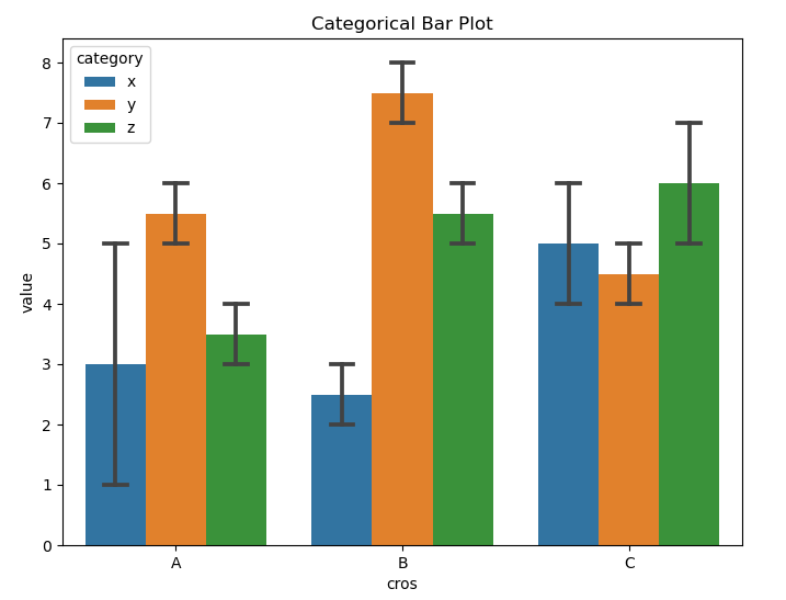
一、sns.barplot()
sns.barplot接口介绍
import pandas as pd
import seaborn as sns
import matplotlib.pyplot as plt
data = {
'cros': ['A', 'A', 'B', 'B', 'C', 'C',
'A', 'A', 'B', 'B', 'C', 'C',
'A', 'A', 'B', 'B', 'C', 'C', ],
'value': [1, 5, 2, 3, 4, 6,
5, 6, 7, 8, 4, 5,
3, 4, 5, 6, 7, 5],
'category': ['x', 'x', 'x', 'x', 'x', 'x',
'y', 'y', 'y', 'y', 'y', 'y',
'z', 'z', 'z', 'z', 'z', 'z'],
}
df = pd.DataFrame(data)
plt.figure(figsize=(8, 6))
sns.barplot(data=df, x='cros', y='value', hue='category', capsize=0.1)
plt.title('Categorical Bar Plot')
plt.show()
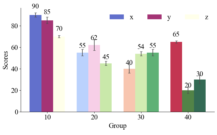
二、plt.bar()
1、不同分组之间有间隔
import numpy as np
import matplotlib.pyplot as plt
from matplotlib import cm
font = {'family': 'Times New Roman', 'size': 18}
plt.rc('font', **font)
n_groups = 4
means_1 = (90, 55, 40, 65)
std_1 = (2, 3, 4, 1)
means_2 = (85, 62, 54, 20)
std_2 = (3, 5, 2, 3)
means_3 = (70, 45, 55, 30)
std_3 = (1, 2, 3, 4)
cmap = plt.get_cmap('coolwarm')
colors_1 = [cmap(i) for i in np.linspace(0, 1, n_groups)]
cmap = plt.get_cmap('PiYG')
colors_2 = [cmap(i) for i in np.linspace(0, 1, n_groups)]
cmap = plt.get_cmap('YlGn')
colors_3 = [cmap(i) for i in np.linspace(0, 1, n_groups)]
fig, ax = plt.subplots(figsize=(8, 5))
index = np.arange(n_groups)
bar_width = 0.25
opacity = 0.8
error_config = {'ecolor': '0.3'}
rects1 = ax.bar(index, means_1, bar_width, capsize=3,
alpha=opacity, color=colors_1,
yerr=std_1, error_kw=error_config,
label='x')
rects2 = ax.bar(index + bar_width, means_2, bar_width, capsize=3,
alpha=opacity, color=colors_2,
yerr=std_2, error_kw=error_config,
label='y')
rects3 = ax.bar(index + 2 * bar_width, means_3, bar_width, capsize=3,
alpha=opacity, color=colors_3,
yerr=std_3, error_kw=error_config,
label='z')
def autolabel(rects):
for rect in rects:
height = rect.get_height()
ax.text(rect.get_x() + rect.get_width() / 2., 1.05 * height,
'{:.0f}'.format(height),
ha='center', va='bottom')
autolabel(rects1)
autolabel(rects2)
autolabel(rects3)
ax.spines['top'].set_visible(False)
ax.spines['right'].set_visible(False)
ax.set_xlabel('Group', font)
ax.set_ylabel('Scores', font)
ax.set_xticks(index + bar_width)
ax.set_xticklabels(('10', '20', '30', '40'))
ax.legend(loc='best', ncol=3, frameon=False)
for tick in ax.xaxis.get_minor_ticks():
tick.label1.set_fontsize(16)
tick.label1.set_fontname('Times New Roman')
for tick in ax.yaxis.get_minor_ticks():
tick.label1.set_fontsize(16)
tick.label1.set_fontname('Times New Roman')
plt.tight_layout()
plt.show()
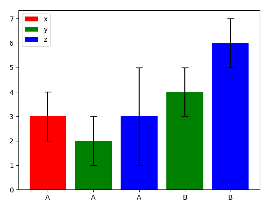
2、不同分组之间没有间隔
import pandas as pd
import matplotlib.pyplot as plt
types = ['x', 'y', 'z']
df = {
'sites': ['A', 'A', 'A', 'B', 'B'],
'cros': ['x', 'y', 'z', 'y', 'z'],
'TET': [3, 2, 3, 4, 6],
'std': [1, 1, 2, 1, 1],
}
dff = pd.DataFrame(df)
sites_name = dff['sites'].unique()
print(sites_name)
colors = {'x': 'red', 'y': 'green', 'z': 'blue'}
cnt = 0
for i in range(len(sites_name)):
print(i)
site = sites_name[i]
data = dff[dff.sites == site]
print(data)
for j in range(len(data)):
print(j)
index = cnt + j
cro = data['cros'][index]
plt.bar(index, data['TET'][index], yerr=data['std'][index], capsize=5, label=cro,
color=colors[cro])
cnt += len(data)
plt.legend(dff['cros'].unique())
plt.xticks(range(len(dff['sites'])), dff['sites'])
plt.show()
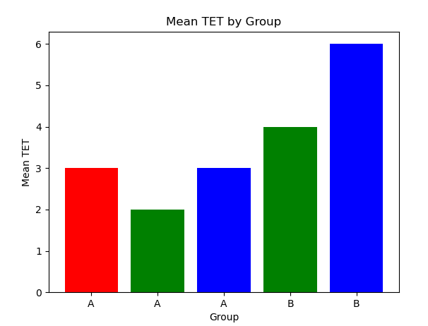
import pandas as pd
import matplotlib.pyplot as plt
df = {
'sites': ['A', 'A', 'A', 'B', 'B'],
'cros': ['x', 'y', 'z', 'y', 'z'],
'TET': [3, 2, 3, 4, 6],
'std': [1, 1, 2, 1, 1],
}
dff = pd.DataFrame(df)
colors = {'x': 'red', 'y': 'green', 'z': 'blue'}
grouped_data = dff.groupby(['sites', 'cros'])['TET'].mean().reset_index()
print(grouped_data)
fig, ax = plt.subplots()
ax.bar(range(len(grouped_data)), grouped_data['TET'], color=[colors[c] for c in grouped_data['cros']])
ax.set_xticks(range(len(dff['sites'])), dff['sites'])
ax.set_xlabel('Group')
ax.set_ylabel('Mean TET')
ax.set_title('Mean TET by Group')
plt.show()


 452
452

 被折叠的 条评论
为什么被折叠?
被折叠的 条评论
为什么被折叠?
 到【灌水乐园】发言


