


所有的热爱都要不遗余力,真正喜欢它便给它更高的优先级,和更多的时间吧!
GIT工程文件在这里: QmlLearningPro
QML其它文章请点击这里: QT QUICK QML 学习笔记
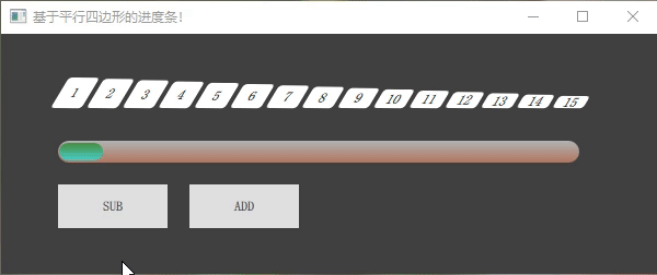
1. 演示
废话不多,上图:
2. 实现过程
1. 先实现平行四边形: 通过 Rectangle 的矩阵变化来实现 (transform: Matrix4x4):
Rectangle {
    id: rect
    ...
    // 切变矩阵
    transform: Matrix4x4 {
        matrix: Qt.matrix4x4(1, xs, 0, 0,   // xs平方向切变     +表示朝右
                             ys, 1, 0, 0,   // ys垂直方向切变   +表示朝下
                             0, 0, 1, 0,
                             0, 0, 0, 1)

    }
}
参考:https://blog.csdn.net/weixin_39644614/article/details/112220330
2. 再实现 15个平行四边形:通过 Row 结合 Repeater 即可:
Row {
    id:  row
    ...
    Repeater {
        id: rep
        model: 15
        Parallelogram {
            xs:  -0.6
            ys:  0.01
            ...
        }
    }
}
3. 通过两种不同颜色的平行四边形来实现进度条的百分比:创建一个显示方块的个数的属性来控制
property int showIndex: 0
onShowIndexChanged: {
    for(var i=0; i<15; i++) {
        if (row.children[i].toString().startsWith("Parallelogram")) {
            if(i<showIndex) 	row.children[i].color = "lightblue"
 			else 				row.children[i].color = "white"
        }
    }
}
4. 创建一个滑动进度条提供输入量:
Rectangle {
        id: container
        ...
        //小滑块条
        Rectangle {
            id: slider
            ...
            MouseArea {
               ...
                drag.axis: Drag.XAxis
            }
            //滑块变动,影响 showIndex 的变化
            onXChanged:{
                showIndex = 15*x/(sliderMax)
            }
        }
    }
5. 同时也创建了两个按键提供输入量:
Button {
    id: sub
    text: "SUB"
    ...
    onClicked:  {
        showIndex--
        if(showIndex <= 0) showIndex=0;
        slider.x = showIndex * sliderMax / 15
    }
}
Button {
    text: "ADD"
    ...
    onClicked: {
        showIndex++
        if(showIndex >= 15) showIndex=15;
        slider.x = showIndex * sliderMax / 15
    }
}
3. 完整代码
Parallelogram.qml:
import QtQuick 2.12

Item {
    property real xs: 0                 // 水平方向切变
    property real ys: 0                 // 垂直方向切变
    property alias radius: rect.radius  // 圆角
    property alias text: title.text     // 文本
    property alias color: rect.color

    Rectangle {
        id: rect
        anchors.fill: parent
        color: "lightblue"
        // 切变矩阵
        transform: Matrix4x4 {
            matrix: Qt.matrix4x4(1, xs, 0, 0,
                                 ys, 1, 0, 0,
                                 0, 0, 1, 0,
                                 0, 0, 0, 1)

        }

        Text {
            id: title
            anchors.centerIn: rect
            text: "0"
        }
    }
}
main.qml:
import QtQuick 2.12
import QtQuick.Window 2.12
import QtQuick.Controls 2.5

Window {
    visible: true

    width: 600
    height: 220
    title: qsTr("不一样的进度条!")
    color: "#404040"

    property int showIndex: 0  //lightblue
    property int _pix:      20
    property int sliderMax: container.width - slider.width-1

    onShowIndexChanged: {
        for(var i=0; i<15; i++) {
            if (row.children[i].toString().startsWith("Parallelogram")) {
                if(i<showIndex) {
                    row.children[i].color = "lightblue"
                }
                else {
                    row.children[i].color = "white"
                }
            }
        }
    }

    Row {
        id:  row
        anchors.horizontalCenter: parent.horizontalCenter
        y: 40
        spacing: 4

        Repeater {
            id: rep
            model: 15

            Parallelogram {
                xs:  -0.6
                ys:  0.01
                radius: 3
                width: 28
                color:    "white"
                height: 10 + (28-10) * (15-index) / 15
                anchors.bottom: parent.bottom
//                anchors.bottomMargin: -index
                text: index + 1
                }
        }
    }

    Rectangle {
        id: container
        anchors {
            top: row.bottom
            topMargin: 30
            left: row.left
            leftMargin: -10
        }
        width:                  row.width
        height:                 _pix
        radius:                 height/2;
        opacity: 0.6                                //不透明度
        antialiasing: true                          // 抗锯齿,具体效果见下面图片
        //渐变色
        gradient: Gradient {
            GradientStop { position: 0.0; color: "White" }
            GradientStop { position: 1.0; color: "LightSalmon" }
        }

        //小滑块条
        Rectangle {
            id: slider
            x: 0
            y: 2
            width:              _pix*2;
            height:             _pix-4
            radius:             height/2;
            antialiasing: true
            gradient: Gradient {
                GradientStop { position: 0.0; color: "green" }
                GradientStop { position: 1.0; color: "aqua" }
            }
            MouseArea {
                anchors.fill: parent
                anchors.margins: -_pix
                drag.target: parent;
                drag.axis: Drag.XAxis
                drag.minimumX: 1;
                drag.maximumX: sliderMax;
            }
            //滑块变动,影响 showIndex 的变化
            onXChanged:{
                showIndex = 15*x/(sliderMax)
            }
        }
    }

    Button {
        id: sub
        text: "SUB"
        anchors.top:    container.bottom
        anchors.topMargin: 20
        anchors.left:   container.left

        onClicked:  {
            showIndex--
            if(showIndex <= 0) showIndex=0;
            slider.x = showIndex * sliderMax / 15
        }
    }
    Button {
        text: "ADD"
        anchors.top:    container.bottom
        anchors.topMargin: 20
        anchors.left:   sub.right
        anchors.leftMargin: 20

        onClicked: {
            showIndex++
            if(showIndex >= 15) showIndex=15;
            slider.x = showIndex * sliderMax / 15
        }
    }
}
GIT 工程文件点击这里: QmlLearningPro
QML 其它文章请点击这里: QT QUICK QML 学习笔记


 1443
1443


 被折叠的 条评论
为什么被折叠?
被折叠的 条评论
为什么被折叠?
 到【灌水乐园】发言


