


matplotlib基础学习
matplotlib库是一个非常强大的数据可视化库,可以绘制多种的可视化图片。
简单示例
import numpy as np
import matplotlib.pyplot as plt
# 从-1,1之间获取50个数
x = np.linspace(-1, 1, 50)
y = 2 * x + 1
# 画线
plt.plot(x, y)
# 显示图像
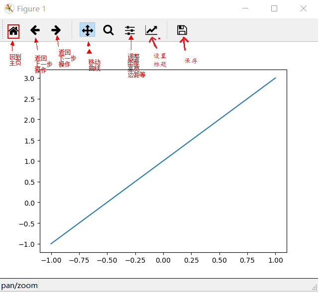
plt.show()如图:
Figure
matplotlib的图像都是位于Figure对象中。我们可以使用plt.figure创建一个Figure:如:
import numpy as np
import matplotlib.pyplot as plt

x = np.linspace(-3, 3, 50)
y1 = x * 2 + 1
y2 = x ** 2

# 创建一个Figure对象
plt.figure()
# 将线画在figure上
plt.plot(x, y1)

# 创建另外一个Figure
plt.figure()
# 在figure上画线
plt.plot(x, y2)

# 显示
plt.show()

除此之外,我们还可以对figure的参数进行修改:
# num:指定figure的名称,figsize:指定figure的宽高
plt.figure(num=3, figsize=(8, 4))
我们还可以在figure上画多根线,还可以指定线的颜色,样式等,如:
import numpy as np
import matplotlib.pyplot as plt

x = np.linspace(-3, 3, 50)
y1 = x * 2 + 1
y2 = x ** 2

# 创建一个Figure对象
plt.figure()
# 将线画在figure上
plt.plot(x, y1)

# 创建另外一个Figure,指定num为3,设置宽高为(8,4)
plt.figure(num=3, figsize=(8, 4))
# 在figure上画线,默认是蓝色
plt.plot(x, y2)
# 在figure上画线,color:指定线的颜色,linewidth:指定线宽,linestype:指定线的样式。
plt.plot(x, y1, color='red', linewidth=1.0, linestyle='--')

# 显示
plt.show()
设置坐标轴和标题
设置坐标轴,我们常常使用如下方法:
xlim:限制x轴的取值范围
ylim:限制y轴的取值范围
xlabel:设置x轴的标签
ylabel:设置y轴的标签
title:设置标题
注:中文在figure的显示,使用FontProperties,加载字体
# 在上面的代码基础上添加
...

# 设置x轴范围在(-2,3)
plt.xlim((-2, 3))
# 设置y轴范围在(-2,8)
plt.ylim((-2, 8))

# 设置x轴的标签
plt.xlabel('I am x')
# 设置y轴的标签,显示中文
font = FontProperties(fname='C:\Windows\Fonts\simkai.ttf', size=14) # 从指定的位置加载字体,设置字体大小
plt.ylabel('y 轴', fontproperties=font)

# 设置标题
plt.title('我是标题', fontproperties=font)

# 显示
plt.show()
我们还可以设置x,y轴上的刻度显示:
xticks:x轴的数字显示(刻度显示)
yticks:x轴的数字显示(刻度显示)
# 在上面的代码基础上
...

# 设置x轴的刻度显示
news_ticks = np.linspace(-2, 3, 11)
plt.xticks(news_ticks)
# 设置y轴上的刻度显示,并指定别名
plt.yticks([0, 2, 4, 6, 8], ['bad', 'normal', 'no bad', 'good', 'very good'])

# 显示
plt.show()
我们还可以通过gca()方法,获取axis对象来对轴进行做操作。
# 在上面代码基础上

...

# get current axis
ax = plt.gca()
# spines表示边框刻度,有left,right,top,bottom
# 设置right,右边的颜色为none
ax.spines['right'].set_color('none')
# 设置top,上边的颜色为none
ax.spines['top'].set_color('none')

# 将bottom的边框刻度设置为0的位置,与y轴相交
ax.spines['bottom'].set_position(('data', 0))
# 将left的边框刻度设置为0的位置,与x轴相交
ax.spines['left'].set_position(('data', 0))

# 显示
plt.show()
图例
import numpy as np
import matplotlib.pyplot as plt

x = np.linspace(-3, 3, 50)
y1 = x * 2 + 1
y2 = x ** 2
# 创建一个Figure
plt.figure()
# 在figure上画线,label:标签
plt.plot(x, y2, label='aaa')
# 在figure上画线,color:指定线的颜色,linewidth:指定线宽,linestype:指定线的样式,label:标签
plt.plot(x, y1, color='red', linewidth=1.0, linestyle='--', label='bbb')

# 设置图例
plt.legend()

# 显示
plt.show()
我们还有另外一种方式生成图例:
import numpy as np
import matplotlib.pyplot as plt

x = np.linspace(-3, 3, 50)
y1 = x * 2 + 1
y2 = x ** 2
# 创建一个Figure
plt.figure()
# 在figure上画线,返回一个line1,对象:变量后面需要加上,
line1, = plt.plot(x, y2, label='aaa')
# 在figure上画线,color:指定线的颜色,linewidth:指定线宽,linestype:指定线的样式
line2, = plt.plot(x, y1, color='red', linewidth=1.0, linestyle='--', label='bbb')

# 设置图例,handles:接收作为图例的参数,labels会把line1和line2的label覆盖,loc:图例放置的位置,best:默认最好的位置
plt.legend(handles=(line1, line2), labels=('linear line', 'square line'), loc='best')

# 显示
plt.show()

annotation标注
import numpy as np
import matplotlib.pyplot as plt
from matplotlib.font_manager import FontProperties

x = np.linspace(-3, 3, 50)
y1 = x * 2
y2 = x ** 2
plt.figure()
plt.plot(x, y1, color='red', lw=1, linestyle='--')
plt.plot(x, y2, color='blue', lw=1)

plt.xlim(-2, 3)
plt.ylim(-2, 6)

ax = plt.gca()
ax.spines['top'].set_color('none')
ax.spines['right'].set_color('none')
ax.spines['bottom'].set_position(('data', 0))
ax.spines['left'].set_position(('data', 0))

x0 = 2
y0 = 2 * x0
plt.plot([x0, x0], [y0, 0], 'k--', lw=1)
plt.scatter([x0, ], [y0, ], s=50, lw=0, color='black')

# 创建一个描述  annotate(s, xy, xytext=None, xycoords='data',textcoords='data', arrowprops=None, **kwargs)
# s : 描述的内容
# xy : 加描述的点
# xytext : 标注的位置,xytext=(30,-30),表示从标注点x轴方向上增加30,y轴方向上减30的位置
# xycoords 、textcoords :这两个参数试了好多次没弄明白,只知道 xycoords='data'给定就行,
#  textcoords='offset points' 标注的内容从xy设置的点进行偏移xytext
# textcoords='data' 标注内容为xytext的绝对坐标
# fontsize : 字体大小,这个没什么好说的
# arrowstyle : 箭头样式'->'指向标注点 '<-'指向标注内容 还有很多'-'
# '->'   head_length=0.4,head_width=0.2
# '-['  widthB=1.0,lengthB=0.2,angleB=None
# '|-|'     widthA=1.0,widthB=1.0
# '-|>'  head_length=0.4,head_width=0.2
# '<-'   head_length=0.4,head_width=0.2
# '<->'   head_length=0.4,head_width=0.2
# '<|-'  head_length=0.4,head_width=0.2
# '<|-|>'     head_length=0.4,head_width=0.2
# 'fancy'   head_length=0.4,head_width=0.4,tail_width=0.4
# 'simple'  head_length=0.5,head_width=0.5,tail_width=0.2
# 'wedge'   tail_width=0.3,shrink_factor=0.5
font = FontProperties(fname='C:\Windows\Fonts\simkai.ttf', size=10)  # 从指定的位置加载字体,设置字体大小
plt.annotate(s='y = 2x 与 \ny = x ** 2相交', xy=(x0, y0), xytext=(+30, -30), xycoords='data', textcoords='offset points',
             fontsize=10, arrowprops=dict(arrowstyle='<-', connectionstyle="arc3,rad=.2"), fontproperties=font)

# 直接在图片上添加文字做标注,实际是添加文字
# (-2,5)坐标处开始输入,输入的内容空格要用\转义,
plt.text(-2, 5, r'$This\ is\ the\ some\ text.$',fontdict={'size': 10, 'color': 'r'})
plt.show()
scatter散点图
import numpy as np
import matplotlib.pyplot as plt

plt.scatter(np.arange(30), np.arange(30) + 3 * np.random.randn(30), marker='o', color='blue')
plt.scatter(np.arange(30), np.arange(30) + 3 * np.random.randn(30), marker='x', color='red')

plt.show()
柱状图
import numpy as np
import matplotlib.pyplot as plt

n = 10
X = np.arange(n)
Y1 = (1 - X / float(n)) * np.random.uniform(0.5, 1.0, n)
Y2 = (1 - X / float(n)) * np.random.uniform(0.5, 1.0, n)

# 设置柱状图,facecolor:柱状图的颜色,edgecolor:边框颜色
bar1 = plt.bar(X, Y1, facecolor='#9999ff', edgecolor='white')
# -Y2:负数,表示朝下
bar2 = plt.bar(X, -Y2, facecolor='#ff9999', edgecolor='white')

for x, y in zip(X, Y1):
    # text():在柱状图上设置文字
    # x,y+0.02表示文字的位置(坐标)
    # '%.2f':保留2位小数
    # ha: horizontal alignment(水平对齐)
    # va: vertical alignment(垂直对齐)
    plt.text(x, y + 0.02, '%.2f' % y, ha='center', va='bottom')

for x, y in zip(X, Y2):
    # text():在柱状图上设置文字
    # x,-y-0.02表示文字的位置(坐标)
    # '%.2f':保留2位小数
    # ha: horizontal alignment(水平对齐)
    # va: vertical alignment(垂直对齐)
    plt.text(x, -y - 0.02, '%.2f' % y, ha='center', va='top')

# 去除边框上的刻度
plt.xticks(())
plt.yticks(())

# 去除边框
ax = plt.gca()
ax.spines['left'].set_color('none')
ax.spines['right'].set_color('none')
ax.spines['top'].set_color('none')
ax.spines['bottom'].set_color('none')

# 设置图例
plt.legend(handles=(bar1, bar2), labels=('male', 'female'), loc='best')

plt.show()
等高线
import numpy as np
import matplotlib.pyplot as plt


def f(x, y):
    # 通过x,y的坐标计算height
    return (1 - x / 2 + x ** 5 + y ** 3) * np.exp(-x ** 2 - y ** 2)


n = 256
x = np.linspace(-3, 3, n)
y = np.linspace(-3, 3, n)
# meshgrid函数通常在数据的矢量化上使用. 适用于生成网格型数据
X, Y = np.meshgrid(x, y)

# 画出等高线
C = plt.contour(X, Y, f(X, Y), 8, cmap = plt.cm.hot, linewidth=0.5)
# 画出等高线上的数字
plt.clabel(C, inline=True, fontsize=10)

plt.xticks(())
plt.yticks(())
plt.show()
Image图片
import numpy as np
import matplotlib.pyplot as plt

a = np.array([0.313660827978, 0.365348418405, 0.423733120134,
              0.365348418405, 0.439599930621, 0.525083754405,
              0.423733120134, 0.525083754405, 0.651536351379]).reshape(3, 3)

# 以image的形式显示
# interpolation:显示方向
# cmap:显示图片的背景
# origin:['upper', 'lower']
plt.imshow(a, interpolation='nearest', cmap='hot', origin='lower')

# 设置颜色条,shrink:压缩比例
plt.colorbar(shrink=0.9)

# 去除边框的刻度
plt.xticks(())
plt.yticks(())

plt.show()
3D图形
import numpy as np
import matplotlib.pyplot as plt
from mpl_toolkits.mplot3d import Axes3D

fig = plt.figure()

ax = Axes3D(fig)

X = np.arange(-4, 4, 0.25)
Y = np.arange(-4, 4, 0.25)
X, Y = np.meshgrid(X, Y)
R = np.sqrt(X ** 2 + Y ** 2)
Z = np.sin(R)

# rstride:横跨
# cstride:列跨
# cmap:彩虹样式
ax.plot_surface(X, Y, Z, rstride=1, cstride=1, cmap=plt.get_cmap('rainbow'))
# 等高线
ax.contourf(X, Y, Z, zdir='x', offset=-2, cmap='rainbow')
# z轴限制,它会把Z轴图形压缩
ax.set_zlim(-2, 2)

plt.show()

sublplot
import matplotlib.pyplot as plt

plt.figure()

# 将figure分成2行2列,1:第1张图
plt.subplot(2, 2, 1)
# 第一个plot
plt.plot([0, 1], [0, 1])

# 将figure分成2行2列,2:第2张图
plt.subplot(2, 2, 2)
# 第一个plot
plt.plot([0, 1], [0, 1])

# 将figure分成2行2列,3:第3张图
plt.subplot(2, 2, 3)
# 第一个plot
plt.plot([0, 1], [0, 1])

# 将figure分成2行2列,4:第4张图
plt.subplot(2, 2, 4)
# 第一个plot
plt.plot([0, 1], [0, 1])

plt.show()
import matplotlib.pyplot as plt

plt.figure()

# 2行1列第1个元素
plt.subplot(2, 1, 1)
plt.plot([0, 1], [0, 1])

# 2行3列第4个元素(上面有一行占了3个元素)
plt.subplot(2, 3, 4)
plt.plot([0, 1], [0, 1])

# 2行3列第5个元素
plt.subplot(2, 3, 5)
plt.plot([0, 1], [0, 1])

# 2行3列第6个元素
plt.subplot(2, 3, 6)
plt.plot([0, 1], [0, 1])

plt.show()

分格显示
分格显示有3种方法:
- subplot2grid
import matplotlib.pyplot as plt


plt.figure()

# (3,3):3行3列,(0,0):起始坐标,colspan=3:占3个单元格,rowspan=1:占一行
ax1 = plt.subplot2grid((3, 3), (0, 0), colspan=3, rowspan=1)
ax1.plot([1, 2], [1, 2])
ax1.set_title('ax1_title')
ax2 = plt.subplot2grid((3, 3), (1, 0), colspan=2)
ax3 = plt.subplot2grid((3, 3), (1, 2), rowspan=2)
ax4 = plt.subplot2grid((3, 3), (2, 0))
ax5 = plt.subplot2grid((3, 3), (2, 1))

plt.show()- gridspec
import matplotlib.pyplot as plt
import matplotlib.gridspec as gridspec


plt.figure()

# 生成grid的数组
gs = gridspec.GridSpec(3,3)
# 通过数组的方式分格空间
ax6 = plt.subplot(gs[0, :])
ax7 = plt.subplot(gs[1, :2])
ax8 = plt.subplot(gs[1:, 2])
ax9 = plt.subplot(gs[-1, 0])
ax10 = plt.subplot(gs[-1, -2])

plt.show()
前2种方式的图如下:

- subplots
import matplotlib.pyplot as plt
import matplotlib.gridspec as gridspec


plt.figure()

# 参数:2,2表示2行2列,sharex:是否分享x轴,sharey:是否分享y轴
# (ax11,ax12),(ax21,ax22)表示矩阵位置
f, ((ax11, ax12), (ax21, ax22)) = plt.subplots(2, 2, sharex=True, sharey=True)

# 对ax11画出散点图
ax11.scatter([1, 2], [1, 2])

plt.show()

图中图
import matplotlib.pyplot as plt

fig = plt.figure()
x = range(1, 8)
y = [1, 3, 4, 2, 5, 8, 6]

# figure中的一个ax1,给ax1设置大小,标签,标题等
left, bottom, width, height = 0.1, 0.1, 0.8, 0.8
ax1 = fig.add_axes([left, bottom, width, height])
ax1.plot(x, y, 'r')
ax1.set_xlabel('x')
ax1.set_ylabel('y')
ax1.set_title('title')

# figure中的一个ax2,给ax1设置大小,标签,标题等
left, bottom, width, height = 0.2, 0.6, 0.25, 0.25
ax2 = fig.add_axes([left, bottom, width, height])
ax2.plot(x, y, 'b')
ax2.set_xlabel('x')
ax2.set_ylabel('y')
ax2.set_title('title inside 1')

# 与上面使用axis对象的是一样的
left, bottom, width, height = 0.6, 0.2, 0.25, 0.25
plt.axes([left, bottom, width, height])
# y[::-1]:y数组倒序排列
plt.plot(y[::-1], x, 'g')
plt.xlabel('x')
plt.ylabel('y')
plt.title('title inside 2')

plt.show()

主次坐标轴
import matplotlib.pyplot as plt
import numpy as np

x = np.arange(0, 10, 0.1)
y1 = 0.05 * x ** 2
y2 = -1 * y1

fig, ax1 = plt.subplots()

ax2 = ax1.twinx()
ax1.plot(x, y1, 'g-')
ax2.plot(x, y2, 'b--')

ax1.set_xlabel('X data')
ax1.set_ylabel('Y1 data', color='g')
ax2.set_ylabel('Y2 data', color='b')

plt.show()

Animation 动画
import numpy as np
from matplotlib import pyplot as plt
from matplotlib import animation

fig, ax = plt.subplots()

x = np.arange(0, 2 * np.pi, 0.01)

line, = ax.plot(x, np.sin(x))


def animate(i):
    # 更新数据
    line.set_ydata(np.sin(x + i / 10.0))
    return line


def init():
    # 初始化
    line.set_ydata(np.sin(x))
    return line


anim = animation.FuncAnimation(fig=fig, func=animate, frames=100,
                               init_func=init, interval=20)

plt.show()


 982
982

 被折叠的 条评论
为什么被折叠?
被折叠的 条评论
为什么被折叠?
 到【灌水乐园】发言


