


柱状图的高级平替可视化
“玫瑰图”,通常也被称为“科克斯图”。它类似于饼图,但不同之处在于每个部分(或“花瓣”)的角度相同,半径根据它表示的值而变化。这种可视化工具对于周期性地显示信息非常有用,比如一年中每月的数据,就像您的图表一样,每个“花瓣”对应一个月份。花瓣的长度代表该月的数值,让观看者能够快速看出哪些月份的值相对较高或较低。这种图表曾被佛罗伦萨·南丁格尔用来说明克里米亚战争期间的死亡原因。
优点
1. 直观展示时间序列数据:非常适合展示随时间变化的数据,如月度或年度的比较。
2. 突出显示数据模式:因其独特的设计,可以突出显示数据中的模式和趋势。
3. 视觉吸引力:具有高度的视觉吸引力,可以吸引观众的注意力。
4. 展示多个变量:能够在一个图表中同时展示多个变量,有助于比较和对比。
5. 历史意义:作为一种历史悠久的数据可视化方法,它在某些情境中具有教育和传统上的价值。
缺点
1. 解读困难:对于不熟悉这种图表的观众来说,可能难以理解和解读。
2. 误导风险:由于区域的大小可能会造成误解,尤其是当外圈的变量值较大时,可能会被过分强调。
3. 不适合复杂数据:对于包含许多类别或复杂数据的情况,可能不是最佳选择。
4. 比较困难:如果需要精确比较数据点的大小,这种图表可能不太合适,因为人眼不擅长比较环形区域的面积。
5. 受限的数据量:不适合展示大量的数据点,因为图表会变得拥挤且难以阅读。
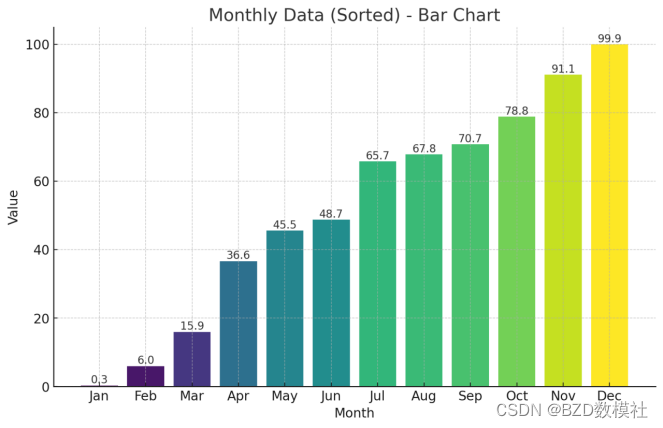
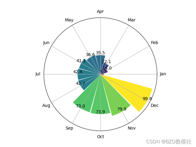
比如下图,我随即生成了一组数据集每个月份具有一个数值,如下的柱状图,为了更加直观的展示其结果,就可以绘制玫瑰图如下所示。
import matplotlib.pyplot as plt
import numpy as np

# Generate random data for 12 months
data = np.random.rand(12) * 100

# Define the angle of each sector
theta = np.linspace(0.0, 2 * np.pi, 12, endpoint=False)

# Sort the data from smallest to largest
sorted_data = np.sort(data)

# Create the plot with the sorted data
fig, ax = plt.subplots(subplot_kw={'projection': 'polar'})

# Create the bars of the rose chart with sorted data
bars = ax.bar(theta, sorted_data, width=0.5, bottom=0.0, color=plt.cm.viridis(sorted_data / 100))

# Set the labels for each 'petal'
ax.set_xticks(theta)
ax.set_xticklabels(['Jan', 'Feb', 'Mar', 'Apr', 'May', 'Jun', 'Jul', 'Aug', 'Sep', 'Oct', 'Nov', 'Dec'])

# Remove the yticks
ax.set_yticks([])

# Add the data values on top of each bar
for bar, value in zip(bars, sorted_data):
    ax.text(bar.get_x() + bar.get_width()/2, bar.get_height(), f'{value:.1f}',
            ha='center', va='bottom')

# Show the plot
plt.show()
为了进一步美化我们使用了渐变的颜色条,加粗了月份标签,并在每个花瓣上方以加粗字体标注了数据值。此外,还调整了背景颜色,网格线样式,以及去除了极坐标的边框,使整个图表看起来更加清晰和现代。
也可以直接使用SPSSPRO的PRO绘图功能绘制。如下所示 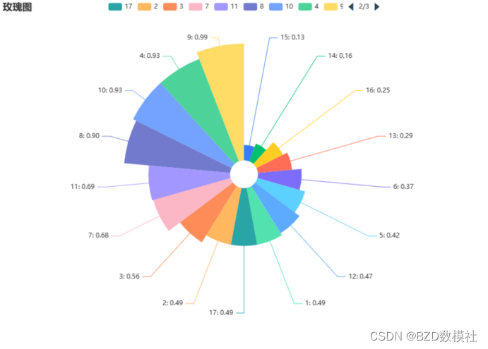
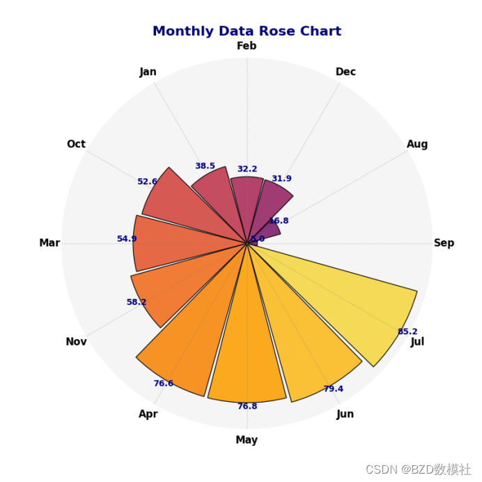
还为大家准备了matlab绘制代码 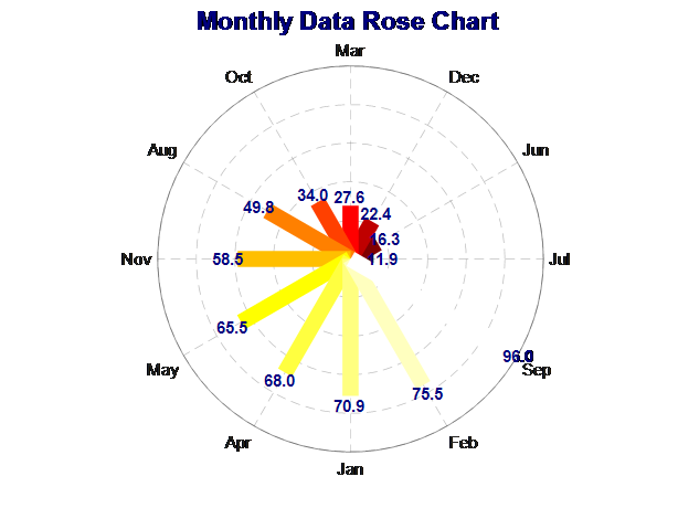
% Random data for 12 months
data = rand(1, 12) * 100;

% Define the angle of each sector
theta = linspace(0, 2 * pi, 13);
theta(end) = []; % To make it 12 elements only

% Sort the data and associated labels
[sorted_data, sortIndex] = sort(data);
sorted_labels = {'Jan', 'Feb', 'Mar', 'Apr', 'May', 'Jun', 'Jul', 'Aug', 'Sep', 'Oct', 'Nov', 'Dec'};
sorted_labels = sorted_labels(sortIndex);

% Create a polar plot
figure('Color', 'white');
pax = polaraxes;
hold on;

% Set the colormap
colors = colormap(hot(12));

% Create the bars
bars = polarplot([theta; theta], [zeros(1, numel(sorted_data)); sorted_data], 'LineWidth', 10);
for i = 1:length(bars)
    bars(i).Color = colors(i, :);
end

% Set the labels for each 'petal'
pax.ThetaTick = rad2deg(theta);
pax.ThetaTickLabel = sorted_labels;

% Add the data values on top of each bar
for i = 1:length(sorted_data)
    text(theta(i), sorted_data(i) + max(data)*0.05, sprintf('%.1f', sorted_data(i)), ...
        'HorizontalAlignment', 'center', 'FontWeight', 'bold', 'Color', [0 0 0.5]);
end

% Customize polar grid and frame
pax.GridLineStyle = '--';
pax.GridColor = [0.5, 0.5, 0.5];
pax.GridAlpha = 0.5;

% Hide the polar frame/spine
pax.RAxis.Visible = 'off';

% Add a title
title('Monthly Data Rose Chart', 'FontSize', 16, 'FontWeight', 'bold', 'Color', [0 0 0.5]);

% Show the plot
hold off;
同时,为了进一步美化可视化结果我们增加标签和图例、添加数据的百分比或数值标签、改进极坐标网格线等操作,最终可视化结果如下所示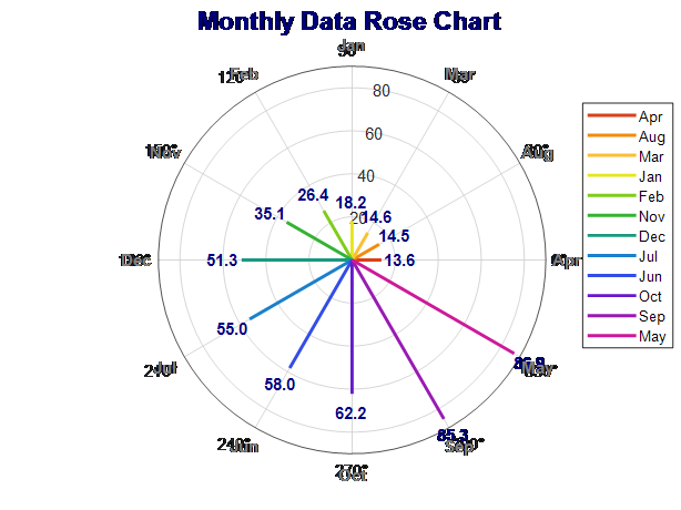


 850
850

 被折叠的 条评论
为什么被折叠?
被折叠的 条评论
为什么被折叠?
 到【灌水乐园】发言


