


css文字颜色渐变和背景色渐变的方法(兼容IE浏览器)
效果图如下
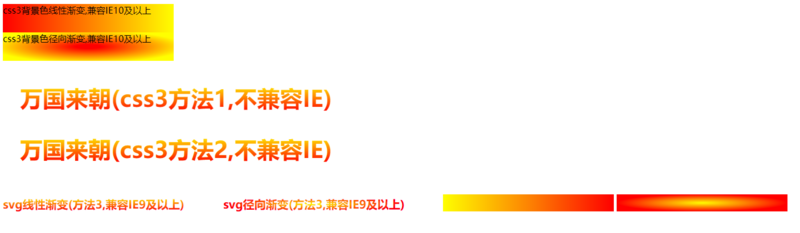
1.svg方法,兼容IE9及以上
-
svg文字颜色
线性渐变
    <svg id="s1" width="382" height="26">
        <defs>
            <linearGradient id="g1" x1="0%" y1="0%" x2="0%" y2="100%">
                <stop offset="0%" stop-color="yellow" stop-opacity="1" ></stop>
                <stop offset="50%" stop-color="#fd8403" stop-opacity="1" ></stop>
                <stop offset="100%" stop-color="red" stop-opacity="1" ></stop>
            </linearGradient>
        </defs>
        <text font-size="20" font-weight="900" x="0" y="21" fill="url(#g1)">svg线性渐变(方法3,兼容IE9及以上)</text>
    </svg>
-
svg文字颜色
径向渐变
    <svg id="s2" width="382" height="26">
        <defs>
            <radialGradient id="g2" fx="50%" fy="50%" cx="50%" cy="50%" r="50%">
                <stop offset="0%" stop-color="yellow" stop-opacity="1" ></stop>
                <stop offset="50%" stop-color="#fd8403" stop-opacity="1" ></stop>
                <stop offset="100%" stop-color="red" stop-opacity="1" ></stop>
            </radialGradient>
        </defs>
        <text font-size="20" font-weight="900" x="0" y="21" fill="url(#g2)">svg径向渐变(方法3,兼容IE9及以上)</text>
    </svg>
-
svg
背景色线性渐变
   <svg id="s3" width="300" height="30" style = "margin-top:15px;">
        <defs>
            <linearGradient id="g3" x1="0%" y1="0%" x2="100%" y2="0%">
                <stop offset="0%" stop-color="yellow" stop-opacity="1"></stop>
                <stop offset="50%" stop-color="#fd8403" stop-opacity="1"></stop>
                <stop offset="100%" stop-color="red" stop-opacity="1"></stop>
            </linearGradient>
        </defs>
        <rect width="300" height="30" x="0" y="0" fill="url(#g3)"></rect>
    </svg>
-
svg
背景色径向渐变
    <svg id="s4" width="300" height="30" style = "margin-top:15px;">
        <defs>
            <radialGradient id="g4" fx="50%" fy="50%" cx="50%" cy="50%" r="50%">
                <stop offset="0%" stop-color="yellow" stop-opacity="1"></stop>
                <stop offset="50%" stop-color="#fd8403" stop-opacity="1"></stop>
                <stop offset="100%" stop-color="red" stop-opacity="1"></stop>
            </radialGradient>
        </defs>
        <rect width="300" height="30" x="0" y="0" fill="url(#g4)"></rect>
    </svg>
2.css3方法,文字颜色不兼容IE浏览器
-
文字
线性渐变,方法1,不兼容IE浏览器
<h3 class="gradient-text gradient-text-one">万国来朝(css3方法1,不兼容IE)</h3>
        .gradient-text {
            text-align: left;
            text-indent: 30px;
            line-height: 50px;
            font-size: 40px;
            font-weight: bolder;
            position: relative;
        }

        /*第一种方法 不兼容IE*/
        .gradient-text-one {
            background-image: linear-gradient(to bottom, red, yellow);
            background-image: -webkit-linear-gradient(bottom, red, yellow);
            -webkit-background-clip: text;
            -webkit-text-fill-color: transparent;
        }
-
文字
线性渐变,方法2,不兼容IE浏览器
<h3 class="gradient-text gradient-text-two" data-content="万国来朝(css3方法2,不兼容IE)">万国来朝(css3方法2,不兼容IE)</h3>
       .gradient-text {
            text-align: left;
            text-indent: 30px;
            line-height: 50px;
            font-size: 40px;
            font-weight: bolder;
            position: relative;
        }

       /*第二种方法 不兼容IE*/
        .gradient-text-two {
            color: red;
        }

        .gradient-text-two[data-content]::after {
            content: attr(data-content);
            display: block;
            position: absolute;
            color: yellow;
            left: 0;
            top: 0;
            z-index: 2;
            -webkit-mask-image: -webkit-gradient(linear, 0 0, 0 bottom, from(yellow), to(rgba(0, 0, 255, 0)));
        }
-
背景色线性渐变,兼容IE10及以上
<div class="box1">css3背景色线性渐变,兼容IE10及以上</div>
        .box1 {
            width:300px;
            height:50px;
            background:linear-gradient(to right,red,yellow);
        }
-
背景色径向渐变,兼容IE10及以上
<div class="box2">css3背景色径向渐变,兼容IE10及以上</div>
    /*css3背景色径向渐变  兼容IE10及以上*/
        .box2 {
            width:300px;
            height:50px;
            background:radial-gradient(red 10%,yellow 80%);
        }


 1541
1541


 被折叠的 条评论
为什么被折叠?
被折叠的 条评论
为什么被折叠?
 到【灌水乐园】发言


