


移动端布局之flex布局1
flex布局体验
传统布局和flex弹性布局的区别
- 传统布局
兼容性好,布局繁琐,局限性,不能在移动端很好的布局 - flex弹性布局
操作方便,布局极为简单,移动端应用很广泛。PC端浏览器支持情况较差。IE 11 或更低版本,不支持或仅部分支持
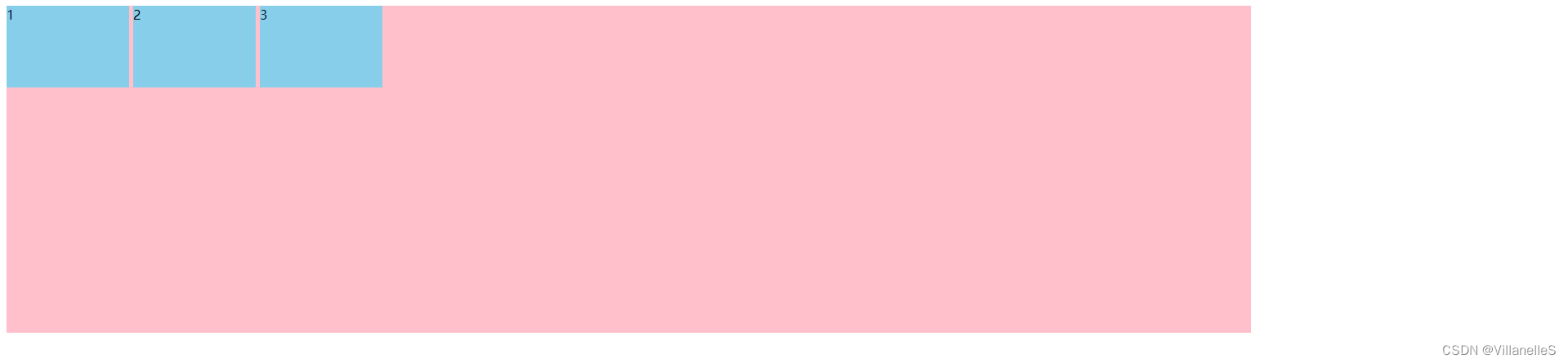
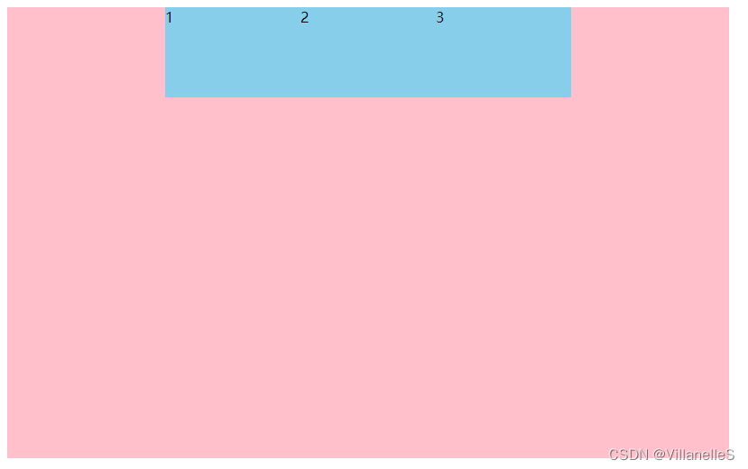
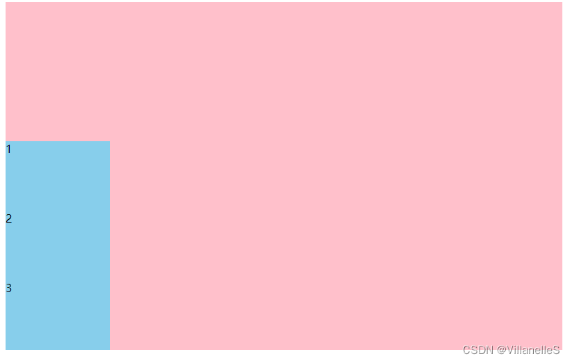
初体验
index.html
<!DOCTYPE html>
<html lang="en">
<head>
    <meta charset="UTF-8">
    <title>Title</title>
    <style>
        div{
            display: flex;
            width: 80%;
            height: 400px;
            background-color: pink;
        }
        span{
            margin-right: 5px;
            width: 150px;
            height: 100px;
            background-color: skyblue;
        }
    </style>
</head>
<body>
    <div>
        <span>1</span>
        <span>2</span>
        <span>3</span>
    </div>
</body>
</html>
flex布局原理
布局原理
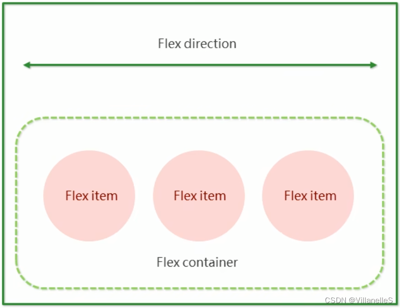
- flex是flexible Box缩写,意为“弹性布局”,用来为盒模型提供最大的灵活性,任何一个容器都可以指定为flex布局
- 当我们为父盒子设为flex布局后,子元素的float、clear和vertical-align属性将失效
- 伸缩布局=弹性布局=伸缩盒布局=弹性盒布局=flex布局
- 采用Flex布局的元素,称为Flex容器(flex container),简称“容器”。它的所有的子元素自动成为容器成员,称为Flex项目(flex item),简称“项目”
- 体验中div就是flex父容器
- 体验中span就是子容器flex项目
- 子容器可以横向排列也可以纵向排列
总结flex布局原理:
就是通过给父盒子添加flex属性,来控制子盒子的位置和排列方式
flex布局父项常见属性
常见父项属性
以下有6个属性是对父元素设置的
- flex-direction:设置主轴方向
- justify-content:设置主轴上的子元素排列方式
- flex-wrap:设置子元素是否换行
- align-content:设置侧轴上的子元素的排列方式(多行)
- align-items:设置侧轴上的子元素排列方式(单行)
- flex-flow:复合属性,相当于同时设置了flex-direction和flex-wrap
flex-direction设置主轴的方向(重要)
主轴与侧轴
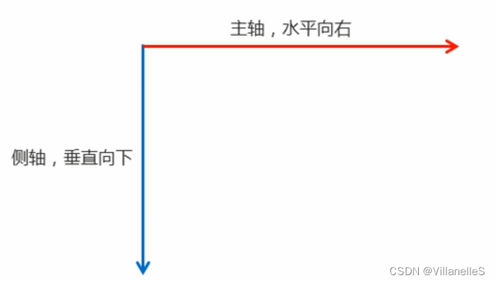
在flex布局中,是分为主轴和侧轴两个方向,同样的叫法有:行和列、x轴和y轴
- 默认主轴方向就是x轴方向,水平向右
- 默认侧轴方向就是y轴方向,水平向下
属性值
flex-direction属性决定主轴的方向(即项目的排列方向)
注意:主轴和侧轴是会变化的,就看flex-direction设置谁为主轴,剩下的就是侧轴,而我们的子元素是跟着主轴来排列的
| 属性值 | 说明 |
|---|---|
row | 默认值从左到右 |
| row-reverse | 从右到左 |
column | 从上到下 |
| column-reverse | 从下到上 |
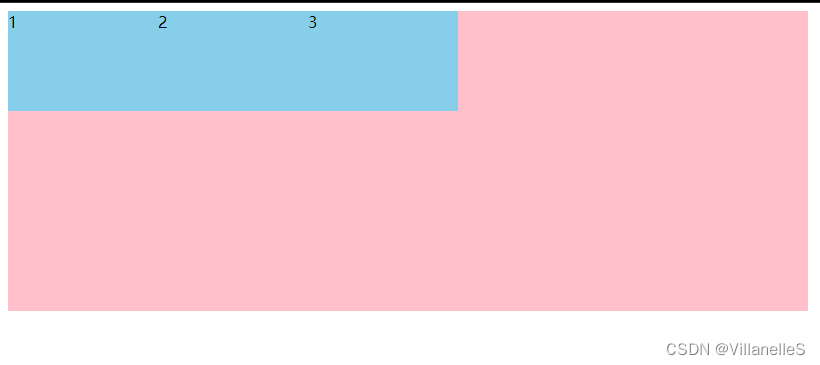
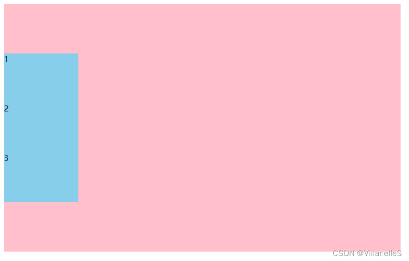
flex-direction: row;
<!DOCTYPE html>
<html lang="en">
<head>
    <meta charset="UTF-8">
    <title>Title</title>
    <style>
        div{
            width: 800px;
            height: 300px;
            background-color: pink;
            display: flex;
            /*默认的主轴是 x轴 行 row 那么y轴就是侧轴喽*/
            /*我们的元素是跟着主轴来排列的*/
            flex-direction: row;
        }
        span{
            width: 150px;
            height: 100px;
            background-color: skyblue;
        }
    </style>
</head>
<body>
<div>
    <span>1</span>
    <span>2</span>
    <span>3</span>
</div>
</body>
</html>
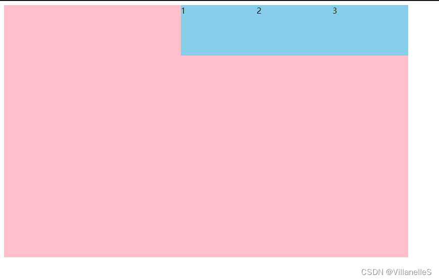
flex-direction: row-reverse;
<!DOCTYPE html>
<html lang="en">
<head>
    <meta charset="UTF-8">
    <title>Title</title>
    <style>
        div{
            width: 800px;
            height: 300px;
            background-color: pink;
            display: flex;
            /*默认的主轴是 x轴 行 row 那么y轴就是侧轴喽*/
            /*我们的元素是跟着主轴来排列的*/
            /*flex-direction: row;*/
            /*简单了解 翻转*/
            flex-direction: row-reverse;
        }
        span{
            width: 150px;
            height: 100px;
            background-color: skyblue;
        }
    </style>
</head>
<body>
<div>
    <span>1</span>
    <span>2</span>
    <span>3</span>
</div>
</body>
</html>
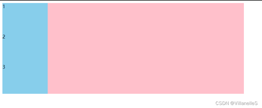
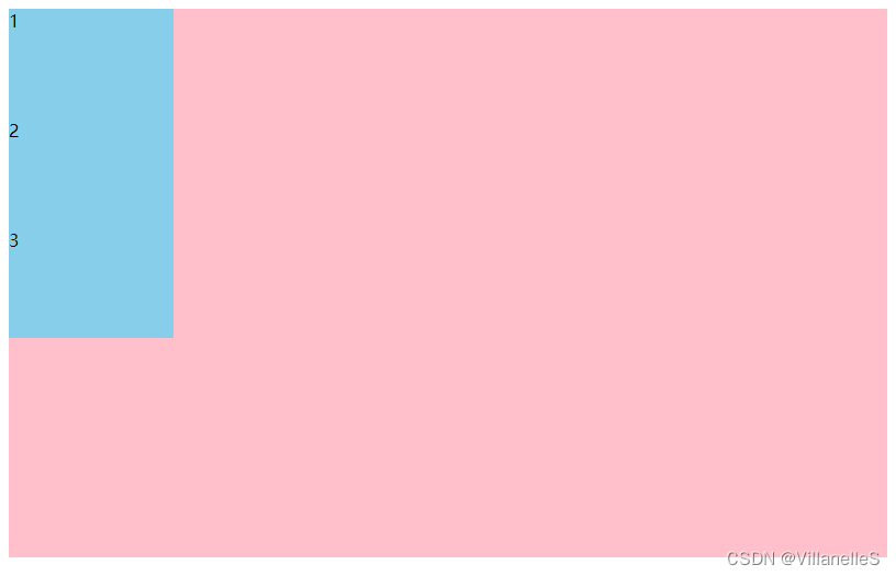
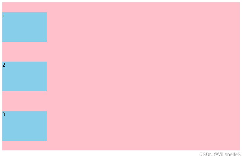
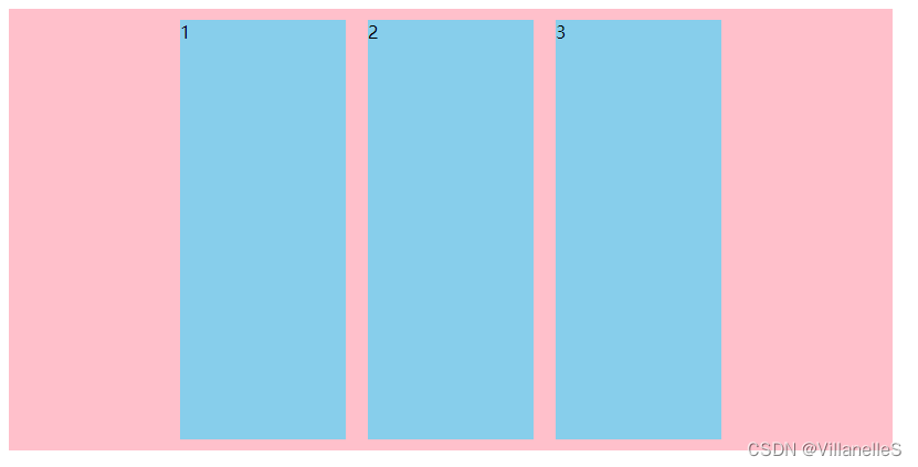
flex-direction: column;
<!DOCTYPE html>
<html lang="en">
<head>
    <meta charset="UTF-8">
    <title>Title</title>
    <style>
        div{
            width: 800px;
            height: 300px;
            background-color: pink;
            display: flex;
            /*默认的主轴是 x轴 行 row 那么y轴就是侧轴喽*/
            /*我们的元素是跟着主轴来排列的*/
            /*flex-direction: row;*/
            /*简单了解 翻转*/
            /*flex-direction: row-reverse;*/
            /*我们可以把我们的主轴设置为 y轴 那么 x轴就成了侧轴*/
            flex-direction: column;
            /*flex-direction: column-reverse;*/
        }
        span{
            width: 150px;
            height: 100px;
            background-color: skyblue;
        }
    </style>
</head>
<body>
<div>
    <span>1</span>
    <span>2</span>
    <span>3</span>
</div>
</body>
</html>
justify-content设置主轴上的子元素排列方式(重要)
justify-content属性定义了项目在主轴上的对齐方式
注意:使用这个属性之前一定要确定好主轴是哪个
| 属性值 | 说明 |
|---|---|
flex-start | 默认值从头部开始 如果主轴是x轴,则从左到右 |
| flex-end | 从尾部开始排列 |
center | 在主轴居中对齐(如果主轴是x轴则 水平居中) |
space-around | 平分剩余空间 |
space-between | 先两边贴边 再平分剩余空间(重要) |
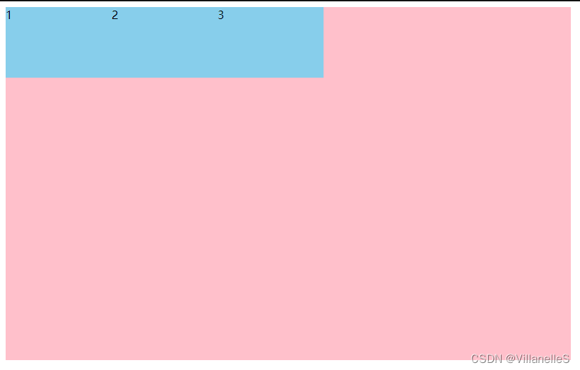
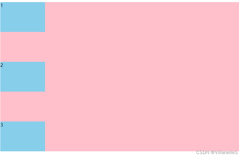
justify-content:flex-start
<!DOCTYPE html>
<html lang="en">
<head>
    <meta charset="UTF-8">
    <title>Title</title>
    <style>
        div{
            width: 800px;
            height: 500px;
            background-color: pink;
            display: flex;
            /*默认的主轴是x轴 row*/
            flex-direction: row;
            /*justify-content:是设置主轴上子元素的排列方式*/
            justify-content: flex-start;
        }
        div span{
            width: 150px;
            height: 100px;
            background-color: skyblue;
        }
    </style>
</head>
<body>
<div>
    <span>1</span>
    <span>2</span>
    <span>3</span>
</div>
</body>
</html>
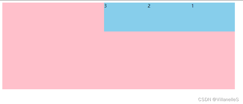
justify-content:flex-end
<!DOCTYPE html>
<html lang="en">
<head>
    <meta charset="UTF-8">
    <title>Title</title>
    <style>
        div{
            width: 800px;
            height: 500px;
            background-color: pink;
            display: flex;
            /*默认的主轴是x轴 row*/
            flex-direction: row;
            /*justify-content:是设置主轴上子元素的排列方式*/
            /*justify-content: flex-start;*/
            justify-content: flex-end;
        }
        div span{
            width: 150px;
            height: 100px;
            background-color: skyblue;
        }
    </style>
</head>
<body>
<div>
    <span>1</span>
    <span>2</span>
    <span>3</span>
</div>
</body>
</html>
justify-content: center;
<!DOCTYPE html>
<html lang="en">
<head>
    <meta charset="UTF-8">
    <title>Title</title>
    <style>
        div{
            width: 800px;
            height: 500px;
            background-color: pink;
            display: flex;
            /*默认的主轴是x轴 row*/
            flex-direction: row;
            /*justify-content:是设置主轴上子元素的排列方式*/
            /*justify-content: flex-start;*/
            /*justify-content: flex-end;*/
            /*让我们子元素居中对齐*/
            justify-content: center;
        }
        div span{
            width: 150px;
            height: 100px;
            background-color: skyblue;
        }
    </style>
</head>
<body>
<div>
    <span>1</span>
    <span>2</span>
    <span>3</span>
</div>
</body>
</html>
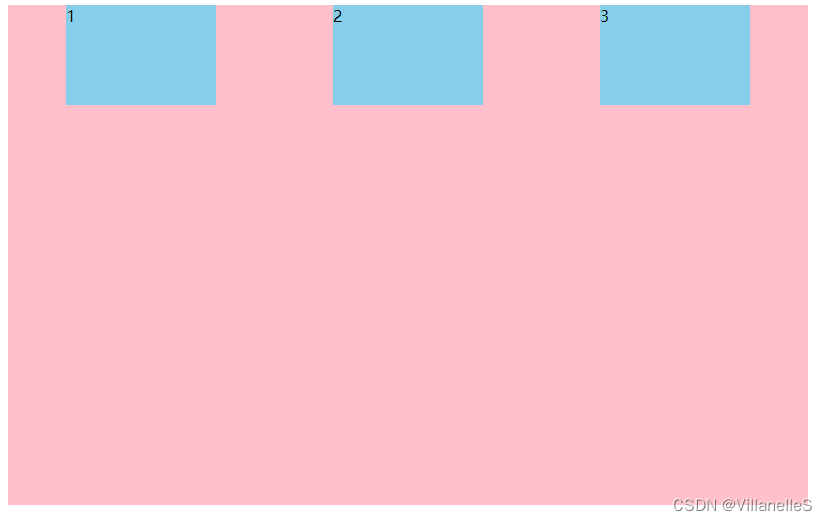
justify-content:space-around
- 平分剩余空间
剩余空间:整个父盒子的宽度-所有子盒子的总的宽度
<!DOCTYPE html>
<html lang="en">
<head>
    <meta charset="UTF-8">
    <title>Title</title>
    <style>
        div{
            width: 800px;
            height: 500px;
            background-color: pink;
            display: flex;
            /*默认的主轴是x轴 row*/
            flex-direction: row;
            /*justify-content:是设置主轴上子元素的排列方式*/
            /*justify-content: flex-start;*/
            /*justify-content: flex-end;*/
            /*让我们子元素居中对齐*/
            /*justify-content: center;*/
            justify-content: space-around;
        }
        div span{
            width: 150px;
            height: 100px;
            background-color: skyblue;
        }
    </style>
</head>
<body>
<div>
    <span>1</span>
    <span>2</span>
    <span>3</span>
</div>
</body>
</html>
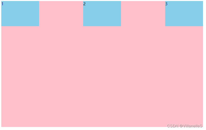
justify-content:space-between
<!DOCTYPE html>
<html lang="en">
<head>
    <meta charset="UTF-8">
    <title>Title</title>
    <style>
        div{
            width: 800px;
            height: 500px;
            background-color: pink;
            display: flex;
            /*默认的主轴是x轴 row*/
            flex-direction: row;
            /*justify-content:是设置主轴上子元素的排列方式*/
            /*justify-content: flex-start;*/
            /*justify-content: flex-end;*/
            /*让我们子元素居中对齐*/
            /*justify-content: center;*/
            /*justify-content: space-around;*/
            /*先两边贴边 再分配剩余的空间*/
            justify-content: space-between;
        }
        div span{
            width: 150px;
            height: 100px;
            background-color: skyblue;
        }
    </style>
</head>
<body>
<div>
    <span>1</span>
    <span>2</span>
    <span>3</span>
</div>
</body>
</html>
主轴为y轴,各元素排列方式样子
- justify-content: flex-start:
- justify-content: flex-end
- justify-content: center
- justify-content: space-around
- justify-content: space-between;
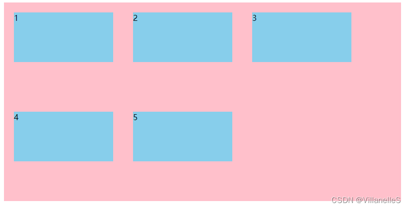
flex-wrap设置子元素是否换行(重要)
默认情况下, 项目都排在一条线(又称“轴线”上)。flex-wrap属性定义,flex布局中默认是不换行的
| 属性值 | 说明 |
|---|---|
no-wrap | 默认值:不换行 |
| wrap | 换行 |
<!DOCTYPE html>
<html lang="en">
<head>
    <meta charset="UTF-8">
    <title>Title</title>
    <style>
        div{
            width: 800px;
            height: 400px;
            background-color: pink;
            display: flex;
            /*flex的布局中,默认的子元素是不换行的,如果装不开,会缩小子元素的宽度,放到父元素里面*/
            /*flex-wrap: nowrap;*/
            flex-wrap: wrap;
        }
        div span{
            margin: 20px;
            width: 200px;
            height: 100px;
            background-color: skyblue;
        }
    </style>
</head>
<body>
<div>
    <span>1</span>
    <span>2</span>
    <span>3</span>
    <span>4</span>
    <span>5</span>
</div>
</body>
</html>
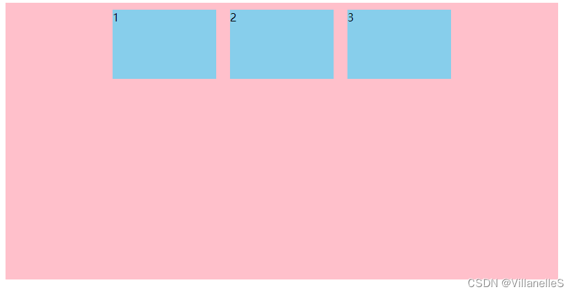
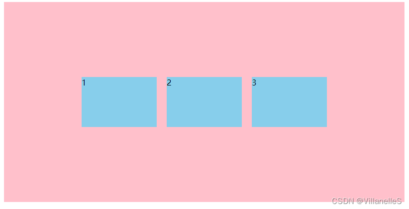
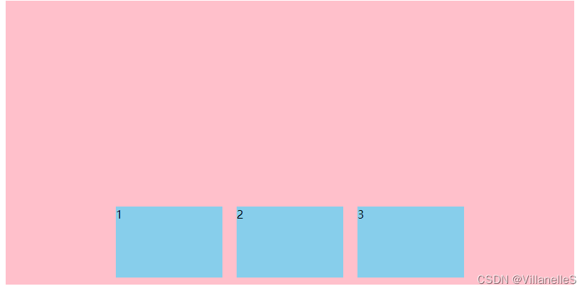
align-items设置侧轴上的子元素排列方式(单行)(重要)
该属性是控制子项在侧轴(默认是y轴)上的排列方式,在子项为单项(单行 )的时候使用
| 属性值 | 说明 |
|---|---|
flex-start | 从上到下 |
| flex-end | 从下到上 |
center | 挤在一起居中(垂直居中) |
stretch | 拉伸(默认值) |
align-items: flex-start;
<!DOCTYPE html>
<html lang="en">
<head>
    <meta charset="UTF-8">
    <title>Title</title>
    <style>
        div{
            width: 800px;
            height: 400px;
            background-color: pink;
            display: flex;
            justify-content: center;
            /*侧轴默认对齐方式*/
            align-items: flex-start;
        }
        div span{
            margin: 10px;
            width: 150px;
            height: 100px;
            background-color: skyblue;
        }
    </style>
</head>
<body>
<div>
    <span>1</span>
    <span>2</span>
    <span>3</span>
</div>
</body>
</html>
align-items: center;
<!DOCTYPE html>
<html lang="en">
<head>
    <meta charset="UTF-8">
    <title>Title</title>
    <style>
        div{
            width: 800px;
            height: 400px;
            background-color: pink;
            display: flex;
            justify-content: center;
            /*侧轴默认对齐方式*/
            /*align-items: flex-start;*/
            /*我们需要一个侧轴居中对齐*/
            align-items: center;
        }
        div span{
            margin: 10px;
            width: 150px;
            height: 100px;
            background-color: skyblue;
        }
    </style>
</head>
<body>
<div>
    <span>1</span>
    <span>2</span>
    <span>3</span>
</div>
</body>
</html>
align-items: flex-end;
<!DOCTYPE html>
<html lang="en">
<head>
    <meta charset="UTF-8">
    <title>Title</title>
    <style>
        div{
            width: 800px;
            height: 400px;
            background-color: pink;
            display: flex;
            justify-content: center;
            /*侧轴默认对齐方式*/
            /*align-items: flex-start;*/
            /*我们需要一个侧轴居中对齐*/
            /*align-items: center;*/
            align-items: flex-end;
        }
        div span{
            margin: 10px;
            width: 150px;
            height: 100px;
            background-color: skyblue;
        }
    </style>
</head>
<body>
<div>
    <span>1</span>
    <span>2</span>
    <span>3</span>
</div>
</body>
</html>
align-items: stretch;
拉伸,但是子盒子不要给高度
<!DOCTYPE html>
<html lang="en">
<head>
    <meta charset="UTF-8">
    <title>Title</title>
    <style>
        div{
            width: 800px;
            height: 400px;
            background-color: pink;
            display: flex;
            justify-content: center;
            /*侧轴默认对齐方式*/
            /*align-items: flex-start;*/
            /*我们需要一个侧轴居中对齐*/
            /*align-items: center;*/
            /*align-items: flex-end;*/
            /*拉伸,但是子盒子不要给高度*/
            align-items: stretch;
        }
        div span{
            margin: 10px;
            width: 150px;
            /*height: 100px;*/
            background-color: skyblue;
        }
    </style>
</head>
<body>
<div>
    <span>1</span>
    <span>2</span>
    <span>3</span>
</div>
</body>
</html>
align-content 设置侧轴上的子元素排列方式(多行)
设置子项在侧轴上的排列方式 并且只能用于子项出现换行的情况(多行),在单行下是没有效果的
| 属性值 | 说明 |
|---|---|
flex-start | 默认值在侧轴的头部开始排列 |
| flex-end | 在侧轴的尾部开始排列 |
center | 在侧轴中间显示 |
space-around | 子项在侧轴平分剩余空间 |
space-between | 子项在侧轴先分布在两头,再平分剩余空间 |
stretch | 设置子项元素高度平分父元素高度 |
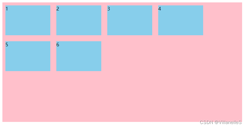
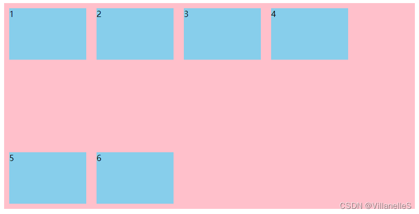
align-content: flex-start;
<!DOCTYPE html>
<html lang="en">
<head>
    <meta charset="UTF-8">
    <title>Title</title>
    <style>
        div{
            width: 800px;
            height: 400px;
            background-color: pink;
            display: flex;
            /*换行*/
            flex-wrap: wrap;
            /*因为有了换行,此时我们侧轴上控制子元素的对齐方式我们用 align-content*/
            align-content: flex-start;
        }
        div span{
            margin: 10px;
            width: 150px;
            height: 100px;
            background-color: skyblue;
        }
    </style>
</head>
<body>
<div>
    <span>1</span>

    <span>2</span>
    <span>3</span>
    <span>4</span>
    <span>5</span>
    <span>6</span>
</div>
</body>
</html>
align-content: center;
<!DOCTYPE html>
<html lang="en">
<head>
    <meta charset="UTF-8">
    <title>Title</title>
    <style>
        div{
            width: 800px;
            height: 400px;
            background-color: pink;
            display: flex;
            /*换行*/
            flex-wrap: wrap;
            /*因为有了换行,此时我们侧轴上控制子元素的对齐方式我们用 align-content*/
            /*align-content: flex-start;*/
            align-content: center;
        }
        div span{
            margin: 10px;
            width: 150px;
            height: 100px;
            background-color: skyblue;
        }
    </style>
</head>
<body>
<div>
    <span>1</span>
    <span>2</span>
    <span>3</span>
    <span>4</span>
    <span>5</span>
    <span>6</span>
</div>
</body>
</html>
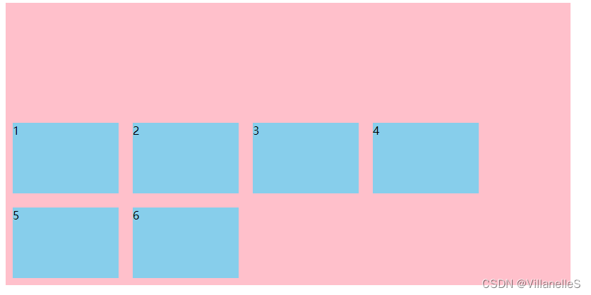
align-content: flex-end;
<!DOCTYPE html>
<html lang="en">
<head>
    <meta charset="UTF-8">
    <title>Title</title>
    <style>
        div{
            width: 800px;
            height: 400px;
            background-color: pink;
            display: flex;
            /*换行*/
            flex-wrap: wrap;
            /*因为有了换行,此时我们侧轴上控制子元素的对齐方式我们用 align-content*/
            /*align-content: flex-start;*/
            /*align-content: center;*/
            align-content: flex-end;
        }
        div span{
            margin: 10px;
            width: 150px;
            height: 100px;
            background-color: skyblue;
        }
    </style>
</head>
<body>
<div>
    <span>1</span>
    <span>2</span>
    <span>3</span>
    <span>4</span>
    <span>5</span>
    <span>6</span>
</div>
</body>
</html>
align-content: space-between;
<!DOCTYPE html>
<html lang="en">
<head>
    <meta charset="UTF-8">
    <title>Title</title>
    <style>
        div{
            width: 800px;
            height: 400px;
            background-color: pink;
            display: flex;
            /*换行*/
            flex-wrap: wrap;
            /*因为有了换行,此时我们侧轴上控制子元素的对齐方式我们用 align-content*/
            /*align-content: flex-start;*/
            /*align-content: center;*/
            /*align-content: flex-end;*/
            align-content: space-between;
        }
        div span{
            margin: 10px;
            width: 150px;
            height: 100px;
            background-color: skyblue;
        }
    </style>
</head>
<body>
<div>
    <span>1</span>
    <span>2</span>
    <span>3</span>
    <span>4</span>
    <span>5</span>
    <span>6</span>
</div>
</body>
</html>
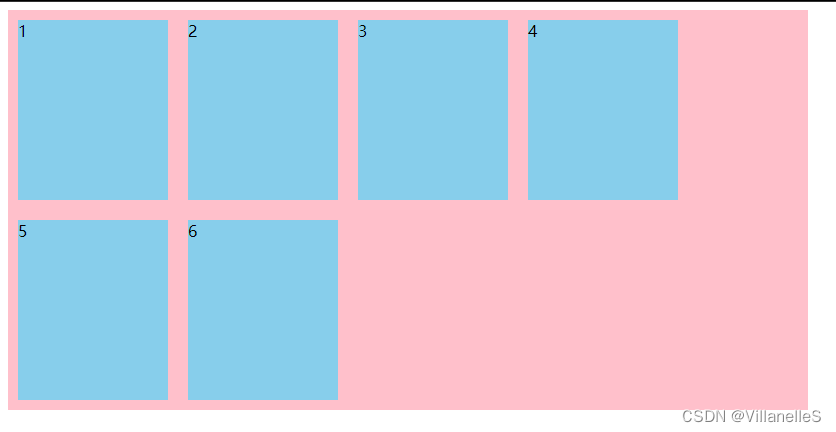
align-content: space-around;
<!DOCTYPE html>
<html lang="en">
<head>
    <meta charset="UTF-8">
    <title>Title</title>
    <style>
        div{
            width: 800px;
            height: 400px;
            background-color: pink;
            display: flex;
            /*换行*/
            flex-wrap: wrap;
            /*因为有了换行,此时我们侧轴上控制子元素的对齐方式我们用 align-content*/
            /*align-content: flex-start;*/
            /*align-content: center;*/
            /*align-content: flex-end;*/
            /*align-content: space-between;*/
            align-content: space-around;
        }
        div span{
            margin: 10px;
            width: 150px;
            height: 100px;
            background-color: skyblue;
        }
    </style>
</head>
<body>
<div>
    <span>1</span>
    <span>2</span>
    <span>3</span>
    <span>4</span>
    <span>5</span>
    <span>6</span>
</div>
</body>
</html>
align-content: stretch;
<!DOCTYPE html>
<html lang="en">
<head>
    <meta charset="UTF-8">
    <title>Title</title>
    <style>
        div{
            width: 800px;
            height: 400px;
            background-color: pink;
            display: flex;
            /*换行*/
            flex-wrap: wrap;
            /*因为有了换行,此时我们侧轴上控制子元素的对齐方式我们用 align-content*/
            /*align-content: flex-start;*/
            /*align-content: center;*/
            /*align-content: flex-end;*/
            /*align-content: space-between;*/
            /*align-content: space-around;*/
            align-content: stretch;
        }
        div span{
            margin: 10px;
            width: 150px;
            /*height: 100px;*/
            background-color: skyblue;
        }
    </style>
</head>
<body>
<div>
    <span>1</span>
    <span>2</span>
    <span>3</span>
    <span>4</span>
    <span>5</span>
    <span>6</span>
</div>
</body>
</html>
总结:align-items和align-content的区别
- align-items适用于单行情况下,只有上对齐、下对齐、居中和拉伸
- align-content适用于
换行(多行)的情况下(单行情况无效),可以设置上对齐,下对齐,居中,拉伸以及平均分配剩余空间等属性值 - 总结就是单行找align-items,多行找align-content


 615
615


 被折叠的 条评论
为什么被折叠?
被折叠的 条评论
为什么被折叠?
 到【灌水乐园】发言


