


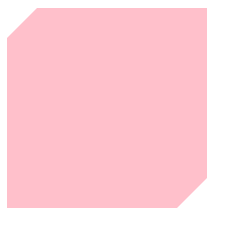
实现如下多边形
方法一:
<div class="container">
       <span class='trangle-lt'></span>
       <span class='trangle-rb'></span>
   </div>
.container{
        width: 200px;
         height: 200px;
         background-color: pink;
         position: relative;
     }
.trangle-lt{
      display: inline-block;
      border-top: 15px solid #fff;
      border-left: 15px solid #fff;
      border-right:  15px solid transparent;
      border-bottom: 15px solid transparent;
      position: absolute;
      left: 0px;
      top: 0px;
  }
  .trangle-rb{
      display: inline-block;
      border-right: 15px solid #fff;
      border-bottom: 15px solid #fff;
      border-left:  15px solid transparent;
      border-top: 15px solid transparent;
      position: absolute;
      right: 0px;
      bottom: 0px;
  }
也可以这样写:
html:
<div class="container"></div>
css:
.container{
            width: 200px;
            height: 200px;
            background-color: pink;
            position: relative;
        }
  .container::before{
       content: '';
       display: inline-block;
       border-top: 15px solid #fff;
       border-left: 15px solid #fff;
       border-right:  15px solid transparent;
       border-bottom: 15px solid transparent;
       position: absolute;
       left: 0px;
       top: 0px;
   }
   .container::after{
       content: '';
       display: inline-block;
       border-right: 15px solid #fff;
       border-bottom: 15px solid #fff;
       border-left:  15px solid transparent;
       border-top: 15px solid transparent;
       position: absolute;
       right: 0px;
       bottom: 0px;
   }
三角形可以组成任何多边形。所以可以根据以上代码任意发挥了(注意上下左右四个border的宽度值不一定要一样~)
实现下边这个图:
在方法一的基础上补充下边两行css代码即可:
.container{
        width: 200px;
         height: 200px;
         background-color: pink;
         position: relative;
         border-top-left-radius: 40px;
         border-bottom-right-radius: 40px;
     }
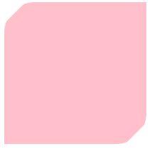
实现下图

 .container{
        width: 200px;
         height: 200px;
         background-color: pink;
         position: relative;
         border-top-left-radius: 50px;
         border-bottom-right-radius: 50px;
     }


 3007
3007


 被折叠的 条评论
为什么被折叠?
被折叠的 条评论
为什么被折叠?
 到【灌水乐园】发言


