


flexbox 存在于CSS布局中
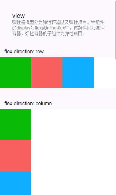
1. flex-direction—弹性容器的方向
然后我们用第3篇中的最简化小程序来跑一下
<1>首先我们需要在index.wxml中编写
<!--index.wxml-->
<view class="zhangsan"> //class就是为了给这个view起个名字,为了在index.wxss中给它布置属性的时候知道是给zhangsan布置属性了

<view class="a" >
<view class="b1">Content</view>
<view class="b2">Content</view>
<view class="b3">Content</view>
</view>
</view>
<2>index.wxss就是为了美化index.wxml而存在的,它俩关系就比如index.wxml是一座房子,让我们看了,但这座房子不好看啊,那就得给房子刷墙,美化,这就是index.wxss的功能
/**index.wxss**/
.zhangsan{
background: #ffFFff;
}
.a{
padding: 5px;
margin: 10px;
background-color: #fff000;
}
.b1{
width: 100px;
height: 100px;
background-color: #00FF00;
}
.b2{
width: 100px;
height: 100px;
background-color: #00fff0;
}
.b3{
width: 100px;
height: 100px;
background-color: #0f00ff;
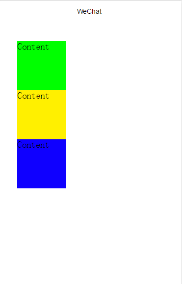
}<3>效果图(可见系统默认的flex-direction方向是纵向的)
<4>将效果图横向排序(只需要将index.wxml的代码改为)
<!--index.wxml-->
<view class="zhangsan">
 <view class="a" style="display:flex; flex-direction:row">
<view class="b1">Content</view>
<view class="b2">Content</view>
<view class="b3">Content</view>
</view>
</view>
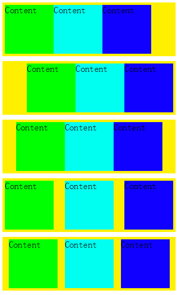
2. justify-content—视图在屏幕中的位置
flex-start —- 位于屏幕的左边
flex-end —- 位于屏幕的右边
center —- 位于屏幕的中间
space-between —-均匀分布
space-around —- 均匀分布,并且两边会留有空间
(从上到下互相对应)
在这里我们只改一下index.wxml的代码
<!--index.wxml-->
<view class="zhangsan">

<view class="a" style="display:flex; flex-direction:row">
<view class="b1">Content</view>
<view class="b2">Content</view>
<view class="b3">Content</view>
</view>

<view class="a" style="display:flex; flex-direction:raw;justify-content:flex-start;">
<view class="b1">Content</view>
<view class="b2">Content</view>
<view class="b3">Content</view>
</view>

<view class="a" style="display:flex; flex-direction:raw;justify-content:flex-end;">
<view class="b1">Content</view>
<view class="b2">Content</view>
<view class="b3">Content</view>
</view>

<view class="a" style="display:flex; flex-direction:raw;justify-content:center;">
<view class="b1">Content</view>
<view class="b2">Content</view>
<view class="b3">Content</view>
</view>

<view class="a" style="display:flex; flex-direction:raw;justify-content:space-between;">
<view class="b1">Content</view>
<view class="b2">Content</view>
<view class="b3">Content</view>
</view>

<view class="a" style="display:flex; flex-direction:raw;justify-content:space-around;">
<view class="b1">Content</view>
<view class="b2">Content</view>
<view class="b3">Content</view>
</view>

</view>
3. align-item—-试图在屏幕中的位置
flex-start—-位于屏幕最上边
flex-end—-位于屏幕的底部
center—-位于屏幕中间
(修改方法和上面一样)


 1211
1211


 被折叠的 条评论
为什么被折叠?
被折叠的 条评论
为什么被折叠?
 到【灌水乐园】发言


