


 本文详细介绍了Seaborn的catplot()函数,用于绘制基于分类型数据的图表,包括分类散点图、分布图和统计估计图。内容涵盖了stripplot()、swarmplot()、boxplot()、violinplot()、barplot()、countplot()的使用方法,以及hue参数、order参数、dodging等概念,旨在帮助读者更好地理解和应用Seaborn进行数据可视化。
catplot(): 用分类型数据(categorical data)绘图
在关系图教程中,我们了解了如何使用不同的可视化表示来显示数据集中多个变量之间的关系。在这些例子中,我们关注的主要关系是两个数值变量之间的情况。如果其中一个主要变量是“分类”(分为不同的组),那么使用更专业的可视化方法可能会有所帮助。
下面所有函数的最高级别的整合接口:catplot()
Categorical scatterplots:
stripplot() (with kind=“strip”; the default)
swarmplot() (with kind=“swarm”)
Categorical distribution plots:
boxplot() (with kind=“box”)
violinplot() (with kind=“violin”)
boxenplot() (with kind=“boxen”)
Categorical estimate plots:
pointplot() (with kind=“point”)
barplot() (with kind=“bar”)
countplot() (with kind=“count”)
import seaborn as sns
import matplotlib.pyplot as plt
sns.set(style="ticks", color_codes=True)
一、分类散点图
“分类坐标轴”
1.catplot(kind=“strip”)默认
tips= sns.load_dataset("tips")
print(tips.head())
print(tips.dtypes)

 total_bill   tip     sex smoker  day    time  size
0       16.99  1.01  Female     No  Sun  Dinner     2
1       10.34  1.66    Male     No  Sun  Dinner     3
2       21.01  3.50    Male     No  Sun  Dinner     3
3       23.68  3.31    Male     No  Sun  Dinner     2
4       24.59  3.61  Female     No  Sun  Dinner     4
total_bill     float64
tip            float64
sex           category
smoker        category
day           category
time          category
size             int64
dtype: object
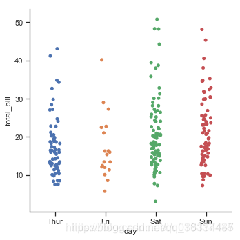
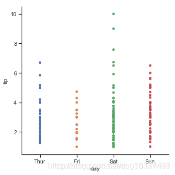
当在同一个类别中出现大量取值相同或接近的观测数据时,他们会挤到一起。seaborn中有两种分类散点图,分别以不同的方式处理了这个问题。 catplot()使用的默认方式是stripplot(),它给这些散点增加了一些随机的偏移量,更容易观察:
sns.catplot(x="day", y="total_bill", data=tips)
jitter参数控制着偏移量的大小,或者我们可以直接禁止他们偏移:
sns.catplot(x="day", y="tip", jitter=False,data=tips)
2、蜂
 最低0.47元/天 解锁文章


 718
718

 被折叠的 条评论
为什么被折叠?
被折叠的 条评论
为什么被折叠?
 到【灌水乐园】发言


