


Backtrader 文档学习- Plotting
虽然回测是一个基于数学计算的自动化过程,还是希望实际通过可视化验证。无论是使用现有算法回测,还是观察数据驱动的指标(内置或自定义)。
凡事都要有人完成,绘制数据加载、指标、操作执行、现金和投资组合价值的演变,可以帮助人们更好地了解正在发生的事情,放弃/修改/创造的思考,查看图表的人对可视化信息做处理 。
这就是为什么backtrader使用matplotlib提供内置的图表功能。
1.How to plot
任何回测运行都可以通过调用方法来绘图:
cerebro.plot()
通常是BT程序执行的最后一个命令,就像下面简单的代码一样,它使用了来自backtrader源的样本数据之一。
from __future__ import (absolute_import, division, print_function,
                        unicode_literals)

import backtrader as bt


class St(bt.Strategy):
    def __init__(self):
        self.sma = bt.indicators.SimpleMovingAverage(self.data)


data = bt.feeds.BacktraderCSVData(dataname='../../datas/2005-2006-day-001.txt')

cerebro = bt.Cerebro()
cerebro.adddata(data)
cerebro.addstrategy(St)
cerebro.run()
cerebro.plot()
图示:
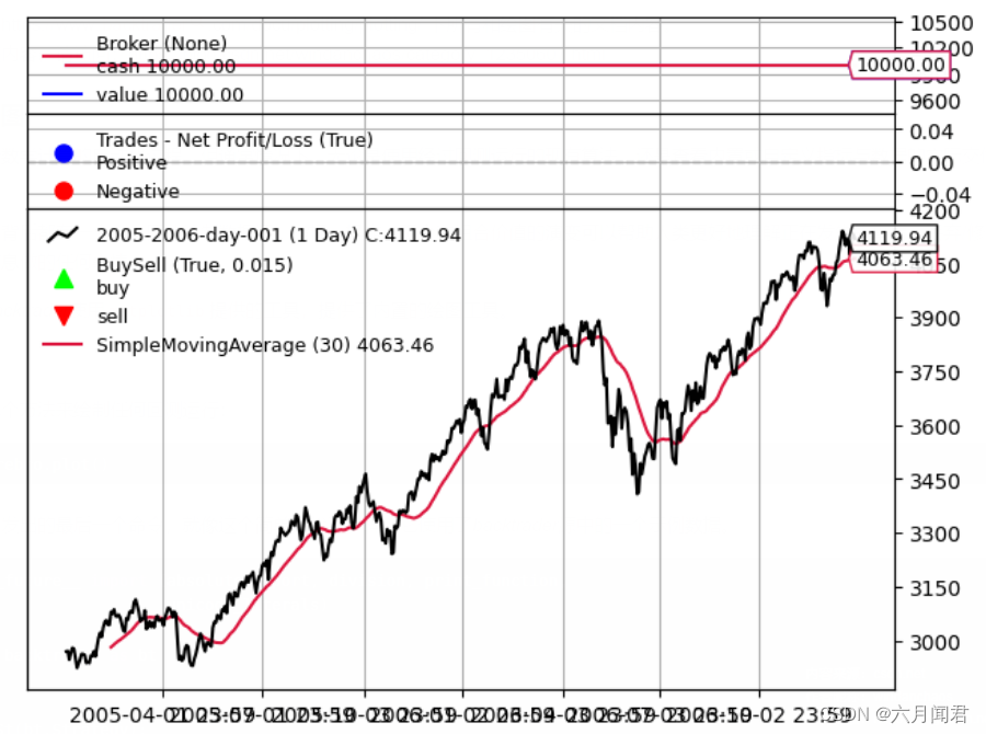
图表包括3个观察者,如果没有任何交易,图示是没有意义的:
- CashValue 现金价值观察者在回测运行期间跟踪现金和组合总价值(包括现金)
- Trade 交易观察者,在交易结束时显示实际利润和损失(PNL)的
交易的定义是开仓并将头寸归零(直接或从多头转为空头或从空头转为多头) - BuySell 买卖观察器,它(在价格之上)标出发生买卖操作发生
These 3 Observers are automatically added by cerebro, and are controlled with the stdstats parameter (default: True). Do the following to disable them if you wish:
这3个观察器由cerebro自动添加,并由stdstats参数控制(默认值:True)。在定义的时候可以禁用:
cerebro = bt.Cerebro(stdstats=False)
或在运行时禁用
cerebro = bt.Cerebro()
…
cerebro.run(stdstats=False)
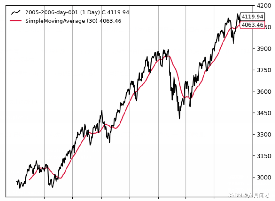
图示:
2.Plotted Elements
尽管前面的介绍中已经提到了Observers,但它们并不是绘制的唯一元素。有三个对象绘图:
-
使用adddata、replaydata和resampledata向Cerebro添加数据加载
-
在策略级别声明的指标(或使用addindicator添加到cerebro中,为了实验目的,并将指标添加到虚拟策略中)
-
观察器直接添加到cerebro
观察者与策略对象Lines 同步运行,可以访问整个生态系统,能够跟踪现金和价值等变化。
3.Plotting Options
Indicators 和Observers 有几个选项可以控制在图表上的绘制方式。有3大组:
- 影响整个对象的绘图行为的选项
- 影响个别Lines 的绘图行为的选项
- 影响系统范围绘图的选项
4.Object-wide plotting options
控制指标和观察器中数据:
plotinfo = dict(plot=True,
                subplot=True,
                plotname='',
                plotskip=False,
                plotabove=False,
                plotlinelabels=False,
                plotlinevalues=True,
                plotvaluetags=True,
                plotymargin=0.0,
                plotyhlines=[],
                plotyticks=[],
                plothlines=[],
                plotforce=False,
                plotmaster=None,
                plotylimited=True,
           )
在类定义中plotinfo为一个字典类型,但backtrader的元类机制将其转换为一个可以继承的对象,甚至可以进行多重继承。作用:
- 如果子类将subplot=True之类的值更改为subplot=False,则类层次中更低一级的子类会,将后者作为subplot的默认值 。
参数赋值有两种方法。第一种方法的简单移动平均实例化:
sma = bt.indicators.SimpleMovingAverage(self.data, period=15, plotname='mysma')
从示例中可以看出,SimpleMovingAverage构造函数未使用的任何**kwargs参数都将解析(如果可能的话),做为plotinfo 对象参数值。SimpleMovingAverage定义了参数period。意味着plotname将与plotinfo中的同名参数一致。
第二种方法:
sma = bt.indicators.SimpleMovingAverage(self.data, period=15)
sma.plotinfo.plotname = 'mysma'
The plotinfo object instantiated along the SimpleMovingAverage can be accessed and the parameters inside can also be accessed with the standard Python dot notation. Easy and possibly clearer than the syntax abve.
可访问SMA实例化的plotinfo对象,使用标准Python点符号访其参数。比上面的语法更简单、更清晰 。
绘图选项:
- plot: 是否绘制对象
- subplot: 是否在数据上绘制或在独立的子图中绘制。移动平均线是在数据上绘制的示例。随机指标和相对强弱指标是在不同比例尺上的子图中绘制的示例。
- plotname: 在图表上使用的名称,而不是类名称。例如,上面的示例中使用mysma而不是SimpleMovingAverage
- plotskip(已弃用):plot的旧别名
- plotabove: 是否在数据上方绘制。否则在下方绘制。这仅在subplot=True时有效
- plotlinelabels: 是否在图表上的图例中绘制单个线的名称
示例:布林带有3条线,但指标是在数据上绘制的。将只显示单个名称BollingerBands,而不是显示3个单独线的名称(mid,top,bot),这似乎是合理的。
这种情况的用例是BuySell观察器,对于它来说,显示2条线和其标记的名称是有意义的:Buy和Sell,以便最终用户清楚地知道是什么。 - plotymargin: 添加到图表上各个子图的顶部和底部的边距
它是一个百分比,但基于1。例如:0.05-> 5% - plothlines: 包含在比例尺内的值(在比例尺内)的可迭代对象,在这些值处必须绘制水平线。
这有助于经典指标的超买,超卖区域,例如通常在RSI上绘制的线通常在70和30处绘制 - plotyticks: 包含在比例尺内的值(在比例尺内)的可迭代对象,在这些值处必须在比例尺上特别放置值刻度
例如,强制比例尺具有50以标识比例尺的中点。尽管这似乎很明显,但指标使用自动缩放机制,如果具有0-100比例尺的指标在30-95之间定期移动,则50可能不明显位于中心。 - plotyhlines: 包含在比例尺内的值(在比例尺内)的可迭代对象,在这些值处必须绘制水平线。
这可以接管plothlines和plotyticks。
如果没有定义上述任何一个,则水平线和刻度线的放置位置将完全由此值控制
如果定义了其中任何一个,则它们优先于此选项中存在的值 - plotforce : 有时,由于匹配数据提要到指标等复杂过程,自定义指标可能无法绘制。这是一种最后的手段机制,尝试强制绘图。
如果所有其他方法都失败,请使用它 - plotmaster : Indicator/Observer有一个主人,即正在使用的数据。在某些情况下,可能希望需要使用不同的主人来绘制它。
一个用例是PivotPoint 指标,它是在月度数据上计算的,但是适用于每日数据。它只有在每日数据上绘制才有意义,这是指标有意义的地方。
5.Line specific plotting options
Indicators/Observers 具有线,如何绘制这些线可以通过plotlines 对象进行设置。大多数在plotlines 中指定的选项都是直接传递给matplotlib 进行绘制的。因此,文档依赖于已完成的事情的示例。
重要提示: 选项是按Lines指定的。
其中一些选项由backtrader直接控制。这些都以下划线( _ )开头:
- _plotskip (布尔值),如果设置为True ,则表示
- _plotskip (布尔值),如果设置为True ,则表示
- _plotvalue (布尔值)控制图例是否包含最后一个绘制的值(默认为True)
- _plotvaluetag (布尔值)控制是否在右侧绘制一个带有最后一个值的标签(默认为True)
- _name (字符串)更改特定线的绘图名称
- _skipnan (布尔值,默认值:False):在绘制时跳过NaN值,允许例如在指标生成的两个远离的点之间绘制一条线,其中所有中间值都为NaN(新创建的数据点的默认值)
- _samecolor (布尔值)这将强制下一行具有与上一行相同的颜色,避免matplotlib默认机制循环遍历每个新绘制的元素的颜色映射
- _method (字符串)选择matplotlib将用于元素的绘图方法。如果未指定,则选择最基本的绘图方法。
例如来自MACDHisto。这里的histo线以行业事实标准的条形图形式绘制。可以在MACDHisto的定义中找到以下定义:
lines = ('histo',)
plotlines = dict(histo=dict(_method='bar', alpha=0.50, width=1.0))
alpha 和width是matplotlib的选项
- _fill_gt / _fill_lt 允许在给定线和以下线或数字值之间进行填充:
- 另一条线
- 数字值
参数是一个包含2个元素的可迭代对象,其中:
- 第一个参数
是参考线的名称(字符串)或数字值
填充将在自身值和线或数字值的值之间进行 - 第二个参数是:
带有颜色名称(matplotlib兼容)或十六进制规范的字符串(请参见matloplit示例)
或
一个可迭代对象,其中第一个元素是颜色的字符串/十六进制值,第二个元素是指定alpha透明度的数字值(默认值:0.20,由绘图方案中的fillalpha控制)
示例:
# Fill for myline when above other_line with colour red
plotlines = dict(
    myline=dict(_fill_gt('other_line', 'red'))
)

# Fill for myline when above 50 with colour red
plotlines = dict(
    myline=dict(_fill_gt(50, 'red))
)

# Fill for myline when above other_line with colour red and 50%
# transparency (1.0 means "no transparency")

plotlines = dict(
    myline=dict(_fill_gt('other_line', ('red', 0.50)))
)
6.Passing options to a not yet known line
使用名称_X,其中X代表从零开始的索引中的数字。这意味着选项适用于第X行
- 来自OscillatorMixIn的用例:
plotlines = dict(_0=dict(_name='osc'))
正如名称所示,这是一个mixin类,旨在在多个继承方案(特别是在右侧)中使用。 mixin没有其他指标的实际名称的知识,这将成为多重继承混合的一部分。
这就是为什么指定选项为: _0 的原因。在子类化完成后,结果类的第一行将具有在绘图中的名称osc 。
7.Some plotlines examples
BuySell 观察者具有以下内容:
plotlines = dict(
    buy=dict(marker='^', markersize=8.0, color='lime', fillstyle='full'),
    sell=dict(marker='v', markersize=8.0, color='red', fillstyle='full')
)
buy 和sell 线具有直接传递给的选项matplotlib 定义marker,markersize,color和fillstyle。所有这些选项都在matplotlib中定义
Trades 观察者具有以下内容:
...
lines = ('pnlplus', 'pnlminus')
...

plotlines = dict(
    pnlplus=dict(_name='Positive',
                 marker='o', color='blue',
                 markersize=8.0, fillstyle='full'),
    pnlminus=dict(_name='Negative',
                  marker='o', color='red',
                  markersize=8.0, fillstyle='full')
)
在这里,线的名称已从例如pnlplus 重新定义为Positive 通过使用_name 。其余选项为matplotlib
DrawDown 观察者:
lines = ('drawdown', 'maxdrawdown',)

...

plotlines = dict(maxdrawdown=dict(_plotskip='True',))
这个定义了两条线,让最终用户不仅可以访问当前drawdown 的值,还可以访问其最大值( maxdrawdown )。但是由于_plotskip = True ,后者不会绘制
BollingerBands 指标:
plotlines = dict(
    mid=dict(ls='--'),
    top=dict(_samecolor=True),
    bot=dict(_samecolor=True),
)
在这里, mid 线将具有虚线样式, top 和bot 线将具有与mid 线相同的颜色。
Stochastic (在_StochasticBase 中定义并继承)
lines = ('percK', 'percD',)
...
plotlines = dict(percD=dict(_name='%D', ls='--'),
                 percK=dict(_name='%K'))
较慢的线percD 以虚线样式绘制。和名字的线被更改以包括花式% 符号( %K 和%D ),这不能在Python中使用名称定义
8.Methods controlling plotting
当处理指标和观察者时,支持以下方法以进一步控制绘图:
- _plotlabel (self)
应返回一个列表,其中包含将放置在指标或观察者名称括号中的标签的内容
来自RSI指标的示例:
def _plotlabel(self):
    plabels = [self.p.period]
    plabels += [self.p.movav] * self.p.notdefault('movav')
    return plabels
此方法返回:
-
一个int,表示为RSI配置的周期,如果默认移动平均线已更改,则为特定类
在后台,两者都将转换为字符串。在类的情况下,将输出类的名称,而不是完整的module.name组合。 -
_plotinit (self)
在绘图开始时调用,以执行指标可能需要的任何特定初始化。再次,来自RSI的示例:
def _plotinit(self):
    self.plotinfo.plotyhlines = [self.p.upperband, self.p.lowerband]
代码为plotyhlines 分配一个值,以在特定y值处绘制水平线(hlines部分)。
参数的值upperband和lowerband用于此目的,因为参数可以被最终用户更改,事先无法知道。
9.System-wide plotting options
首先是cerebro中plot 的signature:
def plot(self, plotter=None, numfigs=1, iplot=True, **kwargs):
意味着:
plotter :包含控制系统范围绘图的选项的对象/类
如果传递None ,则将实例化默认的PlotScheme 对象(请参见下文)
numfigs :独立图表中将绘图分解的数量
有时图表包含太多bar,如果在单个图中打包,将不容易阅读。这要求将它分解为尽可能多的独立图
iplot :如果在Jupyter Notebook 中运行,则自动绘制内联
**kwargs :args将用于更改属性的值plotter ,或如果没有对象传递plotter 则创建默认的PlotScheme 。
10.PlotScheme
对象包含控制系统范围绘图的所有选项,所有选项记录在代码中:
class PlotScheme(object):
    def __init__(self):
        # to have a tight packing on the chart wether only the x axis or also
        # the y axis have (see matplotlib)
        self.ytight = False

        # y-margin (top/bottom) for the subcharts. This will not overrule the
        # option plotinfo.plotymargin
        self.yadjust = 0.0
        # Each new line is in z-order below the previous one. change it False
        # to have lines paint above the previous line
        self.zdown = True
        # Rotation of the date labes on the x axis
        self.tickrotation = 15

        # How many "subparts" takes a major chart (datas) in the overall chart
        # This is proportional to the total number of subcharts
        self.rowsmajor = 5

        # How many "subparts" takes a minor chart (indicators/observers) in the
        # overall chart. This is proportional to the total number of subcharts
        # Together with rowsmajor, this defines a proportion ratio betwen data
        # charts and indicators/observers charts
        self.rowsminor = 1

        # Distance in between subcharts
        self.plotdist = 0.0

        # Have a grid in the background of all charts
        self.grid = True

        # Default plotstyle for the OHLC bars which (line -> line on close)
        # Other options: 'bar' and 'candle'
        self.style = 'line'

        # Default color for the 'line on close' plot
        self.loc = 'black'
        # Default color for a bullish bar/candle (0.75 -> intensity of gray)
        self.barup = '0.75'
        # Default color for a bearish bar/candle
        self.bardown = 'red'
        # Level of transparency to apply to bars/cancles (NOT USED)
        self.bartrans = 1.0

        # Wether the candlesticks have to be filled or be transparent
        self.barupfill = True
        self.bardownfill = True

        # Wether the candlesticks have to be filled or be transparent
        self.fillalpha = 0.20

        # Wether to plot volume or not. Note: if the data in question has no
        # volume values, volume plotting will be skipped even if this is True
        self.volume = True

        # Wether to overlay the volume on the data or use a separate subchart
        self.voloverlay = True
        # Scaling of the volume to the data when plotting as overlay
        self.volscaling = 0.33
        # Pushing overlay volume up for better visibiliy. Experimentation
        # needed if the volume and data overlap too much
        self.volpushup = 0.00

        # Default colour for the volume of a bullish day
        self.volup = '#aaaaaa'  # 0.66 of gray
        # Default colour for the volume of a bearish day
        self.voldown = '#cc6073'  # (204, 96, 115)
        # Transparency to apply to the volume when overlaying
        self.voltrans = 0.50

        # Transparency for text labels (NOT USED CURRENTLY)
        self.subtxttrans = 0.66
        # Default font text size for labels on the chart
        self.subtxtsize = 9

        # Transparency for the legend (NOT USED CURRENTLY)
        self.legendtrans = 0.25
        # Wether indicators have a leged displaey in their charts
        self.legendind = True
        # Location of the legend for indicators (see matplotlib)
        self.legendindloc = 'upper left'

        # Plot the last value of a line after the Object name
        self.linevalues = True

        # Plot a tag at the end of each line with the last value
        self.valuetags = True

        # Default color for horizontal lines (see plotinfo.plothlines)
        self.hlinescolor = '0.66'  # shade of gray
        # Default style for horizontal lines
        self.hlinesstyle = '--'
        # Default width for horizontal lines
        self.hlineswidth = 1.0

        # Default color scheme: Tableau 10
        self.lcolors = tableau10

        # strftime Format string for the display of ticks on the x axis
        self.fmt_x_ticks = None

        # strftime Format string for the display of data points values
        self.fmt_x_data = None
11.Colors in PlotScheme
PlotScheme 类定义了一个可以在子类中覆盖的方法,该方法返回要使用的下一个颜色:
def color(self, idx)
其中idx 是正在绘制的行的当前索引单个子图上。例如, MACD 绘制3条线,因此idx 变量只有以下值: 0 , 1 和2 。下一个图表
(可能是另一个指标)将在0 处重新开始计数。
backtrader中使用的默认颜色方案使用(如上所示), Tableau 10 Color Palette ,索引修改为:
tab10_index = [3, 0, 2, 1, 2, 4, 5, 6, 7, 8, 9]
通过覆盖color 方法或传递 lcolors 变量到plot (或在PlotScheme 的子类中)可以完全更改着色。
源代码还包含Tableau 10 Light 和Tableau 20 颜色调色板的定义。


 2241
2241


 被折叠的 条评论
为什么被折叠?
被折叠的 条评论
为什么被折叠?
 到【灌水乐园】发言


