


简介
回测时往往想知道策略中间的运行情况,虽然可以通过最后的统计指标来一窥端倪,但对回测过程进行可视化是最符合人性的,同时通过观察回测过程也可以更好的设计&优化量化策略。Backtrader使用matplotlib库提供可视化能力
使用方法
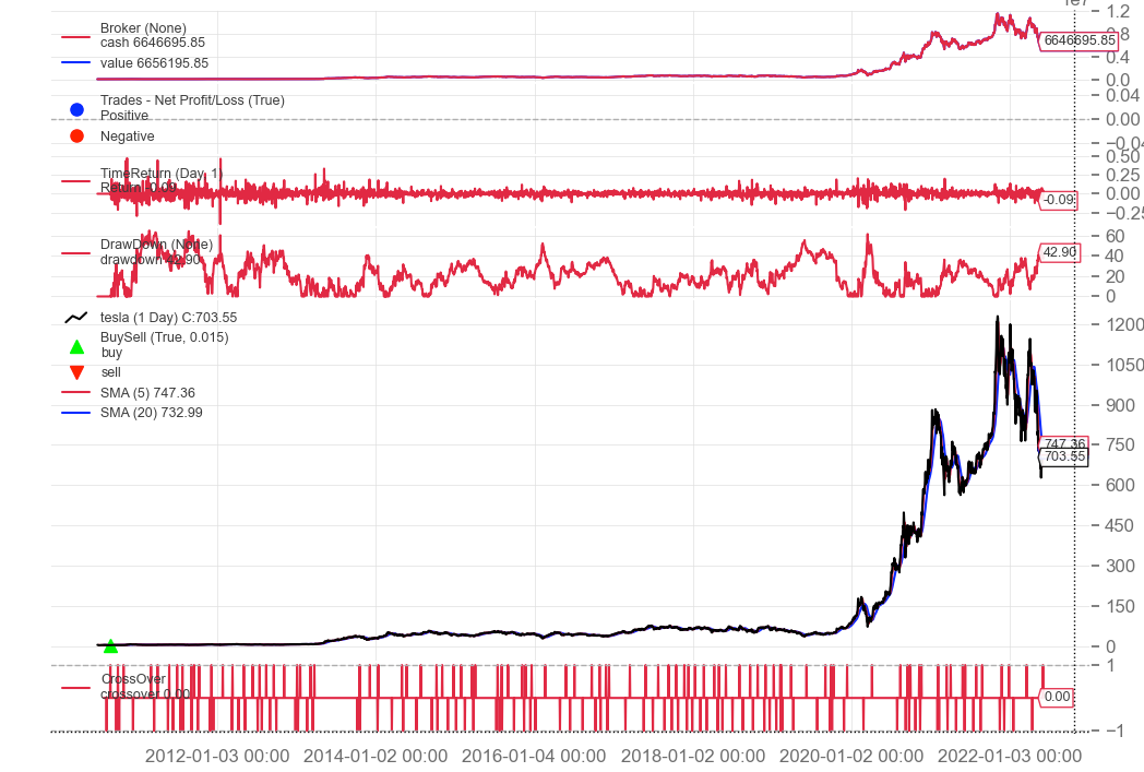
Backtrader数据可视化非常简单,只需在run()之后调用plot()方法即可。
cerebro.run()
cerebro.plot()
plot(self, plotter=None, numfigs=1, iplot=True, **kwargs) 方法各参数含义如下:
-
plotter: 包含绘图属性的PlotScheme及其派生类对象。默认为None,如果为None,则默认的PlotScheme对象会被实例化 -
numfigs:将图形拆分成多幅图展示,默认为1 -
iplot: 在Jupyter Notebook运行则是否自动 plot inline,默认为True。如果不在jupyter中运行,该参数最好设置为False,否则容易出问题 -
*kwargs:args参数用于改变plotter属性值
可以通过两种办法来系统性控制可视化配置:
-
直接通过设置plot()方法的args参数,如下所示。
cerebro.plot(iplot=False,
             style='candel',  # 设置主图行情数据的样式为蜡烛图
             plotdist=0.1,    # 设置图形之间的间距
             barup = '#ff9896', bardown='#98df8a', # 设置蜡烛图上涨和下跌的颜色
             volup='#ff9896', voldown='#98df8a', # 设置成交量在行情上涨和下跌情况下的颜色
            )
2. 自定义 PlotScheme 类修改对应的参数
PlotScheme对象包括了所有的系统级绘图选项,选项如下所示。
class PlotScheme(object):
    def __init__(self):
        # to have a tight packing on the chart wether only the x axis or also
        # the y axis have (see matplotlib)
        self.ytight = False

        # y-margin (top/bottom) for the subcharts. This will not overrule the
        # option plotinfo.plotymargin
        self.yadjust = 0.0
        # Each new line is in z-order below the previous one. change it False
        # to have lines paint above the previous line
        self.zdown = True
        # Rotation of the date labes on the x axis
        self.tickrotation = 15

        # How many "subparts" takes a major chart (datas) in the overall chart
        # This is proportional to the total number of subcharts
        self.rowsmajor = 5

        # How many "subparts" takes a minor chart (indicators/observers) in the
        # overall chart. This is proportional to the total number of subcharts
        # Together with rowsmajor, this defines a proportion ratio betwen data
        # charts and indicators/observers charts
        self.rowsminor = 1

        # Distance in between subcharts
        self.plotdist = 0.0

        # Have a grid in the background of all charts
        self.grid = True

        # Default plotstyle for the OHLC bars which (line -> line on close)
        # Other options: 'bar' and 'candle'
        self.style = 'line'

        # Default color for the 'line on close' plot
        self.loc = 'black'
        # Default color for a bullish bar/candle (0.75 -> intensity of gray)
        self.barup = '0.75'
        # Default color for a bearish bar/candle
        self.bardown = 'red'
        # Level of transparency to apply to bars/cancles (NOT USED)
        self.bartrans = 1.0

        # Wether the candlesticks have to be filled or be transparent
        self.barupfill = True
        self.bardownfill = True

        # Wether the candlesticks have to be filled or be transparent
        self.fillalpha = 0.20

        # Wether to plot volume or not. Note: if the data in question has no
        # volume values, volume plotting will be skipped even if this is True
        self.volume = True

        # Wether to overlay the volume on the data or use a separate subchart
        self.voloverlay = True
        # Scaling of the volume to the data when plotting as overlay
        self.volscaling = 0.33
        # Pushing overlay volume up for better visibiliy. Experimentation
        # needed if the volume and data overlap too much
        self.volpushup = 0.00

        # Default colour for the volume of a bullish day
        self.volup = '#aaaaaa'  # 0.66 of gray
        # Default colour for the volume of a bearish day
        self.voldown = '#cc6073'  # (204, 96, 115)
        # Transparency to apply to the volume when overlaying
        self.voltrans = 0.50

        # Transparency for text labels (NOT USED CURRENTLY)
        self.subtxttrans = 0.66
        # Default font text size for labels on the chart
        self.subtxtsize = 9

        # Transparency for the legend (NOT USED CURRENTLY)
        self.legendtrans = 0.25
        # Wether indicators have a leged displaey in their charts
        self.legendind = True
        # Location of the legend for indicators (see matplotlib)
        self.legendindloc = 'upper left'

        # Plot the last value of a line after the Object name
        self.linevalues = True

        # Plot a tag at the end of each line with the last value
        self.valuetags = True

        # Default color for horizontal lines (see plotinfo.plothlines)
        self.hlinescolor = '0.66'  # shade of gray
        # Default style for horizontal lines
        self.hlinesstyle = '--'
        # Default width for horizontal lines
        self.hlineswidth = 1.0

        # Default color scheme: Tableau 10
        self.lcolors = tableau10

        # strftime Format string for the display of ticks on the x axis
        self.fmt_x_ticks = None

        # strftime Format string for the display of data points values
        self.fmt_x_data = None
PlotScheme类定义了一个color(self, idx) 方法返回将要使用的颜色,子类可以重载,其idx参数为要绘制的line的当前index。 如MACD 绘制3条线,idx变量有0,1和2共3个值,新的指标idx会从0重新开始。默认的color scheme是Tableau 10 Color Palette ,对应的index是tab10_index = [3, 0, 2, 1, 2, 4, 5, 6, 7, 8, 9] 。可以通过在自定义 PlotScheme类重载color()方法或传递 lcolors 变量给plot 方法来改变要使用的颜色。
def color(self, idx):
        colidx = tab10_index[idx % len(tab10_index)]
        return self.lcolors[colidx]
可视化组件
Backtrader支持3大部分组件的可视化:
-
Data feeds数据源:通过 adddata、replaydata和resampledata方法导入cerebro的原始数据
-
Indicators指标:在策略类中声明或者通过 addindicator 添加的指标
-
Observers观测器对象:通过addobserver添加的观测器,如Cash和Value对象
在绘制图形时,默认是将data feeds数据源绘制在主图上,Indicators指标有的与 Data Feeds数据源一起绘制在主图上,比如均线,有的则以子图形式绘制;observers 通常绘制在子图上
可视化选项
除了上面说的通过plot()参数和自定义PlotScheme来系统控制可视化选项外,Indicators指标和Observers观测器有一些选项可以控制其绘图形式,一共有3种类型:
-
Object对象级的可视化选项 —可以影响整个对象的绘制行为,由plotinfo来控制
plotinfo = dict(plot=True, # 是否绘制
                subplot=True, # 是否绘制成子图
                plotname='', # 图形名称
                plotabove=False, # 子图是否绘制在主图的上方
                plotlinelabels=False, # 主图上曲线的名称
                plotlinevalues=True,
                plotvaluetags=True,
                plotymargin=0.0,
                plotyhlines=[],
                plotyticks=[],
                plothlines=[],
                plotforce=False,
                plotmaster=None,
                plotylimited=True,
           )
有2种方法来访问plotinfo的属性,如下所示:
# 通过参数来设置
sma = bt.indicators.SimpleMovingAverage(self.data, period=15, plotname='mysma')

# 通过属性来设置
sma = bt.indicators.SimpleMovingAverage(self.data, period=15)
sma.plotinfo.plotname = 'mysma'
-
Line线相关的可视化选项 — 可以使用plotlines对象来控制lines对象的绘图行为,plotlines中的选项会在绘图时直接传给matplotlib,如下所示。
lines = ('histo',)
plotlines = dict(histo=dict(_method='bar', alpha=0.50, width=1.0))
-
方法控制的可视化 — 当处理indicator指标和observer观测器时,_plotlabel(self), _plotinit(self)方法可以进一步控制可视化
结论 & 交流
关注微信公众号:诸葛说talk,获取更多内容。同时还能获取邀请加入量化投资群, 与众多投资爱好者、量化从业者、技术大牛一起交流、切磋,在实战中快速提升自己的投资水平。
写文章不易,觉得本文对你有帮助的话,帮忙点个在看吧。


 4535
4535

 被折叠的 条评论
为什么被折叠?
被折叠的 条评论
为什么被折叠?
 到【灌水乐园】发言


