散点图
import matplotlib.pyplot as plt
import numpy as np
plt.rcParams['font.sans-serif']=['SimHei']
plt.rcParams['axes.unicode_minus']=False
t=np.arange(0.0, 2.0, 0.1)
s=np.sin(t*np.pi)
plt.figure(figsize=(8,8), dpi=80)
plt.figure(1)
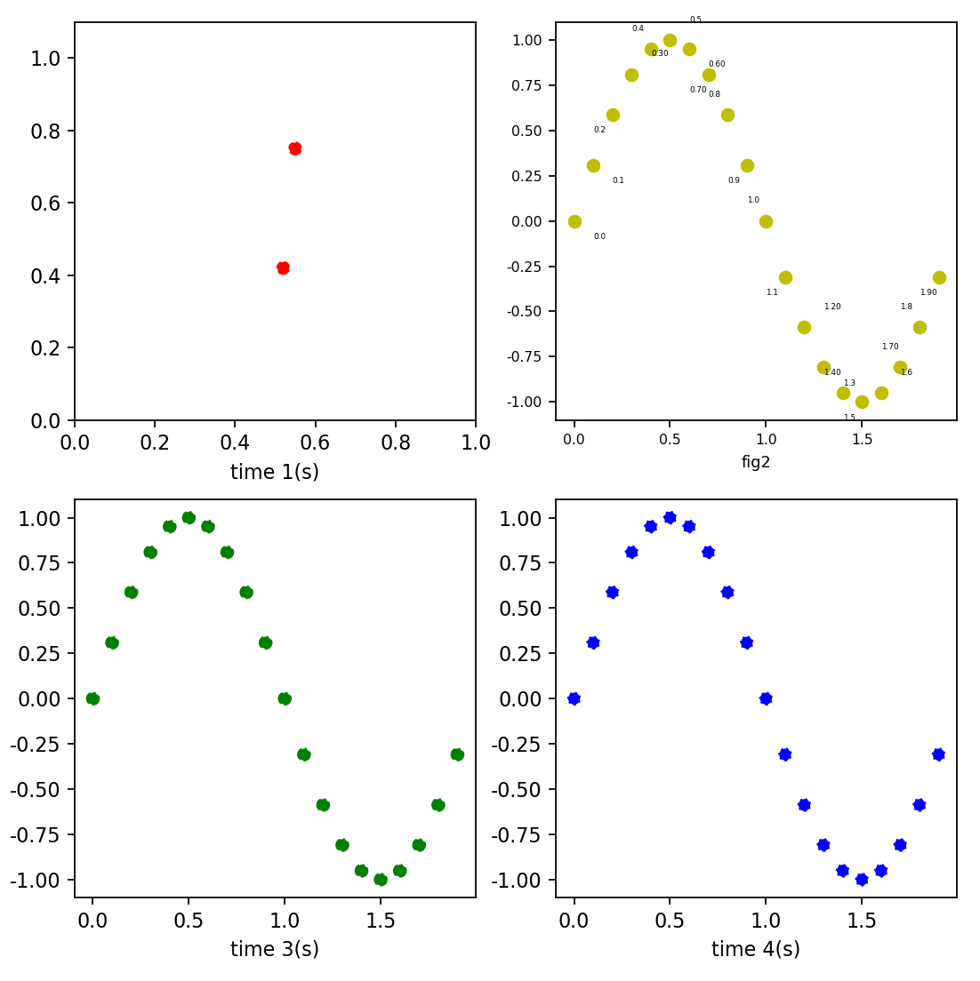
ax1 = plt.subplot(2, 2, 1)
x = [0.55, 0.52]
y = [0.75, 0.42]
ax1.scatter(x, y, color="r",linestyle = "--")
plt.xlabel('time 1(s)')
ax2 = plt.subplot(2, 2, 2)
ax2.scatter(t,s,color="y",linestyle = "-")
for i in range(len(t)):
rdx = np.random.randint(0, 2)
rdy = np.random.randint(0, 2)
if rdx == 0:
rdx = -1
if rdy == 0:
rdy = -1
plt.annotate(str(t[i])[0:4], xy = (t[i], s[i]), xytext = (t[i]+0.1*rdx, s[i]-0.1*rdy), fontsize=4)
ax1.set_xlim([0, 1])
ax1.set_ylim([0, 1.1])
plt.xticks(fontsize=7)
plt.yticks(fontsize=7)
plt.xlabel("fig2", fontsize=8)
ax3 = plt.subplot(2, 2, 3)
ax3.scatter(t,s,color="g",linestyle = "-.")
plt.xlabel('time 3(s)')
ax4 = plt.subplot(2, 2, 4)
ax4.scatter(t,s,color="b",linestyle = ":")
plt.xlabel('time 4(s)')
plt.savefig("path")
plt.show()


 3366
3366

 被折叠的 条评论
为什么被折叠?
被折叠的 条评论
为什么被折叠?
 到【灌水乐园】发言


