


今天这篇推文小编给大家介绍一个我一直想绘制的可视化作品-航线地图,网上有很多类似的教程,但在小编看来,都或多或少有些不完美,小编这次就对其进行完善和美化,主要内容如下:
-
航线地图所需数据处理
-
航线地图绘制完善美化
-
更多详细的数据可视化教程,可订阅我们的店铺课程:
-

航线地图所需数据处理
这一部分主要是对数据进行处理,我们直接给出代码步骤,文中用到的数据,文末都有免费获取方式。
-
导入所需包
library(tidyverse)
library(data.table)
library(geosphere)
library(grid)
library(jpeg)
library(plyr)
library(ggtext)
-
数据导入和处理
# 导入数据
airlines <- fread("airlines.dat", sep = ",", skip = 1)
airports <- fread("airports.dat", sep = ",")
routes <- fread("routes.dat", sep = ",")
# 使用谷歌夜间影像图片作为背景图
earth <- readJPEG("BlackMarble_2016_01deg.jpg", native = TRUE)
earth <- rasterGrob(earth, interpolate = TRUE)

# 数据转换和整理
#添加列名
colnames(airlines) <- c("airline_id", "name", "alias", "iata", "icao", "callisign", "country", "active")
colnames(airports) <- c("airport_id", "name", "city", "country","iata", "icao", "latitude", "longitude","altitude", "timezone","dst","tz_database_time_zone","type", "source")
colnames(routes) <- c("airline", "airline_id", "source_airport", "source_airport_id","destination_airport","destination_airport_id","codeshare", "stops","equipment")

#类型转换
routes$airline_id <- as.numeric(routes$airline_id)
# airlines与routes数据融合
flights <- left_join(routes, airlines, by="airline_id")
# flights与airports数据融合
airports_orig <- airports[,c(5,7,8)]
colnames(airports_orig) <- c("source_airport","source_airport_lat", "source_airport_long")
airports_dest <- airports[, c(5, 7, 8)]
colnames(airports_dest) <- c("destination_airport", "destination_airport_lat", "destination_airport_long")
flights <- left_join(flights, airports_orig, by = "source_airport")
flights <- left_join(flights, airports_dest, by = "destination_airport")
#剔除缺失值
flights <- na.omit(flights, cols = c("source_airport_long", "source_airport_lat", "destination_airport_long", "destination_airport_lat"))
# 按航空公司拆分数据集
flights_split <- split(flights, flights$name)
# 计算两点之间的距离(geosphere包计算)
flights_all <- lapply(flights_split, function(x) gcIntermediate(x[, c("source_airport_long", "source_airport_lat")], x[, c("destination_airport_long", "destination_airport_lat")], n=100, breakAtDateLine = FALSE, addStartEnd = TRUE, sp = TRUE))

# 转换为数据框
flights_fortified <- lapply(flights_all, function(x) ldply(x@lines, fortify))

# Unsplit lists
flights_fortified <- do.call("rbind", flights_fortified)

flights_fortified$name <- rownames(flights_fortified)
flights_fortified$name <- gsub("\\..*", "", flights_fortified$name)

flights_points <- flights_fortified %>%
  group_by(group) %>%
  filter(row_number() == 1 | row_number() == n())
由于绘制全部机场的数据较大(小编的本子太菜,耗时太长),这里我们选择两个机场线路进行绘制,首先我们进行站点筛选和对应的数据选择:
flights_subset <- c("Delta Air Lines","Lufthansa")
flights_subset <- flights_fortified[flights_fortified$name %in% flights_subset, ]
flights_subset_points <- flights_subset%>%
  group_by(group)%>%
  filter(row_number()==1|row_number()==n())
接下来,我们就将选择的数据进行可视化展示。
航线地图绘制完善美化
在已有的教程中,可视化结果都不够完美(或颜色单一、或没有明显图例),这里小编进行了必要绘图元素的添加,代码如下:
library(extrafont)
# 添加字体
windowsFonts(Cinzel = windowsFont("Cinzel"))
fonts()
# 设置颜色
color_set <- c("#9b5de5", "#f15bb5")
# 可视化绘制
light_map2 <- ggplot() +
  annotation_custom(earth, xmin = -180, xmax = 180, ymin = -90, ymax = 90) +
  geom_path(data = flights_subset,aes(long, lat, group = id, colour = name),
            alpha = 0.1, lineend="round",lwd=0.1) +
  geom_point(data = flights_subset_points, aes(long, lat), alpha = 0.8, size = 0.1, colour = "white") +
  scale_color_manual(values =color_set,name="Airlines")+
  labs(
    title = "Example of charts about <span style='color:#D20F26'>Flights at Night</span>",
    subtitle = "processed charts with <span style='color:#1A73E8'>geosphere library</span>",
    caption = "Visualization by <span style='color:#DD6449'>DataCharm</span>") +
  theme_minimal(base_family = "Cinzel")+
  theme(
        plot.title = element_markdown(hjust = 0.5,vjust = .5,color = "grey60",
                                      face = 'bold',size = 22, margin = margin(t = 5, b = 5)),
        plot.subtitle = element_markdown(color = "grey60",hjust = 0,vjust = .5,size=12,
                                        margin = margin(t = 3, b = 3)),
        plot.caption = element_markdown(color = "grey60",face = 'bold',size = 8),

        text = element_text(family = "Cinzel"),
        panel.background = element_rect(fill='#05050F',colour='#05050F'),
        plot.background = element_rect(fill='#05050F',colour='#05050F'),
        panel.grid.major = element_blank(),
        panel.grid.minor = element_blank(),
        axis.text.x = element_blank(),
        axis.text.y = element_blank(),
        legend.position = c(0.1,0.15),
        legend.box.margin = margin(0.2, 0, 0, 0, "cm"),
        legend.box.spacing = unit(0.1, "cm"),
        legend.key.size = unit(1.5, "lines"),
        legend.background = element_rect(colour = NA, fill = NA),
        legend.key = element_rect(colour = NA, fill = NA, size = 10),
        legend.title = element_text(family = "Cinzel",
                                    color = "grey60",
                                    size = 10,
                                    face = "bold"),
        legend.text = element_text(family = "Cinzel",
                                   color = "grey60",
                                   size = 9,
                                   face = "bold")
        ) +

  guides(color = guide_legend(title.position = "top",
                             title.hjust = 0.5, nrow =2 ,
                             label.position = "right",
                             override.aes = list(size = 0.5,
                                                 alpha = 0.8)))
大家可以重点看theme() 关于图例 (legend) 的参数设置和guides() 中对color图例映射的定制化设置,注意,这里用到了override.aes(),小伙伴们需要掌握哦~~ 可视化结果如下:
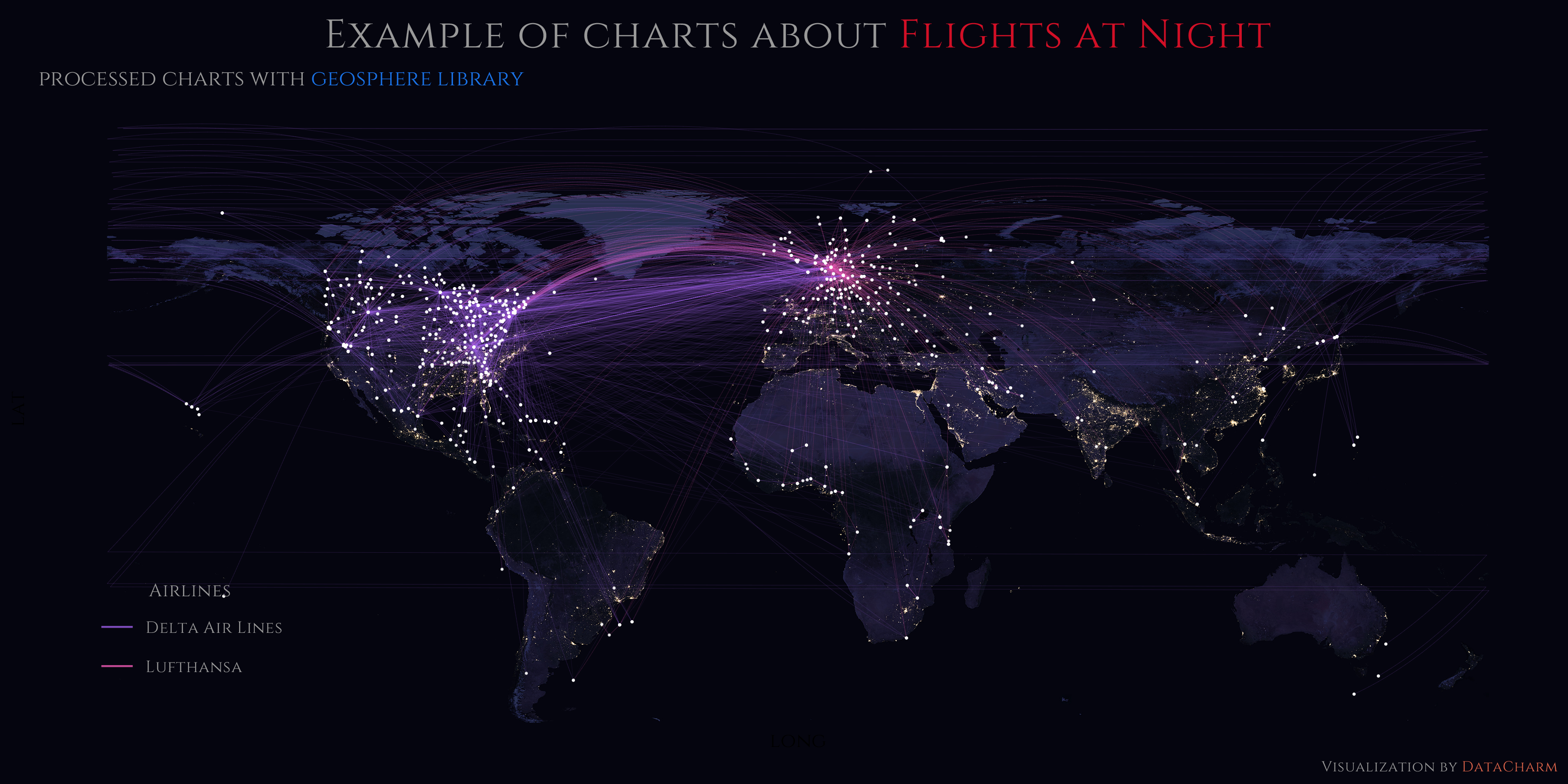
Two airline charts example
后续:后来小编试着将结果保存成pdf格式,保存时间较短,但存在保存时字体不存在错误,可通过如下样啦进行解决:
library(tidyverse)
library(extrafont)
fonts()
df <- data.frame(x = c(1:10), y = c(1:10)) # Dummy data
windowsFonts(Calibri = windowsFont("Calibri"))
plot <- ggplot(df, aes(x, y)) + # Dummy plot
  geom_point() +
  labs(title = "Correct font in R, NO fonts at all in pdf :-(") +
  theme(text = element_text(size=15, family= "Tw Cen MT Condensed Extra Bold"))
ggsave("df_plot.pdf",
       plot = plot,
       device = cairo_pdf,
       dpi = 320)
注意ggsave()部分,小伙伴们可尝试绘制多个机场的航线图,方法都是一样的哈~~
总结
今天的这篇推文算是满足小编一直想绘制的一幅可视化作品,当然,也有读者私信小编要求绘制类似图表,感兴趣的小伙伴可在获取数据后自行进行练习再现哦~~


 2418
2418

 被折叠的 条评论
为什么被折叠?
被折叠的 条评论
为什么被折叠?
 到【灌水乐园】发言


