


03-CSS3背景与渐变
第1章 CSS3背景
1-1 背景图像区域( background-clip)


<!DOCTYPE html>
<html lang="en">
<head>
<title>3</title>
<meta http-equiv="Content-Type" content="text/html;charset=utf-8"/>
<style type="text/css">
.border,.padding,.content{
width: 300px;
height: 300px;
float: left;
margin-left: 50px;
}
a{
text-decoration: none;
font-size: 30px;
}
.div1,.div2,.div3{
width: 220px;
height: 200px;
border:10px solid rgba(0,255,0,0.3);
padding: 50px;
background-image: url("http://climg.mukewang.com/582c316e0001fd6507000210.jpg");
margin-top: 50px;
}
.border:hover div,.padding:hover div,.content:hover div{
display: block;
}
.border div,.padding div,.content div{
display: none;
}
.border:hover div{
background-clip: border-box;
}
.padding:hover div{
background-clip: padding-box;
}
.content:hover div{
background-clip: content-box;
}
</style>
</head>
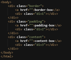
<body>
<div class="border">
<a href="">border-box</a>
<div class="div1"></div>
</div>
<div class="padding">
<a href="">padding-box</a>
<div class="div2"></div>
</div>
<div class="content">
<a href="">content-box</a>
<div class="div3"></div>
</div>
</body>
</html>
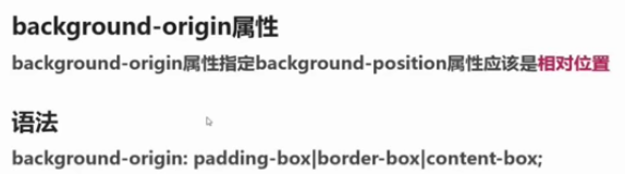
1-2 背景图像定位( background-origin)

<!DOCTYPE html>
<html lang="en">
<head>
	<title>3</title>
	<meta http-equiv="Content-Type" content="text/html;charset=utf-8"/>
	<style type="text/css">
		div{
			width: 300px;
			height: 150px;
			padding: 20px;
			border:5px solid red;
			background: url(http://climg.mukewang.com/582c342b0001fd6507000210.jpg) no-repeat center;
			background-origin: padding-box;
		}
		div:hover{
			background-origin: border-box;
			background: url(http://climg.mukewang.com/582c34220001091605000150.jpg) no-repeat 10px 10px;
		}
	</style>
</head>
<body>
	<div></div>
</body>
</html>
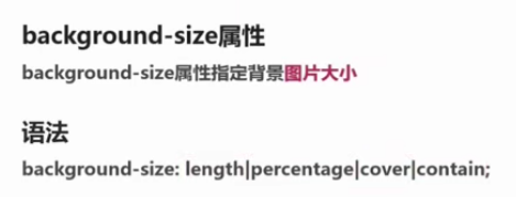
1-3 背景图像大小( background-size)
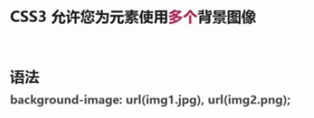
1-4 多重背景图像


<!DOCTYPE html>
<html lang="en">
<head>
	<title>3</title>
	<meta http-equiv="Content-Type" content="text/html;charset=utf-8"/>
	<style type="text/css">
		div{
			width: 400px;
			height: 200px;
			border:10px solid rgba(255,0,0,0.5);
			padding: 20px;
			background: url(http://climg.mukewang.com/582c39c00001091605000150.jpg) no-repeat;
			background-color: #BBB;
			background-position: 20px 100px;
			background-size: 90%;
			font-size: 20px;
			text-align: center;
			font-weight: bold;
		}
	</style>
</head>
<body>
	<div>
		慕课网(IMOOC)国内最大的IT技能学习平台
	</div>
</body>
</html>
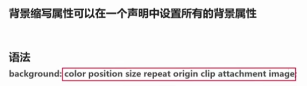
1-5 背景属性整合
第2章 CSS3渐变

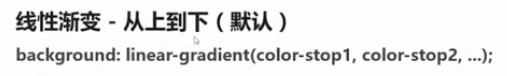
2-1 线性渐变、上下、左右、对角


<!DOCTYPE html>
<html lang="en">
<head>
	<title>3</title>
	<meta http-equiv="Content-Type" content="text/html;charset=utf-8"/>
	<style type="text/css">
		.border{
			width: 300px;
			height: 500px;
			float: left;
		}
		.border .one{
			width: 200px;
			height: 200px;
			background: linear-gradient(yellow,red);
		}
		.border .two{
			width: 200px;
			height: 200px;
			background: linear-gradient(to right,yellow,red);
		}
		.border .three{
			width: 200px;
			height: 200px;
			background: linear-gradient(to left top,yellow,red);
		}
	</style>
</head>
<body>
	<div class="border">
		上下方向渐变
		<div class="one"></div>
	</div>
	<div class="border">
		左右方向渐变
		<div class="two"></div>
	</div>
	<div class="border">
		对角方向渐变
		<div class="three"></div>
	</div>
</body>
</html>
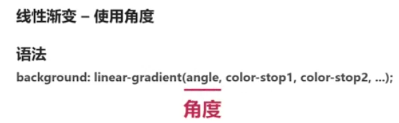
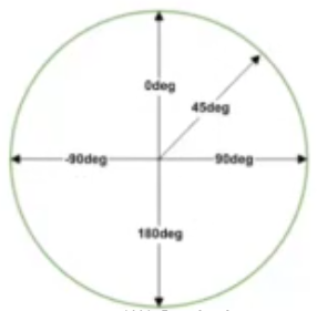
2-2 线性渐变、角度、结点、透明


<!DOCTYPE html>
<html lang="en">
<head>
	<title>3</title>
	<meta http-equiv="Content-Type" content="text/html;charset=utf-8"/>
	<style type="text/css">
		div{
			width: 400px;
			height: 400px;
			border: 1px solid red;
			background: linear-gradient(to right,rgba(255,0,0,0) 20%,rgba(255,0,0,1) 50%,rgba(0,255,0,0.7) 100%,);
		}
	</style>
</head>
<body>
	<div></div>
</body>
</html>
2-3 线性渐变-重复渐变


<!DOCTYPE html>
<html lang="en">
<head>
	<title>3</title>
	<meta http-equiv="Content-Type" content="text/html;charset=utf-8"/>
	<style type="text/css">
		div{
			width: 400px;
			height: 200px;
			background: repeating-linear-gradient(to right, red 0%,orange 5%,yellow 10%,green 15%,#0F0 20%,blue 25%,#606 30%);
		}
	</style>
</head>
<body>
	<div></div>
</body>
</html>
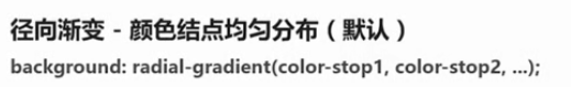
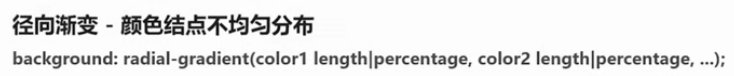
2-4 径向渐变


<!DOCTYPE html>
<html lang="en">
<head>
	<title>3</title>
	<meta http-equiv="Content-Type" content="text/html;charset=utf-8"/>
	<style type="text/css">
		div{
			width: 200px;
			height: 300px;
			float: left;
			margin: 100px 0 0 50px;
		}
		.div1{
			background: -webkit-radial-gradient(60% 40%,closest-side circle,red,yellow,green,blue);
			background:    -moz-radial-gradient(60% 40%,closest-side circle,red,yellow,green,blue);
			background:      -o-radial-gradient(60% 40%,closest-side circle,red,yellow,green,blue);
			background:         radial-gradient(60% 40%,closest-side circle,red,yellow,green,blue);
		}
		.div2{
			background: -webkit-radial-gradient(60% 40%,farthest-side circle,red,yellow,green,blue);
			background:    -moz-radial-gradient(60% 40%,farthest-side circle,red,yellow,green,blue);
			background:      -o-radial-gradient(60% 40%,farthest-side circle,red,yellow,green,blue);
			background:         radial-gradient(60% 40%,farthest-side circle,red,yellow,green,blue);
		}
		.div3{
			background: -webkit-radial-gradient(60% 40%,closest-corner circle,red,yellow,green,blue);
			background:    -moz-radial-gradient(60% 40%,closest-corner circle,red,yellow,green,blue);
			background:      -o-radial-gradient(60% 40%,closest-corner circle,red,yellow,green,blue);
			background:         radial-gradient(60% 40%,closest-corner circle,red,yellow,green,blue);
		}
		.div4{
			background: -webkit-radial-gradient(60% 40%,farthest-corner circle,red,yellow,green,blue);
			background:    -moz-radial-gradient(60% 40%,farthest-corner circle,red,yellow,green,blue);
			background:      -o-radial-gradient(60% 40%,farthest-corner circle,red,yellow,green,blue);
			background:         radial-gradient(60% 40%,farthest-corner circle,red,yellow,green,blue);
		}
	</style>
</head>
<body>
	<div class="div1"></div>
	<div class="div2"></div>
	<div class="div3"></div>
	<div class="div4"></div>
</body>
</html>
2-5 径向渐变-重复渐变


<!DOCTYPE html>
<html lang="en">
<head>
	<title>3</title>
	<meta http-equiv="Content-Type" content="text/html;charset=utf-8"/>
	<style type="text/css">
		div{
			width: 400px;
			height: 400px;
			background:  -webkit-repeating-radial-gradient(center, red 0%,orange 5%,yellow 10%,green 15%,#0F0 20%,blue 25%,#606 30%);
			background:     -moz-repeating-radial-gradient(center, red 0%,orange 5%,yellow 10%,green 15%,#0F0 20%,blue 25%,#606 30%);
			background:       -o-repeating-radial-gradient(center, red 0%,orange 5%,yellow 10%,green 15%,#0F0 20%,blue 25%,#606 30%);
			background:          repeating-radial-gradient(center, red 0%,orange 5%,yellow 10%,green 15%,#0F0 20%,blue 25%,#606 30%);
		}
	</style>
</head>
<body>
	<div></div>
</body>
</html>
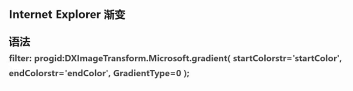
2-6 IE渐变
2-7 渐变应用

<!DOCTYPE html>
<html lang="en">
<head>
	<title>3</title>
	<meta http-equiv="Content-Type" content="text/html;charset=utf-8"/>
	<style type="text/css">
		div{
			width: 400px;
			height: 400px;
			background-color: yellow;
			background-size: 100px 100px;
			background-image: -webkit-linear-gradient(45deg,purple 25%,transparent 25%),
			                  -webkit-linear-gradient(-45deg,purple 25%,transparent 25%),
			                  -webkit-linear-gradient(45deg,transparent 75%,purple 75%),
			                  -webkit-linear-gradient(-45deg,transparent 75%,purple 75%);
			background-image: -moz-linear-gradient(45deg,purple 25%,transparent 25%),
			                  -moz-linear-gradient(-45deg,purple 25%,transparent 25%),
			                  -moz-linear-gradient(45deg,transparent 75%,purple 75%),
			                  -moz-linear-gradient(-45deg,transparent 75%,purple 75%);
			background-image: -o-linear-gradient(45deg,purple 25%,transparent 25%),
			                  -o-linear-gradient(-45deg,purple 25%,transparent 25%),
			                  -o-linear-gradient(45deg,transparent 75%,purple 75%),
			                  -o-linear-gradient(-45deg,transparent 75%,purple 75%);
			background-image: linear-gradient(45deg,purple 25%,transparent 25%),
			                  linear-gradient(-45deg,purple 25%,transparent 25%),
			                  linear-gradient(45deg,transparent 75%,purple 75%),
			                  linear-gradient(-45deg,transparent 75%,purple 75%);
		}
	</style>
</head>
<body>
	<div></div>
</body>
</html>


 8万+
8万+


 被折叠的 条评论
为什么被折叠?
被折叠的 条评论
为什么被折叠?
 到【灌水乐园】发言


