


Python数据可视化matplotlib:第三回:布局格式定方圆
第一回和第二回分别介绍了matplotlib的大致构成以及多种绘图方式。当然我们可以看到别人绘制的图都又精美的布局和颜色设置,接下来的学习就要来开始介绍一下布局格式。
1. 子图
之前就有提到过,matplotlib绘制子图的方式就有两种,分别是plt.subplots()和plt.subplot(),**plt.subplots()**具体的我在第一节就有详细介绍,大家想看的可以传送门过去
Python数据可视化matplotlib:第一回 Matplotlib 初相识
这里介绍一下**plt.subplot()**方法:
这两个方法看起来及其相似,同样我去matplotlib中查看了一下这个方法的相关参数。给大家放在下面:

其中最常用的其实就是前面三个,分表代表总行数,总列数,当前是第几个子图。总行数*总列数就是所有子图的个数,所以第三个参数不可以大于前两个数相乘。而且调用方法也有两种,第一种:plt.subplot(abc),第二种:plt.subplot(a, b, c)。和其他的大部分matplotlib方法一样,绘制子图的方式也分为OO模式(即通过创建axes对象来绘制)和通过模块方法来绘制,但是本质上subplot也是Figure.add_subplot的一种封装。
2. 极坐标绘图
以学习教程里的为例:
N = 150
r = 2 * np.random.rand(N)
theta = 2 * np.pi * np.random.rand(N)
area = 200 * r**2
colors = theta


plt.subplot(projection='polar')
plt.scatter(theta, r, c=colors, s=area, cmap='hsv', alpha=0.75);

这里通过projection 方法设置极坐标,在上文的subplot中我们也可以看到这个参数的介绍,这里主要介绍一下上述例子中plt.scatter() 中的参数分别代表什么意思。
- theta:: 就是对应点在极坐标中的角度(好像是叫极角,一时忘记了叫什么),相当于直角坐标系当中的x。
- r: 代表对应点的极径,相当于直角坐标系当中的y。
- c, s, cmap, alpha: 这些都是一些格式控制参数,c和cmap都是用于设置颜色,alpha用于设置点的透明度。
下面还有个练习题,由于没有找到对应的数据,所以只绘制出一个简陋类似的玫瑰图。
code:
# 生成数据
data = np.arange(20, 500, 20)

# 根据data等分极坐标系
theta = np.linspace(0, 2*np.pi, len(data))

# 设置画布
fig = plt.figure(figsize = (12, 8), facecolor = 'lightgrey')

# 设置极坐标系
ax = plt.subplot(projection='polar')
ax.set_theta_direction(-1)    # 规定顺时针方向为极坐标正方向,默认为逆时针
ax.set_theta_zero_location('N')

# 绘制玫瑰图中的对应数据部分
ax.bar(x = theta, height = data*5, width = 0.33, color = np.random.random((len(data),3)))

# 绘制玫瑰图中留白部分
ax.bar(x=theta,    # 柱体的角度坐标
       height=130,    # 柱体的高度, 半径坐标
       width=0.33,    # 柱体的宽度
       color='white'
      )

# 添加数据标注
for angle, data in zip(theta, data):
    ax.text(angle+0.03, data*5+100, str(data) )

# 忽略 线和圈
ax.set_axis_off();

3. 使用GridSpec绘制非均匀子图
这个方法我之前都没有碰到过,所以这里根据自己的理解来用白话描述一下:大致就是将子图分为一个一个区域,比如说一个3*3的一个子图,类似一个国家的省份,总共这么大块土地,有些省份占地面积大,有些省份占地面积小,但其实一开始都是均分的(这里仅仅用于举例子,不代表实际情况) ,只是有些省份他占了好几块地,有些可能只占了一块地。非均匀子图也是这样,一个子图可以在水平方向上扩展,多占几块子图区域,也可以在竖直方向上发展,多占几块子图区域。不同的图水平或竖直内所占的子图区域不一致,就构成了非均匀子图。
类似于子图绘制一样,非均匀子图也是分为两个方法都可以绘制出来。下面以一种方法为例介绍一下绘制方法
fig = plt.figure(figsize=(10, 4))
spec = fig.add_gridspec(nrows=2, ncols=6, width_ratios=[2,2.5,3,1,1.5,2], height_ratios=[1,2])
fig.suptitle('样例3', size=20)
# sub1
ax = fig.add_subplot(spec[0, :3])
ax.scatter(np.random.randn(10), np.random.randn(10))
# sub2
ax = fig.add_subplot(spec[0, 3:5])
ax.scatter(np.random.randn(10), np.random.randn(10))
# sub3
ax = fig.add_subplot(spec[:, 5])
ax.scatter(np.random.randn(10), np.random.randn(10))
# sub4
ax = fig.add_subplot(spec[1, 0])
ax.scatter(np.random.randn(10), np.random.randn(10))
# sub5
ax = fig.add_subplot(spec[1, 1:5])
ax.scatter(np.random.randn(10), np.random.randn(10))
fig.tight_layout()

可以看见绘制的图片横七竖八的,与我们日常见到的子图都不太一样, 仔细看了例子后突然觉得自己上面的均分描述的不太对,怎么说呢,就是你一开始可以设置每行每列的初始值,比如上面的width_ratios和height_ratios就是用于控制不同行,不同列的宽度和高度的,传进去的分别是array-like of length ncols和array-like of length nrows,然后下面将这些子图区域,作为一个二维的数组来通过和数组一样的切片方式来分给每个图的绘图区域。
4. 子图的一些方法
常用的方法和非子图绘制的大致一样,感兴趣的可以去官方文档查查看。
5. 思考题
5.1 墨尔本1981年至1990年的每月温度情况图形还原
原始图样:

code1:
# 使用pyplot模块绘制图像
import warnings
warnings.filterwarnings("ignore")
# 读取数据
ex1 = pd.read_csv('../data/layout_ex1.csv')
# 设置横坐标和子图标题
x_labels = np.arange(1,13)
year_list = [None,'1981', '1982', '1983', '1984', '1985', '1986', '1987', '1988', '1989', '1990', '1991']
# 设置画布
plt.figure(figsize = (16, 4))

# 编写绘制函数
def plot_subplot(i,year_start, year_end):
    plt.subplot(2, 5, i)
    plt.plot(x_labels, ex1[ex1['Time'] < year_end][ex1['Time'] > year_start]['Temperature'], marker = "*")
    plt.title(year_start + '年', loc = 'center')
    plt.xticks(x_labels)
    plt.yticks(np.arange(0,25,5))


for i in range(1, 11 ,1):
    plot_subplot(i, year_list[i], year_list[i + 1])

plt.suptitle("墨尔本1981至1990年月温度曲线")
plt.tight_layout()
plt.show()
绘制结果:

5.2 画出数据的散点图和边际分布
用 np.random.randn(2, 150) 生成一组二维数据,使用两种非均匀子图的分割方法,做出该数据对应的散点图和边际分布图.
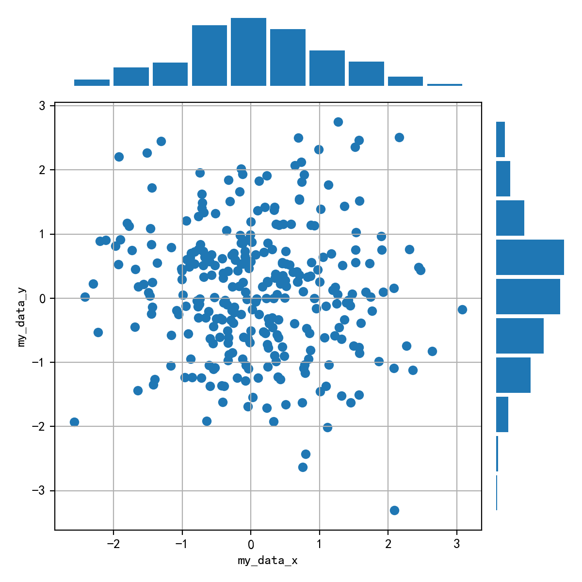
这个没有完全绘制出来,感觉在格式还有需要调的地方,暂且先放在这,后续来修改,达成一致。同时没有思路的也可以看看matplotlib的官方案例。传送门:Scatter plot with histograms
code:
# 生成数据
np.random.seed(322)
datax = np.random.randn(2, 150)
datay = np.random.randn(2, 150)

def scatter_hist(x, y, ax, ax_histx, ax_histy):
    # no labels
    ax_histx.tick_params(axis="x", labelbottom=False)
    ax_histy.tick_params(axis="y", labelleft=False)

    # the scatter plot:
    ax.scatter(x, y)

    # now determine nice limits by hand:
    binwidth = 0.25
    xymax = max(np.max(np.abs(x)), np.max(np.abs(y)))
    lim = (int(xymax/binwidth) + 1) * binwidth

    bins = np.arange(-lim, lim + binwidth, binwidth)
    ax_histx.hist(x, bins=bins)
    ax_histy.hist(y, bins=bins, orientation='horizontal')

    ax_histx.set_xticks([])
    ax_histy.set_xticks([])
    [ax_histx.spines[loc_axis].set_visible(False) for loc_axis in ['top','right','bottom','left']]
    [ax_histy.spines[loc_axis].set_visible(False) for loc_axis in ['top','right','bottom','left']]
# 设置画布
fig = plt.figure(figsize = (10, 8))
# 不规则子图绘制
spec = fig.add_gridspec(2, 2,  width_ratios=(7, 2), height_ratios=(2, 7),
                      left=0.1, right=0.9, bottom=0.1, top=0.9,
                      wspace=0.05, hspace=0.05)

# sub1
ax = fig.add_subplot(spec[1, 0])
ax_histx = fig.add_subplot(spec[0, 0], sharex = ax)
ax_histy = fig.add_subplot(spec[1, 1], sharey = ax)
scatter_hist(datax, datay, ax, ax_histx, ax_histy)


 1267
1267

 被折叠的 条评论
为什么被折叠?
被折叠的 条评论
为什么被折叠?
 到【灌水乐园】发言


