


 本文展示了如何使用Python和Matplotlib绘制雷达图,通过实例演示了如何比较不同学生成绩在各科目的分布情况。通过np.linspace和np.concatenate实现角度划分和数据拼接,帮助读者理解极坐标图的绘制技巧,并演示了如何添加多个学生的成绩数据进行对比。
一.先看代码,
import numpy as np
import matplotlib.pyplot as plt
# 用于正常显示中文
#plt.rcParams['font.family'] = ['sans-serif']#如果是windows系统请去掉这行注释
#plt.rcParams['font.sans-serif'] = ['SimHei']#如果是windows系统请去掉这行注释
plt.rcParams["font.family"] = 'Arial Unicode MS'
#用于正常显示符号
plt.rcParams['axes.unicode_minus'] = False
# 使用ggplot的绘图风格
plt.style.use('ggplot')
#各个属性值
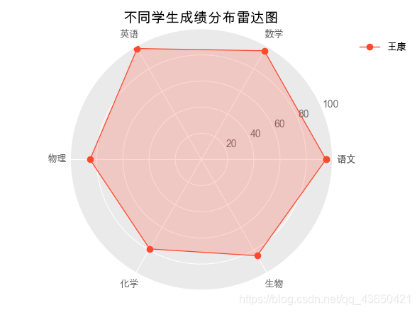
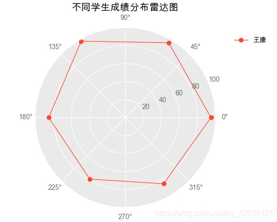
feature = ['语文','数学','英语','物理','化学','生物']
value = np.array([95,96,98,85,79,85])
# 设置每个数据点的显示位置,在雷达图上用角度表示
angles=np.linspace(0, 2*np.pi,len(feature), endpoint=False)
angles=np.concatenate((angles,[angles[0]]))
feature = np.concatenate((feature,[feature[0]]))
# 绘图
fig=plt.figure(facecolor='white')
subject_label = ['王康']
# 拼接数据首尾,使图形中线条封闭
values=np.concatenate((value,[value[0]]))
print(values)
# 设置为极坐标格式
ax = fig.add_subplot(111, polar=True)
# 绘制折线图
ax.plot(angles, values, 'o-', linewidth=1,label=subject_label[0])
# 填充颜色
ax.fill(angles, values, alpha=0.25)
# 设置图标上的角度划分刻度,为每个数据点处添加标签
ax.set_thetagrids(angles * 180/np.pi, feature)
# 设置雷达图的范围
ax.set_ylim(0,100)
# 添加标题
plt.title('不同学生成绩分布雷达图')
plt.legend(bbox_to_anchor=(1.05, 1), loc=2, borderaxespad=1,frameon=False)
# 添加网格线
ax.grid(True)
#保存图片
#plt.savefig('雷达图.png')
plt.show()
具体命令讲解:
1.np.linspace命令:
angles=np.linspace(0, 2*np.pi,len(feature), endpoint=False)
print(angles)
"""[0. ,1.04719755,2.0943951,3.14159265,4.1887902,5.23598776]"""
可以发现np.linspace的作用就是将2π分成了feature长度份,即我们这里对应的6个科目,6份。
angles=np.linspace(0, 2*np.pi,len(feature), endpoint=True)
print(angles)
"""[0.,1.25663706,2.51327412,3.76991118,5.02654825,6.28318531]"""
如果将endpoint设置为True可以看到把2π包括进去了。
这将会导致首尾重合。因此需要制定endpoint=False这个选项,否则会默认endpoint=True。
2.np.concatenate命令:
这个命令用于数组的拼接。
angles=np.concatenate((angles,[angles[0]]))
print(angles)
"""[0.,1.04719755,2.0943951,3.14159265,4.1887902,5.23598776,0.]"""
相当于把angles数组和angles[0]进行沿水平方向拼接。
这个命令其实还是挺好的理解,
x=np.array([1,2,3])
y=np.array([4,5,6])
c=np.concatenate([x,y])#其实这里axis=0
"""c=array([1,2,3,4,5,6])"""
类似于matlab中的
a=[1,2,3]
b=[4,5,6]
c=[a,b]
%c=[1,2,3,4,5,6]
如果想要在沿着第二个轴垂直方向拼接,
x=np.array([1,2,3])
y=np.array([4,5,6])
c=np.concatenate([x,y],axis=1)
"""c=array([[1,2,3],[4,5,6]])"""
类似于matlab中的
a=[1,2,3]
b=[4,5,6]
c=[a;b]
%c=1,2,3
%  4,5,6
补充:
1.np.hstack()用法等同于np.concatenate([],axis=0)
x=np.array([1,2,3])
y=np.array([4,5,6])
c=np.hstack([x,y])#其实这里axis=0
"""c=array([1,2,3,4,5,6])"""
2.np.vstack()用法等同于np.concatenate([],axis=1)
x=np.array([1,2,3])
y=np.array([4,5,6])
c=np.vstack([x,y])#其实这里axis=0
"""c=array([[1,2,3],[4,5,6]])"""
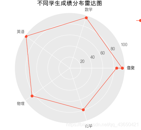
3.ax.set_thetagrids(angles * 180/np.pi, feature)命令
这个作用就是加上刻度的作用,与plt.xticks或ax.set_xticks作用相同。
不加的话就是这样的:
4.ax.fill(angles, values, alpha=0.25)用于填充颜色:
填充后的效果:
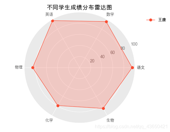
alpha参数用于设置透明度。
其他的命令在注释中大多有标注。
二、我们画雷达图一般用于不同的指标中进行比较所以会在一张图上画多种雷达图。
import numpy as np
import matplotlib.pyplot as plt

# 用于正常显示中文
# 用于正常显示中文
#plt.rcParams['font.family'] = ['sans-serif']#如果是windows系统请去掉这行注释
#plt.rcParams['font.sans-serif'] = ['SimHei']#如果是windows系统
plt.rcParams["font.family"] = 'Arial Unicode MS'
#用于正常显示符号
plt.rcParams['axes.unicode_minus'] = False

# 使用ggplot的绘图风格
plt.style.use('ggplot')

#各个属性值
feature = ['语文','数学','英语','物理','化学','生物']
value  = np.array([[60,66,75,70,54,64],
                   [97,95,94,89,90,80],
                   [80,81,82,83,84,87]])

# 设置每个数据点的显示位置,在雷达图上用角度表示
angles=np.linspace(0, 2*np.pi,len(feature), endpoint=False)
angles=np.concatenate((angles,[angles[0]]))
feature = np.concatenate((feature,[feature[0]]))
# 绘图
fig=plt.figure(facecolor='white')
index0 = 0
subject_label = ['王康','李玉','朱阳']
for values in [value[0,:],value[1,:],value[2,:]]:
# 拼接数据首尾,使图形中线条封闭
    values=np.concatenate((values,[values[0]]))
    # 设置为极坐标格式
    ax = fig.add_subplot(111, polar=True)
    # 绘制折线图
    ax.plot(angles, values, 'o-', linewidth=1,label=subject_label[index0])
    # 填充颜色
    ax.fill(angles, values, alpha=0.25)

    # 设置图标上的角度划分刻度,为每个数据点处添加标签
    ax.set_thetagrids(angles * 180/np.pi, feature)

    # 设置雷达图的范围
    ax.set_ylim(0,100)
    index0 = index0 + 1

# 添加标题
plt.title('不同学生成绩分布雷达图')
plt.legend(bbox_to_anchor=(1.05, 1), loc=2, borderaxespad=1,frameon=False)
# 添加网格线
ax.grid(True)
#plt.savefig('雷达图.png')#保存图片

plt.show()
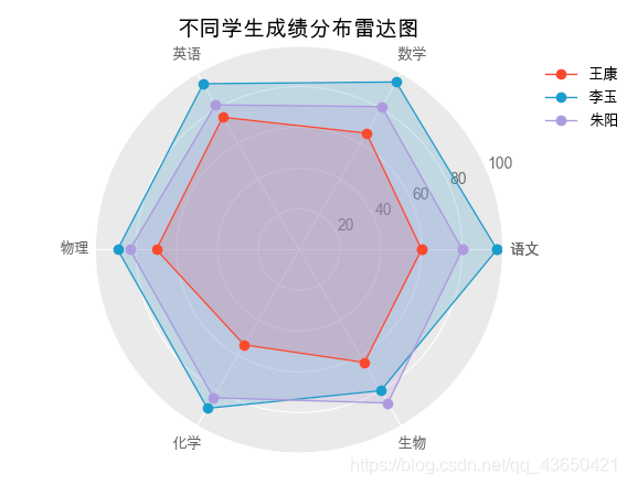
这样就可以很明显的看出对比。


 491
491

 被折叠的 条评论
为什么被折叠?
被折叠的 条评论
为什么被折叠?
 到【灌水乐园】发言


