


目录
(2)相对定位——在移动时是相对于它自身原来的位置来移动(自恋型)
2.2 visibility——用于指定一个元素应可见还是隐藏
2.3 overflow——指定了如果内容溢出一个元素的框(超过其指定高度及宽度) 时,会发生什么
一、定位
1.1 为什么需要定位
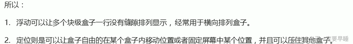
1某个盒子可以自由地在一个盒子内移动位置,并压在其他盒子上面;
2当滚动页面时,有的模块固定到在页面中不动;
以上效果,标准流或浮动都无法快速实现,此时需要定位来实现。
1.2 定位
定位:将盒子定在某一个位置(摆盒子)= 定位模式 + 边偏移
1)定位模式
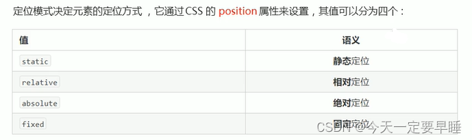
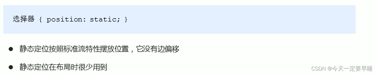
(1) 静态定位——默认定位方式,无定位的意思
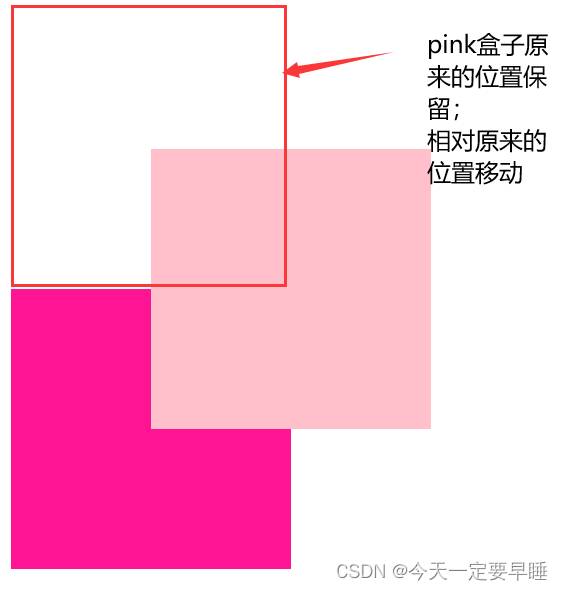
(2)相对定位——在移动时是相对于它自身原来的位置来移动(自恋型)
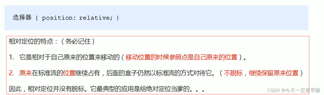
例子:给pink盒子加相对定位
<title>相对定位:相对原来的自己移动、保留原来位置、不会对后面标准流产生影响</title>
    <style>
        .box1 {
            position: relative;
            top: 100px;
            left: 100px;
            width: 200px;
            height: 200px;
            background-color: pink;
        }

        .box2 {
            width: 200px;
            height: 200px;
            background-color: deeppink;
        }
    </style>
</head>

<body>
    <div class="box1">

    </div>
    <div class="box2">

    </div>

</body>效果:
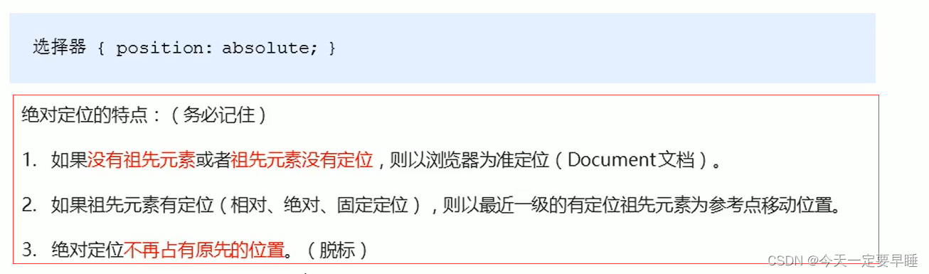
(3)绝对定位——在移动时是相对于它的祖先元素的位置来移动
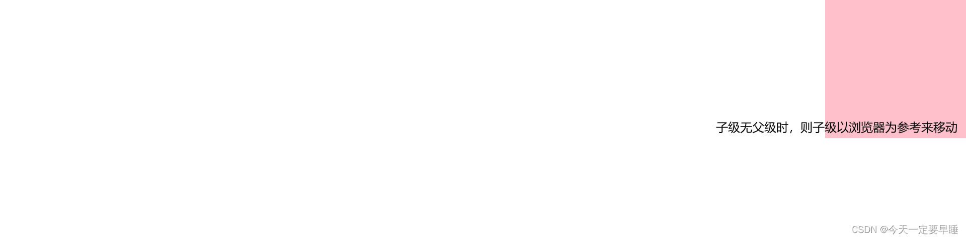
例1:没有父级
<!DOCTYPE html>
<html lang="en">

<head>
    <meta charset="UTF-8">
    <meta name="viewport" content="width=device-width, initial-scale=1.0">
    <meta http-equiv="X-UA-Compatible" content="ie=edge">
    <title>绝对定位-无父亲</title>
    <style>
        .son {
            position: absolute;
            right: 0;
            top: 0;
            width: 200px;
            height: 200px;
            background-color: pink;
        }
    </style>
</head>

<body>
    <div class="son"></div>
</body>

</html>效果:
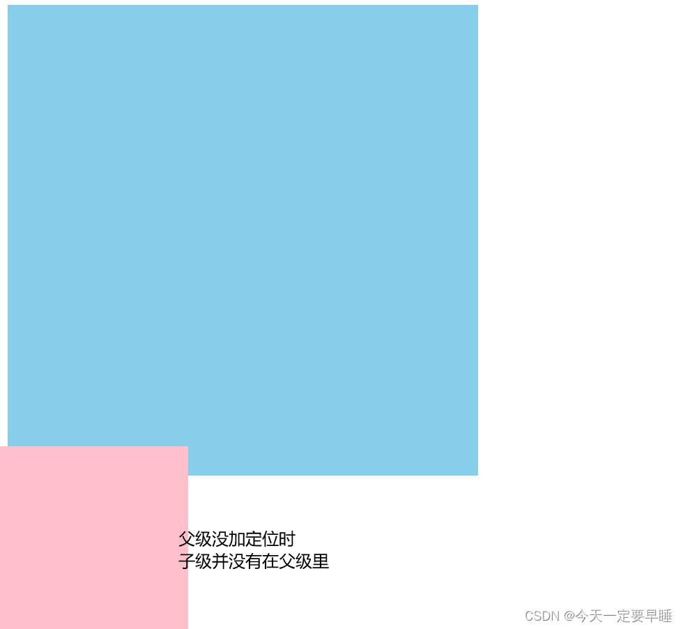
例2:父级没有定位
<!DOCTYPE html>
<html lang="en">

<head>
    <meta charset="UTF-8">
    <meta name="viewport" content="width=device-width, initial-scale=1.0">
    <meta http-equiv="X-UA-Compatible" content="ie=edge">
    <title>绝对定位-无父亲或者父亲无定位</title>
    <style>
        .father {
            width: 500px;
            height: 500px;
            background-color: skyblue;
        }

        .son {
            position: absolute;
            left: 0;
            bottom: 0;
            width: 200px;
            height: 200px;
            background-color: pink;
        }
    </style>
</head>

<body>
    <div class="father">
        <div class="son"></div>
    </div>

</body>

</html>效果:
例3:父级有定位
<!DOCTYPE html>
<html lang="en">

<head>
    <meta charset="UTF-8">
    <meta name="viewport" content="width=device-width, initial-scale=1.0">
    <meta http-equiv="X-UA-Compatible" content="ie=edge">
    <title>绝对定位-父级有定位</title>
    <style>
        .yeye {
            position: relative;
            width: 800px;
            height: 800px;
            background-color: hotpink;
            padding: 50px;
        }

        .father {

            width: 500px;
            height: 500px;
            background-color: skyblue;
        }

        .son {
            position: absolute;
            left: 30px;
            bottom: 10px;
            width: 200px;
            height: 200px;
            background-color: pink;
        }
    </style>
</head>

<body>
    <div class="yeye">
        <div class="father">
            <div class="son"></div>
        </div>
    </div>


</body>

</html>效果:
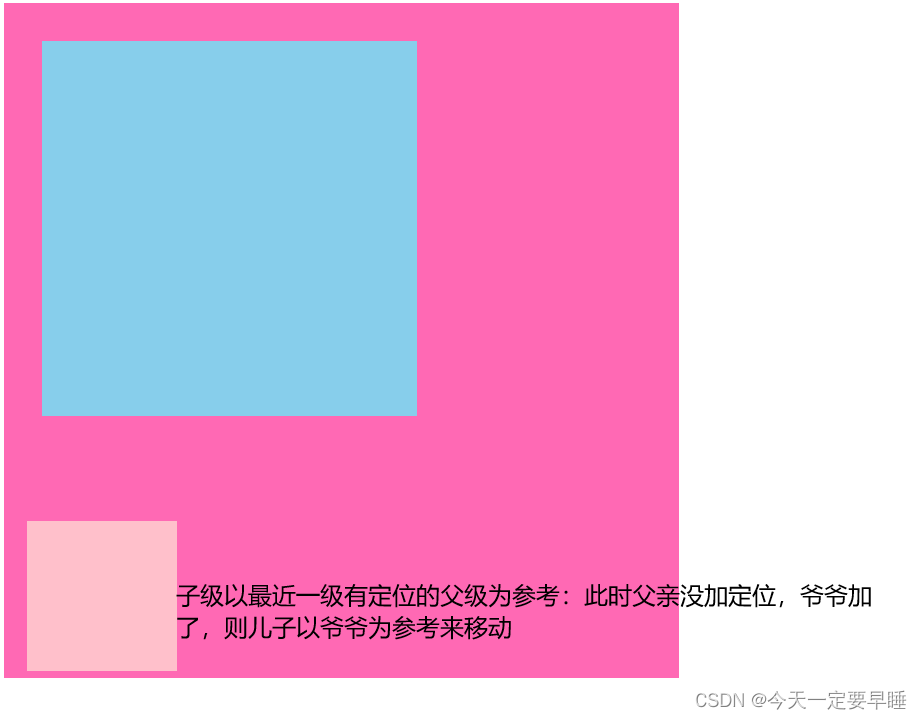
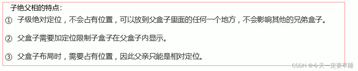
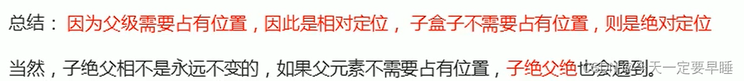
※ 子绝父相:
子级是绝对定位的话,父级用相对定位。
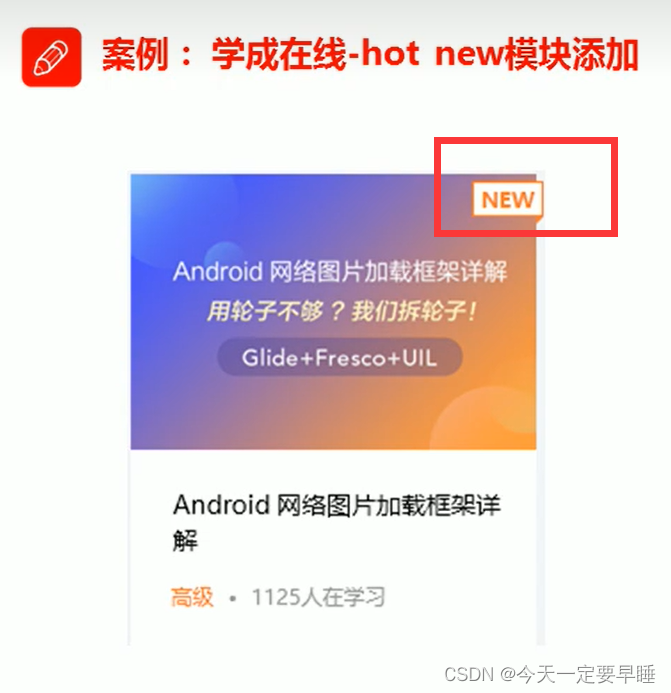
思想:在小li里加上em-img,将em子级设为绝对定位,将li父级设为相对定位
html代码:
<div class="box-bd">
            <ul class="clearfix">
                <li>
                    <em>
                        <img src="images/hot.png" alt="">
                    </em>
                    <img src="images/pic.png" alt="">
                    <h4>
                        Think PHP 5.0 博客系统实战项目演练
                    </h4>
                    <div class="info">
                        <span>高级</span> • 1125人在学习
                    </div>
</li>css代码:
.box-bd ul li em {
   /* 子绝 */
    position: absolute;
    top: 4px;
    right: -4px;
}
.box-bd ul li {
    /* 父相 */
    position: relative;
    float: left;
    width: 228px;
    height: 270px;
    background-color: #fff;
    margin-right: 15px;
    margin-bottom: 15px;

}
.box-bd ul li > img {
  /* 选择亲儿子,就不会把em里的图片变宽  */
    width: 100%;
}
(4)固定定位——是元素固定于浏览器可视区的位置
主要使用场景: 可以在浏览器页面滚动时元素的位置不会改变。
 最低0.47元/天 解锁文章


 被折叠的 条评论
为什么被折叠?
被折叠的 条评论
为什么被折叠?
 到【灌水乐园】发言


