


 本文详细介绍了Flex布局的优缺点、适用场景,并重点讲解了父项的6大属性(如flex-direction、justify-content、align-items等)和子项的3大属性(flex、align-self、order),以及背景颜色线性渐变的使用。
目录
3.6 align-items和align-content的区别
一、传统布局与flex布局
1.1 优缺点
| 传统布局 | Flex弹性布局 |
|---|---|
| 兼容性好 | 操作方便,布局极为简单,在移动端应用广泛 |
| 布局繁琐(浮动、清除浮动……) | PC端浏览器支持情况较差 |
| 有局限性,不能在移动端很好的布局 | IE 11 或更低版本,不支持或部分支持 |
1.2 使用场景
1、如果是PC端布局,仍使用传统布局;
2、如果是移动端,或不考虑兼容性问题的PC端页面布局
,则使用flex弹性布局
二、flex布局的原理
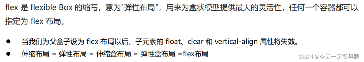
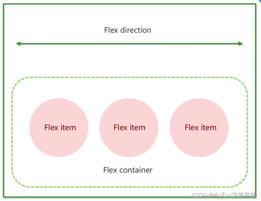
2.1 容器
采用flex布局的元素,被称为flex容器(Flex container),简称“容器”。
2.2 项目
容器的所有子元素自动成为容器成员,被称为flex项目(Flex item),简称“项目”。
2.3 作用
通过给父盒子添加flex属性,来控制子盒子的位置和排列方式。
三、flex布局下父项的常见属性(6个)
3.1 设置主轴的方向 ★
flex-direction: 属性值;
1)主轴默认是x轴,那么此时y轴就是侧轴;反之,如果设置主轴为y轴,那么x轴就成为了侧轴。
注:
在flex布局中,分为主轴与侧轴两个方向,或被叫做:行和列、x轴和y轴。
默认主轴方向为x轴方向,水平向右;
默认侧轴方向为y轴方向,水平向下。
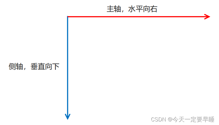
2)子元素是顺着主轴排列的。也就是说,如果主轴是x轴,其子元素就水平排列(左右),反之主轴若是y轴,其子元素就垂直排列(上下)。
3)属性值及其说明:
| 属性值 | 子元素的排列方式 |
|---|---|
| flex-direction: row; | 从左到右(默认x轴为主轴) |
| flex-direction: row-reverse; | 从右到左 |
| flex-direction: column; | 从上到下 (设置y轴为主轴) |
| flex-direction: column-reverse; | 从下到上 |
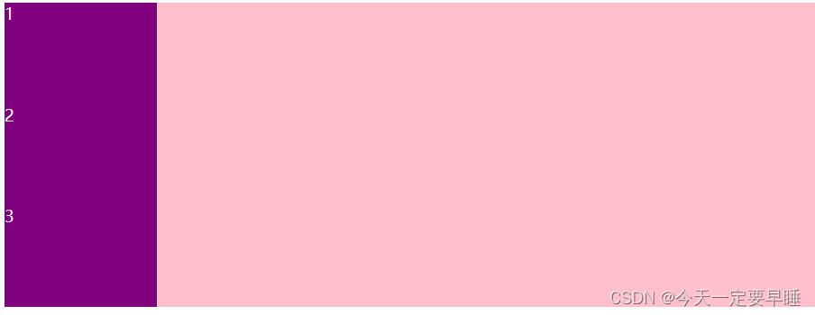
4)使用:设置主轴为y轴
代码:
<!DOCTYPE html>
<html lang="en">

<head>
    <meta charset="UTF-8">
    <meta name="viewport" content="width=device-width, initial-scale=1.0">
    <meta http-equiv="X-UA-Compatible" content="ie=edge">
    <title>flex-direction</title>
    <style>
        body {
            color: aliceblue;
        }
          /* 元素是跟着主轴来排列的 */
        div {
            /* 给父级添加flex属性,可以控制子元素的排列*/
            display: flex;
            width: 800px;
            height: 300px;
            background-color: pink;
            /* 默认的主轴是:x轴 (行 row,从左到右排列),那么y轴就成了侧轴 */
            /* flex-direction: row; */
            /* 可以把主轴设置为 y轴,(从上到下排列) 那么 x 轴就成了侧轴 */
            flex-direction: column;
            /* 翻转属性:从右到左排列 */
            /* flex-direction: row-reverse; */

        }

        div span {
            width: 150px;
            height: 100px;
            background-color: purple;
        }
    </style>
</head>

<body>
    <div>
        <span>1</span>
        <span>2</span>
        <span>3</span>
    </div>
</body>

</html>效果:
3.2 设置主轴上的子元素排列方式 ★
justify-content: 属性值;
1)属性值及其说明:
| 属性值 | 子元素的排列方式 |
| justify-content: center; | 在主轴居中对齐 |
| justify-content: flex-start; | 从主轴头部开始排列(默认) |
| justify-content: flex-end; | 从尾部开始排列 |
| justify-content: space-around; | 平均分配剩余空间(最左最右元素不贴边) |
| justify-content: space-between; | 先两边贴边,再平均分配剩余空间 |
| justify-content: space-evenly; | 每个元素之间的间隔相等(最左最右元素不贴边) |
2)使用:设置主轴(x轴 or y轴)上子元素的排列方式
代码:(主轴为x轴,设置x轴上子元素先两边贴边,再分配中间剩余的空间的效果)
<!DOCTYPE html>
<html lang="en">

<head>
    <meta charset="UTF-8">
    <meta name="viewport" content="width=device-width, initial-scale=1.0">
    <meta http-equiv="X-UA-Compatible" content="ie=edge">
    <title>justify-content:</title>
    <style>
        body {
            color: aliceblue;
        }
        div {
            display: flex;
            width: 800px;
            height: 300px;
            background-color: pink;
            /* 默认的主轴是 x 轴 ,子元素从左到右排列 */
            flex-direction: row;
            /* 子元素贴着左边对齐 */
            /* justify-content: flex-start; */
            /* 子元素贴着右边对齐 */
            /* justify-content: flex-end; */
            /* 可以实现水平居中对齐 */
            /* justify-content: center; */
            /* 平均分配父项的剩余空间(减去子元素占的位置)给每个子元素 */
            /* justify-content: space-around; */
            /* 先两边贴边,再分配中间剩余的空间 (重要) */
            justify-content: space-between;
        }

        div span {
            width: 150px;
            height: 100px;
            background-color: purple;
        }
    </style>
</head>

<body>
    <div>
        <span>1</span>
        <span>2</span>
        <span>3</span>
        <span>4</span>
    </div>
</body>
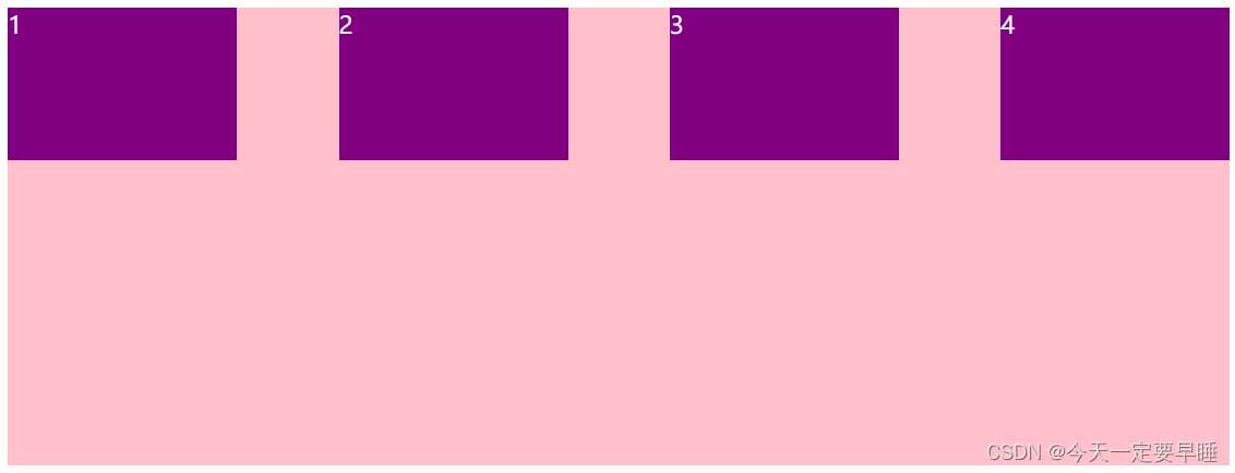
</html>效果:(主轴为x轴,设置x轴上子元素先两边贴边,再分配中间剩余的空间的效果)
代码:(主轴为y轴,设置y轴上子元素上下顶满,中间剩余空间平均分配的效果)
<!DOCTYPE html>
<html lang="en">

<head>
    <meta charset="UTF-8">
    <meta name="viewport" content="width=device-width, initial-scale=1.0">
    <meta http-equiv="X-UA-Compatible" content="ie=edge">
    <title>justify-content:</title>
    <style>
        body {
            color: aliceblue;
        }
        div {
            display: flex;
            width: 800px;
            height: 400px;
            background-color: pink;
            /* 我们现在的主轴是y轴 */
            flex-direction: column;
            /* 可以实现垂直居中 */
            /* justify-content: center; */
            /* 可以实现上下顶满,中间剩余空间平均分配 */
            justify-content: space-between;
        }

        div span {
            width: 150px;
            height: 100px;
            background-color: purple;
        }
    </style>
</head>

<body>
    <div>
        <span>1</span>
        <span>2</span>
        <span>3</span>
    </div>
</body>
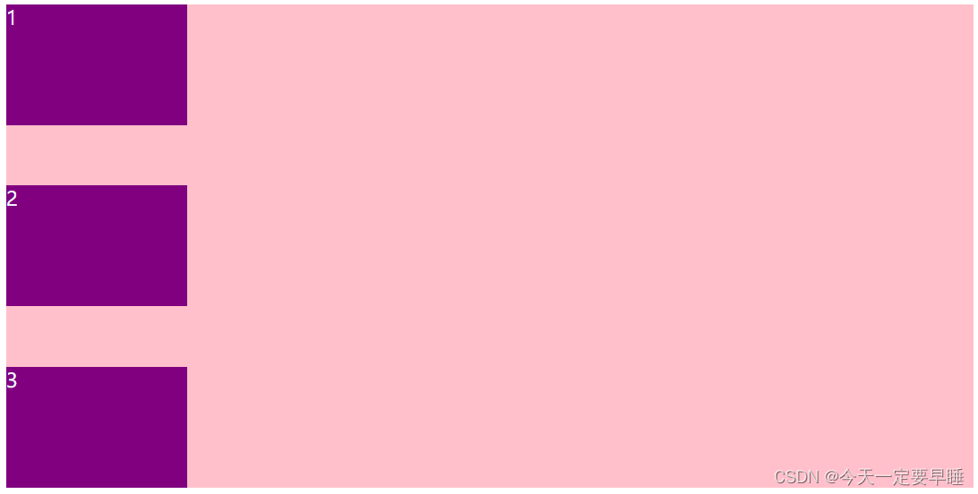
</html>效果:(主轴为y轴,设置y轴上子元素上下顶满,中间剩余空间平均分配的效果)
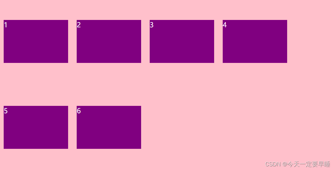
3.3 控制子元素是否换行 ★
在flex布局中默认不换行。一般是在有多行子元素时使用。
1)属性值及其说明
| 属性值 | 说明 |
|---|---|
| flex-wrap: nowrap; | 不换行(默认) |
| flex-wrap: wrap; | 换行 |
2)使用:设置父盒子,使得子元素能换行显示
代码:
<!DOCTYPE html>
<html lang="en">

<head>
    <meta charset="UTF-8">
    <meta name="viewport" content="width=device-width, initial-scale=1.0">
    <meta http-equiv="X-UA-Compatible" content="ie=edge">
    <title>flex-wrap: wrap</title>
    <style>
        body {
            color: aliceblue;
        }
        div {
            display: flex;
            width: 600px;
            height: 400px;
            background-color: pink;
            /* 设置子元素换行 */
            flex-wrap: wrap;
        }

        div span {
            /* 5个子盒子按道理来说,摆到父盒子里,根本摆不开,但是设置了flex布局,子元素就默认不换行flex-wrap: nowrap; ,装不开时会缩小子元素的宽度,然后放到父元素里 */
            width: 150px;
            height: 100px;
            background-color: purple;
            color: #fff;
            margin-left: 10px;
            /* 但此时,两行的子元素并没有贴着 ,要想贴着要用属性5 align-content:*/
        }
    </style>
</head>

<body>
    <div>
        <span>1</span>
        <span>2</span>
        <span>3</span>
        <span>4</span>
        <span>5</span>
        <span>6</span>
    </div>
</body>

</html>效果:
3.4 设置侧轴上的子元素排列方式(单行)★
align-items: 属性值;
1)属性值及其说明
| 属性值 | 子元素的排列方式 |
|---|---|
| align-items: flex-start; | 从上到下(默认) |
| align-items: flex-end; | 从下到上 |
| align-items: center; | 挤在一起居中(子元素没有间隔) |
| align-items: stretch; | 拉伸(默认值,设置此元素时,不要给子元素高度) |
2)使用: 设置父盒子,让子盒子沿着侧轴(y)垂直居中
代码:
<!DOCTYPE html>
<html lang="en">

<head>
    <meta charset="UTF-8">
    <meta name="viewport" content="width=device-width, initial-scale=1.0">
    <meta http-equiv="X-UA-Compatible" content="ie=edge">
    <title>align-items: </title>
    <style>
        body {
            color: aliceblue;
        }
        div {
            display: flex;
            width: 800px;
            height: 400px;
            background-color: pink;
            /* 让子盒子 水平 垂直 居中: */
            /* 默认的主轴是x轴,那么侧轴就是y轴了*/
            /* 让子盒子沿着主轴(x)水平居中 */
            justify-content: center;
            /* 让子盒子沿着侧轴(y)垂直居中 */
            align-items: center;
            /* 沿着侧轴拉伸,但是子盒子不要给高度 */
            /* align-items: stretch; */

            /* 主轴是谁很重要,主轴不同,摆放的位置也不同的 */
        }

        div span {
            width: 150px;
            height: 100px;
            background-color: purple;
            color: #fff;
            margin: 10px;
        }
    </style>
</head>

<body>
    <div>
        <span>1</span>
        <span>2</span>
        <span>3</span>
    </div>
</body>

</html>效果:
3.5 设置侧轴上的子元素的排列方式(多行)
align-content: 属性值;
1)属性值及其说明
| 属性值 | 子元素的排列方式 |
| align-content: flex-start; | 从侧轴的头部开始排列(默认) |
| align-content: flex-end; | 从侧轴的尾部开始排列(贴底对齐) |
| align-content: center; | 在侧轴居中显示 |
| align-centent: stretch; | 各行将会伸展以占用剩余的空间(自动平分父亲的高度)。如果剩余的空间是负数, 该值等效于’flex-start’ (默认) |
| align-content: space-around; | 最边上的子项不贴边,再平分剩余空间 (相邻子元素的边距为2倍被分配的空间) |
| align-content: space-between; | 子项在侧轴先分布在两边,再平分剩余空间 |
2)使用:设置父盒子,使得最边上的子盒子不贴边,并且平分剩余的空间
代码:
<!DOCTYPE html>
<html lang="en">

<head>
    <meta charset="UTF-8">
    <meta name="viewport" content="width=device-width, initial-scale=1.0">
    <meta http-equiv="X-UA-Compatible" content="ie=edge">
    <title>align-content:</title>
    <style>
        body {
            color: aliceblue;
        }
        div {
            display: flex;
            width: 800px;
            height: 400px;
            background-color: pink;
            /* 先有换行才能设置多行子元素的排列方式 */
            flex-wrap: wrap;
            /* 多行子元素是贴着一起动的 */
            /* align-content: flex-start; */
            /* align-content: center; */
            /* align-content: space-between; */
            align-content: space-around;
        }

        div span {
            width: 150px;
            height: 100px;
            background-color: purple;
            color: #fff;
            margin: 10px;
        }
    </style>
</head>

<body>
    <div>
        <span>1</span>
        <span>2</span>
        <span>3</span>
        <span>4</span>
        <span>5</span>
        <span>6</span>
    </div>
</body>
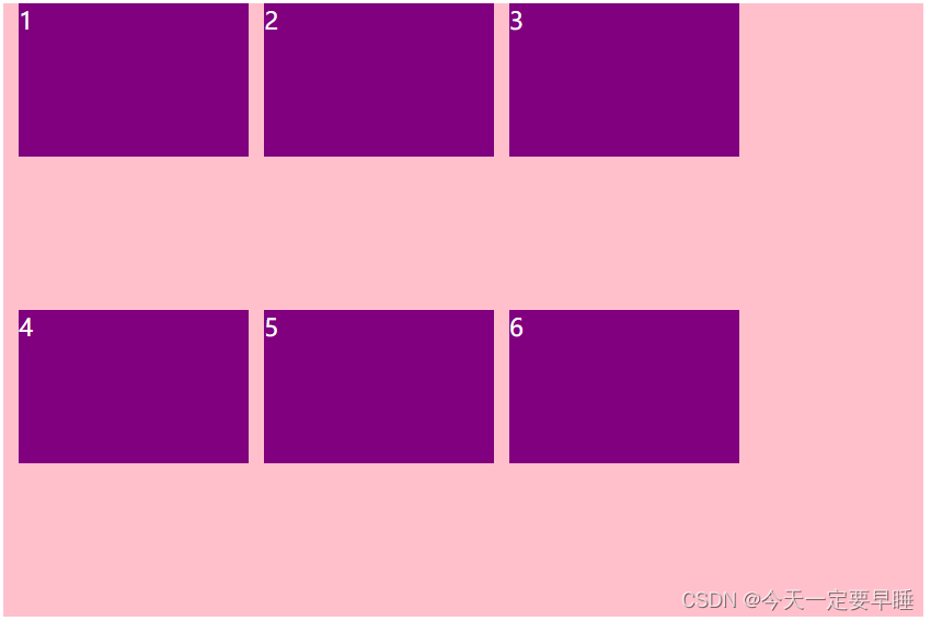
</html>效果:(此处是因为父盒子div给的高度太高了,上下行的子盒子才隔得比较远)
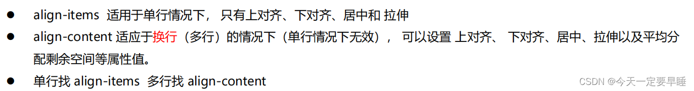
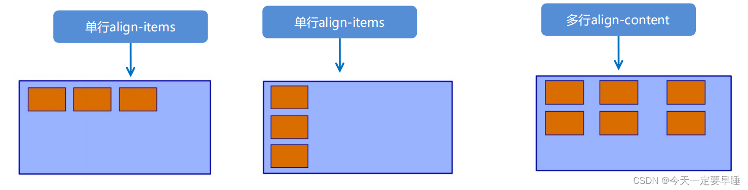
3.6 align-items和align-content的区别
3.7 复合属性
flex-flow: 属性值1 属性值2;
主要是flex-direction 和 flex-wrap 这两个属性的复合写法。
代码:实现在主轴(y轴)上,子元素的换列效果
<!DOCTYPE html>
<html lang="en">

<head>
    <meta charset="UTF-8">
    <meta name="viewport" content="width=device-width, initial-scale=1.0">
    <meta http-equiv="X-UA-Compatible" content="ie=edge">
    <title> flex-flow: </title>
    <style>
        body {
            color: aliceblue;
        }
        div {
            display: flex;
            width: 600px;
            height: 300px;
            background-color: pink;
            /* flex-direction: column;
            flex-wrap: wrap; */
            /* 把设置主轴方向和是否换行(换列)简写 */
            flex-flow: column wrap;
        }

        div span {
            width: 150px;
            height: 100px;
            background-color: purple;
        }
    </style>
</head>

<body>
    <div>
        <span>1</span>
        <span>2</span>
        <span>3</span>
        <span>4</span>
        <span>5</span>
    </div>
</body>

</html>效果:
3.8 常见6种父项属性的总结
| flex-direction | 设置主轴的方向 |
| justify-content | 设置主轴上的子元素排列方式 |
| flex-wrap | 控制子元素是否换行 |
| align-items | 设置侧轴上的子元素的排列方式(单行) |
| align-content | 设置侧轴上的子元素的排列方式(多行) |
| flex-flow | flex-direction和flex-wrap的复合属性 |
四、flex布局下子项的常见属性(3个)
4.1 flex属性(重要)
定义子项目在剩余空间中所分配的空间,占多少份数。
1)flex属性值的写法
flex: 数字 or 百分比; (默认为0)
2)使用
代码:
<!DOCTYPE html>
<html lang="en">
<head>
<meta charset="UTF-8">
<meta name="viewport" content="width=device-width, initial-scale=1.0">
<meta http-equiv="X-UA-Compatible" content="ie=edge">
<title>Document</title>
<style>
body {
color: aliceblue;
}
section {
display: flex;
width: 60%;
height: 150px;
background-color: pink;
margin: 0 auto;
}
section div:nth-child(1) {
width: 100px;
height: 150px;
background-color: red;
}
section div:nth-child(2) {
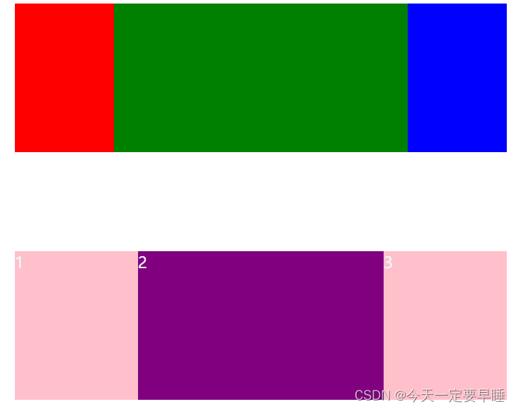
/* 子项占的份数,是分配孩子1和孩子3剩下的空间(中间) ,因为孩子1和孩子3写了宽度和高度*/
/* 宽和高都不用写了,直接占满全部剩余空间 */
/* 就实现了 : 左右孩子固定,中间孩子自适应的 效果 */
flex: 1;
background-color: green;
}
section div:nth-child(3) {
width: 100px;
height: 150px;
background-color: blue;
}
p {
display: flex;
width: 60%;
height: 150px;
background-color: pink;
margin: 100px auto;
}
/* 不给孩子高度和宽度,就只给份数 */
p span {
/* 第一个孩子和第三个孩子占1份 */
flex: 1;
}
p span:nth-child(2) {
/* 第二个孩子占2份 */
flex: 2;
background-color: purple;
}
</style>
</head>
<body>
<section>
<div></div>
<div></div>
<div></div>
</section>
<p>
<span>1</span>
<span>2</span>
<span>3</span>
</p>
</body>
</html>效果:
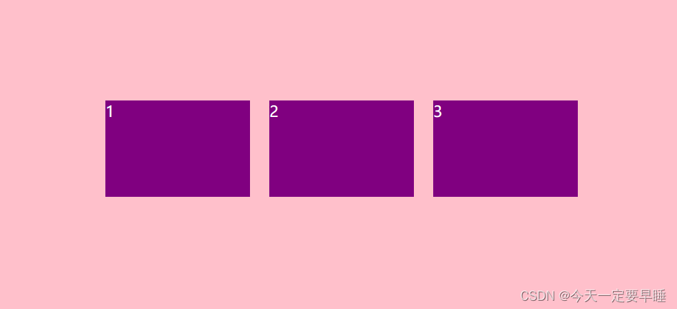
1 实现 左右孩子固定,中间孩子自适应的 效果
2 第一个孩子和第三个孩子占1份,第二个孩子占2份
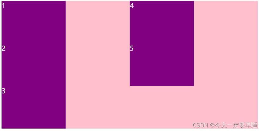
4.2 align-self属性和order 属性
1)说明
(1)align-self属性
设置子项自己在侧轴上的排列方式;
允许单个项目有与其他项目不一样的对齐方式,可覆盖 align-items 属性;
默认值为 auto,表示继承父元素的 align-items 属性,如果没有父元素,则等同于 stretch;
(2)order属性
定义子项目的排列顺序;
数值越小,排列越靠前(默认为0);
注意:和 z-index 不一样。
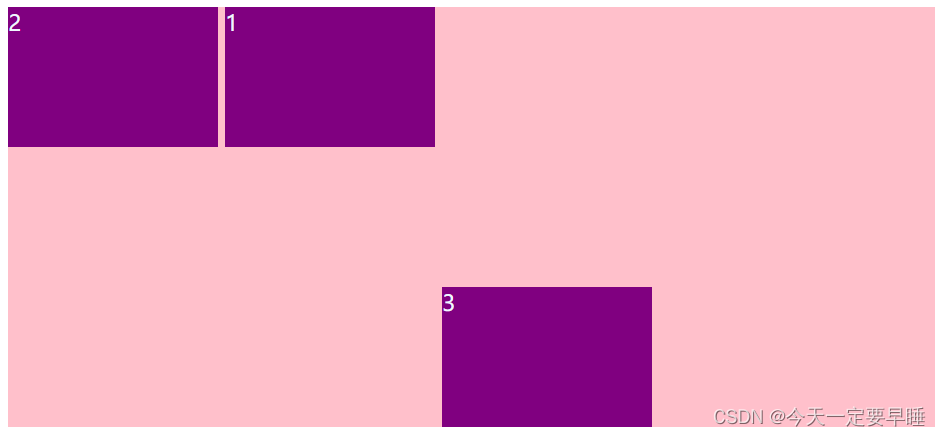
2)使用:只让3号盒子到底侧来,且让2号盒子排列在前
代码:
<!DOCTYPE html>
<html lang="en">

<head>
    <meta charset="UTF-8">
    <meta name="viewport" content="width=device-width, initial-scale=1.0">
    <meta http-equiv="X-UA-Compatible" content="ie=edge">
    <title>Document</title>
    <style>
        body {
            color: aliceblue;
        }
        div {
            display: flex;
            width: 80%;
            height: 300px;
            background-color: pink;
            /* 让三个子盒子沿着侧轴底侧对齐 :*/
            /* align-items: flex-end; */
            /* 我们想只让3号盒子到底侧来,就需要给3号盒子单独写样式,用align-self */
        }

        div span {
            width: 150px;
            height: 100px;
            background-color: purple;
            margin-right: 5px;
        }

        div span:nth-child(2) {
            /* order可以定义子孩子的排列顺序 */
            /* 默认是0   -1比0小,所以2号盒子在最前面 */
            order: -1;
        }

        div span:nth-child(3) {
            /* align-self 可以给单独某个子孩子设置排列位置 */
            align-self: flex-end;
        }
    </style>
</head>

<body>
    <div>
        <span>1</span>
        <span>2</span>
        <span>3</span>
    </div>
</body>

</html>效果:
4.3 常见3种子项属性的总结
| flex | 子项目所占的份数(可为数字和百分比) |
| align-self | 子项目自己在侧轴的排列方式 |
| order | 子项的排列顺序(数值越小,排列越靠前) |
五、背景线性渐变
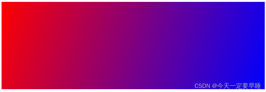
在css3中,可以使用background属性和linear-gradient()函数来实现背景线性渐变。
1)语法
background: linear-gradient(渐变方向, 颜色1, 颜色2, ...);
代码:
<!DOCTYPE html>
<html lang="en">

<head>
    <meta charset="UTF-8">
    <meta name="viewport" content="width=device-width, initial-scale=1.0">
    <meta http-equiv="X-UA-Compatible" content="ie=edge">
    <title>Document</title>
    <style>
        div {
            width: 600px;
            height: 200px;
            /* 背景渐变必须添加浏览器私有前缀 */
            /* background: -webkit-linear-gradient(left, red, blue); */
            /* background: -webkit-linear-gradient(red, blue); */
            background: -webkit-linear-gradient(left, red, blue);
        }
    </style>
</head>

<body>
    <div></div>
</body>

</html>效果:


 扫一扫
扫一扫


 1308
1308

 被折叠的 条评论
为什么被折叠?
被折叠的 条评论
为什么被折叠?
 到【灌水乐园】发言


