


介绍
Matplotlib 是一个 Python 的 2D绘图库,它以各种硬拷贝格式和跨平台的交互式环境生成出版质量级别的图形 [1] 。
通过 Matplotlib,开发者可以仅需要几行代码,便可以生成绘图,直方图,功率谱,条形图,错误图,散点图等
案例
from matplotlib import pyplot

pyplot.figure()
pyplot.plot([1, 0, 9], [4, 5, 6])
pyplot.show()

三层结构
容器层: 主要由Canvas、Figure、Axes组成。
Canvas是位于最底层的系统层,在绘图的过程中充当画板的角色,即放置画布(Figure)的工具。
Figure是Canvas上方的第一层,也是需要用户来操作的应用层的第一层,在绘图的过程中充当画布的角色。
Axes是应用层的第二层,在绘图的过程中相当于画布上的绘图区的角色。
Figure:指整个图形(可以通过plt.figure()设置画布的大小和分辨率等)
Axes(坐标系):数据的绘图区域
Axis(坐标轴):坐标系中的一条轴,包含大小限制、刻度和刻度标签
注意点:
一个figure(画布)可以包含多个axes(坐标系/绘图区),但是一个axes只能属于一个figure
一个axes(坐标系/绘图区)可以包含多个axis(坐标轴),包含两个即为2d坐标系,3个即为3d坐标系
辅助显示层
辅助显示层为Axes(绘图区)内的除了根据数据绘制出的图像以外的内容,主要包括Axes外观(facecolor)、边框线(spines)、坐标轴(axis)、坐标轴名称(axis label)、坐标轴刻度(tick)、坐标轴刻度标签(tick label)、网格线(grid)、图例(legend)、标题(title)等内容。
该层的设置可使图像显示更加直观更加容易被用户理解,但又不会对图像产生实质的影响。
图像层
图像层指Axes内通过plot、scatter、bar、histogram、pie等函数根据数据绘制出的图像。
总结
Canvas(画板)位于最底层,用户一般接触不到
Figure(画布)建立在Canvas之上
Axes(绘图区)建立在Figure之上
坐标轴(axis)、图例(legend)等辅助显示层以及图像层都是建立在Axes之上
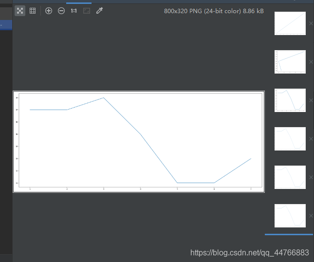
折线图
from matplotlib import pyplot

# 创建画布
pyplot.figure()
# 绘制图像
pyplot.plot([1, 2, 3, 4, 5, 6, 7], [17, 17, 18, 15, 11, 11, 13])
# 显示图像
pyplot.show()

设置画布属性和图片保存
def figure(num=None,  # autoincrement if None, else integer from 1-N
           figsize=None,  # defaults to rc figure.figsize
           dpi=None,  # defaults to rc figure.dpi
           facecolor=None,  # defaults to rc figure.facecolor
           edgecolor=None,  # defaults to rc figure.edgecolor
           frameon=True,
           FigureClass=Figure,
           clear=False,
           **kwargs
           ):
num :整型或者字符串,可选参数,默认:None。
- 如果不提供该参数,一个新的画布(figure)将被创建而且画布数量将会增加。
- 如果提供该参数,带有id的画布是已经存在的,激活该画布并返回该画布的引用。
- 如果这个画布不存在,创建并返回画布实例。
- 如果num是字符串,窗口标题将被设置为该图的数字。
figsize:整型元组,可选参数 ,默认:None。每英寸的宽度和高度。如果不提供,默认值是figure.figsize。
dpi:整型,可选参数,默认:None。每英寸像素点。如果不提供,默认是figure.dpi。
facecolor:背景色。如果不提供,默认值:figure.facecolor。
edgecolor:边界颜色。如果不提供,默认值:figure.edgecolor。
framemon:布尔类型,可选参数,默认值:True。如果是False,禁止绘制画图框。
FigureClass:源于matplotlib.figure.Figure的类。(可选)使用自定义图实例。
clear:布尔类型,可选参数,默认值:False。如果为True和figure已经存在时,这是清理掉改图。
# 创建画布
pyplot.figure(figsize=(20, 8), dpi=40)
# 绘制图像
pyplot.plot([1, 2, 3, 4, 5, 6, 7], [17, 17, 18, 15, 11, 11, 13])
# 保存图像
pyplot.savefig("test_plot.png")
# 显示图像
pyplot.show()

注意:pyplot.show()会释放figure资源,如果在显示图像之后保存图片只能保存空图片
增加图形信息
import random
import matplotlib.pyplot as plt

# 准备数据x,y
x = range(60)
y_shanghai = [random.uniform(15, 18) for i in x]
y_beijing = [random.uniform(15, 18) for i in x]
# 创建画布
plt.figure(figsize=(20, 8), dpi=80)

# 绘制图像
# 八种颜色 b:blue   g:green    r:red   c:cyan   m:magenta   y:yellow  k:black  w:white
# 四种线形 - 实线; -- 虚线; -.  点实线  : 点虚线
plt.plot(x, y_shanghai, color="r", linestyle="--", label="上海")
plt.plot(x, y_beijing, color="b", label="北京")
# 显示图例(结合上方的label)
# best;upper right;upper left;lower left;lower right;right;center left;center right;lower center;upper center;center
plt.legend(loc="upper center")

# 显示中文标签
plt.rcParams['font.sans-serif'] = ['SimHei']
plt.rcParams['axes.unicode_minus'] = False

# 修改x,y刻度,标签
x_label = ["11点{}分".format(i) for i in x]
plt.xticks(x[::5], x_label[::5])
plt.yticks(range(10, 30, 5))

# 添加网格显示
plt.grid(True, linestyle="--", alpha=0.5)

# 添加描述信息
plt.xlabel("时间")z
plt.ylabel("温度")
plt.title("北京,上海中午11点到12点之间的温度变化")

# 显示图像
plt.show()

多个绘图区
import random
import matplotlib.pyplot as plt

# 准备数据x,y
x = range(60)
y_shanghai = [random.uniform(15, 18) for i in x]
y_beijing = [random.uniform(15, 18) for i in x]
# 创建画布
# plt.figure(figsize=(20, 8), dpi=80)
figure, axes = plt.subplots(nrows=1, ncols=2, figsize=(20, 8), dpi=80)

# 绘制图像
# 八种颜色 b:blue   g:green    r:red   c:cyan   m:magenta   y:yellow  k:black  w:white
# 四种线形 - 实线; -- 虚线; -.  点划线  : 点虚线
axes[0].plot(x, y_shanghai, color="r", linestyle="--", label="上海")
axes[1].plot(x, y_beijing, color="b", label="北京")
# 显示图例(结合上方的label)
axes[0].legend(loc="upper center")
axes[1].legend(loc="upper center")

# 显示中文标签
plt.rcParams['font.sans-serif'] = ['SimHei']
plt.rcParams['axes.unicode_minus'] = False

# 修改x,y刻度,标签
x_label = ["11点{}分".format(i) for i in x]
axes[0].set_xticks(x[::5])
axes[0].set_xticklabels(x_label[::5])
axes[0].set_yticks(range(10, 30, 5))
axes[1].set_xticks(x[::5])
axes[1].set_xticklabels(x_label[::5])
axes[1].set_yticks(range(10, 30, 5))

# 添加网格显示
axes[0].grid(True, linestyle="--", alpha=0.5)
axes[1].grid(True, linestyle="--", alpha=0.5)

# 添加描述信息
axes[0].set_xlabel("时间")
axes[0].set_ylabel("温度")
axes[0].set_title("上海中午11点到12点之间的温度变化")
axes[1].set_xlabel("时间")
axes[1].set_ylabel("温度")
axes[1].set_title("北京中午11点到12点之间的温度变化")

# 显示图像
plt.show()

结合数学表达式
import matplotlib.pyplot as plt
import numpy as np

# 准备x,y数据
x = np.linspace(-1, 1, 1000)
y = 2 * x * x

# 创建画布
plt.figure(figsize=(20, 8), dpi=80)

# 绘制图像
plt.plot(x, y)

# 添加网格
plt.grid(True, linestyle="--", alpha=0.5)

# 显示
plt.show()

散点图
import matplotlib.pyplot as plt

x = [225.98, 247.07, 253.14, 457.85, 241.58, 301.01,  20.67, 288.64,
       163.56, 120.06, 207.83, 342.75, 147.9 ,  53.06, 224.72,  29.51,
        21.61, 483.21, 245.25, 399.25, 343.35]

y = [196.63, 203.88, 210.75, 372.74, 202.41, 247.61,  24.9 , 239.34,
       140.32, 104.15, 176.84, 288.23, 128.79,  49.64, 191.74,  33.1 ,
        30.74, 400.02, 205.35, 330.64, 283.45]

plt.figure(figsize=(20, 8), dpi=80)
plt.scatter(x, y)
plt.show()

柱状图
import matplotlib.pyplot as plt


# 准备数据
movie_names = ['雷神3:诸神黄昏','正义联盟','东方快车谋杀案','寻梦环游记','全球风暴', '降魔传','追捕','七十七天','密战','狂兽','其它']
tickets = [73853,57767,22354,15969,14839,8725,8716,8318,7916,6764,52222]

# 创建画布
plt.figure(figsize=(20, 8), dpi=80)

# 绘制柱状图
x_ticks = range(len(movie_names))
plt.bar(x_ticks, tickets, color=['b','r','g','y','c','m','y','k','c','g','b'])

plt.rcParams["font.sans-serif"] = ["SimHei"]
plt.rcParams["axes.unicode_minus"] = True

# 修改x的刻度
plt.xticks(x_ticks, movie_names)

# 添加标题
plt.title("电影票房收入")

# 添加网格
plt.grid(linestyle="--", alpha=0.5)

# 显示图像
plt.show()

import matplotlib.pyplot as plt


# 1、准备数据
movie_names = ['雷神3:诸神黄昏','正义联盟','寻梦环游记']

first_day = [10587.6,10062.5,1275.7]
first_weekend=[36224.9,34479.6,11830]

# 创建画布
plt.figure(figsize=(20, 8), dpi=80)

# 绘制柱状图
x_ticks = range(len(movie_names))
plt.bar(x_ticks, first_day, color='r', width=0.2, label="首日票房")
plt.bar([x_tick+0.2 for x_tick in x_ticks], first_weekend, color='c', width=0.2, label="首周票房")
plt.legend()

plt.rcParams["font.sans-serif"] = ["SimHei"]
plt.rcParams["axes.unicode_minus"] = True

# 修改x的刻度
plt.xticks([x_tick+0.1 for x_tick in x_ticks], movie_names)

# 添加标题
plt.title("电影票房收入")

# 添加网格
plt.grid(linestyle="--", alpha=0.5)

# 显示图像
plt.show()

直方图
import matplotlib.pyplot as plt

# 准备数据
time = [131,  98, 125, 131, 124, 139, 131, 117, 128, 108, 135, 138, 131, 102, 107, 114, 119, 128, 121, 142, 127, 130, 124, 101, 110, 116, 117, 110, 128, 128, 115,  99, 136, 126, 134,  95, 138, 117, 111,78, 132, 124, 113, 150, 110, 117,  86,  95, 144, 105, 126, 130,126, 130, 126, 116, 123, 106, 112, 138, 123,  86, 101,  99, 136,123, 117, 119, 105, 137, 123, 128, 125, 104, 109, 134, 125, 127,105, 120, 107, 129, 116, 108, 132, 103, 136, 118, 102, 120, 114,105, 115, 132, 145, 119, 121, 112, 139, 125, 138, 109, 132, 134,156, 106, 117, 127, 144, 139, 139, 119, 140,  83, 110, 102,123,107, 143, 115, 136, 118, 139, 123, 112, 118, 125, 109, 119, 133,112, 114, 122, 109, 106, 123, 116, 131, 127, 115, 118, 112, 135,115, 146, 137, 116, 103, 144,  83, 123, 111, 110, 111, 100, 154,136, 100, 118, 119, 133, 134, 106, 129, 126, 110, 111, 109, 141,120, 117, 106, 149, 122, 122, 110, 118, 127, 121, 114, 125, 126,114, 140, 103, 130, 141, 117, 106, 114, 121, 114, 133, 137,  92,121, 112, 146,  97, 137, 105,  98, 117, 112,  81,  97, 139, 113,134, 106, 144, 110, 137, 137, 111, 104, 117, 100, 111, 101, 110,105, 129, 137, 112, 120, 113, 133, 112,  83,  94, 146, 133, 101,131, 116, 111,  84, 137, 115, 122, 106, 144, 109, 123, 116, 111,111, 133, 150]

# 创建画布
plt.figure(figsize=(20, 8), dpi=80)

# 绘制直方图
distance = 2
group_num = int(max(time)-min(time) / distance)

# 默认显示的是频数,使用density是频率
plt.hist(time, bins=group_num, density=True)

# 修改x轴刻度
plt.xticks(range(min(time), max(time)+2, distance))

# 添加网格
plt.grid(linestyle="--", alpha=0.5)

# 显示图像
plt.show()

hist参数详解:https://blog.csdn.net/ToYuki_/article/details/104114925
饼图
import matplotlib.pyplot as plt

# 准备数据
movie_name = ['雷神3:诸神黄昏','正义联盟','东方快车谋杀案','寻梦环游记','全球风暴','降魔传','追捕','七十七天','密战','狂兽','其它']
place_count = [60605,54546,45819,28243,13270,9945,7679,6799,6101,4621,20105]

# 准备画布
plt.figure(figsize=(20, 8), dpi=80)

plt.rcParams["font.sans-serif"] = ["SimHei"]
plt.rcParams["axes.unicode_minus"] = True
# 绘制饼图,autopct为显示格式
plt.pie(place_count, labels=movie_name, colors=['b','r','g','y','c','m','y','k','c','g','y'], autopct="%1.2f%%")
plt.legend()

# 为了让饼图显示圆形,保证长宽一致
plt.axis('equal')

# 显示
plt.show()

总结


 621
621

 被折叠的 条评论
为什么被折叠?
被折叠的 条评论
为什么被折叠?
 到【灌水乐园】发言


