


一、实现目标
点击切换主题按钮后,页面中的字体颜色、背景颜色、主颜色等发生切换。
二、设计步骤
- 新建ets文件,配置主题色,并导出获取主题色的方法,参数为boolean值,表示是否获取暗黑主题色
// 定义主题类型
type ThemeType = {
  type: string,
  primary: number,
  bgColor: number,
  overlay: number,
  fontColor: number
}

// 白天模式配置
const lightTheme = {
  type: "light",
  primary: 0xEE5500,
  bgColor: 0xEFEFEF,
  overlay: 0xFFFFFF,
  fontColor: 0x333333
}

// 黑夜模式配置
const darkTheme = {
  type: "dark",
  primary: 0xe92c95,
  bgColor: 0x333333,
  overlay: 0x141414,
  fontColor: 0xFFFFFF
}

// 导出主题
export type Theme = ThemeType
// 获取颜色数据
export const getTheme = (isDark: boolean) => isDark ? darkTheme : lightTheme
以上代码的作用是配置主题色并将类型和获取主题色方法导出,方便组件内使用
-
在@Entry组件中,通过@Provide为后代组件提供getTheme()方法获取的主题色数据
import TopBar from "../views/TopBar" import {Theme, getTheme } from "../common/utils/theme" @Entry @Component struct Index { // 提供主题色数据 @Provide("theme") theme: Theme = getTheme(false) build() { Column() { // ... } } } -
创建ToolBar组件,组件中包含logo、标题和切换主题的按钮。当切换主题按钮被点击时,修改theme数据为switch打开状态对应的主题色数据
import { Theme, getTheme } from "../common/utils/theme" @Component struct ToolBar { @Consume("theme") theme: Theme build() { Row() { Row() { Image($r("app.media.img")) .width(30) .height(30) Text("BLOG") .fontWeight(700) .fontColor(0xFFFFFF) } Text("菠萝狂人的分享园") .fontColor(0xFFFFFF) Toggle({ type: ToggleType.Switch, isOn: this.theme.type === "dark" }) .type(ButtonType.Normal) .onClick((checked: boolean) => this.theme = getTheme(checked)) } .justifyContent(FlexAlign.SpaceBetween) .width("100%") .padding(8) .backgroundColor(this.theme.primary) } } export default ToolBar -
回到@Entry组件中,导入并在build()中声明ToolBar组件
import ToolBar from "../views/ToolBar" import {Theme, getTheme } from "../common/utils/theme" @Entry @Component struct Index { @Provide("theme") theme: Theme = getTheme(false) build() { Column() { ToolBar() Row() { Text("Hello World!") .fontColor(this.theme.fontColor) } .width("80%") .backgroundColor(this.theme.overlay) .justifyContent(FlexAlign.Center) .padding(40) .borderRadius(10) .margin(20) } .backgroundColor(this.theme.bgColor) .animation({ duration: 300, tempo: 1 }) .alignItems(HorizontalAlign.Center) .height("100%") } } -
最后,通过@Consume引入@Entry组件的主题色数据,当需要组件样式适配主题时,使用相应属性的颜色
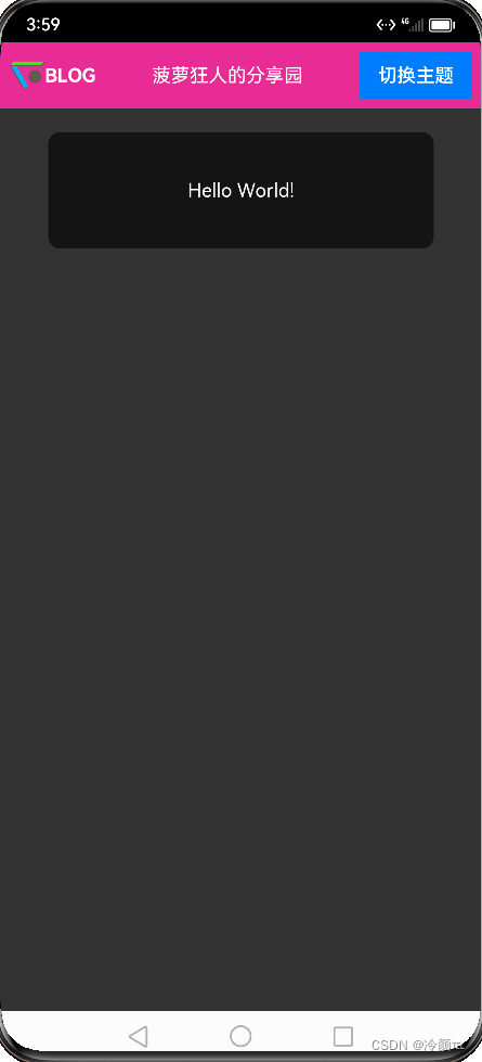
三、 实现效果
点击按钮前:

点击按钮后:
四、总结
我通过利用ArkTS中的@Provide、@Consume、@State等内容,简单的实现了应用内主题切换的效果。目前正在专注学习鸿蒙开发,后续会继续分享制作博客的点滴


 1948
1948


 被折叠的 条评论
为什么被折叠?
被折叠的 条评论
为什么被折叠?
 到【灌水乐园】发言


