


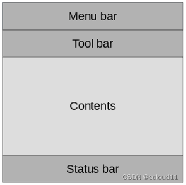
ui控件
Qt Quick控件用于创建由标准化组件(如按钮、标签、滑块等)构建的用户界面。
- QtQuick.Controls:基本控件。
- QtQuick.Templates:为控件提供行为化的、非可化视的基本类型。
- QtQuick.Controls.Imagine:为Imagine主题风格提供支持。
- QtQuick.Controls.Material:为Material主题风格提供支持。
- QtQuick.Controls.Universal:为Universal主题风格提供支持。
- Qt.labs.platform:支持常用对话框,如文件、颜色等,以及系统图标和标准路径。
使用qml创建一个ApplicationWindow程序排版与GUI程序的QMainWindow类似。
我们主要要实现一个图片查看器的例子。
添加工具栏。在工具栏内部,添加了一个Flow元素,里面放置了一个工具按钮。
header: ToolBar {
	Flow {
		anchors.fill: parent
		ToolButton {
		text: qsTr("Open")
		icon.source: "images/open.png"
		onClicked: fileOpenDialog.open()
	}
}
}
fileOpenDialog元素来自Qt.labs.platform模块。文件对话框可用于打开或保存文件。
    Platform.FileDialog{
        id:fileOpenDialog
        title: "Select an image file"
        folder: StandardPaths.writableLocation(StandardPaths.DocumentsLocation)
        nameFilters: [
            "Image files (*.png *.jpg)"
        ]
        onAccepted: {
            image.source = fileOpenDialog.file
        }
    }
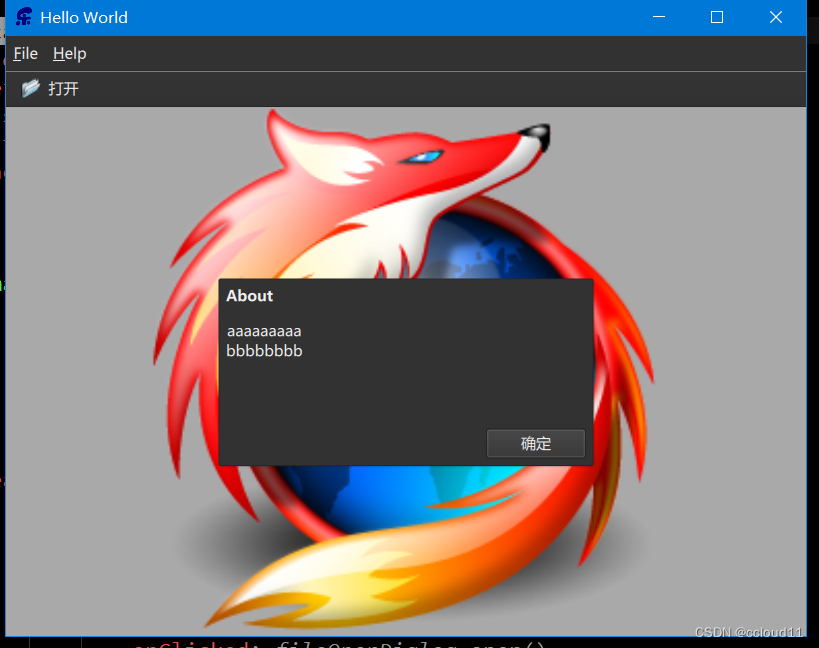
添加菜单栏。
    menuBar: MenuBar{
        Menu{
            title: "&File"
            MenuItem{
                text:"&Open..."
                icon.source:"images/open.png"
                onTriggered: fileOpenDialog.open()
            }
        }

        Menu{
            title: "&Help"
            MenuItem{
                text:"&About..."
                onTriggered: aboutDialog.open()
            }
        }
    }
完整代码
import QtQuick
import QtQuick.Controls
import Qt.labs.platform as Platform

ApplicationWindow  {
    width: 640
    height: 480
    visible: true
    title: qsTr("Hello World")
    background: Rectangle{
        color:"darkGray"
    }

    Image {
        id: image
        anchors.fill: parent
        fillMode: Image.PreserveAspectFit
        asynchronous: true
    }

    header: ToolBar{
        Flow{
            anchors.fill: parent
            ToolButton{
                text:"打开"
                icon.source:"images/open.png"
                onClicked: fileOpenDialog.open()
            }
        }
    }

    Platform.FileDialog{
        id:fileOpenDialog
        title: "Select an image file"
        folder: StandardPaths.writableLocation(StandardPaths.DocumentsLocation)
        nameFilters: [
            "Image files (*.png *.jpg)"
        ]
        onAccepted: {
            image.source = fileOpenDialog.file
        }
    }

    menuBar: MenuBar{
        Menu{
            title: "&File"
            MenuItem{
                text:"&Open..."
                icon.source:"images/open.png"
                onTriggered: fileOpenDialog.open()
            }
        }

        Menu{
            title: "&Help"
            MenuItem{
                text:"&About..."
                onTriggered: aboutDialog.open()
            }
        }
    }

    Dialog{
        id: aboutDialog
        width: 300;height:150
        anchors.centerIn: parent
        title:"About"
        Label{
            horizontalAlignment: Text.AlignHCenter
            text:"aaaaaaaaa\nbbbbbbbb"
        }
        standardButtons: Platform.StandardButton.Ok

    }
}
移动版风格
主要是要实现一个类似手机版的图片查看器。
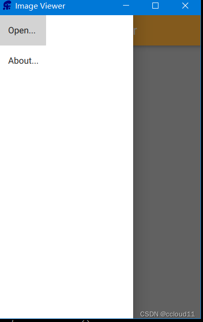
首先,需要改变样式。
QQuickStyle::setStyle("Material");
用侧滑菜单(Drawer)替换菜单。
    Drawer{
        id: drawer
        width: parent.width/3*2
        height: parent.height

        ListView{
            anchors.fill: parent

            model: ListModel{
                ListElement{
                    text: "Open..."
                    triggered:function(){fileOpenDialog.open();}
                }

                ListElement{
                    text: "About..."
                    triggered:function(){aboutDialog.open();}
                }
            }

            delegate: ItemDelegate{
                text:model.text
                highlighted: ListView.isCurrentItem
                onClicked: {
                    drawer.close()
                    model.triggered()
                }
            }
        }
    }
完整代码
import QtQuick
import QtQuick.Controls
import Qt.labs.platform as Platform
import QtQuick.Controls.Material

ApplicationWindow  {
    width: 320
    height: 480
    visible: true
    title: qsTr("Image Viewer")
    background: Rectangle{
        color:"darkGray"
    }

    Image {
        id: image
        anchors.fill: parent
        fillMode: Image.PreserveAspectFit
        asynchronous: true
    }

    header: ToolBar{
        Material.background: Material.Orange

        ToolButton{
            icon.source: "images/baseline-menu-24px"
            onClicked: drawer.open()
        }

        Label{
            text:"Image Viewer"
            font.pixelSize: 20
            anchors.centerIn: parent
        }
    }

    Platform.FileDialog{
        id:fileOpenDialog
        title: "Select an image file"
        nameFilters: [
            "Image files (*.png *.jpg)"
        ]
        onAccepted: {
            image.source = fileOpenDialog.file
        }
    }

    Drawer{
        id: drawer
        width: parent.width/3*2
        height: parent.height

        ListView{
            anchors.fill: parent

            model: ListModel{
                ListElement{
                    text: "Open..."
                    triggered:function(){fileOpenDialog.open();}
                }

                ListElement{
                    text: "About..."
                    triggered:function(){aboutDialog.open();}
                }
            }

            delegate: ItemDelegate{
                text:model.text
                highlighted: ListView.isCurrentItem
                onClicked: {
                    drawer.close()
                    model.triggered()
                }
            }
        }
    }

    Dialog{
        id: aboutDialog
        width: 300;height:150
        anchors.centerIn: parent
        title:"About"
        Label{
            horizontalAlignment: Text.AlignHCenter
            text:"aaaaaaaaa\nbbbbbbbb"
        }
        standardButtons: Platform.StandardButton.Ok

    }
}
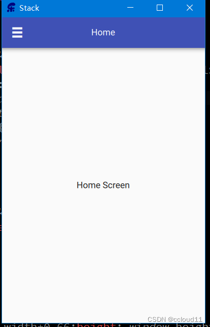
嵌套页面
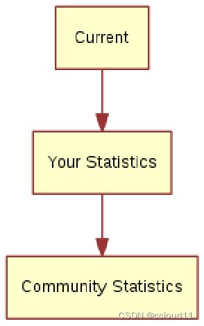
我们将创建一个页面树,可以通过上级页面访问下级页面。
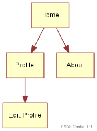
该用户界面的关键组件是StackView。它允许我们将页面放在一个堆栈(stack)上,当用户想要返回时,可以弹出(pop)该堆栈。
import QtQuick
import QtQuick.Window
import QtQuick.Controls

ApplicationWindow {
    id:window
    width: 320
    height: 480
    visible: true
    title: qsTr("Stack")

    header: ToolBar{
        ToolButton{
            text:stackView.depth>1?"\u25C0":"\u2630"
            font.pixelSize: Qt.application.font.pixelSize*1.6
            onClicked: {
                if(stackView.depth>1){
                    stackView.pop()
                }else{
                    drawer.open()
                }
            }
        }
        Label{
            text:stackView.currentItem.title
            anchors.centerIn: parent
        }

    }

    Drawer{
        id:drawer
        width: window.width*0.66;height: window.height

        Column{
            anchors.fill:parent

            ItemDelegate{
                text:"Profile"
                width: parent.width
                onClicked: {
                    stackView.push("Profile.qml")
                    drawer.close()
                }
            }
            ItemDelegate{
                text:"About"
                width: parent.width
                onClicked: {
                    stackView.push(aboutPage)
                    drawer.close()
                }
            }
        }
    }

    StackView{
        id :stackView
        anchors.fill : parent
        initialItem: Home{}
    }

    Component{
        id:aboutPage
        About{}
    }
}
这边贴出main.qml的代码,具体控件可以查看底部仓库代码链接。
并排界面
对于这个示例,我们创建了一个用户界面,该界面由三个页面组成,用户可以在其中切换。
该用户界面的关键组件是SwipeView。PageIndicator(底部的三个点)显示用户当前处于活动状态的页面,这有助于导航。
import QtQuick
import QtQuick.Window
import QtQuick.Controls

ApplicationWindow {
    id:window
    width: 320
    height: 480
    visible: true
    title: qsTr("sidebyside")

    SwipeView{
        id :swipeView
        anchors.fill : parent

        Home{

        }

        About{

        }

        EditProfile{

        }

        Profile{

        }
    }

    PageIndicator{
        anchors.bottom: parent.bottom
        anchors.horizontalCenter: parent.horizontalCenter

        currentIndex: swipeView.currentIndex
        count: swipeView.count
    }
}


 8278
8278


 被折叠的 条评论
为什么被折叠?
被折叠的 条评论
为什么被折叠?
 到【灌水乐园】发言


