


前言
👏CSS 实现六边形柱状图 速速来Get吧~
🥇文末分享源代码。记得点赞+关注+收藏!
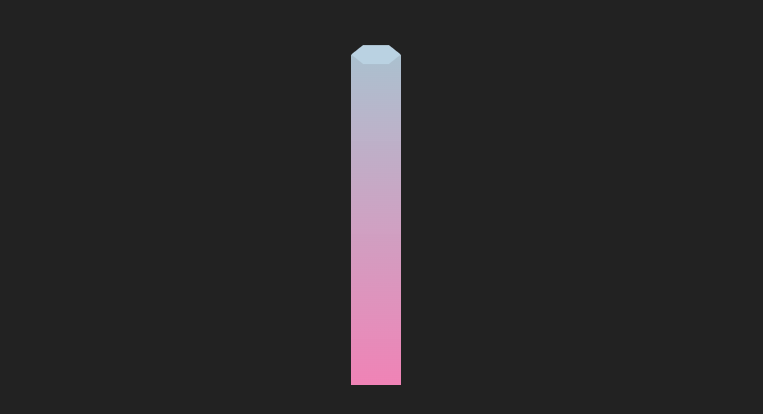
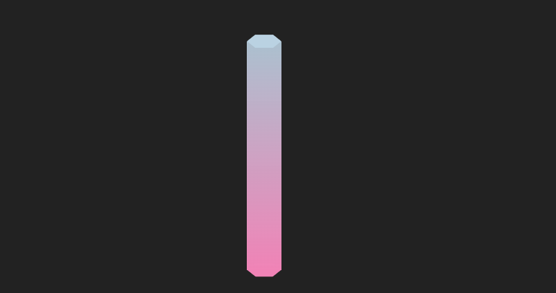
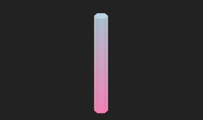
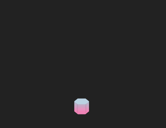
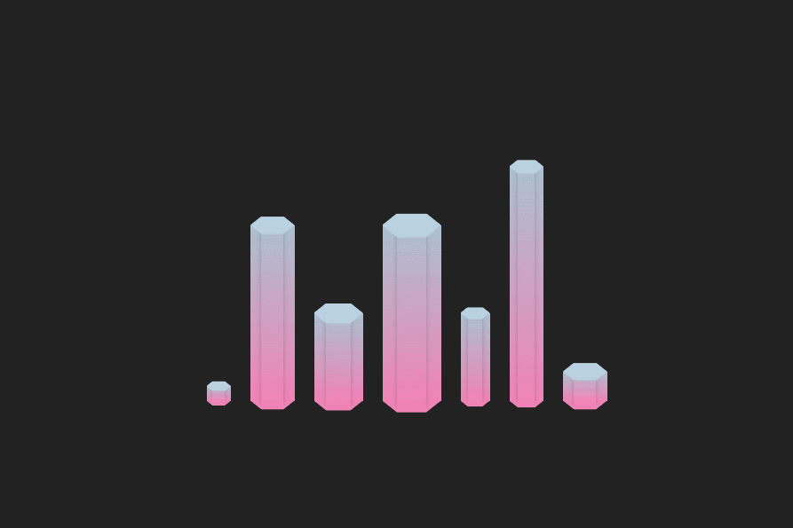
1.实现效果

2.实现步骤
- 定义全局css变量,柱状宽度为–w,最大高度为–h,柱形整体为渐变色,定义上部分颜色为 --bar-shape,下部分颜色为 --bar-bg
:root{
	/* 柱形宽度-全局 */
	 --w: 45px;
	 /* 柱形高度最大值 */
	 --h: 300px;
	 /* 柱形上部分颜色 */
	 --bar-shape: rgba(186, 210, 226, 0.9);
	/* 柱形下部分颜色 */
	 --bar-bg: #f083b6;
}
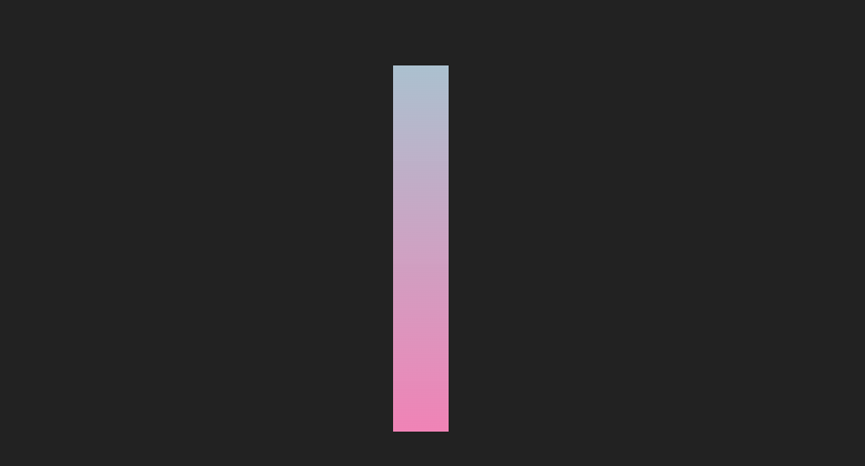
- 根据定义的变量,绘制一个矩形
<div class="bar">
	<span></span>
</div>
.bar{
	position: relative;
	width: var(--w);
	height: var(--height);
	background: linear-gradient(to top, var(--bar-bg), var(--bar-shape));
}
- 定义柱状顶部和底部的六边形颜色,顶部颜色为 --bar-top,底部颜色为 --bar-bg
:root{
	/* 柱形顶部六边形颜色 */
   --bar-top: rgb(186, 210, 226);
   /* 柱形下部分颜色+柱形底部六边形 */
    --bar-bg: #f083b6;
}
- 用clip-path裁剪出六边形,定义clip-path裁剪变量–path
:root{
	/* clip-path裁剪六边形 */
    --path: polygon(75% 0, 100% 50%, 75% 100%, 25% 100%, 0 50%, 25% 0);
}
clip-path:clip-path CSS 属性使用裁剪方式创建元素的可显示区域。区域内的部分显示,区域外的隐藏。
- 这里我们使用clip-path在线网站,在线拖拽出我们想要的形状
- 为该矩形添加前后伪元素,宽度为–w,高度为宽度的40%,用clip-path实现六边形
.bar::before,
.bar::after {
  content: "";
  position: absolute;
  width: var(--w);
  height: calc(var(--w) / 2.5);
  clip-path: var(--path);
  left: 0;
}
- 设置前伪元素的背景色,top为0,层级为2,置于最上方
.bar::before {
	 background: var(--bar-top);
	  top: 0;
	  /* 层级置于最上层 */
	  z-index: 2;
	  transform: translateY(-50%);
 }
- 设置后伪元素的背景色,bottom为0,层级为-1,置于最下方
.bar::after {
	 background: var(--bar-bg);
	 bottom: 0;
	 /* 层级置于最下层 */
	 z-index: -1;
	 transform: translateY(50%);
}
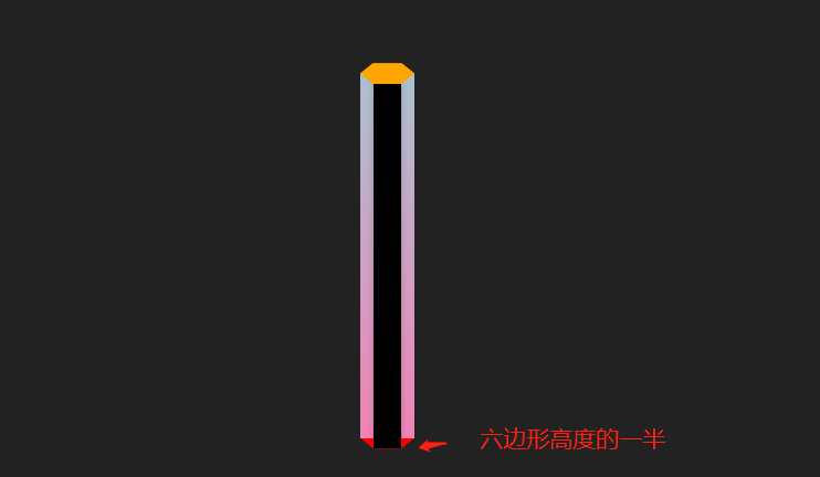
- 用box-shadow给该矩形添加阴影区域,宽度为–w的二分之一,高度设置为101%(保留1%的高度余出),设置absolute定位,bottom设置为底边六边形高度的二分之一,水平居中
<div class="bar">
	+ <span></span>
</div>
box-shadow:CSS box-shadow 属性用于在元素的框架上添加阴影效果。你可以在同一个元素上设置多个阴影效果,并用逗号将他们分隔开。该属性可设置的值包括阴影的 X 轴偏移量、Y 轴偏移量、模糊半径、扩散半径和颜色。
- 添加box-shadow
.bar span {
	 position: absolute;
    --d: calc(var(--w) / 2);
    --b: calc(var(--w) / -2.5 / 2);
    width: var(--d);
    height: 101%;
    left: calc(50% - var(--d) / 2);
    bottom: var(--b);
    box-shadow: 0px -5px 5px var(--bar-line);
}
- 设置hover事件,并添加过渡效果
.bar:hover {
	height: 100%;
}

.bar {
	+ transition: all 1s;
}
- 定义多个元素,为其设置不同的高度,宽度(颜色小伙伴们 可以自行调试哈),就完成啦
3.实现代码
<style>
 :root {
   /* 柱形上部分颜色 */
   --bar-shape: rgba(186, 210, 226, 0.9);
   /* 柱形顶部六边形颜色 */
   --bar-top: rgb(186, 210, 226);
   /* 柱形下部分颜色+柱形底部六边形 */
   --bar-bg: #f083b6;
   /* 柱形线条颜色 */
   --bar-line: rgba(0, 0, 0, 0.2);
   /* clip-path裁剪六边形 */
   --path: polygon(75% 0, 100% 50%, 75% 100%, 25% 100%, 0 50%, 25% 0);
   /* 柱形宽度-全局 */
   --w: 45px;
   /* 柱形高度最大值 */
   --h: 300px;
 }
 section {
   /* flex布局 */
   display: flex;
   align-items: flex-end;
   height: var(--h);
 }
 .bar {
   position: relative;
   width: var(--w);
   height: var(--height);
   margin-right: 20px;
   background: linear-gradient(to top, var(--bar-bg), var(--bar-shape));
   transition: all 1s;
 }
 .bar:hover {
   height: 100%;
 }
 .bar:last-child {
   margin-right: 0;
 }
 /* bar添加前后伪元素,设置为clip-path裁剪后的六边形 */
 .bar::before,
 .bar::after {
   content: "";
   position: absolute;
   width: var(--w);
   height: calc(var(--w) / 2.5);
   clip-path: var(--path);
   left: 0;
 }
 .bar::before {
   background: var(--bar-top);
   top: 0;
   /* 层级置于最上层 */
   z-index: 2;
   transform: translateY(-50%);
 }
 .bar::after {
   background: var(--bar-bg);
   bottom: 0;
   /* 层级置于最下层 */
   z-index: -1;
   transform: translateY(50%);
 }
 .bar span {
   position: absolute;
   --d: calc(var(--w) / 2);
   --b: calc(var(--w) / -2.5 / 2);
   width: var(--d);
   height: 101%;
   left: calc(50% - var(--d) / 2);
   bottom: var(--b);
   box-shadow: 0px -5px 5px var(--bar-line);
 }
</style>
<body>
 <section>
   <div class="bar" style="--height: 5%; --w: 25px">
     <span></span>
   </div>
   <div class="bar" style="--height: 60%">
     <span></span>
   </div>
   <div class="bar" style="--height: 30%; --w: 50px">
     <span></span>
   </div>
   <div class="bar" style="--height: 60%; --w: 60px">
     <span></span>
   </div>
   <div class="bar" style="--height: 30%; --w: 30px">
     <span></span>
   </div>
   <div class="bar" style="--height: 80%; --w: 35px">
     <span></span>
   </div>
   <div class="bar" style="--height: 10%; --w: 45px">
     <span></span>
   </div>
 </section>
</body>


 193
193


 被折叠的 条评论
为什么被折叠?
被折叠的 条评论
为什么被折叠?
 到【灌水乐园】发言


