


数据准备
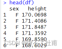
假设有200个男性和200个女性的身高数据(这里使用随机函数生成)。
#数据准备
set.seed(96)
df = data.frame(
sex = factor(rep(c("F", "M"), each=200)),
height = c(rnorm(200, 170), rnorm(200, 165)))
head(df)
基础语法
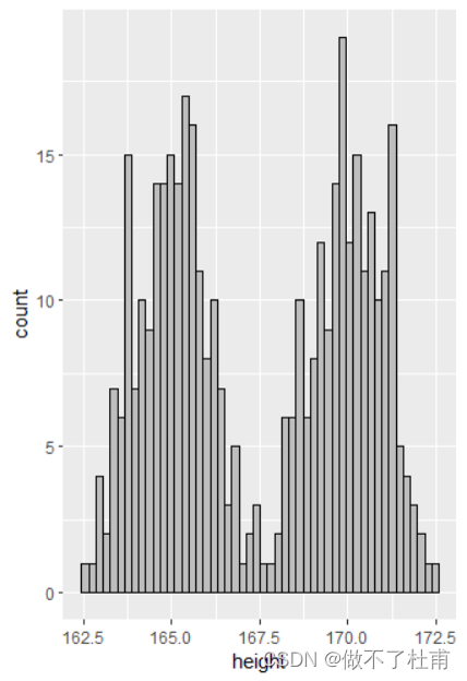
p = ggplot(df,aes(x = height))
p + geom_histogram(bins = 50,color = "black", fill = "gray")
其中:
bins:用于规定 总柱体的条数;
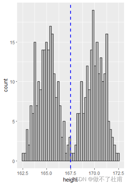
添加平均值线
#添加平均值线
p + geom_histogram(bins = 50,color = "black", fill = "gray") +
geom_vline(aes(xintercept=mean(height)),
color="blue", linetype="dashed", size=1)
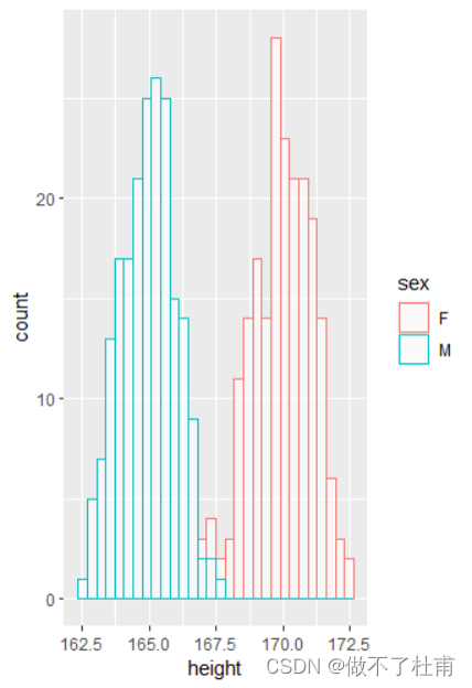
两组数据共图
按不同的性别按不同颜色显示:
#按不同性别不同颜色显示
p + geom_histogram(aes(color = sex), fill = "white",alpha = 0.6)
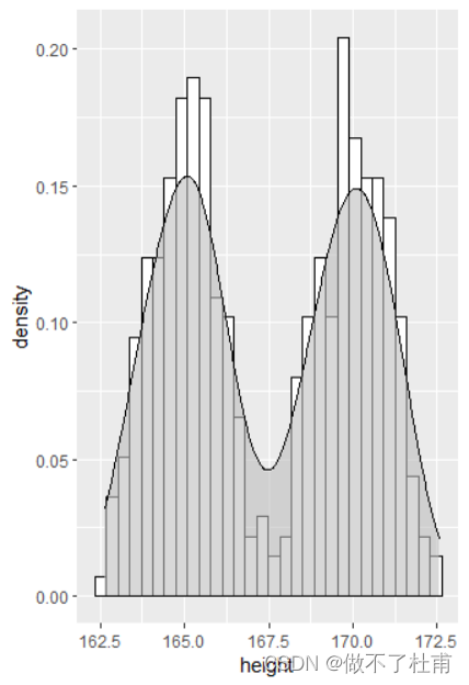
添加密度曲线
添加总的曲线
#添加总的频率线
p + geom_histogram(aes(y=..density..), colour="black", fill="white") +
geom_density(alpha=0.6,fill = "grey")
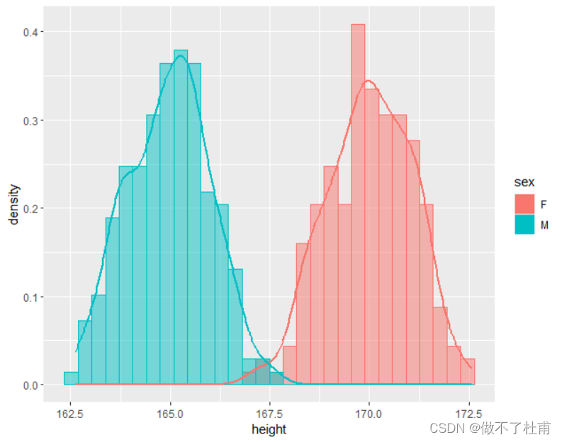
分组添加曲线
#按性别添加频率线
p + geom_histogram(aes(y=..density.., color = sex, fill = sex),
alpha=0.5, position="identity")+
geom_density(aes(color = sex), size = 1)
至此完成基本的六种科研常用作图的绘制...


 1066
1066


 被折叠的 条评论
为什么被折叠?
被折叠的 条评论
为什么被折叠?
 到【灌水乐园】发言


