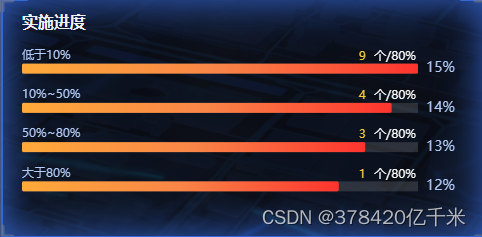
echarts条形图两边带文字

效果图:
在这里插入图片描述
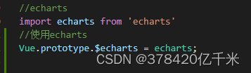
首先确保echarts安装和在main.js中挂载
在这里插入图片描述

代码如下:

<template>
  <div ref="HistogramMiddle"></div>
</template>

<script>
    export default {
    methods: {
        initHistogram() {
      const myChartColumn = this.$echarts.init(this.$refs.HistogramMiddle);
      const ydata = [
        "大于80%",
        "50%~80%",
        "10%~50%",
        "低于10%",
     
      ];
      const xdata = [12, 13, 14, 15];
      myChartColumn.setOption({
        tooltip: {
          trigger: "axis",
        },
        grid: {
          left: "10",
          right: "60",
          bottom: "0",
          top: "15",
          containLabel: false,
        },
        xAxis: {
          type: "value",
          show: false,
        },
        yAxis: [
          {
            type: "category",
            data: ydata,
            axisLine: {
              show: false,
            },
            axisTick: {
              show: false,
            },
            show:false,
            
          },
          {
            type: "category",
            axisLine: {
              show: false,
            },
            axisTick: {
              show: false,
            },
            axisLabel: {
              show: true,
              inside: false,
              textStyle: {
                color: "#b3ccf8",
                fontSize: "14",
                fontFamily: "PingFangSC-Regular",
              },
              formatter: function (val) {
                return `${val}%`;
              },
            },
            splitArea: {
              show: false,
            },
            splitLine: {
              show: false,
            },
            data: xdata,
          },
          // 右侧label
          {
            //左侧柱状图的Y轴
            gridIndex: 0,//y轴所在的 grid 的索引
            splitLine: 'none',
            axisTick: 'none',
            axisLine: 'none',
            data: [9, 4, 3, 1],
            inverse: true,
            axisLabel: {
              show: true,
              verticalAlign: 'bottom',
              align: 'right',
              padding: [0, 10, 5, 0],
              textStyle: {
                color: '#fff',
                fontSize: '14',
              },
              formatter: function (value) {
                return '{x|' + value + '}  {y|'+ '个/' + "80%}"
              },
              rich: {
                y: {
                  color: '#fff',
                  fontSize: 12
                },
                x: {
                  color: '#f6cf42',
                  fontSize: 12
                }
              }
            }
          }
        ],
        series: [
          {
            type: "bar",
            zlevel: 2,
            barWidth: "10px",
            animationDuration: 1500,
            animationEasing: "cubicOut",
            showBackground: true,
            label: {
              normal: {
                color: "#b3ccf8",
                show: true,
                position: [0, "-14px"],
                textStyle: {
                  fontSize: 12,
                },
                formatter: function (a) {
                  return a.name;
                },
              },
            },
            itemStyle: {
              emphasis: {
                barBorderRadius: 2,
              },
              normal: {
                barBorderRadius: 2,
                color: new this.$echarts.graphic.LinearGradient(0, 0, 1, 0, [
                  { offset: 0, color: "#ffaa3a" },
                  { offset: 0.5, color: "#f98547" },
                  { offset: 1, color: "#fe342e" },
                ]),
              },
            },
            data: xdata,
          },
        ],
      });
    },
    }
    }
</script>

<style lang="scss" scoped>
</style>
  • 0
    点赞
  • 1
    收藏
    觉得还不错? 一键收藏
  • 0
    评论
要生成一个echarts条形图,你可以使用以下代码作为参考: ```html <!DOCTYPE html> <html> <head> <meta charset="utf-8"> <title>条形图</title> <!-- 引入 echarts.js --> <script src="../js/echarts.min.js"></script> </head> <body> <!-- 为ECharts准备一个具备大小(宽高)的Dom --> <div id="main" style="width: 600px;height:400px;"></div> <script type="text/javascript"> // 基于准备好的dom,初始化echarts实例 var myChart = echarts.init(document.getElementById('main')); // 指定图表的配置项和数据 var option = { title: { text: 'ECharts入门示例', }, tooltip: {}, legend: { data: \['销量'\] }, xAxis: { data: \["麦当劳", "肯德基", "星巴克", "华莱士"\] }, yAxis: {}, series: \[{ name: '销量', type: 'bar', data: \[5, 20, 36, 10\] }\] }; // 使用刚指定的配置项和数据显示图表。 myChart.setOption(option); </script> </body> </html> ``` 以上代码会生成一个默认的条形图,其中x轴表示不同的商家,y轴表示销量。你可以根据需要修改x轴的数据和y轴的数据来适应你的需求。 #### 引用[.reference_title] - *1* [ECharts——条形图](https://blog.csdn.net/qq_41422448/article/details/103932319)[target="_blank" data-report-click={"spm":"1018.2226.3001.9630","extra":{"utm_source":"vip_chatgpt_common_search_pc_result","utm_medium":"distribute.pc_search_result.none-task-cask-2~all~insert_cask~default-1-null.142^v91^insert_down1,239^v3^insert_chatgpt"}} ] [.reference_item] - *2* [【大数据可视化系列一】echarts自动轮播镂空条形图](https://blog.csdn.net/weixin_53741561/article/details/126854452)[target="_blank" data-report-click={"spm":"1018.2226.3001.9630","extra":{"utm_source":"vip_chatgpt_common_search_pc_result","utm_medium":"distribute.pc_search_result.none-task-cask-2~all~insert_cask~default-1-null.142^v91^insert_down1,239^v3^insert_chatgpt"}} ] [.reference_item] - *3* [echarts条形图](https://blog.csdn.net/qq_49732089/article/details/123356974)[target="_blank" data-report-click={"spm":"1018.2226.3001.9630","extra":{"utm_source":"vip_chatgpt_common_search_pc_result","utm_medium":"distribute.pc_search_result.none-task-cask-2~all~insert_cask~default-1-null.142^v91^insert_down1,239^v3^insert_chatgpt"}} ] [.reference_item] [ .reference_list ]

“相关推荐”对你有帮助么?

  • 非常没帮助
  • 没帮助
  • 一般
  • 有帮助
  • 非常有帮助
提交
评论
添加红包

请填写红包祝福语或标题

红包个数最小为10个

红包金额最低5元

当前余额3.43前往充值 >
需支付:10.00
成就一亿技术人!
领取后你会自动成为博主和红包主的粉丝 规则
hope_wisdom
发出的红包
实付
使用余额支付
点击重新获取
扫码支付
钱包余额 0

抵扣说明:

1.余额是钱包充值的虚拟货币,按照1:1的比例进行支付金额的抵扣。
2.余额无法直接购买下载,可以购买VIP、付费专栏及课程。

余额充值