提示: Pandas不能直接读取string,而只能读取文件对象。例如,文件对象可以利用以下代码抓取并生成: import requests, io response=requests.get(‘YOUR_LINK’) file_object = io.StringIO(response.content.decode(‘utf-8’)) import requests
import io
import pandas as pd
response = requests. get( 'https://pynative.com/wp-content/uploads/2019/01/company_sales_data.csv' )
file_object = io. StringIO( response. content. decode( 'utf-8' ) )
df = pd. read_csv( file_object)
print ( df)
import requests
import io
import pandas as pd
import matplotlib. pyplot as plt
response = requests. get( 'https://pynative.com/wp-content/uploads/2019/01/company_sales_data.csv' )
file_object = io. StringIO( response. content. decode( 'utf-8' ) )
df = pd. read_csv( file_object)
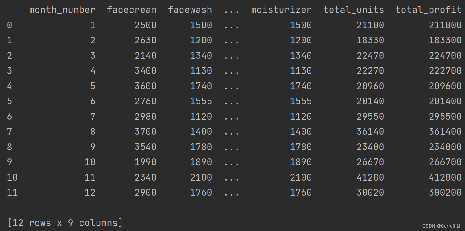
x = df[ 'month_number' ] . tolist( )
y = df[ 'total_profit' ] . tolist( )
plt. plot( x, y)
plt. xlabel( "Month number" )
plt. ylabel( "profit in dollar" )
plt. title( "Company profit per month" )
plt. ylim( ymin= 100000 , ymax= 500000 )
y_major_locator = plt. MultipleLocator( 100000 )
ax = plt. gca( )
ax. yaxis. set_major_locator( y_major_locator)
plt. show( )
import requests
import io
import pandas as pd
import matplotlib. pyplot as plt
response = requests. get( 'https://pynative.com/wp-content/uploads/2019/01/company_sales_data.csv' )
file_object = io. StringIO( response. content. decode( 'utf-8' ) )
df = pd. read_csv( file_object)
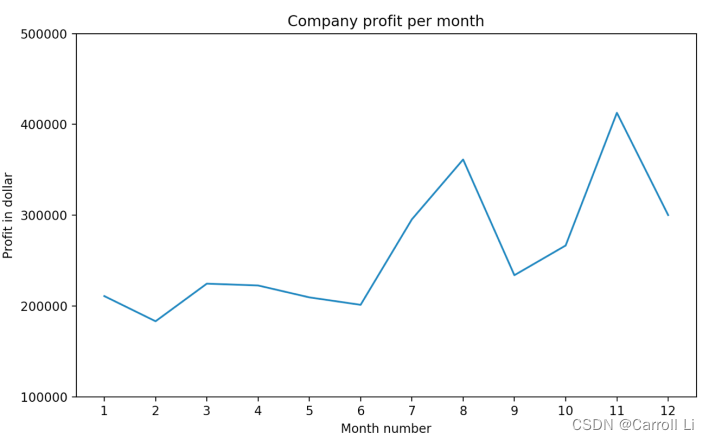
x = df[ 'month_number' ] . tolist( )
y = df[ 'total_profit' ] . tolist( )
plt. plot( x, y, color= 'r' , marker= 'o' , markerfacecolor= 'black' , linestyle= 'dashed' )
plt. xlabel( "Month number" )
plt. ylabel( "profit in dollar" )
plt. title( "Company Sales data of last year" )
plt. ylim( ymin= 100000 , ymax= 500000 )
y_major_locator = plt. MultipleLocator( 100000 )
x_major_locator = plt. MultipleLocator( 1 )
ax = plt. gca( )
ax. xaxis. set_major_locator( x_major_locator)
ax. yaxis. set_major_locator( y_major_locator)
plt. legend( ( 'profit data of last year' , ) , loc= 'lower right' )
plt. show( )
import requests
import io
import pandas as pd
import matplotlib. pyplot as plt
response = requests. get( 'https://pynative.com/wp-content/uploads/2019/01/company_sales_data.csv' )
file_object = io. StringIO( response. content. decode( 'utf-8' ) )
df = pd. read_csv( file_object)
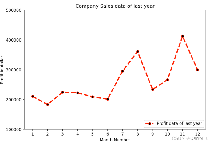
x = df[ 'month_number' ] . tolist( )
y1 = df. iloc[ : , 1 ] . tolist( )
y2 = df. iloc[ : , 2 ] . tolist( )
y3 = df. iloc[ : , 3 ] . tolist( )
y4 = df. iloc[ : , 4 ] . tolist( )
y5 = df. iloc[ : , 5 ] . tolist( )
y6 = df. iloc[ : , 6 ] . tolist( )
plt. plot( x, y1, marker= 'o' )
plt. plot( x, y2, marker= 'o' )
plt. plot( x, y3, marker= 'o' )
plt. plot( x, y4, marker= 'o' )
plt. plot( x, y5, marker= 'o' )
plt. plot( x, y6, marker= 'o' )
plt. xlabel( "Month number" )
plt. ylabel( "Sales units in number" )
plt. title( "Sales data" )
plt. ylim( ymax= 18000 )
x_major_locator = plt. MultipleLocator( 1 )
ax = plt. gca( )
ax. xaxis. set_major_locator( x_major_locator)
plt. legend( ( 'Face cream Sales Data' , 'Face Wash Sales Data' , 'ToothPaste Sales Data' ,
'BathingSoap Sales Data' , 'Shampoo Sales Data' , 'Moisturizer Sales Data' ) , loc= 'upper left' )
plt. show( )
import requests
import io
import pandas as pd
import matplotlib. pyplot as plt
response = requests. get( 'https://pynative.com/wp-content/uploads/2019/01/company_sales_data.csv' )
file_object = io. StringIO( response. content. decode( 'utf-8' ) )
df = pd. read_csv( file_object)
x = df[ 'month_number' ] . tolist( )
y3 = df. iloc[ : , 3 ] . tolist( )
plt. scatter( x, y3, marker= 'o' )
plt. xlabel( "Month number" )
plt. ylabel( "Number of units Sold" )
plt. title( "Tooth paste Sales data" )
y_major_locator = plt. MultipleLocator( 500 )
x_major_locator = plt. MultipleLocator( 1 )
ax = plt. gca( )
ax. yaxis. set_major_locator( y_major_locator)
ax. xaxis. set_major_locator( x_major_locator)
plt. legend( ( 'Tooth paste Sales data' , ) , loc= 'upper left' )
plt. grid( linestyle= '--' )
plt. show( )
import requests
import io
import pandas as pd
import matplotlib. pyplot as plt
import numpy as np
response = requests. get( 'https://pynative.com/wp-content/uploads/2019/01/company_sales_data.csv' )
file_object = io. StringIO( response. content. decode( 'utf-8' ) )
df = pd. read_csv( file_object)
x = df[ 'month_number' ] . tolist( )
y1 = df. iloc[ : , 1 ] . tolist( )
y2 = df. iloc[ : , 2 ] . tolist( )
bar_width = 0.2
index = np. arange( len ( x) ) + 1
plt. bar( x, y1, bar_width)
plt. bar( index+ 0.2 , y2, bar_width)
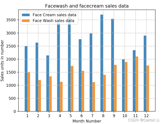
plt. xlabel( "Month number" )
plt. ylabel( "Sales units in number" )
plt. title( "Facewash and facecream sales data" )
plt. ylim( ymin= 0 )
x_major_locator = plt. MultipleLocator( 1 )
y_major_locator = plt. MultipleLocator( 500 )
ax = plt. gca( )
ax. xaxis. set_major_locator( x_major_locator)
ax. yaxis. set_major_locator( y_major_locator)
plt. legend( ( 'Face Cream sales data' , 'Face Wash sales data' , ) , loc= 'upper left' )
plt. grid( linestyle= '--' )
plt. show( )
import requests
import io
import pandas as pd
import matplotlib. pyplot as plt
response = requests. get( 'https://pynative.com/wp-content/uploads/2019/01/company_sales_data.csv' )
file_object = io. StringIO( response. content. decode( 'utf-8' ) )
df = pd. read_csv( file_object)
x = df[ 'month_number' ] . tolist( )
y4 = df. iloc[ : , 4 ] . tolist( )
plt. bar( x, y4)
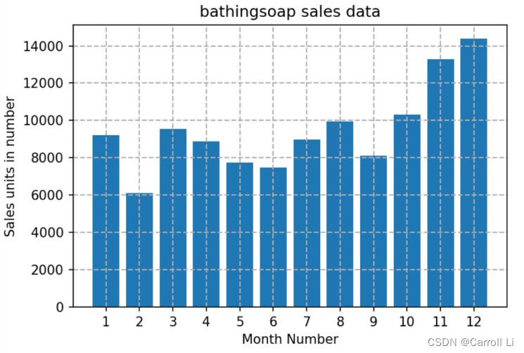
plt. xlabel( "Month Number" )
plt. ylabel( "Sales units in number" )
plt. title( "bathingsoap sales data" )
plt. ylim( ymin= 0 )
x_major_locator = plt. MultipleLocator( 1 )
y_major_locator = plt. MultipleLocator( 2000 )
ax = plt. gca( )
ax. xaxis. set_major_locator( x_major_locator)
ax. yaxis. set_major_locator( y_major_locator)
plt. grid( linestyle= '--' )
plt. savefig( 'D:/7.png' , dpi= 150 )
plt. show( )
import requests
import io
import pandas as pd
import matplotlib. pyplot as plt
response = requests. get( 'https://pynative.com/wp-content/uploads/2019/01/company_sales_data.csv' )
file_object = io. StringIO( response. content. decode( 'utf-8' ) )
df = pd. read_csv( file_object)
x = df[ 'month_number' ] . tolist( )
y1 = sum ( df. iloc[ : , 1 ] . tolist( ) )
y2 = sum ( df. iloc[ : , 2 ] . tolist( ) )
y3 = sum ( df. iloc[ : , 3 ] . tolist( ) )
y4 = sum ( df. iloc[ : , 4 ] . tolist( ) )
y5 = sum ( df. iloc[ : , 5 ] . tolist( ) )
y6 = sum ( df. iloc[ : , 6 ] . tolist( ) )
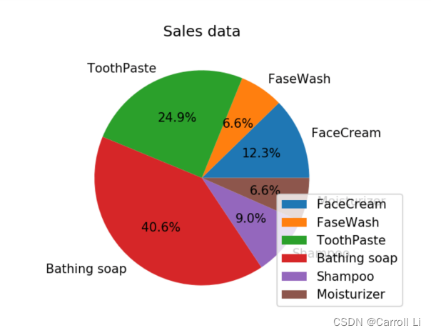
pienum = [ y1, y2, y3, y4, y5, y6]
langs = [ 'FaceCream' , 'FaceWash' , 'ToothPaste' , 'BathingSoap' , 'Shampoo' , 'Moisturizer' ]
plt. pie( pienum, labels = langs, autopct= '%1.1f%%' )
plt. title( "Sales data" )
plt. legend( ( 'Face cream' , 'Face Wash' , 'ToothPaste' ,
'BathingSoap' , 'Shampoo' , 'Moisturizer' ) , loc= 'lower right' )
plt. show( )
import requests
import io
import pandas as pd
import matplotlib. pyplot as plt
response = requests. get( 'https://pynative.com/wp-content/uploads/2019/01/company_sales_data.csv' )
file_object = io. StringIO( response. content. decode( 'utf-8' ) )
df = pd. read_csv( file_object)
x = df[ 'month_number' ] . tolist( )
y4 = df. iloc[ : , 4 ] . tolist( )
y2 = df. iloc[ : , 2 ] . tolist( )
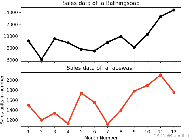
plt. subplot( 211 )
plt. plot( x, y4, color= 'black' , marker= 'o' )
plt. title( "Sales data of a Bathingsoap" )
plt. xticks( [ ] )
plt. subplot( 212 )
plt. plot( x, y2, color= 'r' , marker= 'o' )
plt. title( "Sales data of a facewash" )
x_major_locator = plt. MultipleLocator( 1 )
ax = plt. gca( )
ax. xaxis. set_major_locator( x_major_locator)
plt. xlabel( "Month Number" )
plt. ylabel( "Sales units in number" )
plt. show( )
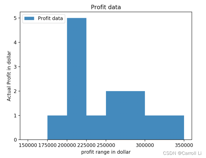
import requests
import io
import pandas as pd
import matplotlib. pyplot as plt
response = requests. get( 'https://pynative.com/wp-content/uploads/2019/01/company_sales_data.csv' )
file_object = io. StringIO( response. content. decode( 'utf-8' ) )
df = pd. read_csv( file_object)
x = df[ 'total_profit' ] . tolist( )
bins = [ 150000 , 175000 , 200000 , 225000 , 250000 , 300000 , 350000 ]
plt. hist( x, bins)
plt. xticks( bins)
plt. xlabel( "profit in dollar" )
plt. ylabel( "Actual Profit in dollar" )
plt. title( 'Profit data' )
plt. legend( ( 'Profit data' , ) , loc= 'upper left' )
plt. show( )


 953
953


 被折叠的 条评论
为什么被折叠?
被折叠的 条评论
为什么被折叠?
 到【灌水乐园】发言


