


 该文章演示了如何在Vue项目中安装和引入Echarts库,然后封装一个柱状图组件barChart.vue,详细介绍了组件的实现步骤,包括在main.js中全局引入Echarts,组件内部的图表配置以及如何响应窗口尺寸变化。此外,文章还展示了在application.vue中如何使用这个柱状图组件。
很久没有水文了,今天来水一篇,方便自己往后更好的划水!
第一步:安装echarts
npm i echarts
第二步:在main.js引入echarts
import * as echarts from 'echarts'
app.config.globalProperties.$echarts = echarts
或者可以在组件页面引入直接使用
第三步:封装组件:barChart.vue
<template>
  <div
    ref="EcharRef"
    :id="`EcharRef-${id}`"
    style="width: 100%; height: 100%"
  ></div>
</template>

<script>
import * as echarts from 'echarts'
import {fontSize} from '../fontSize.js'
import {onMounted} from 'vue'
export default {
  props: {
    chartData: Array,
    series: Array,
    id: String,
    color: Array,
    top: String
  },
  setup(props, context) {
    onMounted(() => {
      const color = props.color
      const data = props.series
      let newStyle = [] //生成渐变数组
      if (data.length > 0) {
        data.forEach((e, i) => {
          let style = [
            {offset: 0, color: color[i][0]}, // 0%柱图渐变色
            {offset: 1, color: color[i][1]} // 100%柱图渐变色
          ]
          newStyle.push(style)
        })
      }
      const series = []
      data.forEach((e, i) => {
        e['type'] = 'bar'
        let itemStyle = {
          color: new echarts.graphic.LinearGradient(0, 0, 1, 0, newStyle[i])
        }
        series.push({...e, ...itemStyle})
      })
      //需要获取到element,所以是onMounted的Hook
      let myChart = echarts.init(
        document.getElementById(`EcharRef-${props.id}`)
      )
      // 绘制图表
      const option = {
        tooltip: {
          trigger: 'axis',
          axisPointer: {
            type: 'shadow'
          },
          backgroundColor: 'rgba(0,12,13,.5)', // 修改背景颜色
          borderColor: '#70F1FF', // 修改边框颜色
          textStyle: {
            color: '#fff'
          }
        },
        legend: {
          data: []
        },
        color: ['#6CEAF9', '#2240E8', '#FBBACB', '#4695D1'],
        grid: {
          top: props.top || '12%',
          left: '1%',
          right: '6%',
          bottom: '5%',
          containLabel: true
        },
        xAxis: {
          type: 'value',
          boundaryGap: [0, 0.01],
          splitLine: {
            show: false
          },
          axisLabel: {
            show: true,
            color: '#ffffff',
            fontSize: fontSize(8)
          }
        },
        yAxis: {
          type: 'category',
          data: props.chartData || [],
          splitLine: {
            show: false
          },
          axisLabel: {
            show: true,
            color: '#ffffff',
            fontSize: fontSize(10)
          },
          axisTick: {
            show: false
          }
        },
        series: series
      }
      myChart.setOption(option)
      myChart.on('click', function (params) {
        context.emit('parentMethod', params)
      })
      window.onresize = function () {
        //自适应大小
        myChart.resize()
      }
    })
  }
}
</script>

<style>
</style>
font-size.js 主要是为了根据屏幕设置字体大小
export function fontSize(res) {
    let clientWidth = document.documentElement.clientWidth
    if (!clientWidth) return
    let fontSize = (clientWidth / 1280)
    return res * fontSize
}
export const defaultColor = ['#c23531', '#2f4554', '#61a0a8', '#d48265', '#91c7ae', '#749f83', '#ca8622', '#bda29a']
export const group = (array = [], subGroupLength = 0) => {
    let index = 0;
    const newArray = [];
    while (index < array.length) {
        newArray.push(array.slice(index, index += subGroupLength));
    }
    return newArray;
}
第四步:如何使用:application.vue
<template>
  <div class="application">
    <mytitle :title="'应用排行'"></mytitle>
    <div class="charts-box">
      <bar-chart
        :chartData="chartData"
        :series="series"
        :color="color"
        :id="'application'"
        @parentMethod="parentMethod"
      ></bar-chart>
    </div>
  </div>
</template>

<script setup>
import barChart from '@/components/echarts/barChart.vue'
import mytitle from './title.vue'
const chartData = ['Brazil', 'Indonesia', 'USA', 'India', 'China']
const color = [
  ['#0095FF', '#008FF9'],
  ['#65D8DF', '#2BDABB']
]
const series = [
  {
    name: '2011',
    data: [120, 248, 204, 490, 174]
  },
  {
    name: '2012',
    data: [325, 438, 100, 594, 131]
  }
]
const parentMethod = (data) => {
  console.log('data', data)
}

</script>

<style lang="less" scoped>
.application {
  height: 100%;
  width: 100%;
  .charts-box {
    height: calc(100% - 35px);
  }
}
</style>
最后看看效果图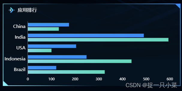


 3576
3576

 被折叠的 条评论
为什么被折叠?
被折叠的 条评论
为什么被折叠?
 到【灌水乐园】发言


