


#-*- coding: UTF-8 -*-
'''
 #################################################
 # Author : 余欢
 # Date : Jan 1, 2016    10:31:38 AM
 #company : 南京师范大学--大数据实验室
 # description :
 #################################################
'''
import numpy as np
from matplotlib import pyplot as plt

x = np.arange(0, 6, 0.01)  #产生数据

plt.plot(x, np.log(x), label="log(x)")  #X,Y轴数字和标签
plt.plot(x, x*np.sin(x) + 1, label="sin(x)")
plt.plot(x, x**2, label="x**2")

plt.legend(loc="upper left", ncol=1)  #在左上角显示并用3行显示函数的说明
plt.grid(True)  #网格显示

plt.xlabel("data set")  #X轴数据
plt.ylabel("data statistic") #Y轴数据
plt.xlim(0, 6) #X轴数据范围
plt.title("This is a Sample")

plt.show()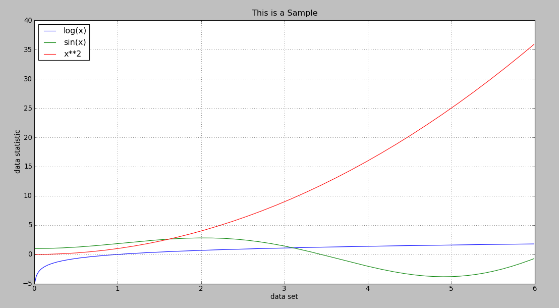


04-27
 783
783
783
06-25
7946
7946

 被折叠的 条评论
为什么被折叠?
被折叠的 条评论
为什么被折叠?
 到【灌水乐园】发言


