


1.概述
使用Matplotlib 绘图实现可视化时,会面临不同的需求有所调整,本文档重点对绘图过程中产生的一些小众需求进行全面总结,其他任务时可以随时即抽即用。
2.绘图
2.1 一般绘图
plt.figure() 参数设置说明
"""设置绘图的尺寸"""
fig = matplotlib.pyplot.gcf()
fig.set_size_inches(18.5, 10.5)
fig.savefig('test2png.png', dpi=100)
matplotlib.pyplot.figure(
figsize=None, # (float,float),画布尺寸 ,默认为6.4*4.8
dpi=None, # int 分辨率,默认为100
facecolor=None, #背景色,默认为白色('w')
edgecolor=None, # 边界颜色,默认为白色('w')
frameon=True, # 是否有边界,默认为True
clear=False, #是否对存在的画布进行清楚,默认为False(即自动创建新画布)
**kwargs)
通过命令设置:
plt.xlabel() → ax.set_xlabel()
plt.ylabel() → ax.set_ylabel()
plt.xlim() → ax.set_xlim()
plt.ylim() → ax.set_ylim()
plt.title() → ax.set_title()
plt.xticks→ ax.set_xticks()
plt.yticks→ ax.set_yticks()
plt.xticklabels→ ax.set_xticklabels()
plt.yticklabels→ ax.set_yticklabels()
ex:
a = [1,2,3,4,5]
labels = ['A', 'B', 'C', 'D','E']
plt.xticks(a,labels,rotation = 30)ax[0].set_yticks([0,5,10,15])
ax[0].set_yticklabels(['low','medium','high','very high'])
#设置刻度尺字体与倾斜角度
ax.tick_params(axis='x', labelsize=8, style='italic')
ax.set_xticklabels(ax.get_xticklabels(), rotation=45)
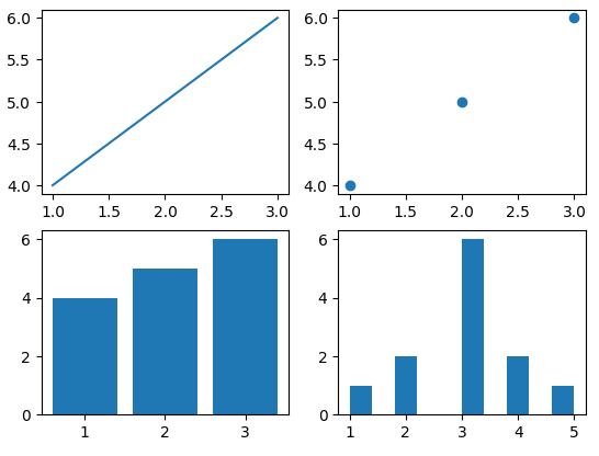
2.1.1 case 1
import matplotlib.pyplot as plt

# Create a 2x2 grid of subplots
fig, axs = plt.subplots(2, 2)
# fig = plt.figure(figsize=(7, 5))  # 1000 x 900 像素(先宽度 后高度)

# Now axs is a 2D array of Axes objects
axs[0, 0].plot([1, 2, 3], [4, 5, 6])
axs[0, 1].scatter([1, 2, 3], [4, 5, 6])
axs[1, 0].bar([1, 2, 3], [4, 5, 6])
axs[1, 1].hist([1, 2, 2, 3, 3, 3, 3, 3, 3, 4, 4, 5])

plt.show()
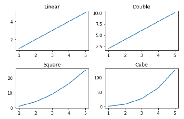
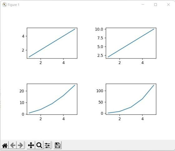
2.1.2 case 2
# importing packages
import numpy as np
import matplotlib.pyplot as plt

# create data
x=np.array([1, 2, 3, 4, 5])

# making subplots
fig, ax = plt.subplots(2, 2)

# set data with subplots and plot
title = ["Linear", "Double", "Square", "Cube"]
y = [x, x*2, x*x, x*x*x]

for i in range(4):

	# subplots
	plt.subplot(2, 2, i+1)

	# plotting (x,y)
	plt.plot(x, y[i])

	# set the title to subplots
	plt.gca().set_title(title[i])

# set spacing
fig.tight_layout()
plt.show()
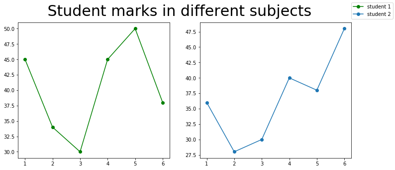
2.1.3 case 3
import matplotlib.pyplot as plt
import numpy as np

fig, (ax1, ax2) = plt.subplots(1, 2, figsize=(12, 5))

x1 = [1, 2, 3, 4, 5, 6]
y1 = [45, 34, 30, 45, 50, 38]
y2 = [36, 28, 30, 40, 38, 48]

labels = ["student 1", "student 2"]

# Add title to subplot
fig.suptitle(' Student marks in different subjects ', fontsize=30)

# Creating the sub-plots.
l1 = ax1.plot(x1, y1, 'o-', color='g')
l2 = ax2.plot(x1, y2, 'o-')

fig.legend([l1, l2], labels=labels,
		loc="upper right")
plt.subplots_adjust(right=0.9)

plt.show()
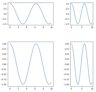
2.1.4 case 4
# importing required libraries
import matplotlib.pyplot as plt
from matplotlib import gridspec
import numpy as np

# create a figure
fig = plt.figure()

# to change size of subplot's
# set height of each subplot as 8
fig.set_figheight(8)

# set width of each subplot as 8
fig.set_figwidth(8)

# create grid for different subplots
spec = gridspec.GridSpec(ncols=2, nrows=2,
						width_ratios=[2, 1], wspace=0.5,
						hspace=0.5, height_ratios=[1, 2])

# initializing x,y axis value
x = np.arange(0, 10, 0.1)
y = np.cos(x)

# ax0 will take 0th position in
# geometry(Grid we created for subplots),
# as we defined the position as "spec[0]"
ax0 = fig.add_subplot(spec[0])
ax0.plot(x, y)

# ax1 will take 0th position in
# geometry(Grid we created for subplots),
# as we defined the position as "spec[1]"
ax1 = fig.add_subplot(spec[1])
ax1.plot(x, y)

# ax2 will take 0th position in
# geometry(Grid we created for subplots),
# as we defined the position as "spec[2]"
ax2 = fig.add_subplot(spec[2])
ax2.plot(x, y)

# ax3 will take 0th position in
# geometry(Grid we created for subplots),
# as we defined the position as "spec[3]"
ax3 = fig.add_subplot(spec[3])
ax3.plot(x, y)

# display the plots
plt.show()
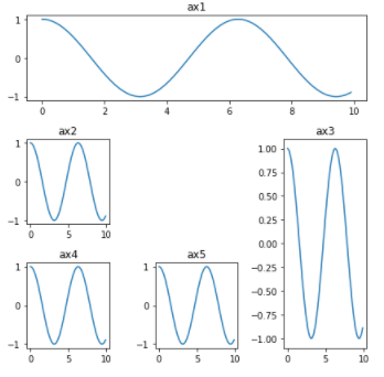
2.1.5 case 5
# importing required library
import matplotlib.pyplot as plt
import numpy as np

# creating grid for subplots
fig = plt.figure()
fig.set_figheight(6)
fig.set_figwidth(6)

ax1 = plt.subplot2grid(shape=(3, 3), loc=(0, 0), colspan=3)
ax2 = plt.subplot2grid(shape=(3, 3), loc=(1, 0), colspan=1)
ax3 = plt.subplot2grid(shape=(3, 3), loc=(1, 2), rowspan=2)
ax4 = plt.subplot2grid((3, 3), (2, 0))
ax5 = plt.subplot2grid((3, 3), (2, 1), colspan=1)


# initializing x,y axis value
x = np.arange(0, 10, 0.1)
y = np.cos(x)

# plotting subplots
ax1.plot(x, y)
ax1.set_title('ax1')
ax2.plot(x, y)
ax2.set_title('ax2')
ax3.plot(x, y)
ax3.set_title('ax3')
ax4.plot(x, y)
ax4.set_title('ax4')
ax5.plot(x, y)
ax5.set_title('ax5')

# automatically adjust padding horizontally
# as well as vertically.
plt.tight_layout()

# display plot
plt.show()
2.1.6 case 6
# importing packages
import numpy as np
import matplotlib.pyplot as plt

# create data
x=np.array([1, 2, 3, 4, 5])

# making subplots
fig, ax = plt.subplots(2, 2)

# set data with subplots and plot
ax[0, 0].plot(x, x)
ax[0, 1].plot(x, x*2)
ax[1, 0].plot(x, x*x)
ax[1, 1].plot(x, x*x*x)

fig.tight_layout(pad=5.0)
plt.show()

"""
# set the spacing between subplots
plt.subplot_tool()
plt.show()


plt.subplots_adjust(left=0.1,
                    bottom=0.1,
                    right=0.9,
                    top=0.9,
                    wspace=0.4,
                    hspace=0.4)
plt.show()


# making subplots with constrained_layout=True
fig, ax = plt.subplots(2, 2,
                       constrained_layout = True)

# set data with subplots and plot
ax[0, 0].plot(x, x)
ax[0, 1].plot(x, x*2)
ax[1, 0].plot(x, x*x)
ax[1, 1].plot(x, x*x*x)
plt.show()
""" 
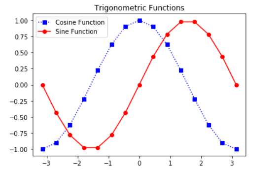
2.1.7 case 7
import matplotlib.pyplot as plt
import numpy as np


X = np.linspace(-np.pi, np.pi, 15)
C = np.cos(X)
S = np.sin(X)

# [left, bottom, width, height]
ax = plt.axes([0.1, 0.1, 0.8, 0.8])

# 'bs:' mentions blue color, square
# marker with dotted line.
ax1 = ax.plot(X, C, 'bs:')

#'ro-' mentions red color, circle
# marker with solid line.
ax2 = ax.plot(X, S, 'ro-')

ax.legend(labels = ('Cosine Function',
					'Sine Function'),
		loc = 'upper left')

ax.set_title("Trigonometric Functions")

plt.show()
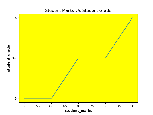
2.1.8 case 8
# importing library
import matplotlib.pyplot as plt

# giving values for x and y to plot
student_marks = [50, 60, 70, 80, 90]
student_grade = ['B', 'B', 'B+', 'B+', 'A']
plt.plot(student_marks, student_grade)

# Giving x label using xlabel() method
# with bold setting
plt.xlabel("student_marks", fontweight='bold')
ax = plt.axes()

# Setting the background color of the plot
# using set_facecolor() method
ax.set_facecolor("yellow")

# Giving y label using xlabel() method
# with bold setting
plt.ylabel("student_grade", fontweight='bold')

# Giving title to the plot
plt.title("Student Marks v/s Student Grade")

# Showing the plot using plt.show()
plt.show()
2.1.9 case 9
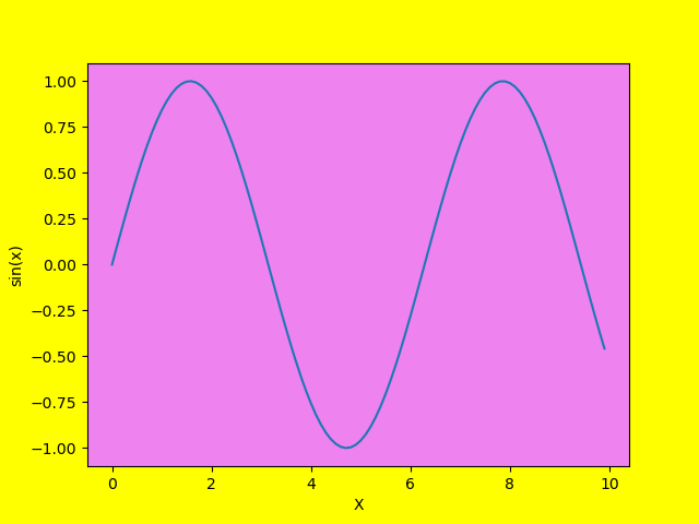
# importing libraries
import matplotlib.pyplot as plt
import numpy as np

# giving values for x and y to plot
x = np.arange(0, 10, .1)
y = np.sin(x)

# Set background color of the outer
# area of the plt
plt.figure(facecolor='yellow')

# Plotting the graph between x and y
plt.plot(x, y)

# Giving x label using xlabel() method
# with bold setting
plt.xlabel("X")
ax = plt.axes()

# Setting the background color of the plot
# using set_facecolor() method
ax.set_facecolor("violet")

# Giving y label using xlabel() method with
# bold setting
plt.ylabel('sin(x)')

# Showing the plot using plt.show()
plt.show()
2.1.10 case 10
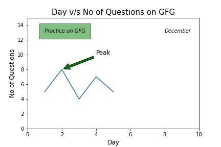
# Code to add text on matplotlib

# Importing library
import matplotlib.pyplot as plt

# Creating x-value and y-value of data
x = [1, 2, 3, 4, 5]
y = [5, 8, 4, 7, 5]

# Creating figure
fig = plt.figure()

# Adding axes on the figure
ax = fig.add_subplot(111)

# Plotting data on the axes
ax.plot(x, y)

# Adding title
ax.set_title('Day v/s No of Questions on GFG', fontsize=15)

# Adding axis title
ax.set_xlabel('Day', fontsize=12)
ax.set_ylabel('No of Questions', fontsize=12)

# Setting axis limits
ax.axis([0, 10, 0, 15])

# Adding text on the plot.
ax.text(1, 13, 'Practice on GFG', style='italic', bbox={
		'facecolor': 'green', 'alpha': 0.5, 'pad': 10})

# Adding text without box on the plot.
ax.text(8, 13, 'December', style='italic')

# Adding annotation on the plot.
ax.annotate('Peak', xy=(2, 8), xytext=(4, 10), fontsize=12,
			arrowprops=dict(facecolor='green', shrink=0.05))

plt.show()
2.1.11 case 11
# importing libraries
""" How to change Matplotlib color bar size """
import matplotlib.pyplot as plt
from mpl_toolkits.axes_grid1 import make_axes_locatable

fig, ax = plt.subplots()
# Reading image from folder

img = mpimg.imread(r'img.jpg')
image = plt.imshow(img)

# Locating current axes
divider = make_axes_locatable(ax)

# creating new axes on the right
# side of current axes(ax).
# The width of cax will be 5% of ax
# and the padding between cax and ax
# will be fixed at 0.05 inch.
colorbar_axes = divider.append_axes("right",
									size="10%",
									pad=0.1)
# Using new axes for colorbar
plt.colorbar(image, cax=colorbar_axes)
plt.show()

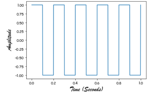
2.2.12 case 12
from scipy import signal
import matplotlib.pyplot as plot
import numpy as np
# %matplotlib inline

# Plot the square wave
t = np.linspace(0, 1, 1000, endpoint=True)
plot.plot(t, signal.square(2 * np.pi * 5 * t))

# Change the x, y axis label to "Brush Script MT" font style.
plot.xlabel("Time (Seconds)", fontname="Brush Script MT", fontsize=18)
plot.ylabel("Amplitude", fontname="Brush Script MT", fontsize=18)

plot.show()
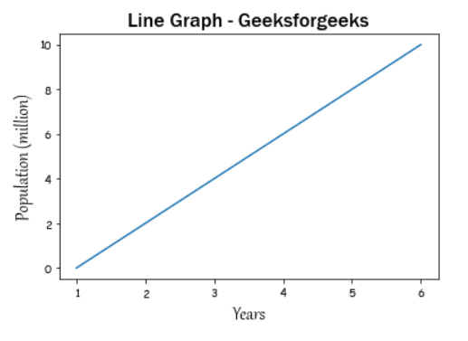
2.2.13 case 13
import matplotlib.pyplot as plot

x = [1, 2, 3, 4, 5, 6]
y = [0, 2, 4, 6, 8, 10]

# plotting a plot
plot.plot(x, y)


# Change the x, y axis label to 'Gabriola' style.
plot.xlabel("Years", fontname="Gabriola", fontsize=18)
plot.ylabel("Population (million)", fontname="Gabriola", fontsize=18)

# Set the title to 'Franklin Gothic Medium' style.
plot.title("Line Graph - Geeksforgeeks",
		fontname='Franklin Gothic Medium', fontsize=18)

plot.show()
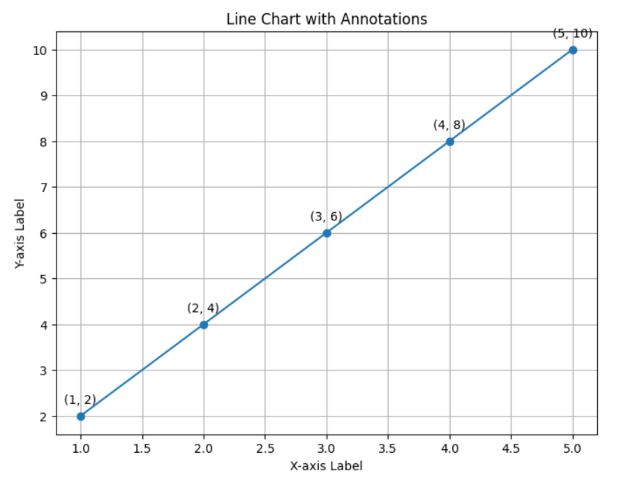
2.1.14 case 14
import matplotlib.pyplot as plt

# Sample data
x = [1, 2, 3, 4, 5]
y = [2, 4, 6, 8, 10]

# Create a line chart
plt.figure(figsize=(8, 6))
plt.plot(x, y, marker='o', linestyle='-')

# Add annotations
for i, (xi, yi) in enumerate(zip(x, y)):
	plt.annotate(f'({xi}, {yi})', (xi, yi), textcoords="offset points", xytext=(0, 10), ha='center')

# Add title and labels
plt.title('Line Chart with Annotations')
plt.xlabel('X-axis Label')
plt.ylabel('Y-axis Label')

# Display grid
plt.grid(True)

# Show the plot
plt.show()
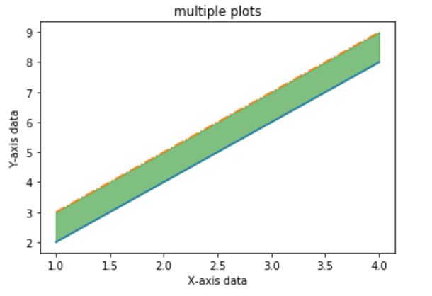
2.1.15 case 15
import matplotlib.pyplot as plt
import numpy as np

x = np.array([1, 2, 3, 4])
y = x*2

plt.plot(x, y)

x1 = [2, 4, 6, 8]
y1 = [3, 5, 7, 9]

plt.plot(x, y1, '-.')
plt.xlabel("X-axis data")
plt.ylabel("Y-axis data")
plt.title('multiple plots')

plt.fill_between(x, y, y1, color='green', alpha=0.5)
plt.show()
2.1.16 case 16
# importing required libraries
import numpy as np
import pandas as pd
import chart_studio.plotly as pl
import plotly.offline as po
import cufflinks as cf
po.init_notebook_mode(connected = True)
cf.go_offline()
# define a function for creating
# data set for plotting graph
def createdata(data):
# creating random data set
if(data == 1):
x = np.random.rand(100,5)
df1 = pd.DataFrame(x, columns = ['A', 'B',
'C', 'D',
'E'])
# creating user data set with input
elif(data == 2):
x = [0, 0, 0, 0, 0]
r1 = [0, 0, 0, 0, 0]
r2 = [0, 0, 0, 0, 0]
r3 = [0, 0, 0, 0, 0]
r4 = [0, 0, 0, 0, 0]
print('Enter the values for columns')
i = 0
for i in [0, 1, 2, 3, 4]:
x[i] = input()
i = i + 1
print('Enter the values for first row')
i = 0
for i in [0, 1, 2, 3, 4]:
r1[i] = int(input())
i = i + 1
print('Enter the values for second row')
i = 0
for i in [0, 1, 2, 3, 4]:
r2[i] = int(input())
i = i + 1
print('Enter the values for third row')
i = 0
for i in [0, 1, 2, 3, 4]:
r3[i] = int(input())
i = i + 1
print('Enter the values for fourth row')
i = 0
for i in [0, 1, 2, 3, 4]:
r4[i] = int(input())
i = i + 1
df1 = pd.DataFrame([r1,r2,r3,r4] ,
columns = x)
# creating data set by csv file
elif(data == 3):
file = input('Enter the file name')
x = pd.read_csv(file)
df1 = pd.DataFrame(x)
else:
print('DataFrame creation failed please' +
'enter in between 1 to 3 and try again')
return df1
# define a function for
# types of plotters
def plotter(plot):
if(plot == 1):
finalplot = df1.iplot(kind = 'scatter')
elif(plot == 2):
finalplot = df1.iplot(kind = 'scatter', mode = 'markers',
symbol = 'x', colorscale = 'paired')
elif(plot == 3):
finalplot = df1.iplot(kind = 'bar')
elif(plot == 4):
finalplot = df1.iplot(kind = 'hist')
elif(plot == 5):
finalplot = df1.iplot(kind = 'box')
elif(plot == 6):
finalplot = df1.iplot(kind = 'surface')
else:
finalplot = print('Select only between 1 to 7')
return finalplot
# define a function for allowing
# to plot for specific rows and columns
def plotter2(plot):
col = input('Enter the number of columns you' +
'want to plot by selecting only 1 , 2 or 3')
col = int(col)
if(col==1):
colm = input('Enter the column you want to plot' +
'by selecting any column from dataframe head')
if(plot == 1):
finalplot = df1[colm].iplot(kind = 'scatter')
elif(plot == 2):
finalplot = df1[colm].iplot(kind = 'scatter', mode = 'markers',
symbol = 'x', colorscale = 'paired')
elif(plot == 3):
finalplot = df1[colm].iplot(kind = 'bar')
elif(plot == 4):
finalplot = df1[colm].iplot(kind = 'hist')
elif(plot == 5):
finalplot = df1[colm].iplot(kind = 'box')
elif(plot == 6 or plot == 7):
finalplot = print('Bubble plot and surface plot require' +
'more than one column arguments')
else:
finalplot = print('Select only between 1 to 7')
elif(col == 2):
print('Enter the columns you want to plot' +
'by selecting from dataframe head')
x = input('First column')
y = input('Second column')
if(plot == 1):
finalplot = df1[[x,y]].iplot(kind = 'scatter')
elif(plot == 2):
finalplot = df1[[x,y]].iplot(kind = 'scatter', mode = 'markers',
symbol = 'x', colorscale = 'paired')
elif(plot == 3):
finalplot = df1[[x,y]].iplot(kind = 'bar')
elif(plot == 4):
finalplot = df1[[x,y]].iplot(kind = 'hist')
elif(plot == 5):
finalplot = df1[[x,y]].iplot(kind = 'box')
elif(plot == 6):
finalplot = df1[[x,y]].iplot(kind = 'surface')
elif(plot == 7):
size = input('Please enter the size column for bubble plot')
finalplot = df1.iplot(kind = 'bubble', x = x,
y = y, size = size)
else:
finalplot = print('Select only between 1 to 7')
elif(col == 3):
print('Enter the columns you want to plot')
x = input('First column')
y = input('Second column')
z = input('Third column')
if(plot == 1):
finalplot = df1[[x,y,z]].iplot(kind = 'scatter')
elif(plot == 2):
finalplot = df1[[x,y,z]].iplot(kind = 'scatter', mode = 'markers',
symbol = 'x' ,colorscale = 'paired')
elif(plot == 3):
finalplot = df1[[x,y,z]].iplot(kind = 'bar')
elif(plot == 4):
finalplot = df1[[x,y,z]].iplot(kind = 'hist')
elif(plot == 5):
finalplot = df1[[x,y,z]].iplot(kind = 'box')
elif(plot == 6):
finalplot = df1[[x,y,z]].iplot(kind = 'surface')
elif(plot == 7):
size = input('Please enter the size column for bubble plot')
finalplot = df1.iplot(kind = 'bubble', x = x, y = y,
z = z, size = size )
else:
finalplot = print('Select only between 1 to 7')
else:
finalplot = print('Please enter only 1 , 2 or 3')
return finalplot
# define a main function
# for asking type of plot
# and calling respective function
def main(cat):
if(cat == 1):
print('Select the type of plot you need to plot by writing 1 to 6')
print('1.Line plot')
print('2.Scatter plot')
print('3.Bar plot')
print('4.Histogram')
print('5.Box plot')
print('6.Surface plot')
plot = int(input())
output = plotter(plot)
elif(cat == 2):
print('Select the type of plot you need to plot by writing 1 to 7')
print('1.Line plot')
print('2.Scatter plot')
print('3.Bar plot')
print('4.Histogram')
print('5.Box plot')
print('6.Surface plot')
print('7.Bubble plot')
plot = int(input())
output = plotter2(plot)
else:
print('Please enter 1 or 2 and try again')
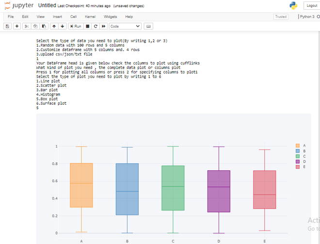
print('Select the type of data you need to plot(By writing 1,2 or 3)')
print('1.Random data with 100 rows and 5 columns')
print('2.Customize dataframe with 5 columns and. 4 rows')
print('3.Upload csv/json/txt file')
data = int(input())
df1 = createdata(data)
print('Your DataFrame head is given below check the columns to plot using cufflinks')
df1.head()
print('What kind of plot you need , the complete data plot or columns plot')
cat = input('Press 1 for plotting all columns or press 2 for specifying columns to plot')
cat = int(cat)
main(cat)
2.1.17 legend画在图外
如果遇到关于legend如何画在图外的问题,并以适合的比例显示出来。首先传统的做法如下,这种方式并不能满足我的要求,而且是显示在图内。
ax1.legend(loc='center left', bbox_to_anchor=(0.2, 1.12),ncol=3)
‘North’ 图例标识放在图顶端
‘South’ 图例标识放在图底端
‘East’ 图例标识放在图右方
‘West’ 图例标识放在图左方
‘NorthEast’ 图例标识放在图右上方(默认)
‘NorthWest 图例标识放在图左上方
‘SouthEast’ 图例标识放在图右下角
‘SouthWest’ 图例标识放在图左下角
采用如下的方式来替换上面的legend位置,得到的结果还是不能满足要求。
‘NorthOutside’ 图例标识放在图框外侧上方
‘SouthOutside’ 图例标识放在图框外侧下方
‘EastOutside’ 图例标识放在图框外侧右方
‘WestOutside’ 图例标识放在图框外侧左方
‘NorthEastOutside’ 图例标识放在图框外侧右上方
‘NorthWestOutside’ 图例标识放在图框外侧左上方
‘SouthEastOutside’ 图例标识放在图框外侧右下方
‘SouthWestOutside’ 图例标识放在图框外侧左下方
(以上几个将图例标识放在框图外)
‘Best’ 图标标识放在图框内不与图冲突的最佳位置
‘BestOutside’ 图标标识放在图框外使用最小空间的最佳位置
bbox_to_anchor:表示legend的位置,前一个表示左右,后一个表示上下。当使用这个参数时。loc将不再起正常的作用,ncol=3表示图例三列显示。
有人说要解决这个问题可以采用对坐标轴放大或是缩小的方式,经本人测试可以行,但是,放大缩小的比率不让人满意,且很难控制到适合的位置。有兴趣可以参考链接,最终得出此方法不行。
box = ax1.get_position()

ax1.set_position([box.x0, box.y0, box.width , box.height* 0.8])首先按上面的方式,如果你想将图例放上面就box.height*0.8,放右边就box.width*0.8
其它方式一样。同时配合下面来使用。
ax1.legend(loc='center left', bbox_to_anchor=(0.2, 1.12),ncol=3)主要是bbox_to_anchor的使用,最终达到目的.
2.1.18 关键字方式绘图
x = np.linspace(0, 10, 200)
data_obj = {'x': x,
            'y1': 2 * x + 1,
            'y2': 3 * x + 1.2,
            'mean': 0.5 * x * np.cos(2*x) + 2.5 * x + 1.1}

fig, ax = plt.subplots()

#填充两条线之间的颜色
ax.fill_between('x', 'y1', 'y2', color='yellow', data=data_obj)

# Plot the "centerline" with `plot`
ax.plot('x', 'mean', color='black', data=data_obj)

plt.show()
2.2 line chart
2.2.1 case 1
# importing package
import matplotlib.pyplot as plt
import numpy as np

# create data
x = [1,2,3,4,5]
y = [3,3,3,3,3]

# plot lines
plt.plot(x, y, label = "line 1", linestyle="-")
plt.plot(y, x, label = "line 2", linestyle="--")
plt.plot(x, np.sin(x), label = "curve 1", linestyle="-.")
plt.plot(x, np.cos(x), label = "curve 2", linestyle=":")
plt.legend()
plt.show()
2.2.2 case 2
# importing module
import matplotlib.pyplot as plt


# assigning x and y coordinates
x = [-5, -4, -3, -2, -1, 0, 1, 2, 3, 4, 5]
y = []

for i in range(len(x)):
	y.append(max(0, x[i]))

# depicting the visualization
plt.plot(x, y, color='green', alpha=0.75)
plt.xlabel('x')
plt.ylabel('y')

# displaying the title
plt.title(label="ReLU function graph",
				fontsize=40,
				color="green")
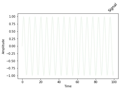
2.2.3 case 3
# importing modules
from matplotlib import pyplot
import numpy

# assigning time values of the signal
# initial time period, final time period
# and phase angle
signalTime = numpy.arange(0, 100, 0.5)

# getting the amplitude of the signal
signalAmplitude = numpy.sin(signalTime)

# depicting the visualization
pyplot.plot(signalTime, signalAmplitude,
			color='green', alpha=0.1)

pyplot.xlabel('Time')
pyplot.ylabel('Amplitude')

# displaying the title
pyplot.title("Signal",
			loc='right',
			rotation=45)
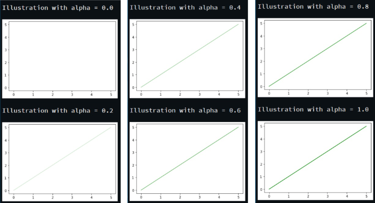
2.2.4 case 4
# importing module
import matplotlib.pyplot as plt

# assigning x and y coordinates
z = [i for i in range(0, 6)]

for i in range(0, 11, 2):

	# depicting the visualization
	plt.plot(z, z, color='green', alpha=i/10)
	plt.xlabel('x')
	plt.ylabel('y')

	# displaying the title
	print('\nIllustration with alpha =', i/10)

	plt.show()
2.3 bar chart
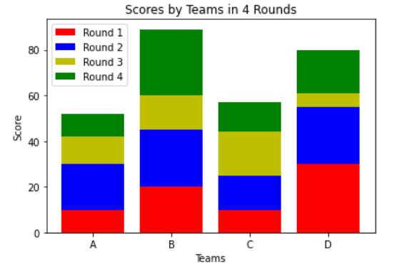
2.3.1 case 1
# importing package
import matplotlib.pyplot as plt
import numpy as np

# create data
x = ['A', 'B', 'C', 'D']
y1 = np.array([10, 20, 10, 30])
y2 = np.array([20, 25, 15, 25])
y3 = np.array([12, 15, 19, 6])
y4 = np.array([10, 29, 13, 19])

# plot bars in stack manner
plt.bar(x, y1, color='r')
plt.bar(x, y2, bottom=y1, color='b')
plt.bar(x, y3, bottom=y1+y2, color='y')
plt.bar(x, y4, bottom=y1+y2+y3, color='g')
plt.xlabel("Teams")
plt.ylabel("Score")
plt.legend(["Round 1", "Round 2", "Round 3", "Round 4"])
plt.title("Scores by Teams in 4 Rounds")
plt.show()
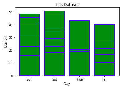
2.3.2 case 2
import matplotlib.pyplot as plt
import pandas as pd

# Reading the tips.csv file
data = pd.read_csv('tips.csv')

# initializing the data
x = data['day']
y = data['total_bill']

# plotting the data
plt.bar(x, y, color='green', edgecolor='blue',
		linewidth=2)

# Adding title to the plot
plt.title("Tips Dataset")

# Adding label on the y-axis
plt.ylabel('Total Bill')

# Adding label on the x-axis
plt.xlabel('Day')

plt.show()
2.3.3 case 3
# importing package
import matplotlib.pyplot as plt
import numpy as np
import pandas as pd

# create data
df = pd.DataFrame([['A', 10, 20, 10, 26], ['B', 20, 25, 15, 21], ['C', 12, 15, 19, 6],
				['D', 10, 18, 11, 19]],
				columns=['Team', 'Round 1', 'Round 2', 'Round 3', 'Round 4'])
# view data
print(df)

# plot data in stack manner of bar type
df.plot(x='Team', kind='bar', stacked=True,
		title='Stacked Bar Graph by dataframe')
plt.show()

2.3.4 case 4
# importing packages
import pandas as pd
import matplotlib.pyplot as plt

# load dataset
df = pd.read_excel("Hours.xlsx")

# view dataset
print(df)

# plot a Stacked Bar Chart using matplotlib
df.plot(
	x = 'Name',
	kind = 'barh',
	stacked = True,
	title = 'Stacked Bar Graph',
	mark_right = True)
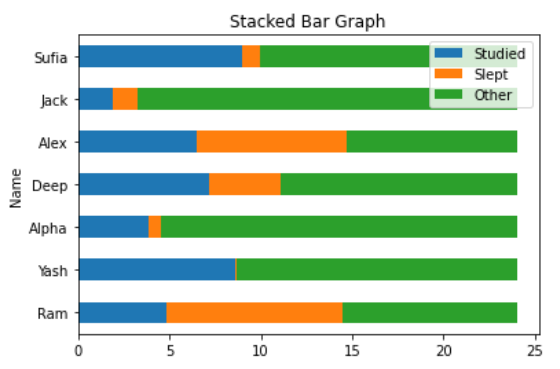
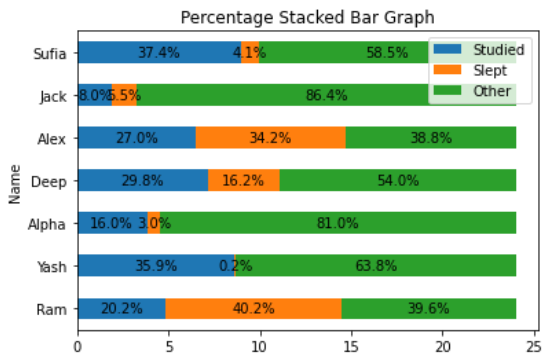
2.3.5 case 5
# importing packages
import pandas as pd
import numpy as np
import matplotlib.pyplot as plt

# load dataset
df = pd.read_excel("Hours.xlsx")

# view dataset
print(df)

# plot a Stacked Bar Chart using matplotlib
df.plot(
x = 'Name',
kind = 'barh',
stacked = True,
title = 'Percentage Stacked Bar Graph',
mark_right = True)

df_total = df["Studied"] + df["Slept"] + df["Other"]
df_rel = df[df.columns[1:]].div(df_total, 0)*100

for n in df_rel:
	for i, (cs, ab, pc) in enumerate(zip(df.iloc[:, 1:].cumsum(1)[n],
										df[n], df_rel[n])):
		plt.text(cs - ab / 2, i, str(np.round(pc, 1)) + '%',
				va = 'center', ha = 'center')
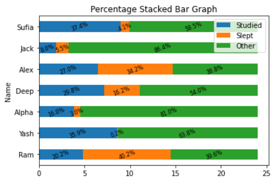
2.3.6 cae 6
# importing packages
import pandas as pd
import numpy as np
import matplotlib.pyplot as plt

# load dataset
df = pd.read_xlsx("Hours.xlsx")

# view dataset
print(df)

# plot a Stacked Bar Chart using matplotlib
df.plot(
x = 'Name',
kind = 'barh',
stacked = True,
title = 'Percentage Stacked Bar Graph',
mark_right = True)

df_total = df["Studied"] + df["Slept"] + df["Other"]
df_rel = df[df.columns[1:]].div(df_total, 0) * 100

for n in df_rel:
	for i, (cs, ab, pc) in enumerate(zip(df.iloc[:, 1:].cumsum(1)[n],
										df[n], df_rel[n])):
		plt.text(cs - ab / 2, i, str(np.round(pc, 1)) + '%',
				va = 'center', ha = 'center', rotation = 20, fontsize = 8)
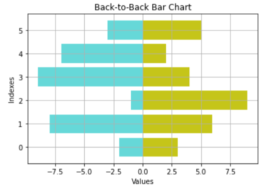
2.3.7 case 7
# import packages
import numpy as np
import matplotlib.pyplot as plt
# create data
A = np.array([3,6,9,4,2,5])
B = np.array([2,8,1,9,7,3])
X = np.arange(6)
# plot the bars
plt.barh(X, A, align='center',
alpha=0.9, color = 'y')
plt.barh(X, -B, align='center',
alpha=0.6, color = 'c')
plt.grid()
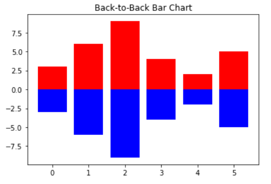
plt.title("Back-to-Back Bar Chart")
plt.ylabel("Indexes")
plt.xlabel("Values")
plt.show()
2.3.8 case 8
# import packages
import numpy as np
import matplotlib.pyplot as plt
# create data
A = np.array([3,6,9,4,2,5])
X = np.arange(6)
# plot the bars
plt.bar(X, A, color = 'r')
plt.bar(X, -A, color = 'b')
plt.title("Back-to-Back Bar Chart")
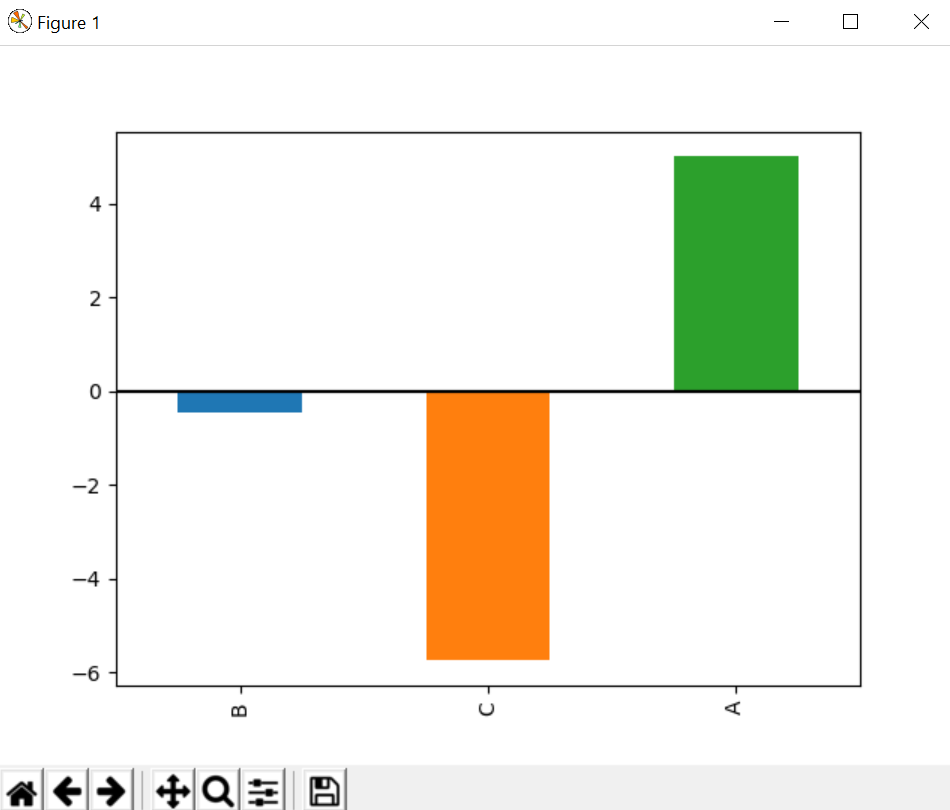
plt.show()
2.3.9 case 9
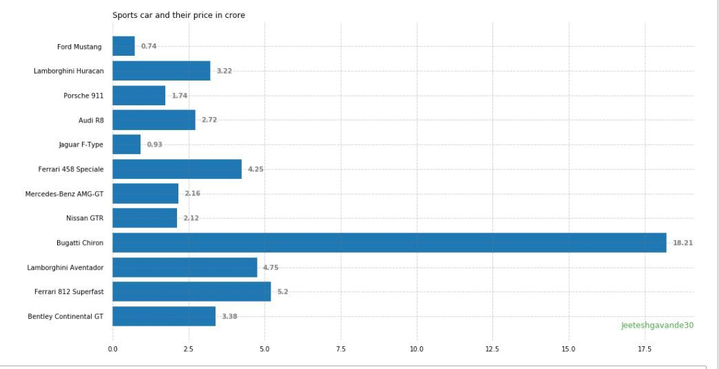
import pandas as pd
from matplotlib import pyplot as plt

# Read CSV into pandas
data = pd.read_csv(r"cars.csv")
data.head()
df = pd.DataFrame(data)

name = df['car'].head(12)
price = df['price'].head(12)

# Figure Size
fig, ax = plt.subplots(figsize =(16, 9))

# Horizontal Bar Plot
ax.barh(name, price)

# Remove axes splines
for s in ['top', 'bottom', 'left', 'right']:
	ax.spines[s].set_visible(False)

# Remove x, y Ticks
ax.xaxis.set_ticks_position('none')
ax.yaxis.set_ticks_position('none')

# Add padding between axes and labels
ax.xaxis.set_tick_params(pad = 5)
ax.yaxis.set_tick_params(pad = 10)

# Add x, y gridlines
ax.grid(b = True, color ='grey',
		linestyle ='-.', linewidth = 0.5,
		alpha = 0.2)

# Show top values
ax.invert_yaxis()

# Add annotation to bars
for i in ax.patches:
	plt.text(i.get_width()+0.2, i.get_y()+0.5,
			str(round((i.get_width()), 2)),
			fontsize = 10, fontweight ='bold',
			color ='grey')

# Add Plot Title
ax.set_title('Sports car and their price in crore',
			loc ='left', )

# Add Text watermark
fig.text(0.9, 0.15, 'Jeeteshgavande30', fontsize = 12,
		color ='grey', ha ='right', va ='bottom',
		alpha = 0.7)

# Show Plot
plt.show()
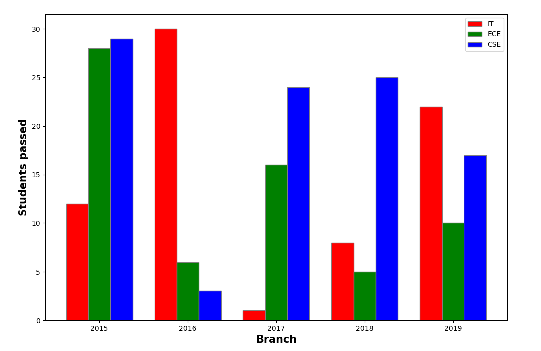
2.3.10 case 10
import numpy as np
import matplotlib.pyplot as plt

# set width of bar
barWidth = 0.25
fig = plt.subplots(figsize =(12, 8))

# set height of bar
IT = [12, 30, 1, 8, 22]
ECE = [28, 6, 16, 5, 10]
CSE = [29, 3, 24, 25, 17]

# Set position of bar on X axis
br1 = np.arange(len(IT))
br2 = [x + barWidth for x in br1]
br3 = [x + barWidth for x in br2]

# Make the plot
plt.bar(br1, IT, color ='r', width = barWidth,
		edgecolor ='grey', label ='IT')
plt.bar(br2, ECE, color ='g', width = barWidth,
		edgecolor ='grey', label ='ECE')
plt.bar(br3, CSE, color ='b', width = barWidth,
		edgecolor ='grey', label ='CSE')

# Adding Xticks
plt.xlabel('Branch', fontweight ='bold', fontsize = 15)
plt.ylabel('Students passed', fontweight ='bold', fontsize = 15)
plt.xticks([r + barWidth for r in range(len(IT))],
		['2015', '2016', '2017', '2018', '2019'])

plt.legend()
plt.show()
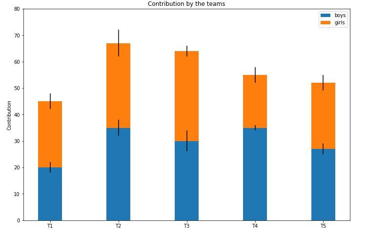
2.3.11 case 11
import numpy as np
import matplotlib.pyplot as plt

N = 5

boys = (20, 35, 30, 35, 27)
girls = (25, 32, 34, 20, 25)
boyStd = (2, 3, 4, 1, 2)
girlStd = (3, 5, 2, 3, 3)
ind = np.arange(N)
width = 0.35

fig = plt.subplots(figsize =(10, 7))
p1 = plt.bar(ind, boys, width, yerr = boyStd)
p2 = plt.bar(ind, girls, width,
			bottom = boys, yerr = girlStd)

plt.ylabel('Contribution')
plt.title('Contribution by the teams')
plt.xticks(ind, ('T1', 'T2', 'T3', 'T4', 'T5'))
plt.yticks(np.arange(0, 81, 10))
plt.legend((p1[0], p2[0]), ('boys', 'girls'))

plt.show()
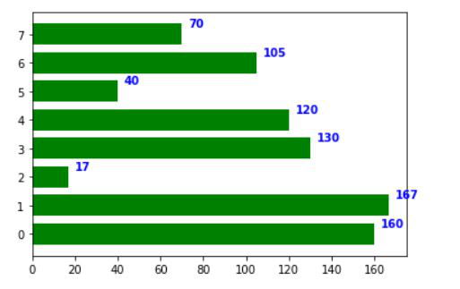
2.3.12 case 12
import os
import numpy as np
import matplotlib.pyplot as plt

x = [0, 1, 2, 3, 4, 5, 6, 7]
y = [160, 167, 17, 130, 120, 40, 105, 70]
fig, ax = plt.subplots()
width = 0.75
ind = np.arange(len(y))

ax.barh(ind, y, width, color = "green")

for i, v in enumerate(y):
	ax.text(v + 3, i + .25, str(v),
			color = 'blue', fontweight = 'bold')
plt.show()
2.4 hist chart
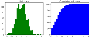
2.4.1 case 1
# importing pyplot for getting graph
import matplotlib.pyplot as plt

# importing numpy for getting array
import numpy as np

# importing scientific python
from scipy import stats

# list of values
x = [10, 40, 20, 10, 30, 10, 56, 45]

res = stats.cumfreq(x, numbins=4,
					defaultreallimits=(1.5, 5))

# generating random values
rng = np.random.RandomState(seed=12345)

# normalizing
samples = stats.norm.rvs(size=1000,
						random_state=rng)

res = stats.cumfreq(samples,
					numbins=25)

x = res.lowerlimit + np.linspace(0, res.binsize*res.cumcount.size,
								res.cumcount.size)

# specifying figure size
fig = plt.figure(figsize=(10, 4))

# adding sub plots
ax1 = fig.add_subplot(1, 2, 1)

# adding sub plots
ax2 = fig.add_subplot(1, 2, 2)

# getting histogram using hist function
ax1.hist(samples, bins=25,
		color="green")

# setting up the title
ax1.set_title('Histogram')

# cumulative graph
ax2.bar(x, res.cumcount, width=4, color="blue")

# setting up the title
ax2.set_title('Cumulative histogram')

ax2.set_xlim([x.min(), x.max()])

# display the figure(histogram)
plt.show()
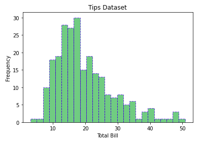
2.4.2 case 2
import matplotlib.pyplot as plt
import pandas as pd

# Reading the tips.csv file
data = pd.read_csv('tips.csv')

# initializing the data
x = data['total_bill']

# plotting the data
plt.hist(x, bins=25, color='green', edgecolor='blue',
		linestyle='--', alpha=0.5)

# Adding title to the plot
plt.title("Tips Dataset")

# Adding label on the y-axis
plt.ylabel('Frequency')

# Adding label on the x-axis
plt.xlabel('Total Bill')

plt.show()
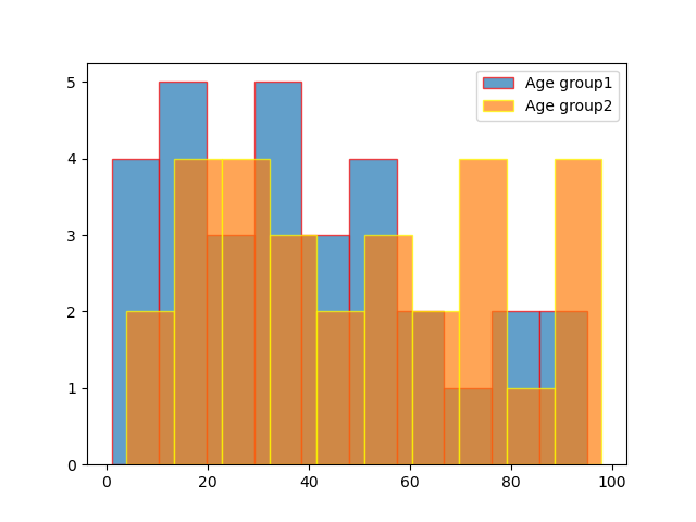
2.4.3 case 3
# importing libraries
import matplotlib.pyplot as plt

# giving two age groups data
age_g1 = [1, 3, 5, 10, 15, 17, 18, 16, 19,
		21, 23, 28, 30, 31, 33, 38, 32,
		40, 45, 43, 49, 55, 53, 63, 66,
		85, 80, 57, 75, 93, 95]

age_g2 = [6, 4, 15, 17, 19, 21, 28, 23, 31,
		36, 39, 32, 50, 56, 59, 74, 79, 34,
		98, 97, 95, 67, 69, 92, 45, 55, 77,
		76, 85]

# plotting first histogram
plt.hist(age_g1, label='Age group1', bins=14, alpha=.7, edgecolor='red')

# plotting second histogram
plt.hist(age_g2, label="Age group2", bins=14, alpha=.7, edgecolor='yellow')
plt.legend()

# Showing the plot using plt.show()
plt.show()
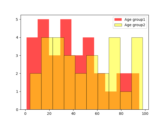
2.4.4 case 4
# importing libraries
import matplotlib.pyplot as plt

# giving two age groups data
age_g1 = [1, 3, 5, 10, 15, 17, 18, 16, 19, 21,
		23, 28, 30, 31, 33, 38, 32, 40, 45,
		43, 49, 55, 53, 63, 66, 85, 80, 57,
		75, 93, 95]

age_g2 = [6, 4, 15, 17, 19, 21, 28, 23, 31, 36,
		39, 32, 50, 56, 59, 74, 79, 34, 98, 97,
		95, 67, 69, 92, 45, 55, 77, 76, 85]

# plotting first histogram
plt.hist(age_g1, label='Age group1', alpha=.7, color='red')

# plotting second histogram
plt.hist(age_g2, label="Age group2", alpha=.5,
		edgecolor='black', color='yellow')
plt.legend()

# Showing the plot using plt.show()
plt.show()
2.4.5 case 5
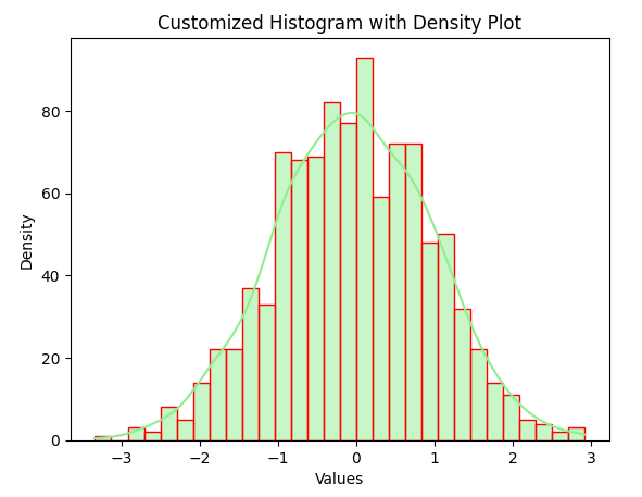
import matplotlib.pyplot as plt
import seaborn as sns
import numpy as np

# Generate random data for the histogram
data = np.random.randn(1000)

# Creating a customized histogram with a density plot
sns.histplot(data, bins=30, kde=True, color='lightgreen', edgecolor='red')

# Adding labels and title
plt.xlabel('Values')
plt.ylabel('Density')
plt.title('Customized Histogram with Density Plot')

# Display the plot
plt.show()
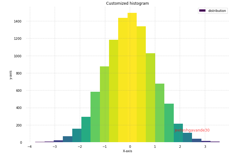
2.4.6 case 6
import matplotlib.pyplot as plt
import numpy as np
from matplotlib import colors
from matplotlib.ticker import PercentFormatter


# Creating dataset
np.random.seed(23685752)
N_points = 10000
n_bins = 20

# Creating distribution
x = np.random.randn(N_points)
y = .8 ** x + np.random.randn(10000) + 25
legend = ['distribution']

# Creating histogram
fig, axs = plt.subplots(1, 1,
						figsize =(10, 7),
						tight_layout = True)


# Remove axes splines
for s in ['top', 'bottom', 'left', 'right']:
	axs.spines[s].set_visible(False)

# Remove x, y ticks
axs.xaxis.set_ticks_position('none')
axs.yaxis.set_ticks_position('none')

# Add padding between axes and labels
axs.xaxis.set_tick_params(pad = 5)
axs.yaxis.set_tick_params(pad = 10)

# Add x, y gridlines
axs.grid(b = True, color ='grey',
		linestyle ='-.', linewidth = 0.5,
		alpha = 0.6)

# Add Text watermark
fig.text(0.9, 0.15, 'Jeeteshgavande30',
		fontsize = 12,
		color ='red',
		ha ='right',
		va ='bottom',
		alpha = 0.7)

# Creating histogram
N, bins, patches = axs.hist(x, bins = n_bins)

# Setting color
fracs = ((N**(1 / 5)) / N.max())
norm = colors.Normalize(fracs.min(), fracs.max())

for thisfrac, thispatch in zip(fracs, patches):
	color = plt.cm.viridis(norm(thisfrac))
	thispatch.set_facecolor(color)

# Adding extra features
plt.xlabel("X-axis")
plt.ylabel("y-axis")
plt.legend(legend)
plt.title('Customized histogram')

# Show plot
plt.show()
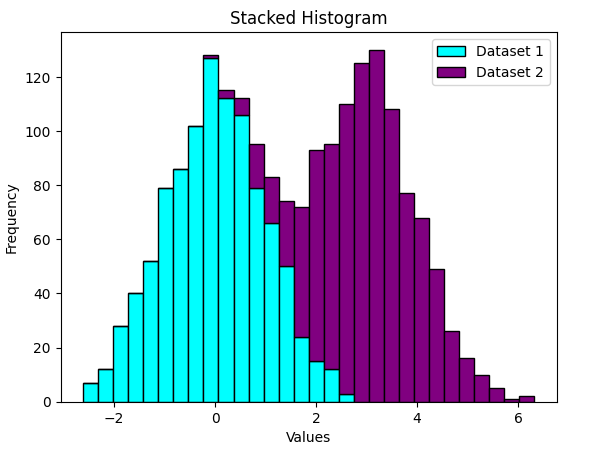
2.4.7 case 7
import matplotlib.pyplot as plt
import numpy as np

# Generate random data for stacked histograms
data1 = np.random.randn(1000)
data2 = np.random.normal(loc=3, scale=1, size=1000)

# Creating a stacked histogram
plt.hist([data1, data2], bins=30, stacked=True, color=['cyan', 'Purple'], edgecolor='black')

# Adding labels and title
plt.xlabel('Values')
plt.ylabel('Frequency')
plt.title('Stacked Histogram')

# Adding legend
plt.legend(['Dataset 1', 'Dataset 2'])

# Display the plot
plt.show()
2.4.8 case 8
import matplotlib.pyplot as plt
import numpy as np

# Generate random 2D data for hexbin plot
x = np.random.randn(1000)
y = 2 * x + np.random.normal(size=1000)

# Creating a 2D histogram (hexbin plot)
plt.hexbin(x, y, gridsize=30, cmap='Blues')

# Adding labels and title
plt.xlabel('X values')
plt.ylabel('Y values')
plt.title('2D Histogram (Hexbin Plot)')

# Adding colorbar
plt.colorbar()

# Display the plot
plt.show()
2.4.9 case 9
# importing matplotlib
import matplotlib.pyplot as plt

# Storing set of values in
# x, height, error and colors for plotting the graph
x= range(4)
height=[ 3, 6, 5, 4]
error=[ 1, 5, 3, 2]
colors = ['red', 'green', 'blue', 'black']

# using tuple unpacking
# to grab fig and axes
fig, ax = plt.subplots()

# plotting the bar plot
ax.bar( x, height, alpha = 0.1)

# Zip function acts as an
# iterator for tuples so that
# we are iterating through
# each set of values in a loop
for pos, y, err, colors in zip(x, height,
							error, colors):

	ax.errorbar(pos, y, err, lw = 2,
				capsize = 4, capthick = 4,
				color = colors)

# Showing the plotted error bar
# plot with different color
plt.show()
2.4.10 case 10
# importing matplotlib package
import matplotlib.pyplot as plt

# importing the numpy package
import numpy as np

# Storing set of values in
# names, x, height,
# error and colors for plotting the graph
names= ['Bijon', 'Sujit', 'Sayan', 'Saikat']
x=np.arange(4)
marks=[ 60, 90, 55, 46]
error=[ 11, 15, 5, 9]
colors = ['red', 'green', 'blue', 'black']

# using tuple unpacking
# to grab fig and axes
fig, ax = plt.subplots()

# plotting the bar plot
ax.bar(x, marks, alpha = 0.5,
	color = colors)

# Zip function acts as an
# iterator for tuples so that
# we are iterating through
# each set of values in a loop
for pos, y, err, colors in zip(x, marks,
							error, colors):

	ax.errorbar(pos, y, err, lw = 2,
				capsize = 4, capthick = 4,
				color = colors)

# Showing the plotted error bar
# plot with different color
ax.set_ylabel('Marks of the Students')

# Using x_ticks and x_labels
# to set the name of the
# students at each point
ax.set_xticks(x)
ax.set_xticklabels(names)
ax.set_xlabel('Name of the students')

# Showing the plot
plt.show()
2.4.11 case 11
# importing matplotlib
import matplotlib.pyplot as plt

# importing the numpy package
import numpy as np

# Storing set of values in
# names, x, height, error,
# error1 and colors for plotting the graph
names= ['USA', 'India', 'England', 'China']
x=np.arange(4)
economy=[21.43, 2.87, 2.83, 14.34]
error=[1.4, 1.5, 0.5, 1.9]
error1=[0.5, 0.2, 0.6, 1]
colors = ['red', 'grey', 'blue', 'magenta']

# using tuple unpacking
# to grab fig and axes
fig, ax = plt.subplots()

# plotting the bar plot
ax.bar(x, economy, alpha = 0.5,
	color = colors)

# Zip function acts as an
# iterator for tuples so that
# we are iterating through
# each set of values in a loop
for pos, y, err,err1, colors in zip(x, economy,
									error, error1,
									colors):

	ax.errorbar(pos, y, err, err1, fmt = 'o',
				lw = 2, capsize = 4, capthick = 4,
				color = colors)

# Showing the plotted error bar
# plot with different color
ax.set_ylabel('Economy(in trillions)')

# Using x_ticks and x_labels
# to set the name of the
# countries at each point
ax.set_xticks(x)
ax.set_xticklabels(names)
ax.set_xlabel('Name of the countries')

# Showing the plot
plt.show()
2.4.12 直方图汇总
np.random.seed(19680801)

n_bins = 10
x = np.random.randn(1000, 3)

fig, axes = plt.subplots(nrows=2, ncols=2)
ax0, ax1, ax2, ax3 = axes.flatten()

colors = ['red', 'tan', 'lime']
ax0.hist(x, n_bins, density=True, histtype='bar', color=colors, label=colors)
ax0.legend(prop={'size': 10})
ax0.set_title('bars with legend')

ax1.hist(x, n_bins, density=True, histtype='barstacked')
ax1.set_title('stacked bar')

ax2.hist(x,  histtype='barstacked', rwidth=0.9)

ax3.hist(x[:, 0], rwidth=0.9)
ax3.set_title('different sample sizes')

fig.tight_layout()
plt.show() 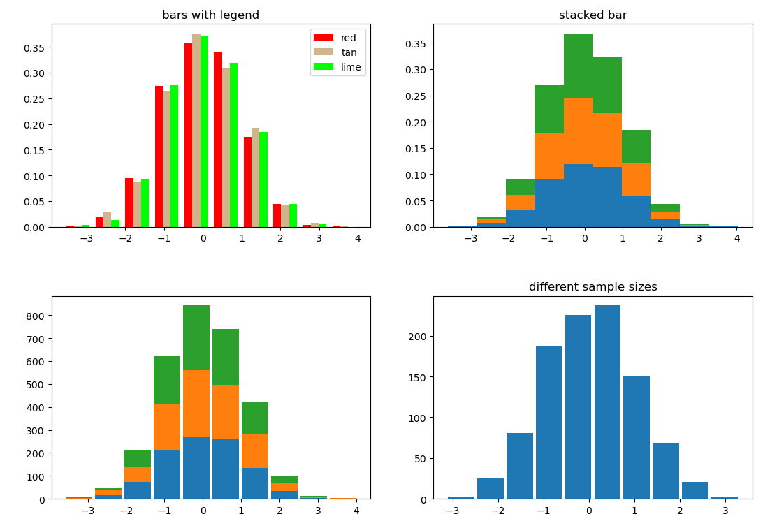
2.4.13 等高线图
fig, (ax1, ax2) = plt.subplots(2)
x = np.arange(-5, 5, 0.1)
y = np.arange(-5, 5, 0.1)
xx, yy = np.meshgrid(x, y, sparse=True)
z = np.sin(xx**2 + yy**2) / (xx**2 + yy**2)
ax1.contourf(x, y, z)
ax2.contour(x, y, z)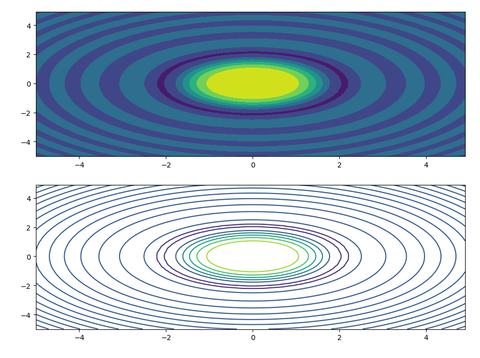
2.5 scatter chart
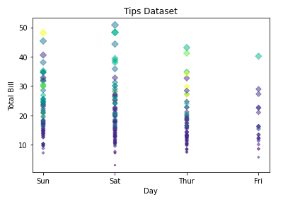
2.5.1 case 1
import matplotlib.pyplot as plt
import pandas as pd

# Reading the tips.csv file
data = pd.read_csv('tips.csv')

# initializing the data
x = data['day']
y = data['total_bill']

# plotting the data
plt.scatter(x, y, c=data['size'], s=data['total_bill'],
			marker='D', alpha=0.5)

# Adding title to the plot
plt.title("Tips Dataset")

# Adding label on the y-axis
plt.ylabel('Total Bill')

# Adding label on the x-axis
plt.xlabel('Day')

plt.show()
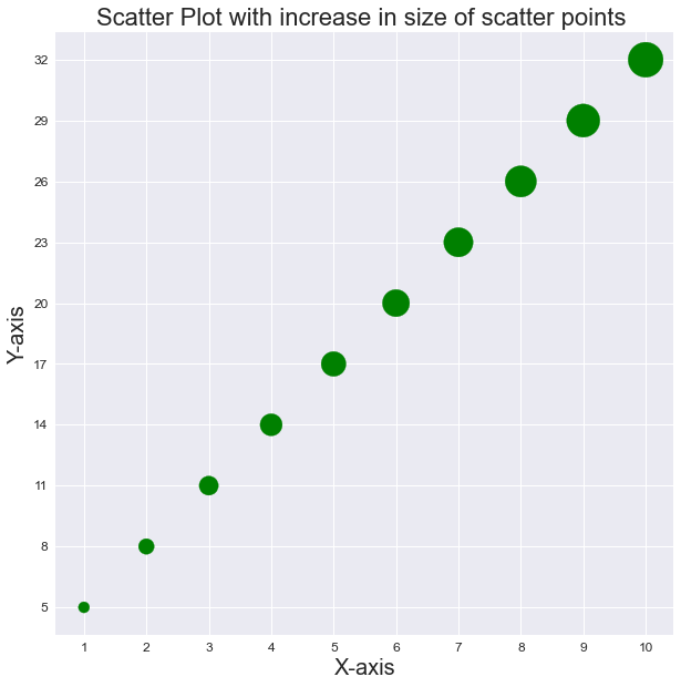
2.5.2 case 2
import matplotlib.pyplot as plt

plt.style.use('seaborn')
plt.figure(figsize=(10, 10))

x = [1, 2, 3, 4, 5, 6, 7, 8, 9, 10]
y = [3*i+2 for i in x]
size = [n*100 for n in range(1, len(x)+1)]
# print(size)

plt.scatter(x, y, s=size, c='g')
plt.title("Scatter Plot with increase in size of scatter points ", fontsize=22)

plt.xlabel('X-axis', fontsize=20)
plt.ylabel('Y-axis', fontsize=20)

plt.xticks(x, fontsize=12)
plt.yticks(y, fontsize=12)

plt.show()
2.5.3泡泡图
np.random.seed(19680801)


N = 50
x = np.random.rand(N)
y = np.random.rand(N)
colors = np.random.rand(N)
area = (30 * np.random.rand(N))**2  # 0 to 15 point radii

plt.scatter(x, y, s=area, c=colors, alpha=0.5)
plt.show()
2.6 pie chart
2.6.1 case 1
import matplotlib.pyplot as plt

years = [2016, 2017, 2018, 2019, 2020]
profit = [15, 19, 35, 14, 17]

# Plotting the pie chart
plt.pie(profit, labels = years, autopct = '%1.1f%%',
		startangle = 90,
		wedgeprops = {"edgecolor" : "black",
					'linewidth': 2,
					'antialiased': True})

# Equal aspect ratio ensures
# that pie is drawn as a circle.
plt.axis('equal')

# Display the graph onto the screen
plt.show()
2.6.2 case 2
import matplotlib.pyplot as plt

# the slices are ordered and
# plotted counter-clockwise:
product = 'Product A', 'Product B',
			'Product C', 'Product D'

stock = [15, 30, 35, 20]
explode = (0.1, 0, 0.1, 0)

plt.pie(stock, explode = explode,
		labels = product, autopct = '%1.1f%%',
		shadow = True, startangle = 90,
		wedgeprops= {"edgecolor":"black",
					'linewidth': 3,
					'antialiased': True})

# Equal aspect ratio ensures that
# pie is drawn as a circle.
plt.axis('equal')

plt.show()

2.6.3 case 3
import matplotlib.pyplot as plt

# the slices are ordered and
# plotted counter-clockwise:
continents = ['Asia', 'Europe', 'North America',
			'South America','Australia',
			'Africa','Antarctica']

area = [25, 20, 15, 10,15,10,5]
explode = (0.1, 0, 0.1, 0,0.1,0.1,0.1)

plt.pie(area, explode = explode, labels = continents,
		autopct = '%1.1f%%',startangle = 0,
		wedgeprops = {"edgecolor" : "black",
					'linewidth' : 2,
					'antialiased': True})

# Equal aspect ratio ensures
# that pie is drawn as a circle.
plt.axis('equal')

plt.show()
2.7 3D graph
2.7.1 case 1
# Import libraries
from mpl_toolkits import mplot3d
import numpy as np
import matplotlib.pyplot as plt


# Creating dataset
z = np.random.randint(100, size =(50))
x = np.random.randint(80, size =(50))
y = np.random.randint(60, size =(50))

# Creating figure
fig = plt.figure(figsize = (10, 7))
ax = plt.axes(projection ="3d")

# Creating plot
ax.scatter3D(x, y, z, color = "green")
plt.title("simple 3D scatter plot")

# show plot
plt.show()

2.7.2 case 2
# Import libraries
from mpl_toolkits import mplot3d
import numpy as np
import matplotlib.pyplot as plt


# Creating dataset
z = 4 * np.tan(np.random.randint(10, size =(500))) + np.random.randint(100, size =(500))
x = 4 * np.cos(z) + np.random.normal(size = 500)
y = 4 * np.sin(z) + 4 * np.random.normal(size = 500)

# Creating figure
fig = plt.figure(figsize = (16, 9))
ax = plt.axes(projection ="3d")

# Add x, y gridlines
ax.grid(b = True, color ='grey',
		linestyle ='-.', linewidth = 0.3,
		alpha = 0.2)


# Creating color map
my_cmap = plt.get_cmap('hsv')

# Creating plot
sctt = ax.scatter3D(x, y, z,
					alpha = 0.8,
					c = (x + y + z),
					cmap = my_cmap,
					marker ='^')

plt.title("simple 3D scatter plot")
ax.set_xlabel('X-axis', fontweight ='bold')
ax.set_ylabel('Y-axis', fontweight ='bold')
ax.set_zlabel('Z-axis', fontweight ='bold')
fig.colorbar(sctt, ax = ax, shrink = 0.5, aspect = 5)

# show plot
plt.show()
2.7.3 case 3
# Import libraries
from mpl_toolkits import mplot3d
import numpy as np
import matplotlib.pyplot as plt


# Creating dataset
x = np.outer(np.linspace(-3, 3, 32), np.ones(32))
y = x.copy().T # transpose
z = (np.sin(x **2) + np.cos(y **2) )

# Creating figure
fig = plt.figure(figsize =(14, 9))
ax = plt.axes(projection ='3d')

# Creating plot
ax.plot_surface(x, y, z)

# show plot
plt.show()
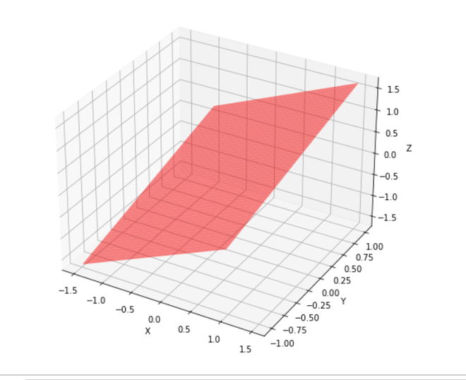
2.7.4 case 4
# Import libraries
from mpl_toolkits import mplot3d
import numpy as np
import matplotlib.pyplot as plt

# Creating dataset
x = np.outer(np.linspace(-3, 3, 32), np.ones(32))
y = x.copy().T # transpose
z = (np.sin(x **2) + np.cos(y **2) )

# Creating figure
fig = plt.figure(figsize =(14, 9))
ax = plt.axes(projection ='3d')

# Creating color map
my_cmap = plt.get_cmap('hot')

# Creating plot
surf = ax.plot_surface(x, y, z,
					cmap = my_cmap,
					edgecolor ='none')

fig.colorbar(surf, ax = ax,
			shrink = 0.5, aspect = 5)

ax.set_title('Surface plot')

# show plot
plt.show()
2.7.5 case 5
# Import libraries
from mpl_toolkits import mplot3d
import numpy as np
import matplotlib.pyplot as plt
# Creating dataset
x = np.outer(np.linspace(-3, 3, 32), np.ones(32))
y = x.copy().T # transpose
z = (np.sin(x **2) + np.cos(y **2) )
# Creating figure
fig = plt.figure(figsize =(14, 9))
ax = plt.axes(projection ='3d')
# Creating color map
my_cmap = plt.get_cmap('hot')
# Creating plot
surf = ax.plot_surface(x, y, z,
rstride = 8,
cstride = 8,
alpha = 0.8,
cmap = my_cmap)
cset = ax.contourf(x, y, z,
zdir ='z',
offset = np.min(z),
cmap = my_cmap)
cset = ax.contourf(x, y, z,
zdir ='x',
offset =-5,
cmap = my_cmap)
cset = ax.contourf(x, y, z,
zdir ='y',
offset = 5,
cmap = my_cmap)
fig.colorbar(surf, ax = ax,
shrink = 0.5,
aspect = 5)
# Adding labels
ax.set_xlabel('X-axis')
ax.set_xlim(-5, 5)
ax.set_ylabel('Y-axis')
ax.set_ylim(-5, 5)
ax.set_zlabel('Z-axis')
ax.set_zlim(np.min(z), np.max(z))
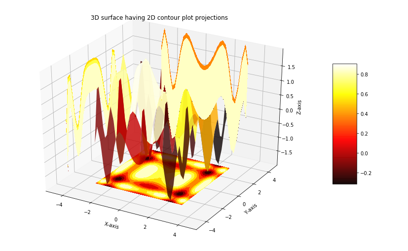
ax.set_title('3D surface having 2D contour plot projections')
# show plot
plt.show()
2.7.6 case 6
# importing modules
from mpl_toolkits.mplot3d import axes3d
from matplotlib import pyplot
# creating the visualization
fig = pyplot.figure()
wf = fig.add_subplot(111, projection='3d')
x, y, z = axes3d.get_test_data(0.05)
wf.plot_wireframe(x,y,z, rstride=2,
cstride=2,color='green')
# displaying the visualization
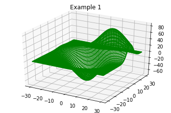
wf.set_title('Example 1')
pyplot.show()
2.7.7 case 7
from mpl_toolkits import mplot3d
import numpy as np
import matplotlib.pyplot as plt
from matplotlib import cm
import math
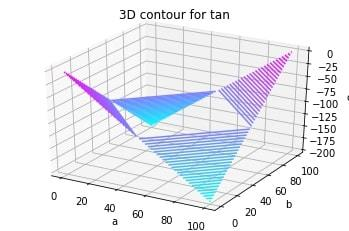
x = [i for i in range(0, 200, 100)]
y = [i for i in range(0, 200, 100)]
X, Y = np.meshgrid(x, y)
Z = []
for i in x:
t = []
for j in y:
t.append(math.tan(math.sqrt(i*2+j*2)))
Z.append(t)
fig = plt.figure()
ax = plt.axes(projection='3d')
ax.contour3D(X, Y, Z, 50, cmap=cm.cool)
ax.set_xlabel('a')
ax.set_ylabel('b')
ax.set_zlabel('c')
ax.set_title('3D contour for tan')
plt.show()
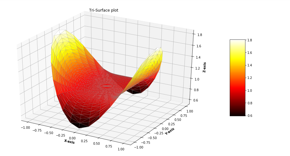
2.7.8 case 8
# Import libraries
from mpl_toolkits.mplot3d import Axes3D
import matplotlib.pyplot as plt
import numpy as np


# Creating radii and angles
r = np.linspace(0.125, 1.0, 100)
a = np.linspace(0, 2 * np.pi,
				100,
				endpoint = False)

# Repeating all angles for every radius
a = np.repeat(a[..., np.newaxis], 100, axis = 1)

# Creating dataset
x = np.append(0, (r * np.cos(a)))
y = np.append(0, (r * np.sin(a)))
z = (np.sin(x ** 4) + np.cos(y ** 4))

# Creating figure
fig = plt.figure(figsize =(16, 9))
ax = plt.axes(projection ='3d')

# Creating color map
my_cmap = plt.get_cmap('hot')

# Creating plot
trisurf = ax.plot_trisurf(x, y, z,
						cmap = my_cmap,
						linewidth = 0.2,
						antialiased = True,
						edgecolor = 'grey')
fig.colorbar(trisurf, ax = ax, shrink = 0.5, aspect = 5)
ax.set_title('Tri-Surface plot')

# Adding labels
ax.set_xlabel('X-axis', fontweight ='bold')
ax.set_ylabel('Y-axis', fontweight ='bold')
ax.set_zlabel('Z-axis', fontweight ='bold')

# show plot
plt.show()
2.7.9 case 9
import numpy as np
import pandas as pd
import matplotlib.pyplot as plt
from mpl_toolkits.mplot3d import Axes3D

a = np.array([1, 2, 3])
b = np.array([4, 5, 6, 7])

a, b = np.meshgrid(a, b)

# surface plot for a**2 + b**2
a = np.arange(-1, 1, 0.02)
b = a
a, b = np.meshgrid(a, b)

fig = plt.figure()
axes = fig.gca(projection ='3d')
axes.plot_surface(a, b, a**2 + b**2)

plt.show()
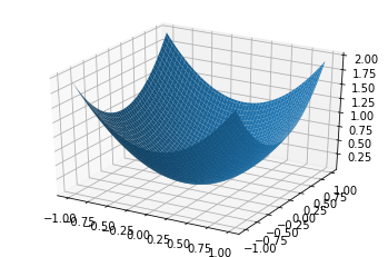
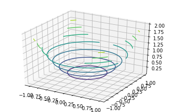
2.7.10 case 10
import numpy as np
import pandas as pd
import matplotlib.pyplot as plt
from mpl_toolkits.mplot3d import Axes3D

a = np.array([1, 2, 3])
b = np.array([4, 5, 6, 7])

a, b = np.meshgrid(a, b)

# surface plot for a**2 + b**2
a = np.arange(-1, 1, 0.02)
b = a
a, b = np.meshgrid(a, b)

fig = plt.figure()
axes = fig.gca(projection ='3d')
axes.contour(a, b, a**2 + b**2)

plt.show()
2.7.11 case 11
""" change view angle"""
from mpl_toolkits import mplot3d
import numpy as np
import matplotlib.pyplot as plt

fig = plt.figure(figsize = (8,8))
ax = plt.axes(projection = '3d')

# Data for a three-dimensional line
z = np.linspace(0, 15, 1000)
x = np.sin(z)
y = np.cos(z)
ax.plot3D(x, y, z, 'green')

ax.view_init(-140, 60)

plt.show()
2.7.12 case 12
""" change view angle"""
import numpy as np
from matplotlib import pyplot as plt
from mpl_toolkits.mplot3d import Axes3D
from math import sin, cos

fig = plt.figure(figsize = (8,8))
ax = fig.add_subplot(111, projection = '3d')

#creating Datasheet
y = np.linspace(-1, 1, 200)
x = np.linspace(-1, 1, 200)
x,y = np.meshgrid(x, y)

#set z values
z = x + y

# rotate the samples by changing the value of 'a'
a = 50

t = np.transpose(np.array([x, y, z]), ( 1, 2, 0))

m = [[cos(a), 0, sin(a)],[0, 1, 0],
	[-sin(a), 0, cos(a)]]

X,Y,Z = np.transpose(np.dot(t, m), (2, 0, 1))

#label axes
ax.set_xlabel('X')
ax.set_ylabel('Y')
ax.set_zlabel('Z')

#plot figure
ax.plot_surface(X,Y,Z, alpha = 0.5,
				color = 'red')

plt.show()
2.7.13 case 13
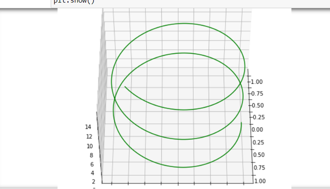
from mpl_toolkits import mplot3d
import numpy as np
import matplotlib.pyplot as plt

fig = plt.figure(figsize = (8, 8))
ax = plt.axes(projection = '3d')

# Data for a three-dimensional line
z = np.linspace(0, 15, 1000)
x = np.sin(z)
y = np.cos(z)
ax.plot3D(x, y, z, 'green')

ax.view_init(120, 30)

plt.show()
2.7 box graph
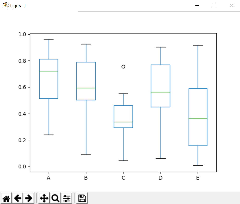
2.7.1 case 1
# importing libraries
import matplotlib.pyplot as plt
import pandas as pd
import numpy as np

df = pd.DataFrame(np.random.rand(10, 5),
	columns =['A', 'B', 'C', 'D', 'E'])

df.plot.box()
plt.show()
2.7.2 case 2
import matplotlib.pyplot as plt
import numpy as np

from matplotlib.patches import Polygon

# Fixing random state for reproducibility
np.random.seed(19680801)

# fake up some data
spread = np.random.rand(50) * 100
center = np.ones(25) * 50
flier_high = np.random.rand(10) * 100 + 100
flier_low = np.random.rand(10) * -100
data = np.concatenate((spread, center, flier_high, flier_low))

fig, axs = plt.subplots(2, 3)

# basic plot
axs[0, 0].boxplot(data)
axs[0, 0].set_title('basic plot')

# notched plot
axs[0, 1].boxplot(data, 1)
axs[0, 1].set_title('notched plot')

# change outlier point symbols
axs[0, 2].boxplot(data, 0, 'gD')
axs[0, 2].set_title('change outlier\npoint symbols')

# don't show outlier points
axs[1, 0].boxplot(data, 0, '')
axs[1, 0].set_title("don't show\noutlier points")

# horizontal boxes
axs[1, 1].boxplot(data, 0, 'rs', 0)
axs[1, 1].set_title('horizontal boxes')

# change whisker length
axs[1, 2].boxplot(data, 0, 'rs', 0, 0.75)
axs[1, 2].set_title('change whisker length')

fig.subplots_adjust(left=0.08, right=0.98, bottom=0.05, top=0.9,
                    hspace=0.4, wspace=0.3)

# fake up some more data
spread = np.random.rand(50) * 100
center = np.ones(25) * 40
flier_high = np.random.rand(10) * 100 + 100
flier_low = np.random.rand(10) * -100
d2 = np.concatenate((spread, center, flier_high, flier_low))
# Making a 2-D array only works if all the columns are the
# same length.  If they are not, then use a list instead.
# This is actually more efficient because boxplot converts
# a 2-D array into a list of vectors internally anyway.
data = [data, d2, d2[::2]]

# Multiple box plots on one Axes
fig, ax = plt.subplots()
ax.boxplot(data)

plt.show() 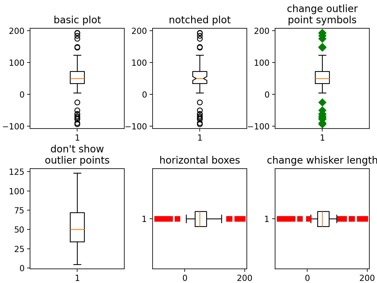
2.7.3 case 3
random_dists = ['Normal(1, 1)', 'Lognormal(1, 1)', 'Exp(1)', 'Gumbel(6, 4)',
                'Triangular(2, 9, 11)']
N = 500

norm = np.random.normal(1, 1, N)
logn = np.random.lognormal(1, 1, N)
expo = np.random.exponential(1, N)
gumb = np.random.gumbel(6, 4, N)
tria = np.random.triangular(2, 9, 11, N)

# Generate some random indices that we'll use to resample the original data
# arrays. For code brevity, just use the same random indices for each array
bootstrap_indices = np.random.randint(0, N, N)
data = [
    norm, norm[bootstrap_indices],
    logn, logn[bootstrap_indices],
    expo, expo[bootstrap_indices],
    gumb, gumb[bootstrap_indices],
    tria, tria[bootstrap_indices],
]

fig, ax1 = plt.subplots(figsize=(10, 6))
fig.canvas.manager.set_window_title('A Boxplot Example')
fig.subplots_adjust(left=0.075, right=0.95, top=0.9, bottom=0.25)

bp = ax1.boxplot(data, notch=False, sym='+', vert=True, whis=1.5)
plt.setp(bp['boxes'], color='black')
plt.setp(bp['whiskers'], color='black')
plt.setp(bp['fliers'], color='red', marker='+')

# Add a horizontal grid to the plot, but make it very light in color
# so we can use it for reading data values but not be distracting
ax1.yaxis.grid(True, linestyle='-', which='major', color='lightgrey',
               alpha=0.5)

ax1.set(
    axisbelow=True,  # Hide the grid behind plot objects
    title='Comparison of IID Bootstrap Resampling Across Five Distributions',
    xlabel='Distribution',
    ylabel='Value',
)

# Now fill the boxes with desired colors
box_colors = ['darkkhaki', 'royalblue']
num_boxes = len(data)
medians = np.empty(num_boxes)
for i in range(num_boxes):
    box = bp['boxes'][i]
    box_x = []
    box_y = []
    for j in range(5):
        box_x.append(box.get_xdata()[j])
        box_y.append(box.get_ydata()[j])
    box_coords = np.column_stack([box_x, box_y])
    # Alternate between Dark Khaki and Royal Blue
    ax1.add_patch(Polygon(box_coords, facecolor=box_colors[i % 2]))
    # Now draw the median lines back over what we just filled in
    med = bp['medians'][i]
    median_x = []
    median_y = []
    for j in range(2):
        median_x.append(med.get_xdata()[j])
        median_y.append(med.get_ydata()[j])
        ax1.plot(median_x, median_y, 'k')
    medians[i] = median_y[0]
    # Finally, overplot the sample averages, with horizontal alignment
    # in the center of each box
    ax1.plot(np.average(med.get_xdata()), np.average(data[i]),
             color='w', marker='*', markeredgecolor='k')

# Set the axes ranges and axes labels
ax1.set_xlim(0.5, num_boxes + 0.5)
top = 40
bottom = -5
ax1.set_ylim(bottom, top)
ax1.set_xticklabels(np.repeat(random_dists, 2),
                    rotation=45, fontsize=8)

# Due to the Y-axis scale being different across samples, it can be
# hard to compare differences in medians across the samples. Add upper
# X-axis tick labels with the sample medians to aid in comparison
# (just use two decimal places of precision)
pos = np.arange(num_boxes) + 1
upper_labels = [str(round(s, 2)) for s in medians]
weights = ['bold', 'semibold']
for tick, label in zip(range(num_boxes), ax1.get_xticklabels()):
    k = tick % 2
    ax1.text(pos[tick], .95, upper_labels[tick],
             transform=ax1.get_xaxis_transform(),
             horizontalalignment='center', size='x-small',
             weight=weights[k], color=box_colors[k])

# Finally, add a basic legend
fig.text(0.80, 0.08, f'{N} Random Numbers',
         backgroundcolor=box_colors[0], color='black', weight='roman',
         size='x-small')
fig.text(0.80, 0.045, 'IID Bootstrap Resample',
         backgroundcolor=box_colors[1],
         color='white', weight='roman', size='x-small')
fig.text(0.80, 0.015, '*', color='white', backgroundcolor='silver',
         weight='roman', size='medium')
fig.text(0.815, 0.013, ' Average Value', color='black', weight='roman',
         size='x-small')

plt.show() 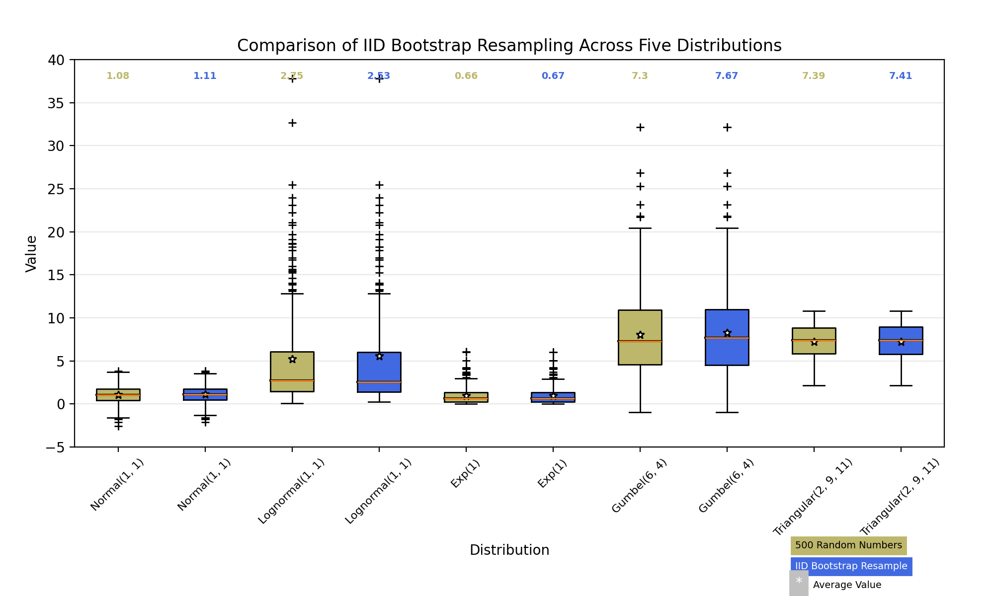
2.7.4 case 4
def fake_bootstrapper(n):
    """
    This is just a placeholder for the user's method of
    bootstrapping the median and its confidence intervals.

    Returns an arbitrary median and confidence interval packed into a tuple.
    """
    if n == 1:
        med = 0.1
        ci = (-0.25, 0.25)
    else:
        med = 0.2
        ci = (-0.35, 0.50)
    return med, ci

inc = 0.1
e1 = np.random.normal(0, 1, size=500)
e2 = np.random.normal(0, 1, size=500)
e3 = np.random.normal(0, 1 + inc, size=500)
e4 = np.random.normal(0, 1 + 2*inc, size=500)

treatments = [e1, e2, e3, e4]
med1, ci1 = fake_bootstrapper(1)
med2, ci2 = fake_bootstrapper(2)
medians = [None, None, med1, med2]
conf_intervals = [None, None, ci1, ci2]

fig, ax = plt.subplots()
pos = np.arange(len(treatments)) + 1
bp = ax.boxplot(treatments, sym='k+', positions=pos,
                notch=True, bootstrap=5000,
                usermedians=medians,
                conf_intervals=conf_intervals)

ax.set_xlabel('treatment')
ax.set_ylabel('response')
plt.setp(bp['whiskers'], color='k', linestyle='-')
plt.setp(bp['fliers'], markersize=3.0)
plt.show() 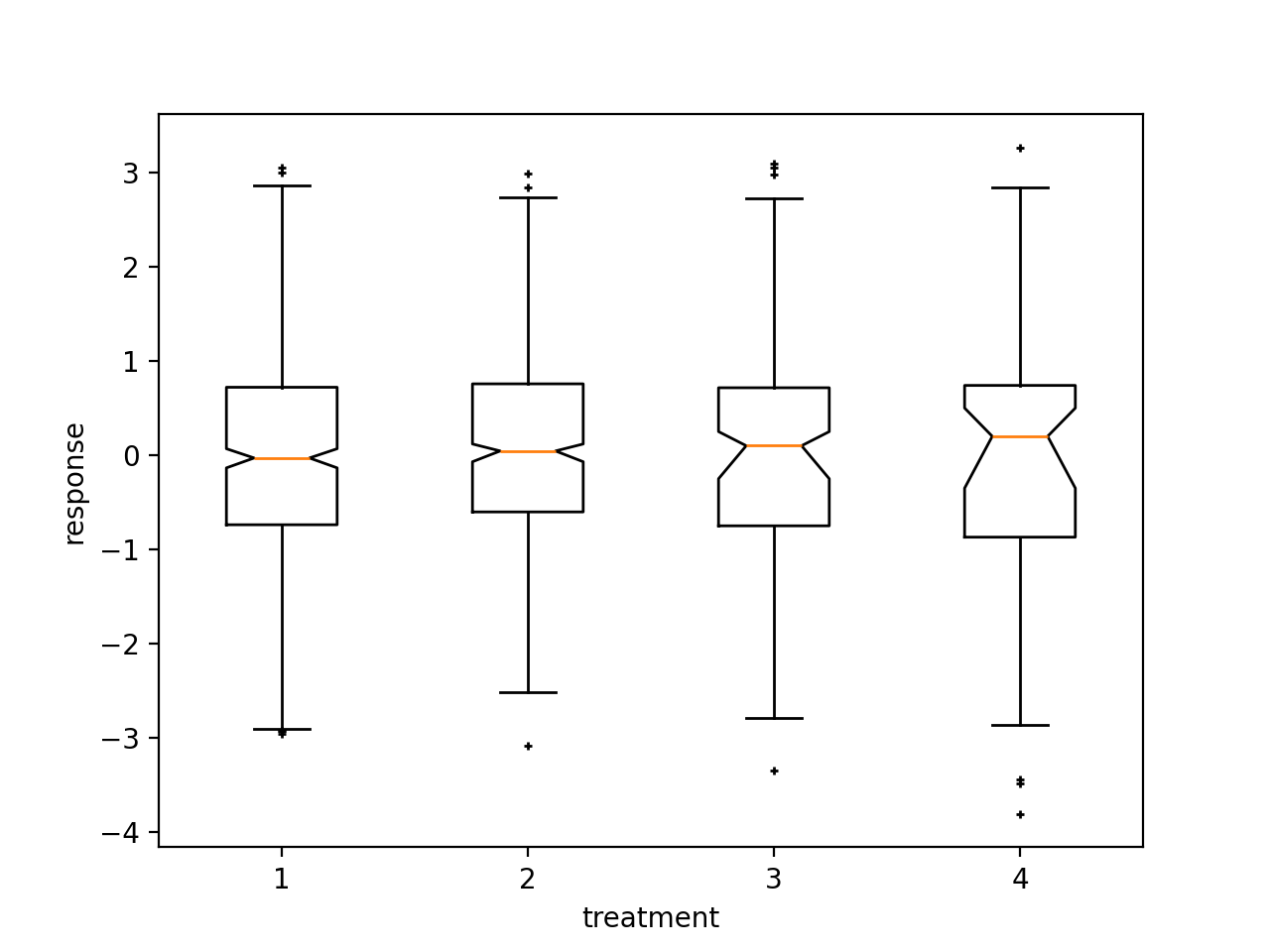
2.8 heatmap
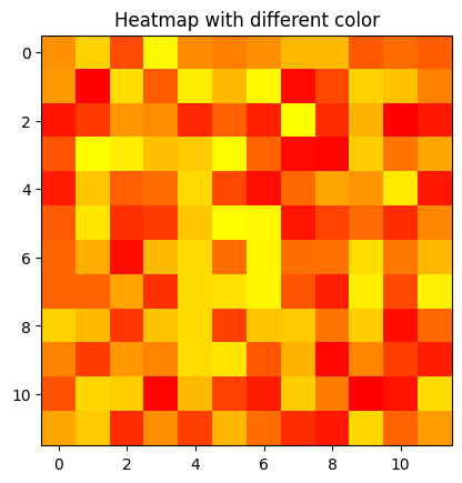
2.8.1 case 1
# Program to plot 2-D Heat map
# using matplotlib.pyplot.imshow() method
import numpy as np
import matplotlib.pyplot as plt

data = np.random.random((12, 12))
plt.imshow(data, cmap='autumn')

plt.title("Heatmap with different color")
plt.show()
2.8.2 case 2
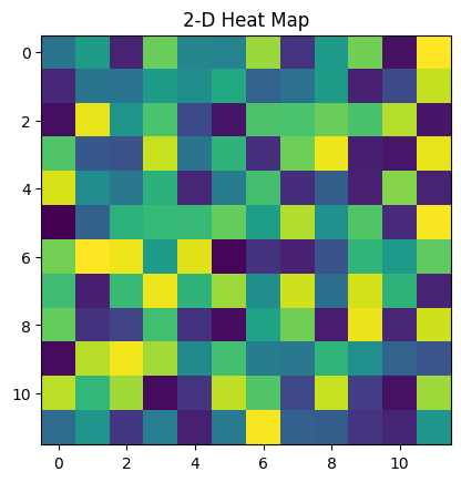
# Program to plot 2-D Heat map
# using matplotlib.pyplot.imshow() method
import numpy as np
import matplotlib.pyplot as plt

data = np.random.random(( 12 , 12 ))
plt.imshow( data )

plt.title( "2-D Heat Map" )
plt.show()
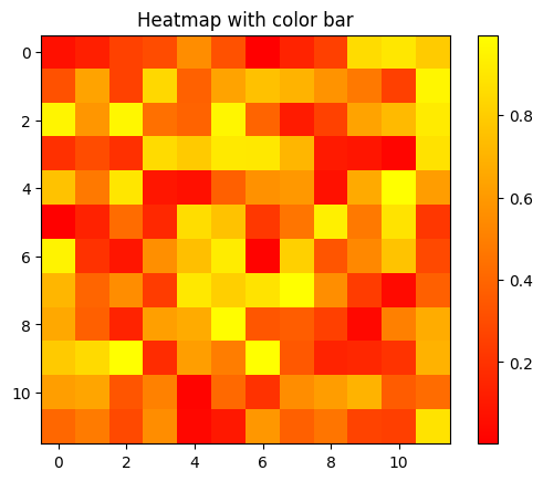
2.8.3 case 3
data = np.random.random((12, 12))
plt.imshow(data, cmap='autumn', interpolation='nearest')

# Add colorbar
plt.colorbar()

plt.title("Heatmap with color bar")
plt.show()
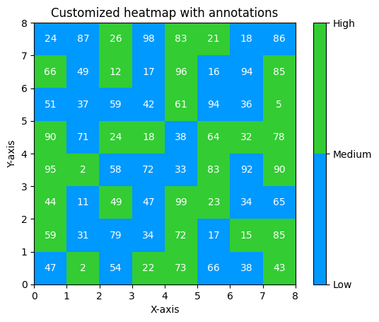
2.8.4 case 4
import matplotlib.colors as colors

# Generate random data
data = np.random.randint(0, 100, size=(8, 8))

# Create a custom color map
# with blue and green colors
colors_list = ['#0099ff', '#33cc33']
cmap = colors.ListedColormap(colors_list)

# Plot the heatmap with custom colors and annotations
plt.imshow(data, cmap=cmap, vmin=0,\
		vmax=100, extent=[0, 8, 0, 8])
for i in range(8):
	for j in range(8):
		plt.annotate(str(data[i][j]), xy=(j+0.5, i+0.5),
					ha='center', va='center', color='white')

# Add colorbar
cbar = plt.colorbar(ticks=[0, 50, 100])
cbar.ax.set_yticklabels(['Low', 'Medium', 'High'])

# Set plot title and axis labels
plt.title("Customized heatmap with annotations")
plt.xlabel("X-axis")
plt.ylabel("Y-axis")

# Display the plot
plt.show()
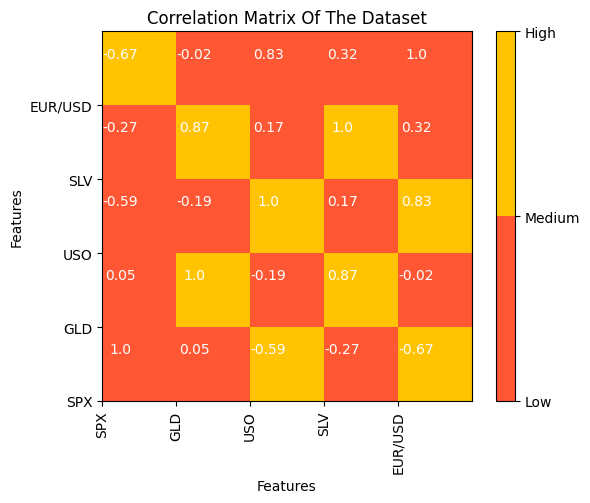
2.8.5 case 5
import pandas as pd
import matplotlib.pyplot as plt
from matplotlib import colors

df = pd.read_csv("gold_price_data.csv")

# Calculate correlation between columns
corr_matrix = df.corr()

# Create a custom color
# map with blue and green colors
colors_list = ['#FF5733', '#FFC300']
cmap = colors.ListedColormap(colors_list)

# Plot the heatmap with custom colors and annotations
plt.imshow(corr_matrix, cmap=cmap, vmin=0\
		, vmax=1, extent=[0, 5, 0, 5])
for i in range(5):
	for j in range(5):
		plt.annotate(str(round(corr_matrix.values[i][j], 2)),\
					xy=(j+0.25, i+0.7),
					ha='center', va='center', color='white')

# Add colorbar
cbar = plt.colorbar(ticks=[0, 0.5, 1])
cbar.ax.set_yticklabels(['Low', 'Medium', 'High'])

# Set plot title and axis labels
plt.title("Correlation Matrix Of The Dataset")
plt.xlabel("Features")
plt.ylabel("Features")

# Set tick labels
plt.xticks(range(len(corr_matrix.columns)),\
		corr_matrix.columns, rotation=90)
plt.yticks(range(len(corr_matrix.columns)),
		corr_matrix.columns)

# Display the plot
plt.show()
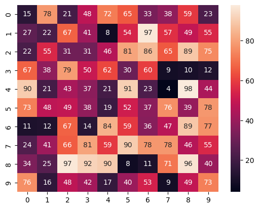
2.8.6 case 6
# importing the modules
import numpy as np
import seaborn as sns
import matplotlib.pyplot as plt

# generating 2-D 10x10 matrix of random numbers
# from 1 to 100
data = np.random.randint(low=1,
						high=100,
						size=(10, 10))

# plotting the heatmap
hm = sns.heatmap(data=data,
				annot=True)

# displaying the plotted heatmap
plt.show()
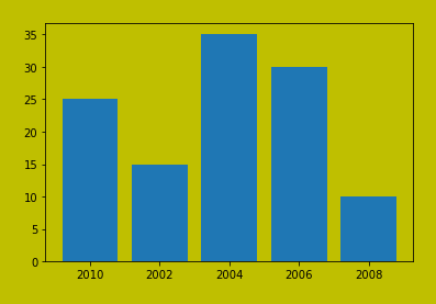
2.9 save fig
2.9.1 case 1
import matplotlib.pyplot as plt

# Creating data
year = ['2010', '2002', '2004', '2006', '2008']
production = [25, 15, 35, 30, 10]

# Plotting barchart
plt.bar(year, production)

# Saving the figure.
plt.savefig("output.jpg")

# Saving figure by changing parameter values
plt.savefig("output1", facecolor='y', bbox_inches="tight",
			pad_inches=0.3, transparent=True)
2.9.2 case 2
import matplotlib.pyplot as plt

# Creating data
year = ['2010', '2002', '2004', '2006', '2008']
production = [25, 15, 35, 30, 10]

# Plotting barchart
plt.bar(year, production)

# Saving the figure.
plt.savefig("output.jpg")

# Saving figure by changing parameter values
plt.savefig("output1", facecolor='y', bbox_inches="tight",
			pad_inches=0.3, transparent=True)
2.10 pandas绘图
2.10.1 case 1
# importing libraries
import matplotlib.pyplot as plt
import pandas as pd
import numpy as np

ts = pd.Series(np.random.randn(1000), index = pd.date_range(
								'1/1/2000', periods = 1000))

df = pd.DataFrame(np.random.randn(1000, 4),
index = ts.index, columns = list('ABCD'))

df = df.cumsum()
plt.figure()
df.plot()
plt.show()
2.10.2 case 2
# importing libraries
import matplotlib.pyplot as plt
import pandas as pd
import numpy as np

ts = pd.Series(np.random.randn(1000), index = pd.date_range(
								'1/1/2000', periods = 1000))

df = pd.DataFrame(np.random.randn(1000, 4),
index = ts.index, columns = list('ABCD'))

df = df.cumsum()
plt.figure()
df.plot()
plt.show()
2.10.3 case 3
# importing libraries
import matplotlib.pyplot as plt
import pandas as pd
import numpy as np

ts = pd.Series(np.random.randn(1000), index = pd.date_range(
								'1/1/2000', periods = 1000))

df = pd.DataFrame(np.random.randn(1000, 4), index = ts.index,
									columns = list('ABCD'))

df3 = pd.DataFrame(np.random.randn(1000, 2),
			columns =['B', 'C']).cumsum()

df3['A'] = pd.Series(list(range(len(df))))
df3.plot(x ='A', y ='B')
plt.show()
2.10.4 case 4
# importing libraries
import matplotlib.pyplot as plt
import pandas as pd
import numpy as np

ts = pd.Series(np.random.randn(1000), index = pd.date_range(
								'1/1/2000', periods = 1000))

df = pd.DataFrame(np.random.randn(1000, 4), index = ts.index,
									columns = list('ABCD'))

df3 = pd.DataFrame(np.random.randn(1000, 2),
			columns =['B', 'C']).cumsum()

df3['A'] = pd.Series(list(range(len(df))))
df3.iloc[5].plot.bar()
plt.axhline(0, color ='k')

plt.show()
2.10.5 case 5
# importing libraries
import matplotlib.pyplot as plt
import pandas as pd
import numpy as np

df4 = pd.DataFrame({'a': np.random.randn(1000) + 1,
					'b': np.random.randn(1000),
					'c': np.random.randn(1000) - 1},
						columns =['a', 'b', 'c'])
plt.figure()

df4.plot.hist(alpha = 0.5)
plt.show()

2.10.6 case 6
# importing libraries
import matplotlib.pyplot as plt
import pandas as pd
import numpy as np
df = pd.DataFrame(np.random.rand(10, 5),
columns =['A', 'B', 'C', 'D', 'E'])
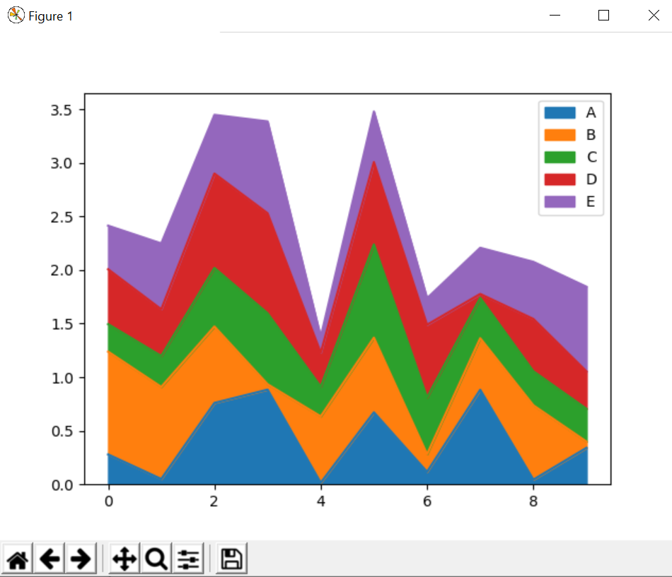
df.plot.area()
plt.show()
2.10.7 case 7
# importing libraries
import matplotlib.pyplot as plt
import pandas as pd
import numpy as np
df = pd.DataFrame(np.random.rand(500, 4),
columns =['a', 'b', 'c', 'd'])
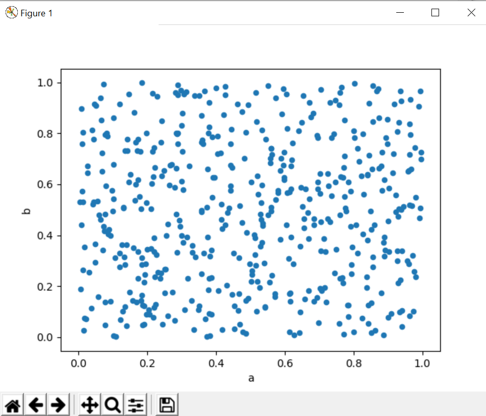
df.plot.scatter(x ='a', y ='b')
plt.show()
2.10.8 case 8
# importing libraries
import matplotlib.pyplot as plt
import pandas as pd
import numpy as np
df = pd.DataFrame(np.random.randn(1000, 2), columns =['a', 'b'])
df['a'] = df['a'] + np.arrange(1000)
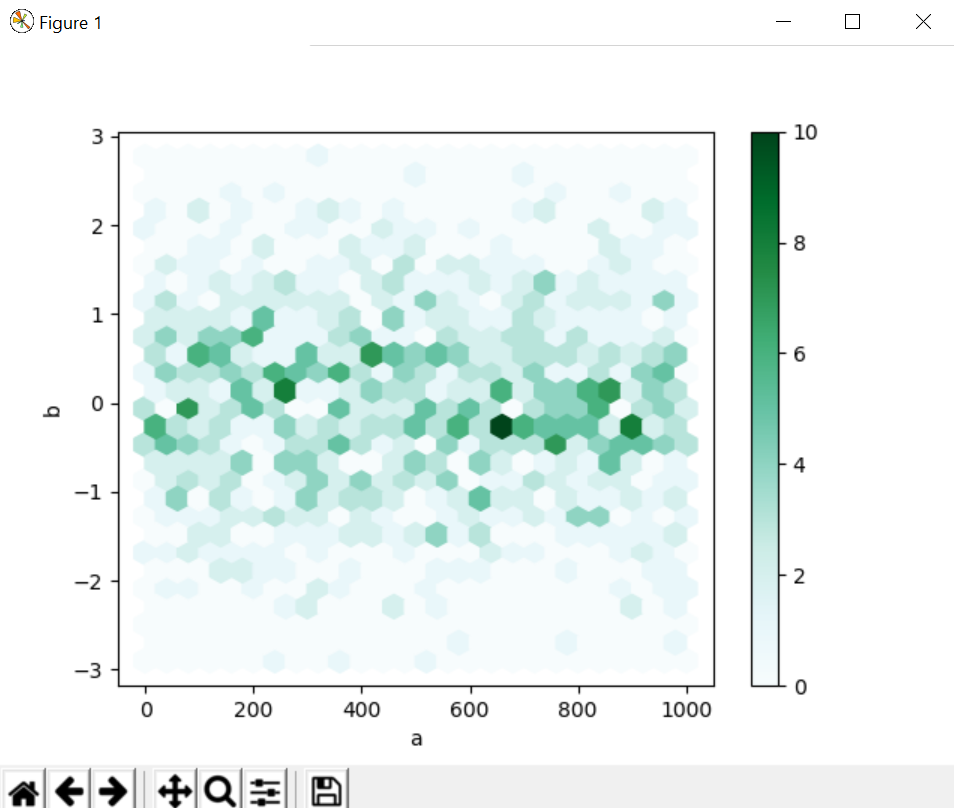
df.plot.hexbin(x ='a', y ='b', gridsize = 25)
plt.show()
2.10.9 case 9
# importing libraries
import matplotlib.pyplot as plt
import pandas as pd
import numpy as np

series = pd.Series(3 * np.random.rand(4),
index =['a', 'b', 'c', 'd'], name ='series')

series.plot.pie(figsize =(4, 4))
plt.show()
2.10.10 case 10
import plotly.graph_objects as go
import pandas as pd

df = pd.read_csv('https://raw.githubusercontent.com / plotly / datasets / 718417069ead87650b90472464c7565dc8c2cb1c / sunburst-coffee-flavors-complete.csv')

fig = go.Figure()

fig.add_trace(go.Sunburst(
	ids = df.ids,
	labels = df.labels,
	parents = df.parents,
	domain = dict(column = 0)
))

fig.show()
2.11 error plot
2.11.1 case 1
# importing matplotlib
import matplotlib.pyplot as plt


# making a simple plot
x =[1, 2, 3, 4, 5, 6, 7]
y =[1, 2, 1, 2, 1, 2, 1]

# creating error
y_error = 0.2

# plotting graph
plt.plot(x, y)

plt.errorbar(x, y,
			yerr = y_error,
			fmt ='o')
2.11.2 case 2
# importing matplotlib
import matplotlib.pyplot as plt

# making a simple plot
x =[1, 2, 3, 4, 5, 6, 7]
y =[1, 2, 1, 2, 1, 2, 1]

# creating error
x_error = 0.5

# plotting graph
plt.plot(x, y)
plt.errorbar(x, y,
			xerr = x_error,
			fmt ='o')
2.11.3 case 3
# importing matplotlib
import matplotlib.pyplot as plt


# making a simple plot
x =[1, 2, 3, 4, 5, 6, 7]
y =[1, 2, 1, 2, 1, 2, 1]

# creating error
x_error = 0.5
y_error = 0.3

# plotting graph
plt.plot(x, y)
plt.errorbar(x, y,
			yerr = y_error,
			xerr = x_error,
			fmt ='o')
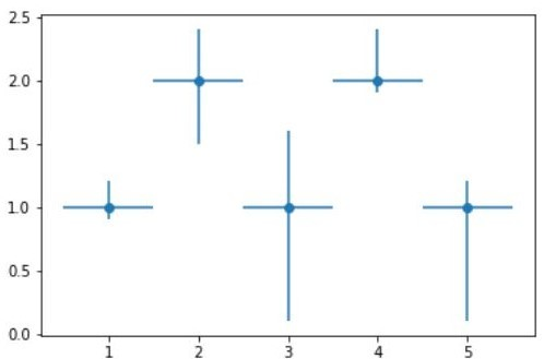
2.11.4 case 4
# importing matplotlib
import matplotlib.pyplot as plt
# making a simple plot
x =[1, 2, 3, 4, 5]
y =[1, 2, 1, 2, 1]
# creating error
y_errormin =[0.1, 0.5, 0.9,
0.1, 0.9]
y_errormax =[0.2, 0.4, 0.6,
0.4, 0.2]
x_error = 0.5
y_error =[y_errormin, y_errormax]
# plotting graph
# plt.plot(x, y)
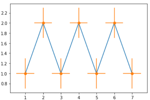
plt.errorbar(x, y,
yerr = y_error,
xerr = x_error,
fmt ='o')
2.11.5 case 5
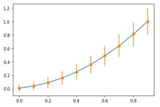
# import require modules
import numpy as np
import matplotlib.pyplot as plt


# defining our function
x = np.arange(10)/10
y = (x + 0.1)**2

# defining our error
y_error = np.linspace(0.05, 0.2, 10)

# plotting our function and
# error bar
plt.plot(x, y)

plt.errorbar(x, y, yerr = y_error, fmt ='o')
3.动画
3.1 case 1
from matplotlib import pyplot as plt
import numpy as np
from matplotlib.animation import FuncAnimation

# initializing a figure in
# which the graph will be plotted
fig = plt.figure()

# marking the x-axis and y-axis
axis = plt.axes(xlim =(0, 4),
				ylim =(-2, 2))

# initializing a line variable
line, = axis.plot([], [], lw = 3)

# data which the line will
# contain (x, y)
def init():
	line.set_data([], [])
	return line,

def animate(i):
	x = np.linspace(0, 4, 1000)

	# plots a sine graph
	y = np.sin(2 * np.pi * (x - 0.01 * i))
	line.set_data(x, y)

	return line,

anim = FuncAnimation(fig, animate, init_func = init,
					frames = 200, interval = 20, blit = True)


anim.save('continuousSineWave.mp4',
		writer = 'ffmpeg', fps = 30)
3.2 case 2
import matplotlib.animation as animation
import matplotlib.pyplot as plt
import numpy as np


# creating a blank window
# for the animation
fig = plt.figure()
axis = plt.axes(xlim =(-50, 50),
				ylim =(-50, 50))

line, = axis.plot([], [], lw = 2)

# what will our line dataset
# contain?
def init():
	line.set_data([], [])
	return line,

# initializing empty values
# for x and y co-ordinates
xdata, ydata = [], []

# animation function
def animate(i):
	# t is a parameter which varies
	# with the frame number
	t = 0.1 * i

	# x, y values to be plotted
	x = t * np.sin(t)
	y = t * np.cos(t)

	# appending values to the previously
	# empty x and y data holders
	xdata.append(x)
	ydata.append(y)
	line.set_data(xdata, ydata)

	return line,

# calling the animation function
anim = animation.FuncAnimation(fig, animate, init_func = init,
							frames = 500, interval = 20, blit = True)

# saves the animation in our desktop
anim.save('growingCoil.mp4', writer = 'ffmpeg', fps = 30)

"""
    anim = animation.FuncAnimation(fig, update_line, frames=len_frames,
        fargs=(data_args, plot_list),interval=100,repeat=False)
    anim.save("growingCoil.gif", writer='pillow')
"""


 1769
1769

 被折叠的 条评论
为什么被折叠?
被折叠的 条评论
为什么被折叠?
 到【灌水乐园】发言


