


 本文介绍如何在Highcharts图表中沿X轴设置不同的背景色,以实现类似电能统计中区分峰平谷电价的效果。通过设置xAxis的plotBands属性,可以为图表添加多个背景色分辨带,从而达到视觉区分的目的。
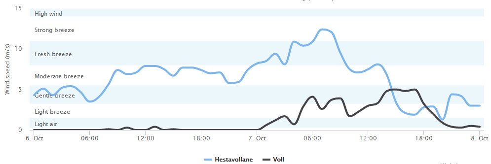
在Highcharts中文网里,介绍了如何按照Y轴的数值范围设置背景色,也叫分辨带,它提供的demo效果像这样:
代码在这里
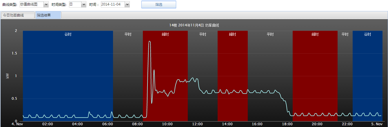
而如果要想沿着X轴设置不同的背景色或者叫分辨带该怎么办呢,在笔者的项目中,就曾经碰到过这样的需求。因为电能统计的时候是按照用电时间区分峰平谷电价的。尽量调节用电高峰到谷时电价区间,是节能的一个办法。效果图如下:
代码如下:
        // 一天24小时的曲线图,有峰平谷背景色
        function chartsDay(renderTo) {

            return {
                chart: {
                    zoomType: 'x',
                    resetZoomButton: {
                        theme: {
                            fill: 'white',
                            stroke: 'silver',
                            r: 0,
                            states: {
                                hover: {
                                    fill: '#000',
                                    style: {
                                        color: 'white'
                                    }
                                }
                            }
                        }
                    },
                    renderTo: renderTo,
                    plotBackgroundColor: null,
                    plotBorderWidth: null,
                    height: 382,
                    plotShadow: false,
                    type: 'spline'
                },
                title: {
                    text: currentRoom == 0 ? '总功率 ' + theYear + '年' + (theMonth + 1) + '月' + theDay + '日' : currentRoom + ' 号房间 ' + currentRoomName + ' ' + theYear + '年'
最低0.47元/天 解锁文章


 962
962

 被折叠的 条评论
为什么被折叠?
被折叠的 条评论
为什么被折叠?
 到【灌水乐园】发言


