


 本文介绍了如何在R语言中利用rcompanion包的plotNormalHistogram函数来绘制正态分布的直方图,并展示了数据预处理(移除缺失值)和美化图表的步骤。
绘制正态分布直方图有多种的方法,本文主要使用R语言中的rcompanion包的plotNormalHistogram函数进行分析
01 数据准备
02 去除数据中的缺失值NA
03 制图
install.packages("rcompanion")
library(rcompanion)
library(tidyr)
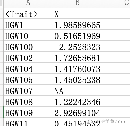
data<-read.table("test.txt",header=T,sep="\t",row.names=1)##读入数据
data<-drop_na(data,X) ##去除数据中的NA(缺失值)
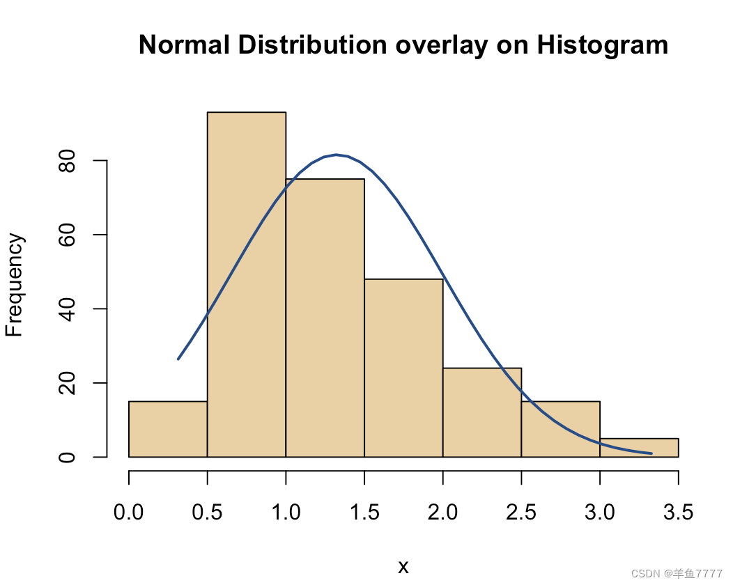
plotNormalHistogram(data$X, prob = FALSE,
main = "Normal Distribution overlay on Histogram",
length = 40 )
plotNormalHistogram( data$X, prob = FALSE, col="gray", border="black",
main = "Normal Distribution overlay on Histogram",
length = 5, linecol="blue", lwd=2) ###美化
# prob: 布尔值。FALSE,显示计数,否则就显示密度。
# main: 绘图的显示标题。
# length: 密度线中的点的数量。
# col: 直方图填充的颜色。
# border: 直方图边框的颜色。
# linecol: 密度线的颜色。
# lwd: 密度线的宽度。04 结果


 3616
3616


 被折叠的 条评论
为什么被折叠?
被折叠的 条评论
为什么被折叠?
 到【灌水乐园】发言


