


rem vs em
做为相对长度单位的俩个活宝, 都是以倍数关系定长度,只是参照物不一样,这里就事例分析两者的区别:
1,em 的参照倍数对象为其自身字体大小,font-size;如果没有向上继承;
2,rem的参照倍数对象为根元素
事例代码:
<html style="font-size:14px">
<div style="font-size:14px;background:#bbb;border:1px solid #f00;margin-bottom:5px;">
        this is a 14px div
        <p style="font-size:1em;background:#ccc;">
            this is a 1em p in 14px div
        </p>
    </div>

    <div style="font-size:10px;background:#b71119;border:1px solid #006f00;color:#fff;margin-bottom:5px">
        this is a 10px  div
        <p style="font-size:2em;background:#b0b000">
            this is a 2em p in 10px div
            <span style="font-size:1em;color:#b71119">
               span: this is a 1em span in 2emp of 10px div;
            </span>
        </p>
    </div>
    <div style="font-size:1rem;background:#ee7324;padding-bottom: 1px;">
        this is 1rem div
        <p style="font-size:2rem;background: #eee">
            this is a 2rem p in 1rem div
            <span style="font-size:.5rem;color:green">span: this is a 0.5rem span in 2rem p of 1rem div</span>
        </p>
    </div>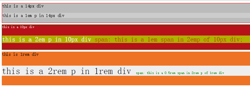
使用:
如果是跟父元素成倍数关系缩放大小,可选择em为单位;
rem常用在移动端开发,是非常不错的选择,可解决不同屏幕下的显示不适应情况,后面会介绍如何使用100%布局和rem 来开发移动端业务。


 4175
4175


 被折叠的 条评论
为什么被折叠?
被折叠的 条评论
为什么被折叠?
 到【灌水乐园】发言


