


 本文详细介绍了如何使用Pandas库中的DataFrame进行各种图表绘制,包括折线图、条形图、饼图等,并提供了丰富的示例代码,帮助读者快速掌握数据可视化技巧。
学习pandas数据框的绘图,轻松搞定各种图画法。
DataFrame.plot(x=None, y=None, kind='line', ax=None, subplots=False, sharex=None, sharey=False, layout=None,figsize=None, use_index=True, title=None, grid=None, legend=True, style=None, logx=False, logy=False,loglog=False, xticks=None, yticks=None, xlim=None, ylim=None, rot=None, fontsize=None, colormap=None,table=False, yerr=None, xerr=None, secondary_y=False, sort_columns=False, **kwds)
Parameters:
data : DataFrame
x : label or position, default None#指数据框列的标签或位置参数
y : label or position, default None
Allows plotting of one column versus another
kind : str
‘line’ : line plot (default)#折线图‘bar’ : vertical bar plot#条形图‘barh’ : horizontal bar plot#横向条形图‘hist’ : histogram#柱状图‘box’ : boxplot#箱线图‘kde’ : Kernel Density Estimation plot#Kernel 的密度估计图,主要对柱状图添加Kernel 概率密度线‘density’ : same as ‘kde’‘area’ : area plot#不了解此图‘pie’ : pie plot#饼图‘scatter’ : scatter plot#散点图‘hexbin’ : hexbin plot#不了解此图
ax : matplotlib axes object, default None#一个图片切成不同片段,子图对象
subplots : boolean, default False#判断图片中是否有子图
Make separate subplots for each column
sharex : boolean, default True if ax is None else False#如果有子图,子图共x轴刻度,标签
In case subplots=True, share x axis and set some x axis labels to invisible; defaults to True if ax is None otherwise False if an ax is passed in; Be aware, that passing in both an ax and sharex=True will alter all x axis labels for all axis in a figure!
sharey : boolean, default False#如果有子图,子图共y轴刻度,标签
In case subplots=True, share y axis and set some y axis labels to invisible
layout : tuple (optional)#子图的行列布局
(rows, columns) for the layout of subplots
figsize : a tuple (width, height) in inches#图片尺寸大小
use_index : boolean, default True#默认用索引做x轴
Use index as ticks for x axis
title : string#图片的标题用字符串
Title to use for the plot
grid : boolean, default None (matlab style default)#图片是否有网格
Axis grid lines
legend : False/True/’reverse’#子图的图例
Place legend on axis subplots
style : list or dict#对每列折线图设置线的类型
matplotlib line style per column
logx : boolean, default False#设置x轴刻度是否取对数
Use log scaling on x axis
logy : boolean, default False
Use log scaling on y axis
loglog : boolean, default False#同时设置x,y轴刻度是否取对数
Use log scaling on both x and y axes
xticks : sequence#设置x轴刻度值,序列形式(比如列表)
Values to use for the xticks
yticks : sequence#设置y轴刻度,序列形式(比如列表)
Values to use for the yticks
xlim : 2-tuple/list#设置坐标轴的范围,列表或元组形式
ylim : 2-tuple/list
rot : int, default None#设置轴标签(轴刻度)的显示旋转度数
Rotation for ticks (xticks for vertical, yticks for horizontal plots)
fontsize : int, default None#设置轴刻度的字体大小
Font size for xticks and yticks
colormap : str or matplotlib colormap object, default None#设置图的区域颜色
Colormap to select colors from. If string, load colormap with that name from matplotlib.
colorbar : boolean, optional
If True, plot colorbar (only relevant for ‘scatter’ and ‘hexbin’ plots)
position : float
Specify relative alignments for bar plot layout. From 0 (left/bottom-end) to 1 (right/top-end). Default is 0.5 (center)
layout : tuple (optional)
(rows, columns) for the layout of the plot
table : boolean, Series or DataFrame, default False
If True, draw a table using the data in the DataFrame and the data will be transposed to meet matplotlib’s default layout. If a Series or DataFrame is passed, use passed data to draw a table.
yerr : DataFrame, Series, array-like, dict and str
See Plotting with Error Bars for detail.
xerr : same types as yerr.
stacked : boolean, default False in line and
bar plots, and True in area plot. If True, create stacked plot.
sort_columns : boolean, default False
Sort column names to determine plot ordering
secondary_y : boolean or sequence, default False
Whether to plot on the secondary y-axis If a list/tuple, which columns to plot on secondary y-axis
mark_right : boolean, default True
When using a secondary_y axis, automatically mark the column labels with “(right)” in the legend
kwds : keywords
Options to pass to matplotlib plotting method
Returns:axes : matplotlib.AxesSubplot or np.array of them下面从http://pandas.pydata.org/pandas-docs/version/0.13.1/visualization.html的实例分析
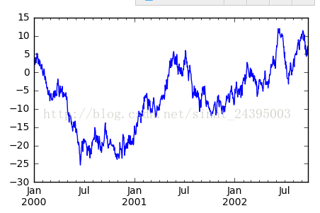
%matplotlib inlineimport numpy as npimport pandas as pdimport matplotlib.pyplot as pltplt.rc('figure', figsize=(5, 3))#设置图片大小ts = pd.Series(np.random.randn(1000), index=pd.date_range('1/1/2000', periods=1000))ts = ts.cumsum()ts.plot()
![]()
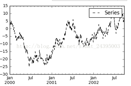
plt.figure(); ts.plot(style='k--', label='Series'); plt.legend()#创建个新图片,在新图片上画ts的折线图,并添加图例
![]()
df =pd.DataFrame(np.random.randn(1000, 4), index=ts.index, columns=list('ABCD'))
df = df.cumsum()
plt.figure(); df.plot(); plt.legend(loc='best')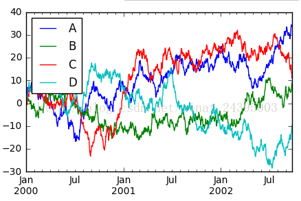
df.plot(subplots=True, figsize=(6, 6)); plt.legend(loc='best')#对数据框相同索引分列分别作图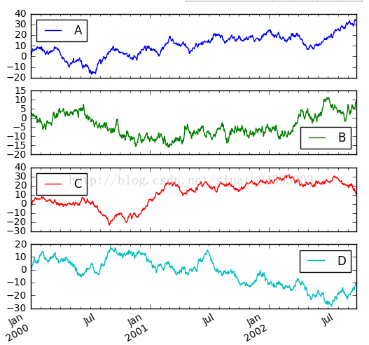
plt.figure();
ts = pd.Series(np.random.randn(1000), index=pd.date_range('1/1/2000', periods=1000))
ts = np.exp(ts.cumsum())
ts.plot(logy=True) #对y轴进行log(y)放缩,图中y轴刻度依然是y的真实值,而不是log(y)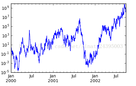
plt.figure()
df3 = pd.DataFrame(np.random.randn(1000, 2), columns=['B', 'C']).cumsum()
df3['A'] = pd.Series(list(range(len(df))))
df3.plot(x='A', y='B')#x,y分别设置x轴,y轴的列标签或列的位置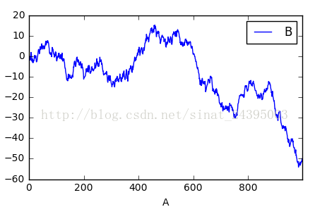
plt.figure()
df.A.plot()
df.B.plot(secondary_y=True, style='g')#设置第二个y轴(右y轴)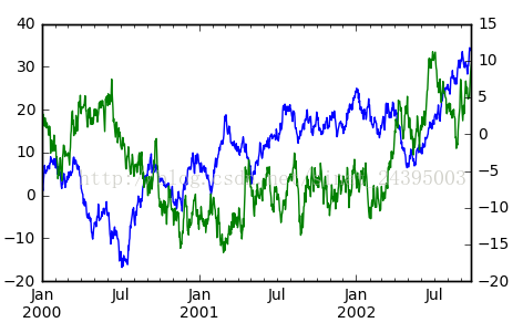
plt.figure()
ax = df.plot(secondary_y=['A', 'B'])#设置2个列轴,分别对各个列轴画折线图。ax(axes)可以理解为子图,也可以理解成对黑板进行切分,每一个板块就是一个axes
ax.set_ylabel('CD scale')
ax.right_ax.set_ylabel('AB scale')
ax.legend(loc=2)#设置图例的位置
plt.legend(loc=1)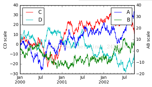
[source]


 168
168

 被折叠的 条评论
为什么被折叠?
被折叠的 条评论
为什么被折叠?
 到【灌水乐园】发言


