


C# WPF编程-布局
布局
WPF布局原则
WPF窗口只能包含单个元素。为在WPF窗口中放置多个元素并创建更贴近实用的用户界面,需要在窗口上放置一个容器,然后在这个容器中添加其他元素。
造成这一限制的原因是Window类继承自ContentControl类。
在WPF窗口布局需要遵循以下几条重要原则:
- 不应显示设定元素的尺寸:元素应当可以改变尺寸以适合他们的内容。可通过设置最大和最小尺寸来限制可以接受的控件尺寸范围。
- 不应使用屏幕坐标指定元素的位置:元素应当由它们的容器根据它们之间的尺寸、顺序以及其他特定于具体布局容器的信息进行排列。元素之间添加空白空间,可使用Margin属性。
- 布局容器的子元素“共享”可用的空间:如果空间允许,布局容器会根据每个元素的内容尽可能为元素设置更合理的尺寸。
- 可嵌套的布局容器:典型的用户界面使用Grid面板作为开始,Grid面板是WPF中功能最强大的容器,Grid面板可包含其他布局容器,包含的这些容器以更小的分组排列元素,如带有标题的文本框、列表框中的项、工具栏上的图标以及一列按钮等。
布局过程
WPF布局包括两个阶段:测量(measure)阶段和排列(arrange)阶段。测量阶段容器遍历所有子元素,并询问子元素它们所期望的尺寸。排列阶段,容器在合适的位置放置子元素。
注意:布局容器不能提供任何滚动支持。滚动是由特定的内容控件-ScrollViewer提供。
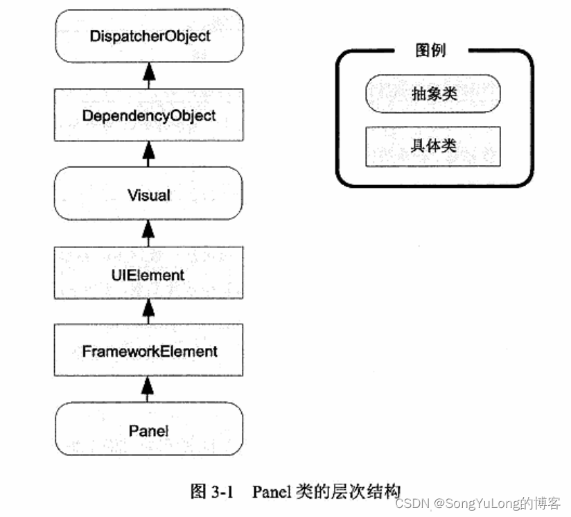
布局容器
所有WPF布局容器都是派生自System.Windows.Controls.Panel抽象类的面板。Panel类添加了少量成员,包括三个共有属性。
Panel类的共有属性:
- Background:该属性是用于为面板背景着色的画刷。
- Children:该属性是在面板中存储的条目集合。
- IsItemsHost:该属性是一个布尔值,如果面板用于显示与ItemsControls控件关联的项,该属性值为true。
核心布局面板:
- StackPanel:在水平或垂直的堆栈中放置元素。
- WrapPanel:在一系列可换行的行中放置元素。水平方向,从左到右放置元素。垂直方向,从上到下放置元素。
- DockPanel:更加容器的整个边界调整元素。
- Grid:根据不可见的表格在行个列中排列元素,这是最灵活、最常用的容器之一。
- UniformGrid:在不可见但是强制所有单元格具有相同尺寸的表中放置元素。
- Canvas:使用固定坐标绝对定位元素。对于尺寸可变的窗口,不适合使用该布局容器。
StackPanel和WrapPanel面板主要用来控制用户界面中一小部分的布局细节,并非用于控制整个窗口布局。
更专业的面板:
- TabPanel:在TabPanel面板中包含多个选项卡。
- ToolbarPanel:工具栏中的多个按钮。
- ToolbarOverflowPanel:Toolbar控件的溢出菜单中的多个命令。
- VirtualizingStackPanel:数据绑定列表控件使用该面板以大幅降低开销。
- InkCanvas:该控件和Canvas控件类似,但该控件支持处理平板电脑上的手写笔输入。
布局属性
| 名称 | 说明 |
|---|---|
| HorizontalAlignment | 当水平方向上有额外的空间时,该属性决定了子元素在布局中如何定位。可选值:Center、Left、Right或Stretch等属性值 |
| VerticalAlignment | 当垂直方向上有额外的空间时,该属性决定了子元素在布局中如何定位。可选值:Center、Top、Bottom或Stretch等属性值 |
| Margin | 该属性用于在元素的周围添加一定的空间。顶部、底部、左边、右边添加空间 |
| MinWidth和MinHeight | 这两个属性用于设置元素的最小尺寸 |
| MaxWidth和MaxHeight | 这两个属性用于设置元素的最打尺寸 |
| Width和Height | 这两个属性用于设置元素的尺寸 |
Border控件
Border控件不是布局面板,而是非常便于使用的元素,经常与布局面板一起使用。
Border类的属性:
| Background | 使用Brush对象设置边框中所有内容后面的背景。 |
| BorderBrush和BroderThickness | 使用Brush对象设置位于Border对象边缘的边框的颜色,并设置边框的宽度。为显示边框必须设置这两个属性 |
| CornerRadius | 该属性设置边框圆角 |
| Padding | 该属性在边框和内部的内容之间添加空间 |
<Window x:Class="WpfHelloWorld.MainWindow"
xmlns="http://schemas.microsoft.com/winfx/2006/xaml/presentation"
xmlns:x="http://schemas.microsoft.com/winfx/2006/xaml"
xmlns:d="http://schemas.microsoft.com/expression/blend/2008"
xmlns:mc="http://schemas.openxmlformats.org/markup-compatibility/2006"
xmlns:sys="clr-namespace:System;assembly=mscorlib"
xmlns:local="clr-namespace:WpfHelloWorld"
mc:Ignorable="d"
Title="MainWindow" Height="450" Width="800">
<Grid Name="grid1">
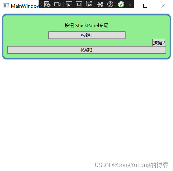
<Border Margin="5" Padding="5" Background="LightGreen"
BorderBrush="SteelBlue" BorderThickness="3,5,3,5"
CornerRadius="8" VerticalAlignment="Top">
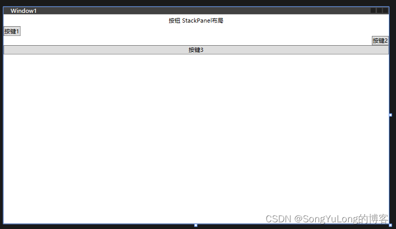
<StackPanel Orientation="Vertical" Margin="5">
<Label Margin="3" HorizontalAlignment="Center">按钮 StackPanel布局</Label>
<Button Margin="3,0,0,0" MaxWidth="200" MinWidth="100">按键1</Button>
<Button HorizontalAlignment="Right">按键2</Button>
<Button HorizontalAlignment="Stretch">按键3</Button>
</StackPanel>
</Border>
</Grid>
</Window>
常用布局
StackPanel布局
<Window x:Class="WpfHelloWorld.Window1"
xmlns="http://schemas.microsoft.com/winfx/2006/xaml/presentation"
xmlns:x="http://schemas.microsoft.com/winfx/2006/xaml"
xmlns:d="http://schemas.microsoft.com/expression/blend/2008"
xmlns:mc="http://schemas.openxmlformats.org/markup-compatibility/2006"
xmlns:local="clr-namespace:WpfHelloWorld"
mc:Ignorable="d"
Title="Window1" Height="450" Width="800">
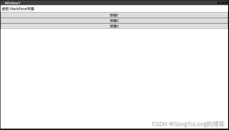
<StackPanel>
<Label>按钮 StackPanel布局</Label>
<Button>按键1</Button>
<Button>按键2</Button>
<Button>按键3</Button>
</StackPanel>
</Window>
通过设置Orientation属性,改变排列方向
< StackPanel Orientation=“Horizontal”> 水平方向
< StackPanel Orientation=“Vertical”> 垂直方向
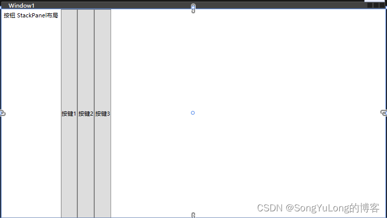
<StackPanel Orientation="Vertical">
    <Label HorizontalAlignment="Center">按钮 StackPanel布局</Label>
    <Button HorizontalAlignment="Left">按键1</Button>
    <Button HorizontalAlignment="Right">按键2</Button>
    <Button HorizontalAlignment="Stretch">按键3</Button>
</StackPanel>
WrapPanel布局
WrapPanel面板在可能得空间中,以一次一行或一列的方式布局控件。
<Window x:Class="WpfHelloWorld.MainWindow"
xmlns="http://schemas.microsoft.com/winfx/2006/xaml/presentation"
xmlns:x="http://schemas.microsoft.com/winfx/2006/xaml"
xmlns:d="http://schemas.microsoft.com/expression/blend/2008"
xmlns:mc="http://schemas.openxmlformats.org/markup-compatibility/2006"
xmlns:sys="clr-namespace:System;assembly=mscorlib"
xmlns:local="clr-namespace:WpfHelloWorld"
mc:Ignorable="d"
Title="MainWindow" Height="450" Width="800">
<Grid Name="grid1">
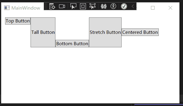
<WrapPanel Margin="10">
<Button VerticalAlignment="Top">Top Button</Button>
<Button MinHeight="80" >Tall Button</Button>
<Button VerticalAlignment="Bottom">Bottom Button</Button>
<Button>Stretch Button</Button>
<Button VerticalAlignment="Center">Centered Button</Button>
</WrapPanel>
</Grid>
</Window>
DockPanel布局
DockPanel面板,沿着一条外边缘来拉伸所包含的控件。
<Window x:Class="WpfHelloWorld.MainWindow"
        xmlns="http://schemas.microsoft.com/winfx/2006/xaml/presentation"
        xmlns:x="http://schemas.microsoft.com/winfx/2006/xaml"
        xmlns:d="http://schemas.microsoft.com/expression/blend/2008"
        xmlns:mc="http://schemas.openxmlformats.org/markup-compatibility/2006"
        xmlns:sys="clr-namespace:System;assembly=mscorlib"
        xmlns:local="clr-namespace:WpfHelloWorld"
        mc:Ignorable="d"
        Title="MainWindow" Height="450" Width="800">

    <Grid Name="grid1">
        <DockPanel LastChildFill="True">
            <Button DockPanel.Dock="Top">Top Button</Button>
            <Button DockPanel.Dock="Bottom">Bottom Button</Button>
            <Button DockPanel.Dock="Left">Left Button</Button>
            <Button DockPanel.Dock="Right">Right Button</Button>
            <Button>Remaining Space</Button>
        </DockPanel>
    </Grid>
</Window>

Grid布局
Grid面板是WPF中功能最强大的布局容器。Grid面板也是将窗口分割成更小区域的理想工具。Grid面板常作为窗口的顶级容器。Grid.ShowGridLines属性设置为true,可以显示面板网格线。
Grid面板通过使用对象填充Grid.ColumnDefinitions和Grid.RowDefinitions集合来创建网格。
Grid布局定义:
<Window x:Class="WpfHelloWorld.MainWindow"
xmlns="http://schemas.microsoft.com/winfx/2006/xaml/presentation"
xmlns:x="http://schemas.microsoft.com/winfx/2006/xaml"
xmlns:d="http://schemas.microsoft.com/expression/blend/2008"
xmlns:mc="http://schemas.openxmlformats.org/markup-compatibility/2006"
xmlns:sys="clr-namespace:System;assembly=mscorlib"
xmlns:local="clr-namespace:WpfHelloWorld"
mc:Ignorable="d"
Title="MainWindow" Height="450" Width="800">
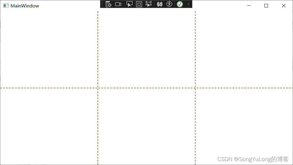
<Grid ShowGridLines="True" Name="grid1">
<Grid.RowDefinitions>
<!-- 两行 -->
<RowDefinition></RowDefinition>
<RowDefinition></RowDefinition>
</Grid.RowDefinitions>
<Grid.ColumnDefinitions>
<!-- 三列 -->
<ColumnDefinition></ColumnDefinition>
<ColumnDefinition></ColumnDefinition>
<ColumnDefinition></ColumnDefinition>
</Grid.ColumnDefinitions>
</Grid>
</Window>
Grid布局添加元素
<Window x:Class="WpfHelloWorld.MainWindow"
xmlns="http://schemas.microsoft.com/winfx/2006/xaml/presentation"
xmlns:x="http://schemas.microsoft.com/winfx/2006/xaml"
xmlns:d="http://schemas.microsoft.com/expression/blend/2008"
xmlns:mc="http://schemas.openxmlformats.org/markup-compatibility/2006"
xmlns:sys="clr-namespace:System;assembly=mscorlib"
xmlns:local="clr-namespace:WpfHelloWorld"
mc:Ignorable="d"
Title="MainWindow" Height="450" Width="800">
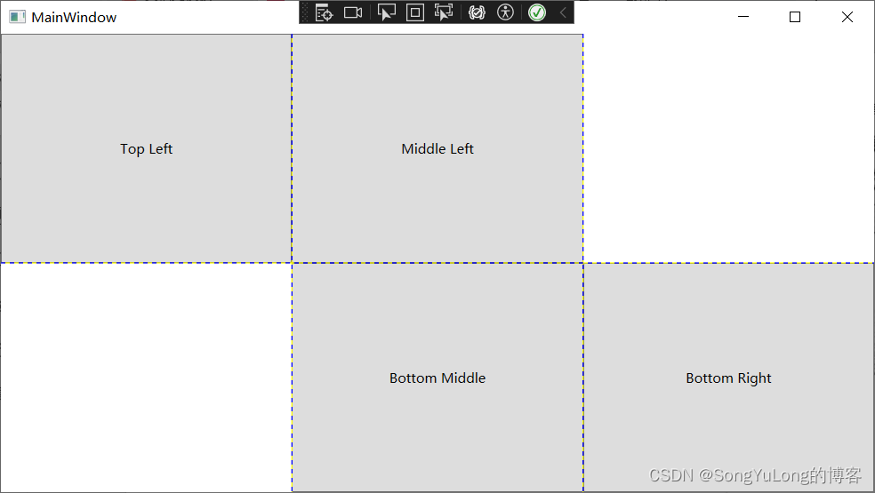
<Grid ShowGridLines="True" Name="grid1">
<Grid.RowDefinitions>
<!-- 两行 -->
<RowDefinition></RowDefinition>
<RowDefinition></RowDefinition>
</Grid.RowDefinitions>
<Grid.ColumnDefinitions>
<!-- 三列 -->
<ColumnDefinition></ColumnDefinition>
<ColumnDefinition></ColumnDefinition>
<ColumnDefinition></ColumnDefinition>
</Grid.ColumnDefinitions>
<!-- 网格布局添加元素 -->
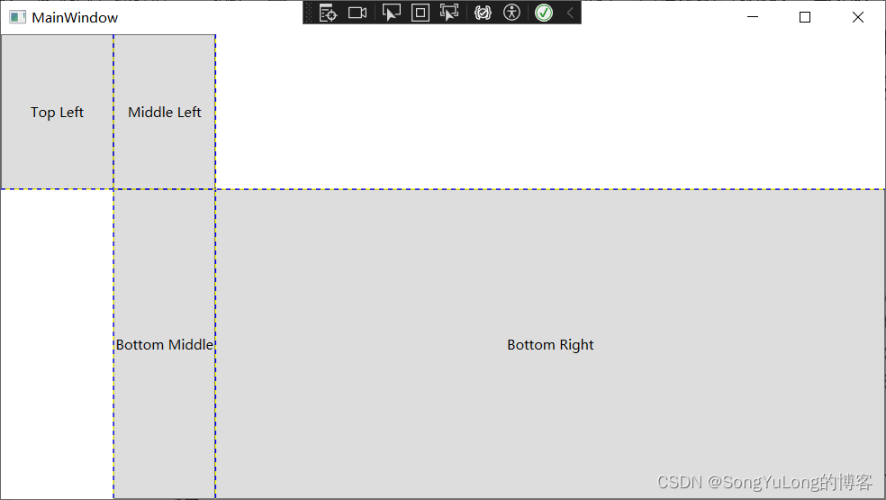
<Button Grid.Row="0" Grid.Column="0">Top Left</Button>
<Button Grid.Row="0" Grid.Column="1">Middle Left</Button>
<Button Grid.Row="1" Grid.Column="2">Bottom Right</Button>
<Button Grid.Row="1" Grid.Column="1">Bottom Middle</Button>
</Grid>
</Window>
调整行和列
Grid面板支持一次三种设置尺寸的方式:
- 绝对设置尺寸方式:使用设备无关点位的准确地设置尺寸。难以适应内容大小和容器大小的改变。
- 自动设置尺寸方式:每行和每列的尺寸刚好满足需要。这是最有用的尺寸设置方式。
- 按比例设置尺寸方式:按比例将空间分割到一组行和列中。这是对所有行和列的标准设置。
- 绝对宽度:
< ColumnDefinition Width=“100”>< /ColumnDefinition> - 自动尺寸:
< ColumnDefinition Width=“Auto”>< /ColumnDefinition> - 比例尺寸:
< ColumnDefinition Width=“*”>< /ColumnDefinition>
如有两行时按比例设置尺寸,第一行的高度是第二行高度的一半:
< RowDefinition Height=“*”>< /RowDefinition>
< RowDefinition Height=“2*”>< /RowDefinition>
<Window x:Class="WpfHelloWorld.MainWindow"
        xmlns="http://schemas.microsoft.com/winfx/2006/xaml/presentation"
        xmlns:x="http://schemas.microsoft.com/winfx/2006/xaml"
        xmlns:d="http://schemas.microsoft.com/expression/blend/2008"
        xmlns:mc="http://schemas.openxmlformats.org/markup-compatibility/2006"
        xmlns:sys="clr-namespace:System;assembly=mscorlib"
        xmlns:local="clr-namespace:WpfHelloWorld"
        mc:Ignorable="d"
        Title="MainWindow" Height="450" Width="800">

    <Grid ShowGridLines="True" Name="grid1">
        <Grid.RowDefinitions>
            <!-- 两行 -->
            <RowDefinition Height="*"></RowDefinition>
            <RowDefinition Height="2*"></RowDefinition>
        </Grid.RowDefinitions>
        <Grid.ColumnDefinitions>
            <!-- 三列 -->
            <ColumnDefinition Width="100"></ColumnDefinition>
            <ColumnDefinition Width="Auto"></ColumnDefinition>
            <ColumnDefinition Width="*"></ColumnDefinition>
        </Grid.ColumnDefinitions>

        <!-- 网格布局添加元素 -->
        <Button Grid.Row="0" Grid.Column="0">Top Left</Button>
        <Button Grid.Row="0" Grid.Column="1">Middle Left</Button>
        <Button Grid.Row="1" Grid.Column="2">Bottom Right</Button>
        <Button Grid.Row="1" Grid.Column="1">Bottom Middle</Button>
    </Grid>
</Window>
<Window x:Class="WpfHelloWorld.MainWindow"
xmlns="http://schemas.microsoft.com/winfx/2006/xaml/presentation"
xmlns:x="http://schemas.microsoft.com/winfx/2006/xaml"
xmlns:d="http://schemas.microsoft.com/expression/blend/2008"
xmlns:mc="http://schemas.openxmlformats.org/markup-compatibility/2006"
xmlns:sys="clr-namespace:System;assembly=mscorlib"
xmlns:local="clr-namespace:WpfHelloWorld"
mc:Ignorable="d"
Title="MainWindow" Height="450" Width="800">
<Grid ShowGridLines="True" Name="grid1">
<Grid.RowDefinitions>
<!-- 两行 -->
<RowDefinition Height="*"></RowDefinition>
<RowDefinition Height="Auto"></RowDefinition>
</Grid.RowDefinitions>
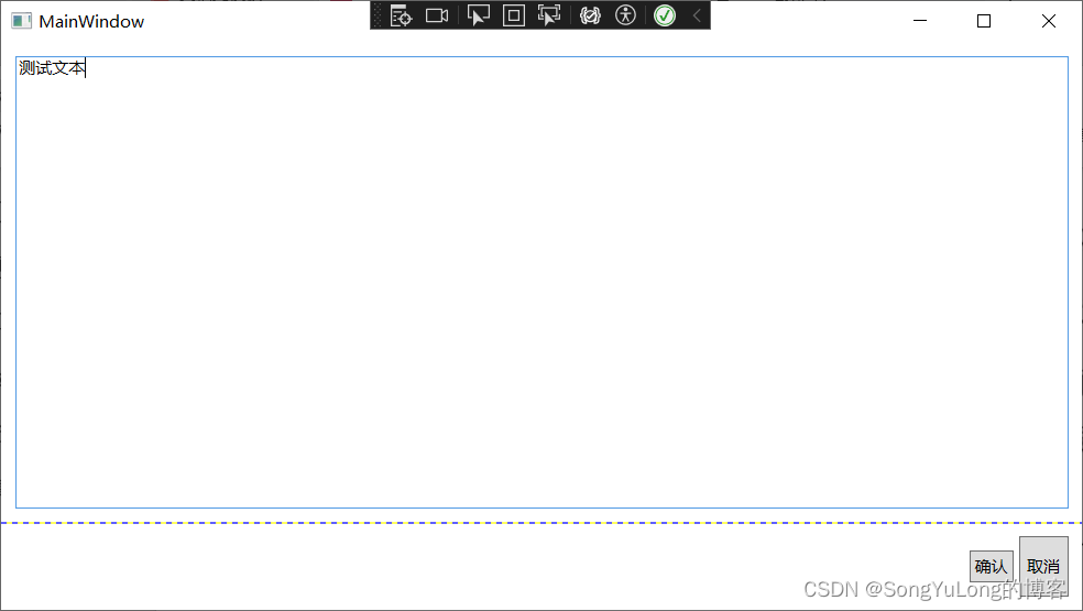
<TextBox Margin="10" Grid.Row="0">测试文本</TextBox>
<StackPanel Grid.Row="1" HorizontalAlignment="Right" Orientation="Horizontal">
<Button Margin="10,20,2,20" Padding="3">确认</Button>
<Button Margin="2,10,10,10" Padding="5">取消</Button>
</StackPanel>
</Grid>
</Window>
跨越行和列
使元素跨越多个单元格的属性RowSpan和ColumnSpan。
<Window x:Class="WpfHelloWorld.MainWindow"
xmlns="http://schemas.microsoft.com/winfx/2006/xaml/presentation"
xmlns:x="http://schemas.microsoft.com/winfx/2006/xaml"
xmlns:d="http://schemas.microsoft.com/expression/blend/2008"
xmlns:mc="http://schemas.openxmlformats.org/markup-compatibility/2006"
xmlns:sys="clr-namespace:System;assembly=mscorlib"
xmlns:local="clr-namespace:WpfHelloWorld"
mc:Ignorable="d"
Title="MainWindow" Height="450" Width="800">
<Grid ShowGridLines="True" Name="grid1">
<Grid.RowDefinitions>
<!-- 两行 -->
<RowDefinition Height="*"></RowDefinition>
<RowDefinition Height="Auto"></RowDefinition>
</Grid.RowDefinitions>
<Grid.ColumnDefinitions>
<ColumnDefinition Width="*"></ColumnDefinition>
<ColumnDefinition Width="Auto"></ColumnDefinition>
<ColumnDefinition Width="Auto"></ColumnDefinition>
</Grid.ColumnDefinitions>
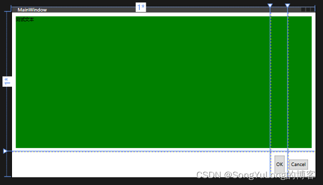
<TextBlock Margin="10" Grid.Row="0" Grid.Column="0" Grid.ColumnSpan="3" Background="Green">测试文本</TextBlock>
<Button Margin="10,10,10,10" Padding="3" Grid.Row="1" Grid.Column="1">OK</Button>
<Button Margin="2,20,20,20" Padding="5" Grid.Row="1" Grid.Column="2">Cancel</Button>
</Grid>
</Window>
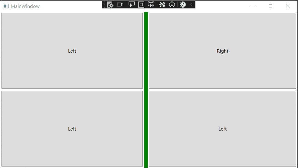
分割窗口:
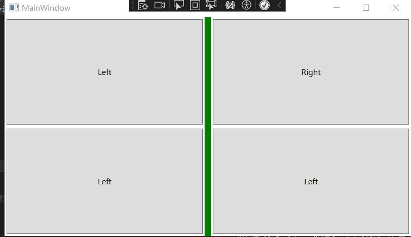
在WPF中,分割条由GridSplitter类表示,它是Grid面板的功能之一。
- GridSplitter对象必须放在Grid单元格中。
- GridSpliiter对象,总是改变整行或整列的尺寸。
- 最初,GridSplitter对象很小不易看见。对于垂直分割条需要将VerticalAlignment属性设为Stretch,并将Width设置为固定值。对于水平分割条,需要设置HorizontalAlignment属性来拉伸,并将Height属性设置为固定值。
- GridSplitter对齐方式还决定了分割条是水平的还垂直的。
<Window x:Class="WpfHelloWorld.MainWindow"
        xmlns="http://schemas.microsoft.com/winfx/2006/xaml/presentation"
        xmlns:x="http://schemas.microsoft.com/winfx/2006/xaml"
        xmlns:d="http://schemas.microsoft.com/expression/blend/2008"
        xmlns:mc="http://schemas.openxmlformats.org/markup-compatibility/2006"
        xmlns:sys="clr-namespace:System;assembly=mscorlib"
        xmlns:local="clr-namespace:WpfHelloWorld"
        mc:Ignorable="d"
        Title="MainWindow" Height="450" Width="800">

    <Grid ShowGridLines="False" Name="grid1">
        <Grid.RowDefinitions>
            <!-- 两行 -->
            <RowDefinition></RowDefinition>
            <RowDefinition></RowDefinition>
        </Grid.RowDefinitions>
        <Grid.ColumnDefinitions>
            <ColumnDefinition MinWidth="100"></ColumnDefinition>
            <ColumnDefinition Width="Auto"></ColumnDefinition>
            <ColumnDefinition MinWidth="50"></ColumnDefinition>
        </Grid.ColumnDefinitions>

        <Button Grid.Row="0" Grid.Column="0" Margin="3">Left</Button>
        <Button Grid.Row="0" Grid.Column="2" Margin="3">Right</Button>
        <Button Grid.Row="1" Grid.Column="0" Margin="3">Left</Button>
        <Button Grid.Row="1" Grid.Column="2" Margin="3">Left</Button>

        <GridSplitter Background="Green" Grid.Row="0" Grid.Column="1" Grid.RowSpan="2"
                      Width="10" VerticalAlignment="Stretch" HorizontalAlignment="Center"
                      ShowsPreview="False" >
        </GridSplitter>
    </Grid>
</Window>
ShowsPreview=“False”
ShowsPreview=“True”
共享尺寸组
还有一种确定一行或一列尺寸的方法–与其他行或列的尺寸相匹配。共享尺寸的目标是保持用户界面独立部分的一致性。
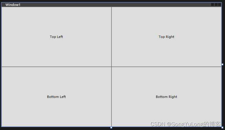
UniformGrid布局
<UniformGrid Rows="2" Columns="2">
    <Button>Top Left</Button>
    <Button>Top Right</Button>
    <Button>Bottom Left</Button>
    <Button>Bottom Right</Button>
</UniformGrid>
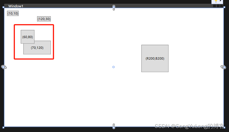
Canvas布局
Canvas面板允许使用精确的坐标放置元素。可以构建如,为图形工具创建绘图表面。为在Canvas面板中定位元素,需要设置Canvas.Left和Canvas.Top附加属性(也可以设置Canvas.Right和 Canvas.Bottom附加属性)。
<Window x:Class="WpfHelloWorld.Window1"
        xmlns="http://schemas.microsoft.com/winfx/2006/xaml/presentation"
        xmlns:x="http://schemas.microsoft.com/winfx/2006/xaml"
        xmlns:d="http://schemas.microsoft.com/expression/blend/2008"
        xmlns:mc="http://schemas.openxmlformats.org/markup-compatibility/2006"
        xmlns:local="clr-namespace:WpfHelloWorld"
        mc:Ignorable="d"
        Title="Window1" Height="450" Width="800">
    <Canvas>
        <Button Canvas.Left="10" Canvas.Top="10">(10,10)</Button>
        <Button Canvas.Left="120" Canvas.Top="30">(120,30)</Button>
        <Button Canvas.Left="60" Canvas.Top="80" Width="50" Height="50">(60,80)</Button>
        <Button Canvas.Left="70" Canvas.Top="120" Width="100" Height="50">(70,120)</Button>
        <Button Canvas.Right="200" Canvas.Bottom="200" Width="100" Height="100">(R200,B200)</Button>
    </Canvas>
</Window>
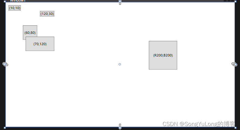
Z顺序:
如果Canvas面板中有多个相互重叠的元素,可通过设置Canvas.ZIndex附加属性来控制它们的层叠方式。添加的元素通常默认具有相同的ZIndex值0。如果元素ZIndex值相同,就按他们在Canvas.Children集合中的顺序进行显示(依赖于元素在XAML标记中的定义顺序)。
代码调用Canvas.SetZIndex(val)方法,亦可设置新的ZIndex值。
<Button Canvas.Left="60" Canvas.Top="80" Canvas.ZIndex="1" Width="50" Height="50">(60,80)</Button>
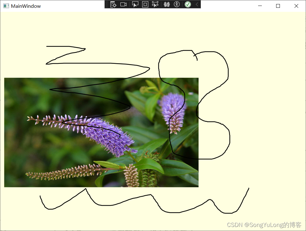
InkCanvas布局
InkCanvas元素的主要目的是用于接收鼠标和手写笔输入。例如包含一幅图片的InkCanvas元素,可以通过鼠标或手写板进行涂鸦。
<Window x:Class="WpfHelloWorld.MainWindow"
        xmlns="http://schemas.microsoft.com/winfx/2006/xaml/presentation"
        xmlns:x="http://schemas.microsoft.com/winfx/2006/xaml"
        xmlns:d="http://schemas.microsoft.com/expression/blend/2008"
        xmlns:mc="http://schemas.openxmlformats.org/markup-compatibility/2006"
        xmlns:sys="clr-namespace:System;assembly=mscorlib"
        xmlns:local="clr-namespace:WpfHelloWorld"
        mc:Ignorable="d"
        Title="MainWindow" Height="600" Width="800">

    <InkCanvas Name="inkCanvas" Background="LightYellow" EditingMode="Ink">
        <Image Source="images/1.jpg" InkCanvas.Top="10" InkCanvas.Left="10" Width="500" Height="600"></Image>
    </InkCanvas>

</Window>
InkCanvasEditingMode枚举值
| 名称 | 说明 |
|---|---|
| Ink | InkCanvas元素允许用户绘制批注,默认。 |
| GestureOnly | InkCanvas元素不允许用户绘制画笔批注。但支持特定手势如,拖动。能识别的手势由System.Windos.Ink.ApplicationGesture枚举定义。 |
| InkAndGesture | 允许用户绘制画笔,也可也识别预定手势 |
| EraseByStroke | 当单击笔画时,InkCanvas元素会擦除画笔。 |
| EraseByPoint | 当单击笔画时,擦除笔画中被点击的部分(笔画上的一个点) |
| Select | 允许用户选择保存在Children集合中的元素。 |
| None | 忽略鼠标和手写板输入 |


 811
811


 被折叠的 条评论
为什么被折叠?
被折叠的 条评论
为什么被折叠?
 到【灌水乐园】发言


