


UIStepper
UIStepper是一个数字调节控件,非常简单的一个控件, 下面我们学习如何使用它
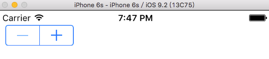
1. UIStepper的创建
let stepper = UIStepper(frame: CGRect(x: 10, y: 20, width: 300, height: 300))
self.view.addSubview(stepper)
运行程序
2. UIStepper的值改变监听
和UISlider非常类似, 监听UIControlEvents.ValueChanged即可
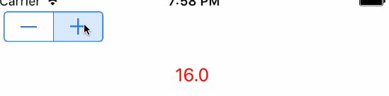
我们添加一个标签, 让我们可以直观的看见值的改变
self.label = UILabel(frame: CGRect(x: 0, y: 60, width: self.view.frame.width, height: self.view.frame.height))
label.textAlignment = .Center
label.textColor = UIColor.redColor()
label.text = "\(stepper.value)"
self.view.addSubview(label)

func stepperChangeAction(sender: UIStepper) {
    self.label.text = "\(sender.value)"
}
运行程序
3. UIStepper属性
我们查看UIStepper的定义
public var continuous: Bool // 默认值为true,当为true时,每次值改变都发送值改变事件
public var autorepeat: Bool // 默认值为true,为true时,按住不放值会连续改变
public var wraps: Bool // 默认为false, 为true时到最大值时在增大会从最小值开始
public var value: Double // 获取当前值, 改变它会发送UIControlEvent.ValueChanged事件
public var minimumValue: Double // 最小值,默认为0.0
public var maximumValue: Double // 最大值,默认为100.0
public var stepValue: Double // 步进值,默认为1
// The tintColor is inherited through the superview hierarchy. See UIView for more information.
@available(iOS 6.0, *)
public var tintColor: UIColor! // 设置UIStepper的颜色
// a background image which will be 3-way stretched over the whole of the control. Each half of the stepper will paint the image appropriate for its state
@available(iOS 6.0, *)
public func setBackgroundImage(image: UIImage?, forState state: UIControlState) // 设置不同状态的背景值
@available(iOS 6.0, *)
public func backgroundImageForState(state: UIControlState) -> UIImage? // 获取不同状态的图片
// an image which will be painted in between the two stepper segments. The image is selected depending both segments' state
@available(iOS 6.0, *)
public func setDividerImage(image: UIImage?, forLeftSegmentState leftState: UIControlState, rightSegmentState rightState: UIControlState) // 设置分割线的图片
@available(iOS 6.0, *)
public func dividerImageForLeftSegmentState(state: UIControlState, rightSegmentState state: UIControlState) -> UIImage? // 获取分割线的图片
// the glyph image for the plus/increase button
@available(iOS 6.0, *)
public func setIncrementImage(image: UIImage?, forState state: UIControlState) // 设置"+"号的图片
@available(iOS 6.0, *)
public func incrementImageForState(state: UIControlState) -> UIImage? // 获取+号的图片
// the glyph image for the minus/decrease button
@available(iOS 6.0, *)
public func setDecrementImage(image: UIImage?, forState state: UIControlState) // 设置"-"号的图片
@available(iOS 6.0, *)
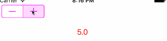
public func decrementImageForState(state: UIControlState) -> UIImage? // 获取"-"号的图片现在我们完成一个需求:
设置UIStepper的最大值10,最小值1.0,值连续变化可循环:
stepper.minimumValue = 1
stepper.maximumValue = 10
stepper.value = 2
stepper.stepValue = 1
stepper.continuous = true
stepper.autorepeat = true
stepper.wraps = true
stepper.tintColor = UIColor.magentaColor()
运行程序
4. 完整代码
import UIKit

class ViewController: UIViewController {

    var label: UILabel!

    override func viewDidLoad() {
        super.viewDidLoad()


        let stepper = UIStepper(frame: CGRect(x: 10, y: 20, width: 300, height: 300))
        self.view.addSubview(stepper)

        stepper.addTarget(self, action: "stepperChangeAction:", forControlEvents: .ValueChanged)

        stepper.minimumValue = 1
        stepper.maximumValue = 10
        stepper.value = 2
        stepper.stepValue = 1
        stepper.continuous = true
        stepper.autorepeat = true
        stepper.wraps = true
        stepper.tintColor = UIColor.magentaColor()

        self.label = UILabel(frame: CGRect(x: 0, y: 60, width: self.view.frame.width, height: 40))
        label.textAlignment = .Center
        label.textColor = UIColor.redColor()
        label.text = "\(stepper.value)"
        self.view.addSubview(label)
    }

    func stepperChangeAction(sender: UIStepper) {
        self.label.text = "\(sender.value)"
    }

    override func didReceiveMemoryWarning() {
        super.didReceiveMemoryWarning()
        // Dispose of any resources that can be recreated.
    }

}


 264
264


 被折叠的 条评论
为什么被折叠?
被折叠的 条评论
为什么被折叠?
 到【灌水乐园】发言


