


转载http://www.jianshu.com/p/9dc8d5762b7d
在 Material Design 官方文档 中的 Errors 一节里,使用的 TextInputLayout 的右下角有一个字数统计的功能,但是我在查看 TextInputLayout 的源码时发现,虽然它在 attrs.xml 里定义了相关属性,在代码中缺没有使用,所以我就把相关的代码都提取出来,单独创建了一个库。
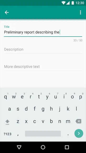
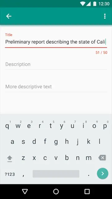
这是文档中 TextInputLayout 的字数统计效果图:
1.提取相关代码
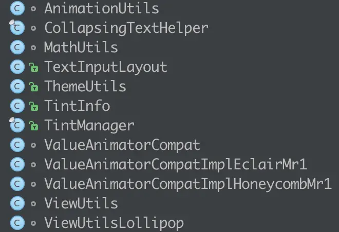
首先从 sdk 的 sources 里,把 TextInputLayout 拷出来,根据提示与其相关的类有:
从 sdk/extras/android/support/design/libs 中将 android-support-design.jar 拷贝出来,修改拓展名为 .zip 并解压。
相关资源有:
attrs.xml :
<declare-styleable name="TextInputLayout">
    <attr name="hintTextAppearance" format="reference"/>
    <!-- The hint to display in the floating label -->
    <attr name="android:hint"/>
    <!-- Whether the layout is laid out as if an error will be displayed -->
    <attr name="errorEnabled" format="boolean"/>
    <!-- TextAppearance of any error message displayed -->
    <attr name="errorTextAppearance" format="reference"/>
    <!-- Whether the layout is laid out as if the character counter will be displayed -->
    <attr name="counterEnabled" format="boolean"/>
    <!-- The max length to display in the character counter -->
    <attr name="counterMaxLength" format="integer" />
    <!-- TextAppearance of the character counter -->
    <attr name="counterTextAppearance" format="reference"/>
    <!-- TextAppearance of the character counter when the text is longer than the max -->
    <attr name="counterOverflowTextAppearance" format="reference"/>
    <attr name="android:textColorHint"/>
    <!-- Whether to animate hint state changes. -->
    <attr name="hintAnimationEnabled" format="boolean"/>
</declare-styleable>
style.xml :
<style name="TextAppearance.Design.Counter" parent="TextAppearance.AppCompat.Caption"/>
<style name="TextAppearance.Design.Counter.Overflow" parent="TextAppearance.AppCompat.Caption">
    <item name="android:textColor">@color/design_textinput_error_color</item>
</style>
<style name="TextAppearance.Design.Error" parent="TextAppearance.AppCompat.Caption">
    <item name="android:textColor">@color/design_textinput_error_color</item>
</style>
<style name="TextAppearance.Design.Hint" parent="TextAppearance.AppCompat.Caption">
    <item name="android:textColor">?attr/colorControlActivated</item>
</style>

<style name="Widget.Design.TextInputLayout" parent="android:Widget">
    <item name="hintTextAppearance">@style/TextAppearance.Design.Hint</item>
    <item name="errorTextAppearance">@style/TextAppearance.Design.Error</item>
    <item name="counterTextAppearance">@style/TextAppearance.Design.Counter</item>
    <item name="counterOverflowTextAppearance">@style/TextAppearance.Design.Counter.Overflow</item>
</style>
colors.xml:
<color name="design_textinput_error_color">#FFDD2C00</color>此时,项目终于不再报错了。
2. 思考
根据效果图中计数器的位置,我们可以知道是在与 mErrorView 同一横排的位置,所以在代码中追踪了一下 mErrorView 的创建过程。
代码中声明了一个 mErrorView 的成员变量,还有两个与其相关的属性。
private TextView mErrorView;
private boolean mErrorEnabled; // 是否显示错误提示
private int mErrorTextAppearance; // 错误提示的文字格式
接下去,我们在构造器中找到了:
// 获取 xml 里设置的属性值
mErrorTextAppearance = a.getResourceId(R.styleable.TextInputLayout_errorTextAppearance, 0);
final boolean errorEnabled = a.getBoolean(R.styleable.TextInputLayout_errorEnabled, false);

...

setErrorEnabled(errorEnabled);
我们再看一下 setErrorEnabled 方法:
public void setErrorEnabled(boolean enabled) {
    if (mErrorEnabled != enabled) {
        if (mErrorView != null) {
            ViewCompat.animate(mErrorView).cancel();
        }

        if (enabled) {
            // 创建 mErrorView,并进行相关设置
            mErrorView = new TextView(getContext());
            mErrorView.setTextAppearance(getContext(), mErrorTextAppearance);
            mErrorView.setVisibility(INVISIBLE);
            addView(mErrorView); // 添加到当前 textInputLayout 中

            if (mEditText != null) {
                // Add some start/end padding to the error so that it matches the EditText
                ViewCompat.setPaddingRelative(mErrorView, ViewCompat.getPaddingStart(mEditText),
                        0, ViewCompat.getPaddingEnd(mEditText), mEditText.getPaddingBottom());
            }
        } else {
            // 如果设置为不显示错误时,移除 mErrorView
            removeView(mErrorView);
            mErrorView = null;
        }
        mErrorEnabled = enabled;
    }
}
还有一个有参考价值的方法:
public void setError(@Nullable CharSequence error) {

    ...

    if (!TextUtils.isEmpty(error)) {

        ... 省略了动画效果设置

        // Set the EditText's background tint to the error color
        ViewCompat.setBackgroundTintList(mEditText,
                ColorStateList.valueOf(mErrorView.getCurrentTextColor()));
    } else {
        if (mErrorView.getVisibility() == VISIBLE) {

            ... 省略了动画效果设置

            // Restore the 'original' tint, using colorControlNormal and colorControlActivated
            final TintManager tintManager = TintManager.get(getContext());
            ViewCompat.setBackgroundTintList(mEditText,
                    tintManager.getTintList(R.drawable.abc_edit_text_material));
        }
    }
}
省略了对 mErrorView 显示和隐藏时动画效果的代码,剩下的 ViewCompat.setBackgroundTintList() 方法是对 editText 的那条底线的颜色设置。
2. 修改代码
在知道了 mErrorView 的创建流程,正式开始对代码动刀。
2.1 定义成员变量
由于 TextInputLayout 继承自 LinearLayout ,为了可以使自己定义的 mCounterView 与 mErrorView 保持在统一横排,且位于控件最右方,我在这里定义了一个 RelativeLayout,并将 mErrorView 也挪到相对布局中。
private RelativeLayout mBottomBar;
private TextView mCounterView;
private boolean mCounterEnabled;
private int mCounterMaxLength;
2.2 在构造器中添加
// 是否显示计数器
final boolean counterEnabled = a.getBoolean(R.styleable.TextInputLayout_counterEnabled, false);

// 最大字数长度限制
mCounterMaxLength = a.getInt(R.styleable.TextInputLayout_counterMaxLength, 0);

mTooltip = new RelativeLayout(context);
addView(mTooltip); // 将底部提示条添加到 TextInputLayout 中
setCounterEnabled(counterEnabled);
2.3 创建 setCounterEnabled 方法
public void setCounterEnabled(boolean enabled) {
    if (mCounterEnabled != enabled) {
        if (enabled) {
            mCounterView = new TextView(getContext());
            // 根据此时输入的文字的长度对字体格式进行设置,避免与setError产生冲突
            if (mEditText != null && mEditText.length() > mCounterMaxLength) {
                mCounterView.setTextAppearance(getContext(), mErrorTextAppearance);
            } else {
                mCounterView.setTextAppearance(getContext(), R.style.TextAppearance_Design_Counter);
            }
            // mCounterView.setVisibility(VISIBLE);
            RelativeLayout.LayoutParams params = new RelativeLayout.LayoutParams(
                    RelativeLayout.LayoutParams.WRAP_CONTENT, RelativeLayout.LayoutParams.WRAP_CONTENT);
            params.addRule(RelativeLayout.ALIGN_PARENT_RIGHT);
            params.addRule(RelativeLayout.CENTER_VERTICAL);
            mBottomBar.addView(mCounterView, params);

            if (mEditText != null) {
                // Add some start/end padding to the counter so that it matches the EditText
                ViewCompat.setPaddingRelative(mCounterView, ViewCompat.getPaddingStart(mEditText),
                        0, ViewCompat.getPaddingEnd(mEditText), mEditText.getPaddingBottom());
            }
            mCounterView.setText(mResources.getString(R.string.counterMaxLength,
                        0, mCounterMaxLength));
        } else {
            mBottomBar.removeView(mCounterView);
            mCounterView = null;
        }
        mCounterEnabled = enabled;
    }
}
我仿照 setErrorEnabled 在自己创建的 setCounterEnabled 方法中完成了对 mCounterView 的创建,设置布局参数,设置初始文字等操作。
2.4 更新显示效果
在 TextInputLayout 中,对起内部的 mEditText 添加了一个 TextWatcher 监听,我在其中添加了 updateCounterView 方法
mEditText.addTextChangedListener(new TextWatcher() {

    @Override
    public void afterTextChanged(Editable s) {
        updateLabelVisibility(true);
        updateCounterText(s);
    }
    ...
}

private void updateCounterText(Editable text) {
    if (mCounterView != null) {
        final int currentLength = text.length();

        //<string name="counterMaxLength">%1$d/%2$d</string>
        mCounterView.setText(mResources.getString(R.string.counterMaxLength,
                currentLength, mCounterMaxLength));

        // 如果超过最大限制,则将文字和底线变成红色
        if (currentLength == mCounterMaxLength + 1) {
            mCounterView.setTextAppearance(getContext(), mErrorTextAppearance);
            ViewCompat.setBackgroundTintList(mEditText,
                    ColorStateList.valueOf(mResources.getColor(R.color.design_textinput_error_color)));
        } else if (currentLength == mCounterMaxLength) {
            // 当字数从超出限制回到了允许的长度范围,则恢复默认颜色
            mCounterView.setTextAppearance(getContext(), R.style.TextAppearance_Design_Counter);
            // 当不显示 error 信息时,对底线颜色进行修改
            if (!mErrorEnabled) {
                ViewCompat.setBackgroundTintList(mEditText, mFocusedTextColor);
            }
        }
    }
}
为了避免重复设置,我这里根据判断临界值来设置当前状态下的显示颜色。
2.5 修改 setError
public void setError(@Nullable CharSequence error) {

    ...

    if (!TextUtils.isEmpty(error)) {

        ...

    } else {
        if (mErrorView.getVisibility() == VISIBLE) {

            ... 省略了动画效果设置

            // 避免与计数器的效果冲突
            if (mEditText.length() > mCounterMaxLength) {
                return;
            }

            final TintManager tintManager = TintManager.get(getContext());
            ViewCompat.setBackgroundTintList(mEditText,
                    tintManager.getTintList(R.drawable.abc_edit_text_material));
        }
    }
}
3. 总结
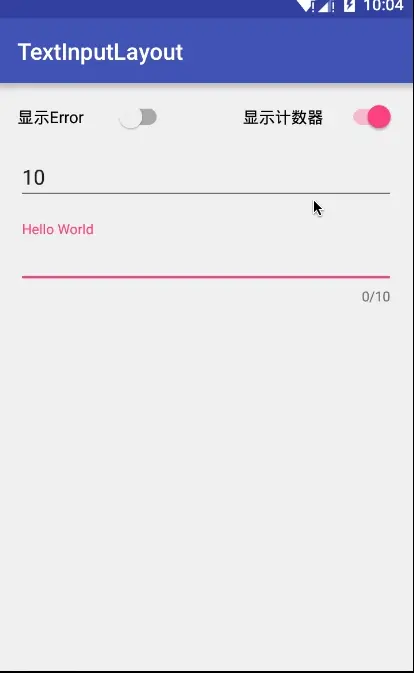
通过上面的修改,TextInputLayout已经具有了字数统计的功能,下面是效果图:


 589
589

 被折叠的 条评论
为什么被折叠?
被折叠的 条评论
为什么被折叠?
 到【灌水乐园】发言


