


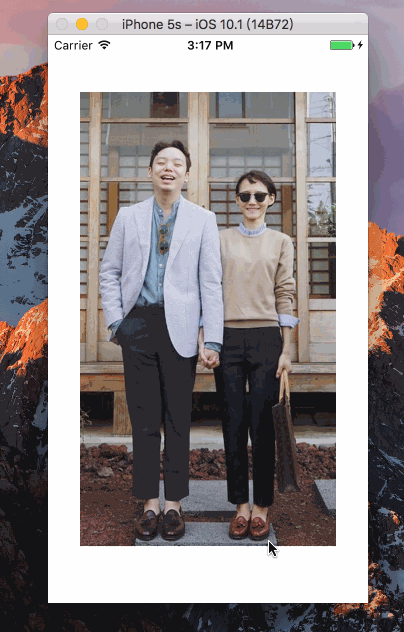
一:
Animated:仅关注动画的输入与输出声明,在其中建立一个可配置的变化函数,然后使用简单的start/stop方法来控制动画按顺序执行!
效果如下:
export default class Anim extends Component{
constructor(props) {
super(props);
this.state = {
bounceValue: new Animated.Value(0),
};
}
componentDidMount() {
this.state.bounceValue.setValue(1.5);
//可选的动画类型有三种:spring,decay,timing;
Animated.spring(
this.state.bounceValue,
//将bounceValue的值动画化,是一个持续变化的过程
{
toValue: 0.8,
friction: 1,
}
).start();
}
render(){
return(
//可选基本组件一般为Image,Text,View
<Animated.Image
source={{uri: "https://img3.doubanio.com/view/photo/photo/public/p2396117560.jpg"}}
style={{
flex: 1,
//transform是一个有序的数组(动画按顺序执行)
transform: [
{scale: this.state.bounceValue},
]
}}
/>
);
}
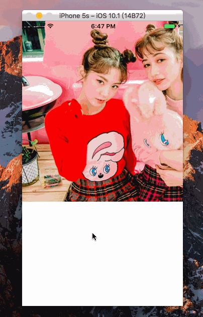
}二:渐变
效果如下:
export default class Anim extends Component{
constructor(props) {
super(props);
this.state = {
fadeAnim:new Animated.Value(0),
};
}
componentDidMount(){
Animated.timing(
this.state.fadeAnim,
{
toValue:1,
duration:3500,
}
).start();
}
render(){
return(
<Animated.View
style={{
opacity: this.state.fadeAnim,
}}>
<Image source={require('./img/a.jpg')} >
</Image>
</Animated.View>
);
}
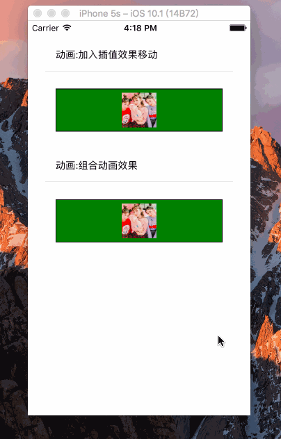
}三:
效果如下:
class CustomButton extends Component {
  render() {
    return (
      <TouchableHighlight
        style={styles.button}
        underlayColor="#a5a5a5"
        onPress={this.props.onPress}>
        <Text style={styles.buttonText}>{this.props.text}</Text>
      </TouchableHighlight>
    );
  }
}


export default class Anim extends Component{
  constructor(props) {
    super(props);
    this.state = {
        show:true,
        anim: new Animated.Value(0),
        compositeAnim: new Animated.Value(0),
    };
    }
  render() {
    return (
      <View style={{margin:20}}>

        <CustomButton text="动画:加入插值效果移动"
         onPress={()=>{
           Animated.spring(this.state.anim, {
              toValue: 0,
              velocity: 7,
              tension: -20,
              friction: 3,
            }).start();
         }}
        />
         <Animated.View
            style={[styles.content, {
              transform: [
                {scale: this.state.anim.interpolate({
                  inputRange: [0, 1],
                  outputRange: [1, 3],
                })},
                {translateX: this.state.anim.interpolate({
                  inputRange: [0, 1],
                  outputRange: [0, 300],
                })},
                {rotate: this.state.anim.interpolate({
                  inputRange: [0, 1],
                  outputRange: [
                    '0deg', '720deg'
                  ],
                })},
              ]}
            ]}>
            <Image source={require('./img/a.jpg')} style={{width:50,height:50}}/>
          </Animated.View>


          <CustomButton text="动画:组合动画效果"
            onPress={()=>{
              Animated.sequence([
              Animated.timing(this.state.compositeAnim, {
                toValue: 100,
                easing: Easing.linear,
              }),
              Animated.delay(200),
              Animated.timing(this.state.compositeAnim, {
                toValue: 0,
                easing: Easing.elastic(2),
              }),
              Animated.delay(100),
              Animated.timing(this.state.compositeAnim, {
                toValue: 50,
                easing: Easing.linear,
              }),
              Animated.timing(this.state.compositeAnim, {
                toValue: 0,
                easing: Easing.elastic(1),
              })
              ]).start();
            }}
          />
          <Animated.View
                style={[styles.content, {
                  //bottom,top,left,right
                   bottom:this.state.compositeAnim
                }]}>
                <Image source={require('./img/a.jpg')} style={{width:50,height:50}}/>
              </Animated.View>
      </View>
    );
  }

}


const styles = StyleSheet.create({
  welcome: {
    fontSize: 20,
    textAlign: 'center',
    margin: 10,
  },
  button: {
    margin:5,
    backgroundColor: 'white',
    padding: 15,
    borderBottomWidth: StyleSheet.hairlineWidth,
    borderBottomColor: '#cdcdcd',
  },
  content: {
    backgroundColor: 'green',
    borderWidth: 1,
    padding: 5,
    margin: 20,
    alignItems: 'center',
  },
});


 扫一扫
扫一扫
 8316
8316

 被折叠的 条评论
为什么被折叠?
被折叠的 条评论
为什么被折叠?
 到【灌水乐园】发言


