from sklearn.datasets import load_iris
iris = load_iris()
iris.data.shape
print(iris.DESCR)
from sklearn.cross_validation import train_test_split
X_train,X_test,y_train,y_test=train_test_split(iris.data,iris.target,test_size=0.25,random_state=33)
from sklearn.preprocessing import StandardScaler
from sklearn.neighbors import KNeighborsClassifier
ss = StandardScaler()
X_train=ss.fit_transform(X_train)
X_test=ss.transform(X_test)
knc=KNeighborsClassifier()
knc.fit(X_train,y_train)
y_predict=knc.predict(X_test)
print('The accuray of K-Nearest Neighbor Classifier is',knc.score(X_test,y_test))
from sklearn.metrics import classification_report
print(classification_report(y_test,y_predict,target_names=iris.target_names))


from matplotlib import pyplot as plt
import numpy as np

def show_values(pc, fmt="%.2f", **kw):
    '''
    Heatmap with text in each cell with matplotlib's pyplot
    Source: https://stackoverflow.com/a/25074150/395857
    By HYRY
    '''
    global zip
    import  itertools
    zip = getattr(itertools, 'izip', zip)
    pc.update_scalarmappable()
    ax = pc.axes
    for p, color, value in  zip(pc.get_paths(), pc.get_facecolors(), pc.get_array()):
        x, y = p.vertices[:-2, :].mean(0)
        if np.all(color[:3] > 0.5):
            color = (0.0, 0.0, 0.0)
        else:
            color = (1.0, 1.0, 1.0)
        ax.text(x, y, fmt % value, ha="center", va="center", color=color, **kw)


def cm2inch(*tupl):
    '''
    Specify figure size in centimeter in matplotlib
    Source: https://stackoverflow.com/a/22787457/395857
    By gns-ank
    '''
    inch = 2.54
    if type(tupl[0]) == tuple:
        return tuple(i/inch for i in tupl[0])
    else:
        return tuple(i/inch for i in tupl)


def heatmap(AUC, title, xlabel, ylabel, xticklabels, yticklabels, figure_width=40, figure_height=20, correct_orientation=False, cmap='RdBu'):
    '''
    Inspired by:
    - https://stackoverflow.com/a/16124677/395857
    - https://stackoverflow.com/a/25074150/395857
    '''

    # Plot it out
    fig, ax = plt.subplots()
    #c = ax.pcolor(AUC, edgecolors='k', linestyle= 'dashed', linewidths=0.2, cmap='RdBu', vmin=0.0, vmax=1.0)
    c = ax.pcolor(AUC, edgecolors='k', linestyle= 'dashed', linewidths=0.2, cmap=cmap)

    # put the major ticks at the middle of each cell
    ax.set_yticks(np.arange(AUC.shape[0]) + 0.5, minor=False)
    ax.set_xticks(np.arange(AUC.shape[1]) + 0.5, minor=False)

    # set tick labels
    #ax.set_xticklabels(np.arange(1,AUC.shape[1]+1), minor=False)
    ax.set_xticklabels(xticklabels, minor=False)
    ax.set_yticklabels(yticklabels, minor=False)

    # set title and x/y labels
    plt.title(title)
    plt.xlabel(xlabel)
    plt.ylabel(ylabel)

    # Remove last blank column
    plt.xlim( (0, AUC.shape[1]) )

    # Turn off all the ticks
    ax = plt.gca()
    for t in ax.xaxis.get_major_ticks():
        t.tick1On = False
        t.tick2On = False
    for t in ax.yaxis.get_major_ticks():
        t.tick1On = False
        t.tick2On = False

    # Add color bar
    plt.colorbar(c)

    # Add text in each cell
    show_values(c)

    # Proper orientation (origin at the top left instead of bottom left)
    if correct_orientation:
        ax.invert_yaxis()
        ax.xaxis.tick_top()

    # resize
    fig = plt.gcf()
    #fig.set_size_inches(cm2inch(40, 20))
    #fig.set_size_inches(cm2inch(40*4, 20*4))
    fig.set_size_inches(cm2inch(figure_width, figure_height))


def plot_classification_report(classification_report, title='Classification report ', cmap='RdBu'):
    '''
    Plot scikit-learn classification report.
    Extension based on https://stackoverflow.com/a/31689645/395857
    '''
    lines = classification_report.split('\n')

    classes = []
    plotMat = []
    support = []
    class_names = []
    for line in lines[2 : (len(lines) - 2)]:
        t = line.strip().split()
        if len(t) < 2: continue
        classes.append(t[0])
        v = [float(x) for x in t[1: len(t) - 1]]
        support.append(int(t[-1]))
        class_names.append(t[0])
        print(v)
        plotMat.append(v)

    print('plotMat: {0}'.format(plotMat))
    print('support: {0}'.format(support))

    xlabel = 'Metrics'
    ylabel = 'Classes'
    xticklabels = ['Precision', 'Recall', 'F1-score']
    yticklabels = ['{0} ({1})'.format(class_names[idx], sup) for idx, sup  in enumerate(support)]
    figure_width = 25
    figure_height = len(class_names) + 7
    correct_orientation = False
    heatmap(np.array(plotMat), title, xlabel, ylabel, xticklabels, yticklabels, figure_width, figure_height, correct_orientation, cmap=cmap)

#传入相应的report结果
def main():
    sampleClassificationReport =classification_report(y_test,y_predict,target_names=iris.target_names)
    plot_classification_report(sampleClassificationReport)
    plt.savefig('knear_neighbor_report.png', dpi=200, format='png', bbox_inches='tight')
    plt.close()


if __name__ == "__main__":
    main()
    #cProfile.run('main()') # if you want to do some profiling
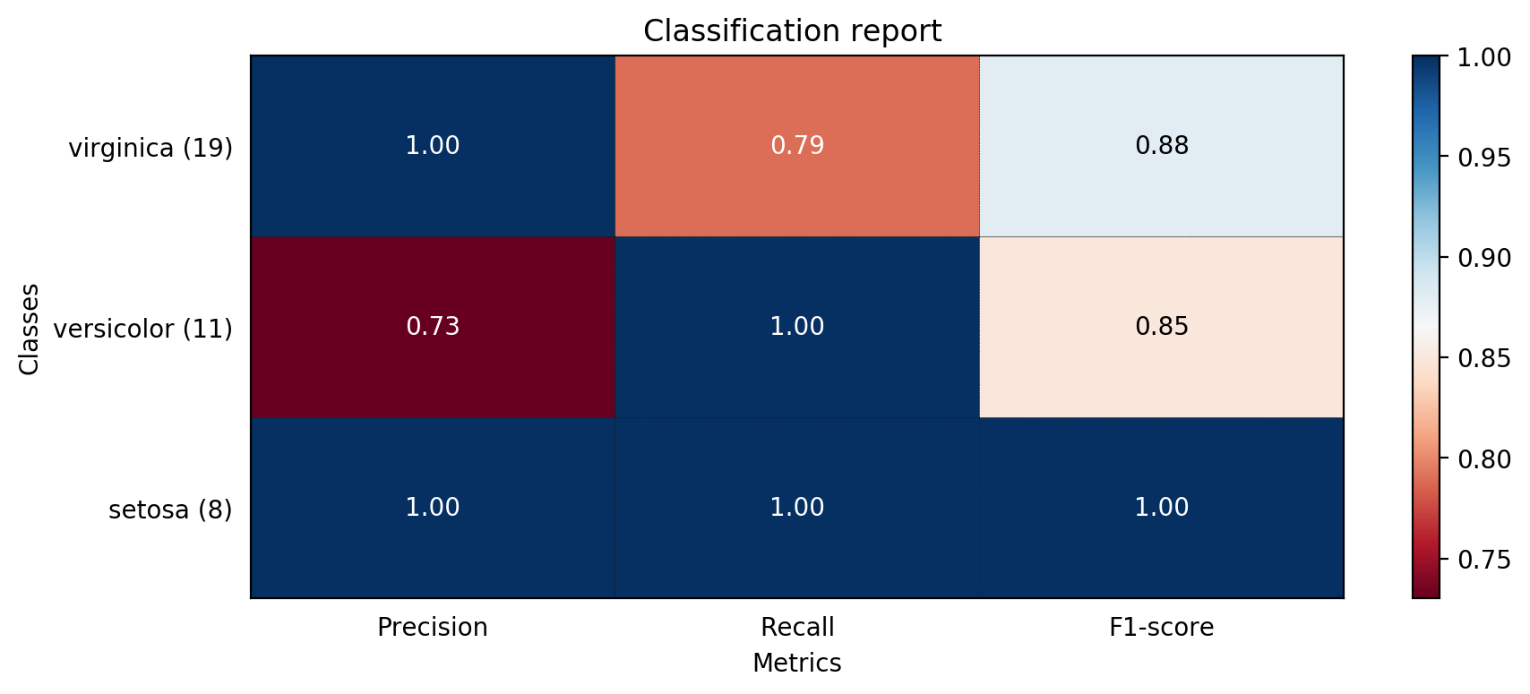
预测结果如下:
The accuray of K-Nearest Neighbor Classifier is 0.8947368421052632
             precision    recall  f1-score   support

     setosa       1.00      1.00      1.00         8
 versicolor       0.73      1.00      0.85        11
  virginica       1.00      0.79      0.88        19

avg / total       0.92      0.89      0.90        38
相应的报表如下


 3946
3946

 被折叠的 条评论
为什么被折叠?
被折叠的 条评论
为什么被折叠?
 到【灌水乐园】发言


