


目标:
在R语言中,将数据的经验分布函数和生存函数绘制在同一个坐标系下。
方法一:
使用ggplot,在layer层上绘制两个不同的曲线,前提是这两个曲线使用的数据值具有先沟通的长度。也就是说,两条区间的x轴对应的数据点必须完全相同。
自定义函数:
# 自定义函数
# 用于经验分布函数
cdf_table <- function(x){
  x <- sort(x)
  n <- length(x)
  tab <- unname(c(table(x)))
  pct = tab / n
  d <- data.frame(
    x = sort(unique(x)),
    freq = tab,
    pct = pct,
    cumfreq = cumsum(tab),
    cumpct = cumsum(pct))
  d
}


# 用于生存函数
surv_table <- function(x){
  x <- sort(x)
  n <- length(x)
  tab <- unname(c(table(x)))
  pct = tab / n
  d <- data.frame(
    x = sort(unique(x)),
    freq = tab,
    pct = pct,
    cumfreq = cumsum(tab),
    cumpct = cumsum(pct),
    cumsurv = 1-cumsum(pct))
  d
}
数据整理成绘图所需要的形式:
scores = c(63, 72, 74, 79, 82, 82, 87, 89, 90, 90)
surv_freq <-surv_table(scores)
dfreq <- cdf_table(scores)

f1 <- c(-Inf,0,0,0,0,1)
f2 <- c(Inf,0,0,0,1,0)
surv_freq1 <- rbind(f1,surv_freq,f2)


f3 <- c(-Inf,0)
f4 <- c(Inf,1)
dfreq1 <- dfreq[,c(1,5)]
data_f <- rbind(f3,dfreq1,f4)

data_S <- surv_req[,c(1,6)]
dat <- cbind(data_f,data_S[,2])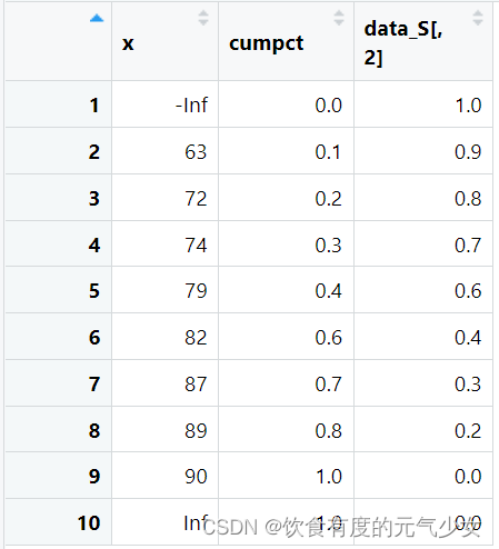
在同一坐标轴中绘制生存函数和经验分布函数
library(ggplot2)
ggplot(dat)+
  geom_line(aes(x=dat[,1],y=dat[,2]),color="red")+
  geom_line(aes(x=dat[,1],y=dat[,3]),color="blue")
# geom_line()使用折线段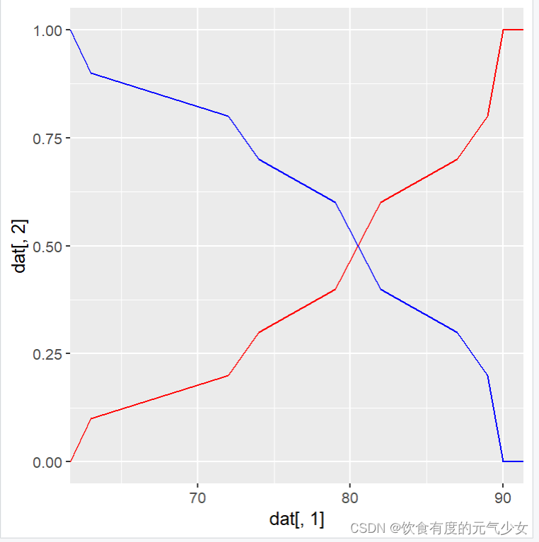
折线段+散点图:
library(ggplot2)
ggplot(dat)+
  geom_line(aes(x=dat[,1],y=dat[,2]),color="red")+
  geom_point(aes(x=dat[,1],y=dat[,3]),color="blue")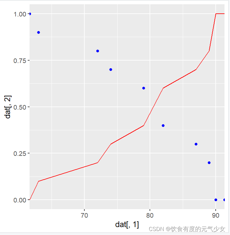
阶梯函数+折线段:
library(ggplot2)
ggplot(dat)+
  geom_step(aes(x=dat[,1],y=dat[,2]),color="red")+
  geom_line(aes(x=dat[,1],y=dat[,3]),color="blue")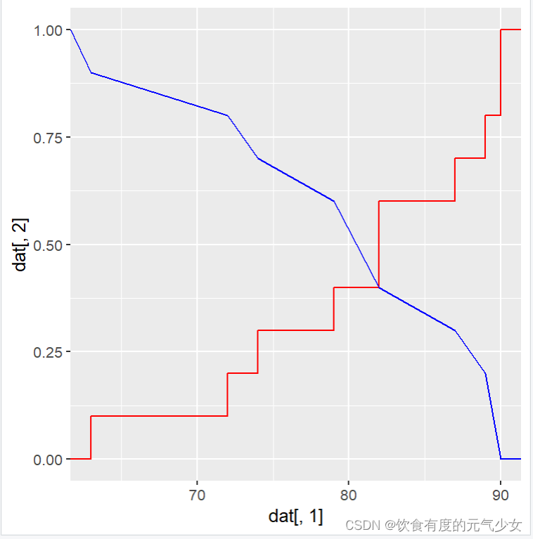
对于x轴、y轴以及图的title就相当简单了,可以查一下相关的添加标签命令,或者直接对dat这个数据框修改colname。
方法二:
使用plot() + lines()
仍然以上列的数据为例,区别在于每个图使用的x的长度是不一样的。
plot(x=dat[2:8,1], y=dat[2:8,2], xlab="Time",
     ylab="函数值",type="l",col="red")
lines(x=dat[,1], y=dat[,3], lty=2,col="blue")
legend(63,0.7,
       c("经验分布函数","生存函数"),
       lty=c(1,2), col=c("red","blue"),cex=0.8)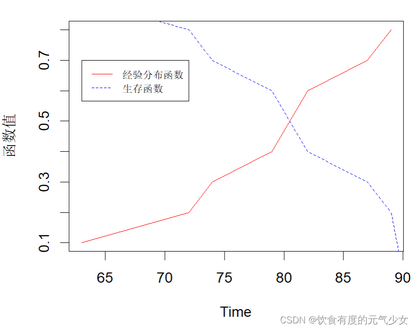
参考:如何用R语言中ggplot包在同一张图上画两组折线图,或者散点图_r语言一张图多个散点图_Sarah945的博客-CSDN博客
CoxPhLb source: R/station.test.plot.R
Add legends to plots in R software : the easiest way! - Easy Guides - Wiki - STHDA
最后一个网址是关于legend函数的相关介绍,这个网页给出的该函数的使用非常全面且直观!


 1159
1159


 被折叠的 条评论
为什么被折叠?
被折叠的 条评论
为什么被折叠?
 到【灌水乐园】发言


