


1.代码:
<!DOCTYPE html>
<html>
<head>
<meta charset="utf-8">
<title>网页title</title>
<style>
/*---范例1:基本按钮组---*/
.button {
background-color: #4CAF50; /* Green */
border: none;
color: white;
padding: 15px 32px;
text-align: center;
text-decoration: none;
display: inline-block;
font-size: 16px;
cursor: pointer;
float: left;
}
.button:hover {
background-color: #3e8e41;
}
/*---范例2:带边框按钮组---*/
.button1 {
background-color: #4CAF50; /* Green */
border: 1px solid green;
color: white;
padding: 15px 32px;
text-align: center;
text-decoration: none;
display: inline-block;
font-size: 16px;
cursor: pointer;
float: left;
}
.button1:hover {
background-color: #3e8e41;
}
/*---范例3:按钮动画-1 (添加箭头)---*/
.button2 {
display: inline-block;
border-radius: 4px;
background-color: #f4511e;
border: none;
color: #FFFFFF;
text-align: center;
font-size: 28px;
padding: 20px;
width: 200px;
transition: all 0.5s;
cursor: pointer;
margin: 5px;
}
.button2 span {
cursor: pointer;
display: inline-block;
position: relative;
transition: 0.5s;
}
.button2 span:after {
content: '»';
position: absolute;
opacity: 0;
top: 0;
right: -20px;
transition: 0.5s;
}
.button2:hover span {
padding-right: 25px;
}
.button2:hover span:after {
opacity: 1;
right: 0;
}
/*---范例3:按钮动画-2 (波纹效果)---*/
.button3 {
position: relative;
background-color: #4CAF50;
border: none;
font-size: 28px;
color: #FFFFFF;
padding: 20px;
width: 200px;
text-align: center;
-webkit-transition-duration: 0.4s; /* Safari */
transition-duration: 0.4s;
text-decoration: none;
overflow: hidden;
cursor: pointer;
}
.button3:after {
content: "";
background: #90EE90;
display: block;
position: absolute;
padding-top: 300%;
padding-left: 350%;
margin-left: -20px!important;
margin-top: -120%;
opacity: 0;
transition: all 0.8s
}
.button3:active:after {
padding: 0;
margin: 0;
opacity: 1;
transition: 0s
}
/*---范例3:按钮动画-3 (按压效果)---*/
.button4 {
display: inline-block;
padding: 15px 25px;
font-size: 24px;
cursor: pointer;
text-align: center;
text-decoration: none;
outline: none;
color: #fff;
background-color: #4CAF50;
border: none;
border-radius: 15px;
box-shadow: 0 9px #999;
}
.button4:hover {background-color: #3e8e41}
.button4:active {
background-color: #3e8e41;
box-shadow: 0 5px #666;
transform: translateY(4px);
}
</style>
</head>
<body>
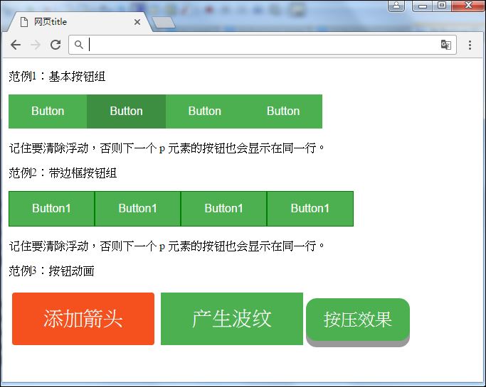
<p>范例1:基本按钮组</p>
<button class="button">Button</button>
<button class="button">Button</button>
<button class="button">Button</button>
<button class="button">Button</button>
<p style="clear:both"><br>记住要清除浮动,否则下一个 p 元素的按钮也会显示在同一行。</p>
<p>范例2:带边框按钮组</p>
<button class="button1">Button1</button>
<button class="button1">Button1</button>
<button class="button1">Button1</button>
<button class="button1">Button1</button>
<p style="clear:both"><br>记住要清除浮动,否则下一个 p 元素的按钮也会显示在同一行。</p>
<p>范例3:按钮动画</p>
<button class="button2" style="vertical-align:small"><span>添加箭头</span></button>
<button class="button3" style="vertical-align:small"><span>产生波纹</span></button>
<button class="button4" style="vertical-align:small"><span>按压效果</span></button>
</body>
</html>2.結果:


 412
412


 被折叠的 条评论
为什么被折叠?
被折叠的 条评论
为什么被折叠?
 到【灌水乐园】发言


