


Toolbar是在应用程序的Layout布局中使用的一个泛化的action bar,就是说它和action bar有相同的设计意图,但却设计的更加自由和可控。说自由是因为Toolbar可以放在View树中的任何地方,要知道传统的action bar是Activity的一部分,由framework层控制。现在把Toolbar从Activity中独立出来,不是使得它更加自由了吗?说更加可控其实也还是它更加自由的表现吧,我们设置它的外观及其内容会更加方便。
ToolBar能做什么呢?开发者文档上说它可以包含以下可选的内容:
- A navigation button.导航按钮,不知道干嘛用的,一会试试。
- A branded logo image,Logo?这个好理解,就是个icon
- A title and subtitle,标题和子标题。
- One or more custom views,一个或者多个自定义View,一会一定要试试。
- An
action menu.他既然可以用来替代action bar,有action menu是必然了吧。
知道了Toolbar 是什么,能做什么以后,那么,接下来,对它能做的时一一尝试。
感性认识
Toolbar到底长什么样子?不如写一个简单的程序来一睹它的芳容吧。既然官网上说它可以放置在view树中的任何地方,那我们就放一个看看。
- 首先把action bar禁止掉,选一个没有Action bar 的theme就可以了:
<span style="font-family:SimSun;font-size:18px;background-color: rgb(255, 255, 255);">android:theme="@style/Theme.AppCompat.NoActionBar"</span> -
在布局文件中添加Toolbar
我们使用的是v7包下的Toolbar。<android.support.v7.widget.Toolbar android:id="@+id/tool_bar" android:layout_width="match_parent" android:layout_height="wrap_content"> </android.support.v7.widget.Toolbar> -
它既然和使用view一样,那么也可以在onCreate中获取它的实例,然后用代码配置它。    @Override
    protected void onCreate(Bundle savedInstanceState) {
        super.onCreate(savedInstanceState);
        setContentView(R.layout.activity_main);
        toolbar = (Toolbar) findViewById(R.id.tool_bar);
        toolbar.setTitle("Scan");
        toolbar.setSubtitle("subScan");
        toolbar.setNavigationIcon(R.mipmap.ic_launcher);
        toolbar.setOverflowIcon(getDrawable(R.mipmap.ic_launcher));
    }
通过以上三步,我们先来解开Toolbar面纱的一角,看看它的样子:
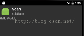
这里就是我们的Toolbar了,它和Action bar确实有点相似,但却没有背景,没有阴影,似乎丑丑的。此外,我们设置的OverFlowIcon并没有显示,原因是不是因为我们还没有给它设置menu菜单项呢?那么接下来我们给它添加menu好了。
添加menu
在第一步中,我们一次性设置了六个item,前三个的showAsAction设置为了ifRoom,就是说有空间的话就显示在Toolbar上面,没有空间的话就只好显示在OverFlow中了,后三个的showAsAction设置为了never,也就是说他们会一直在OverFlow中了,那么我们看看效果:
- 添加menu布局文件:
<span style="font-family:SimSun;font-size:18px;background-color: rgb(255, 255, 255);"><?xml version="1.0" encoding="utf-8"?> <menu xmlns:android="http://schemas.android.com/apk/res/android" xmlns:app="http://schemas.android.com/apk/res-auto"> <item android:id="@+id/menu1" android:title="Menu1" android:icon="@mipmap/ic_launcher" app:showAsAction="ifRoom" /> <item android:id="@+id/menu2" android:title="Menu2" android:icon="@mipmap/ic_launcher" app:showAsAction="ifRoom" /> <item android:id="@+id/menu3" android:title="Menu3" android:icon="@mipmap/ic_launcher" app:showAsAction="ifRoom" /> <item android:id="@+id/menu4" android:title="Menu4" android:icon="@mipmap/ic_launcher" app:showAsAction="never" /> <item android:id="@+id/menu5" android:title="Menu5" android:icon="@mipmap/ic_launcher" app:showAsAction="never" /> <item android:id="@+id/menu6" android:title="Menu6" android:icon="@mipmap/ic_launcher" app:showAsAction="never" /> </menu></span>- 使用布局文件填充toolbar
<span style="font-family:SimSun;font-size:18px;background-color: rgb(255, 255, 255);">toolbar.inflateMenu(R.menu.menu_test);</span>
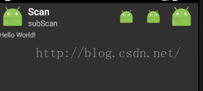
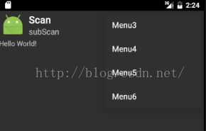
可以看到现在有六项,只有前两项会显示,是空间的关系吧,OverFlow中显示了四项。
只会显示还是不行呀,还要处理触摸或者按键事件。
处理menu事件
Toolbar处理menu点击事件需要给它设置一个事件监听器:
<span style="font-family:SimSun;font-size:18px;background-color: rgb(255, 255, 255);">        toolbar.setOnMenuItemClickListener(new Toolbar.OnMenuItemClickListener() {
            @Override
            public boolean onMenuItemClick(MenuItem item) {
                textView.setText(item.getTitle()+" cliced");
                return true;
            }
        });</span>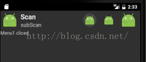
ToolBar"美化"
这里给美化加了引号,因为它实在很丑,不敢称得上是美化。这里主要想说的是,现在Toolbar还不像一个action bar,它的背景色和Activit的背景一样,而且我们总希望将外观的配置放置在xml中进行,而不是使用代码,所以,我们可以在布局文件中作如下配置:
<span style="font-family:SimSun;font-size:18px;background-color: rgb(255, 255, 255);">    <android.support.v7.widget.Toolbar
        android:id="@+id/tool_bar"
        android:layout_width="match_parent"
        android:layout_height="wrap_content"
        android:background="#892354"
        android:titleTextColor="#ff0000"
        toolbar:title="Scan"
        toolbar:subtitle="subScan"
        toolbar:logo="@mipmap/ic_launcher"
        toolbar:titleTextColor="@color/colorPrimary"
        toolbar:subtitleTextColor="@color/colorPrimaryDark"
        >
    </android.support.v7.widget.Toolbar></span>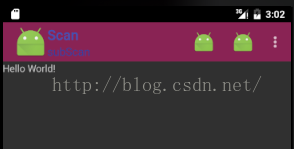
因为我们现在可以使用backgroud给toolbar设置背景,所以我们还可以给toolbar添加动态背景哦,使用一个drawable动画即可:
<span style="font-family:SimSun;font-size:18px;background-color: rgb(255, 255, 255);"><?xml version="1.0" encoding="utf-8"?>
<animation-list xmlns:android="http://schemas.android.com/apk/res/android"
    android:oneshot="true">
    <item android:drawable="@drawable/icon1" android:duration="200" />
    <item android:drawable="@drawable/icon2" android:duration="200" />
    <item android:drawable="@drawable/icon3" android:duration="200" />
</animation-list></span><span style="font-family:SimSun;font-size:18px;background-color: rgb(255, 255, 255);"> AnimationDrawable ani;
ani = (AnimationDrawable) toolbar.getBackground();
ani.setOneShot(false);
ani.start();</span>
这是实在太丑了,这里主要是抛砖引玉,丑就丑吧。。。
这里再次可以看出tool bar 比 action bar自由很多了。
添加自定义View
添加自定义view很简单:
调用ToolBar中的addView函数即可,如下:
<span style="font-family:SimSun;font-size:18px;background-color: rgb(255, 255, 255);">        Button button = new Button(this);
        button.setText("hello");
        button.setBackgroundColor(Color.YELLOW);
        toolbar.addView(button);</span>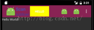
使用navigation button
从源码来看,navigation应该是这样配置的:<span style="font-family:SimSun;font-size:18px;background-color: rgb(255, 255, 255);">toolbar:navigationIcon="@mipmap/ic_launcher"</span><pre><span style="font-family:SimSun;font-size:18px;background-color: rgb(255, 255, 255);">这里就是我们的Toolbar了,它和Action bar确实有点相似,但却没有背景,没有阴影,似乎丑丑的。此外,我们设置的OverFlowIcon</span>并没有显示,原因是不是因为我们还没有给它设置menu菜单项呢?那么接下来我们给它添加menu好了。
这样,当我们点击navigation button的时候,就会显示Navigation button clicked的字样:<span style="font-family:SimSun;font-size:18px;background-color: rgb(255, 255, 255);"> toolbar.setNavigationOnClickListener(new View.OnClickListener() { @Override public void onClick(View v) { textView.setText("Navigation button clicked"); } });</span>
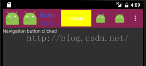
注意,第一个小机器人就是我们的navigation button,第二小机器人是Logo。这可以从ToolBar的onLayout布局文件中看出他们的布局过程,如果有navitation button,最左边就是navigation button,然后依次是logo,titel,之后会检测添加的自定义view等。


 2932
2932

 被折叠的 条评论
为什么被折叠?
被折叠的 条评论
为什么被折叠?
 到【灌水乐园】发言


