


swiftui
WWDC 2020 commences this week, and the developer community was eagerly looking forward to SwiftUI 2.0. Unsurprisingly, Apple dropped some brand new API updates for SwiftUI at the end of Keynote.
WWDC 2020从本周开始,开发人员社区热切期待SwiftUI 2.0。 毫不奇怪,Apple在Keynote末尾放弃了SwiftUI的一些全新API更新。
The new improvements in SwiftUI are additive in nature. This means that there are no deprecations or changes that’ll break your old 13 SwiftUI codebases.
SwiftUI的新改进本质上是累加的。 这意味着没有任何折旧或更改会破坏您以前的13个SwiftUI代码库。
In the next few sections, we’ll take a sneak peek at the new SwiftUI controls released with iOS 14. You’ll need an Xcode 12 beta (which requires a minimum macOS version of 10.15.4) to run them. Let’s get started.
在接下来的几节中,我们将简要介绍一下随iOS 14发行的新SwiftUI控件。您将需要运行Xcode 12 beta(要求最低macOS版本为10.15.4)。 让我们开始吧。
新的SwiftUI应用起点 (A New SwiftUI App Starting Point)
Up until now, we had to use AppDelegates and SceneDelegates to set our first SwiftUI view. Swift 5.3 introduced a type-based program entry point that can be set using the @main attribute and the latest SwiftUI iteration smartly leverages that.
到目前为止,我们必须使用AppDelegates和SceneDelegates来设置我们的第一个SwiftUI视图。 Swift 5.3引入了可以使用@main属性设置的基于类型的程序入口点,而最新的SwiftUI迭代巧妙地利用了这一点。

SwiftUI now provides the following struct that’s called upon app launch:
SwiftUI现在提供以下在应用启动时调用的结构:
WindowGroup is a scene property inside so that we can define the starting view hierarchy. We can set out TabView, NavigationViews, or App Clips inside the WindowGroup computed property.
WindowGroup是其中的一个场景属性,因此我们可以定义起始视图层次。 我们可以在WindowGroup计算属性内设置TabView,NavigationViews或App Clip。
SwiftUI LazyVStack和LazyHStack (SwiftUI LazyVStack and LazyHStack)
Previously, SwiftUI views used to load immediately, which led to performance and memory issues when populating huge amounts of data.
以前,SwiftUI视图用于立即加载,因此在填充大量数据时会导致性能和内存问题。
Funnily, the NavigationLink destination view used to load contents upfront too in SwiftUI’s first iteration. This time, Apple has introduced new lazy horizontal and vertical stacks that load content as and when it’s needed, thereby aiding in the performance optimization of SwiftUI. Lazy loading is introduced in SwiftUI Lists as well now.
有趣的是, NavigationLink目标视图也用于在SwiftUI的第一次迭代中预先加载内容。 这次,Apple引入了新的水平和垂直惰性堆栈,可在需要时加载内容,从而有助于SwiftUI的性能优化。 现在,SwiftUI列表中也引入了延迟加载。
Here’s an example of a SwiftUI LazyHStack in action:
这是一个实际LazyHStack的SwiftUI LazyHStack的示例:

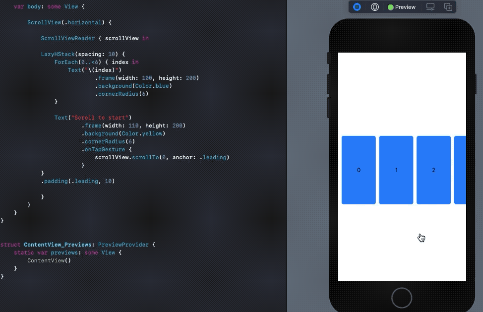
SwiftUI滚动视图位置 (SwiftUI Scroll View Position)
The first version of SwiftUI suffered a lot at the ScrollView front due to its limited capabilities. iOS 14’s SwiftUI brings the much-needed ScrollViewReader and ScrollViewProxy to capture scroll view offset positions and move onto them programmatically.
SwiftUI的第一个版本由于其功能有限而在ScrollView方面遭受了很多损失。 iOS 14的SwiftUI带来了急需的ScrollViewReader和ScrollViewProxy来捕获滚动视图偏移位置并以编程方式移至它们。
In order to do so, we embed our views inside a ScrollViewReader and use the scrollTo method in either of the following ways:
为此,我们将视图嵌入ScrollViewReader并通过以下两种方式之一使用scrollTo方法:
scrollView.scrollTo(viewId)
//or
scrollView.scrollTo(viewId, anchor: .center)
By default, the scroll view position gets set to the leading or top of the view. We can refine that by using the anchor property. For example, in the following piece of code, when setting the anchor property to the center, the scroll position looks much better than when it was set to leading.
默认情况下,滚动视图的位置设置为视图的顶部或顶部。 我们可以通过使用anchor属性来完善它。 例如,在下面的代码中,将anchor属性设置为center ,滚动位置看起来比设置为leading时要好得多。
SwiftUI ProgressView (SwiftUI ProgressView)
Previously, we had to leverage SwiftUI Shapes to replicate linear ProgressView and UIViewRepresentable for creating ActivityIndicator in SwiftUI. Now, in iOS 14’s SwiftUI, ProgressView has native support.
以前,我们必须利用SwiftUI Shapes复制线性ProgressView和UIViewRepresentable以便在SwiftUI中创建ActivityIndicator 。 现在,在iOS 14的SwiftUI中, ProgressView具有本机支持。
A default ProgressView() creates an indeterminate UIActivityIndicator like progress loader whereas the following creates a linear ProgressView in SwiftUI:
默认的ProgressView()创建一个不确定的UIActivityIndicator例如进度加载器,而以下代码在SwiftUI中创建一个线性的ProgressView :
ProgressView("Text", value: 10, total: 100)We can further customize the ProgressView by using progressViewStyle, which accepts built-in CircularProgressViewStyle , DefaultProgressViewStyle, and lets you create custom modifiers as well.
我们可以使用progressViewStyle进一步自定义ProgressView ,该ProgressView接受内置的CircularProgressViewStyle , DefaultProgressViewStyle ,还可以让您创建自定义修饰符。
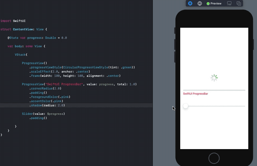
accentColor is used to set the text color in the ProgressView, while foregroundColor acts as the tint.
accentColor用于设置ProgressView的文本颜色,而foregroundColor颜色则用作tint 。
SwiftUI标签,链接和ColorPickers (SwiftUI Labels, Links, and ColorPickers)
Labels are a much-needed addition in the latest SwiftUI iteration. They let you set icons alongside text with the following line of code:
标签是最新的SwiftUI迭代中急需的添加。 他们让您使用以下代码行在文本旁边设置图标:
Label("SwiftUI 2.0", systemImage: "checkmark.icloud")Inside the icons property, you can set SF Symbols, image assets, or custom SwiftUI Shapes.
在icons属性内,您可以设置SF符号,图像资产或自定义SwiftUI形状。
Note: At the time of writing, the icon is aligned with the top of the text. Hopefully, this will get fixed soon.
注意:在撰写本文时,图标与文本顶部对齐。 希望这会尽快解决。
SwiftUI Link is another cool UI control that provides built-in support for navigating to a URL:
SwiftUI Link是另一个很酷的UI控件,它提供了对导航到URL的内置支持:
Link("Click me",destination: URL(string: "your_url")!)The link is redirected to either the web browser or the associated application in case it’s a universal link.
如果是通用链接,该链接将重定向到Web浏览器或关联的应用程序。
Another big addition to the SwiftUI arsenal is the inclusion of a native ColorPicker UI control. You can use a State property wrapper to update the color picked by the user.
SwiftUI工具库的另一个重要补充是包含了本机ColorPicker UI控件。 您可以使用State属性包装器来更新用户选择的颜色。
ColorPicker("Sample Picker", selection: $myColor)SwiftUI TextEditor,MapKit,使用Apple登录 (SwiftUI TextEditor, MapKit, Sign In With Apple)
Multi-line scrollable UITextViews that were omitted last time are now included natively in SwiftUI and known as TextEditor.
上次被省略的多行可滚动UITextViews现在原生包含在SwiftUI中,称为TextEditor 。
TextEditor(text: $stateProperty)MapKit, which had to be embedded in SwiftUI by wrapping in UIViewRepresentable, now gets added natively. We can pass a MKCoordinateRegion , show user location, and do a lot of other MapKit stuff directly from SwiftUI’s view interface itself.
现在必须通过包装UIViewRepresentable将UIViewRepresentable嵌入UIViewRepresentable ,现在可以本地添加。 我们可以通过一个MKCoordinateRegion ,显示用户的位置,并做了很多其他MapKit直接从SwiftUI的观点接口本身的东西。
Map(mapRect:interactionModes:showsUserLocation: userTrackingMode:SignInWithAppleButton now makes its way into SwiftUI’s built-in control. To set up the button, we simply instantiate the struct and set the label argument as either .signUp or .signIn to indicate the type of authorization. For more details on its syntax, refer to the official documentation.
SignInWithAppleButton现在进入SwiftUI的内置控件。 要设置按钮,我们只需实例化struct并将label参数设置为.signUp或.signIn即可指示授权类型。 有关其语法的更多详细信息,请参阅官方文档 。
一个新的onChange修饰符,用于侦听状态更改 (A New onChange Modifier to Listen for State Changes)
onChange is a new view modifier that’s available across all SwiftUI views. It lets you listen to state changes and perform actions on a view accordingly.
onChange是一个新的视图修改器,可在所有SwiftUI视图中使用。 它使您可以侦听状态更改并相应地对视图执行操作。
For instance, we can toggle a Button state change and trigger the TextEditor to clear since the onChanged modifier is attached, as shown below:
例如,由于附加了onChanged修饰符,因此我们可以切换Button状态更改并触发TextEditor清除,如下所示:
Note: The clearText state property triggers the onChange modifier automatically for the first time when SwiftUI’s body is instantiated.
注意: 当SwiftUI的主体实例化时 , clearText 状态属性会 自动自动 触发 onChange 修饰符 。
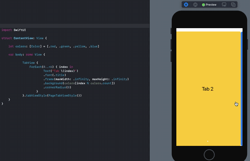
SwiftUI TabView为页面控件带来新风格 (SwiftUI TabView Brings New Style for Page Control)
UIPageViewController did make its way into SwiftUI the last time. In the iOS 14 iteration, TabView introduces a new style to let you embed swipeable page control in your SwiftUI views. Simply set the PageTabViewStyle() in your .tabViewStyle() modifier, as shown below:
UIPageViewController确实进入了SwiftUI。 在iOS 14迭代中, TabView引入了一种新样式,可让您将可滑动页面控件嵌入到SwiftUI视图中。 只需在.tabViewStyle()修改器中设置PageTabViewStyle() ,如下所示:
Here’s a screengrab of the code above in action on Xcode 12:
这是上面在Xcode 12上运行的代码的屏幕截图:
SwiftUI网格 (SwiftUI Grids)
CollectionView and Compositional Layouts were once again missed in iOS 14 SwiftUI. But that didn’t stop Apple from introducing new containers for grid-based layouts that let you set child views in LazyHGrid or LazyVGrid.
在iOS 14 SwiftUI中,再次错过了CollectionView和Compositional Layouts。 但这并没有阻止Apple为基于网格的布局引入新的容器,使您可以在LazyHGrid或LazyVGrid设置子视图。
Each element of a SwiftUI grid is a GridItem. We can set the alignments, spacing, and size of the GridItem. In the following code, we’ve created a vertical grid layout in SwiftUI that consists of three columns:
SwiftUI网格的每个元素都是一个GridItem 。 我们可以设置GridItem的对齐方式,间距和大小。 在以下代码中,我们在SwiftUI中创建了一个垂直网格布局,该布局由三列组成:
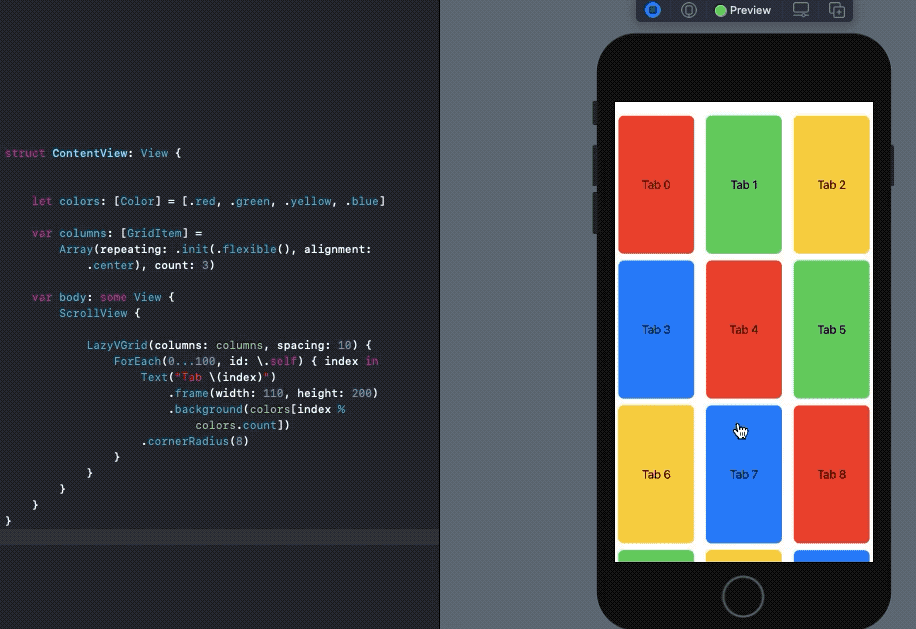
With just a few lines of code, we’ve built a customizable grid layout in SwiftUI for iOS 14.
仅用几行代码,我们就为iOS 14在SwiftUI中构建了可自定义的网格布局。
结论 (Conclusion)
There’s a lot more to look forward to from SwiftUI and other iOS 14 framework updates this year. SwiftUI OutlineGroups and VideoPlayer support are a few promising new features. Most importantly, SwiftUI View builders now support if let and switch statements.
SwiftUI和今年的其他iOS 14框架更新还有很多值得期待的地方。 SwiftUI OutlineGroups和VideoPlayer支持是一些有前途的新功能。 最重要的是,SwiftUI View构建器现在支持if let和switch语句。
That’s it for this one. Thanks for reading.
就这个。 谢谢阅读。
翻译自: https://medium.com/better-programming/whats-new-in-swiftui-2-0-ed13f2c40ae2
swiftui


 扫一扫
扫一扫
 1608
1608

 被折叠的 条评论
为什么被折叠?
被折叠的 条评论
为什么被折叠?
 到【灌水乐园】发言


