


ios swiftui
SwiftUI was announced at WWDC 2019 and it paved a way for declarative programming for building interfaces. SwiftUI Grid comes in two different flavours, which includes LazyVGrid and LazyHGrid. As the name suggest, LazyVGrid is a Grid that flows in vertical direction and the LazyHGrid flows in horizontal direction.
SwiftUI在WWDC 2019上宣布,它为构建接口的声明式编程铺平了道路。 SwiftUI Grid有两种不同的样式,其中包括LazyVGrid和LazyHGrid。 顾名思义,LazyVGrid是在垂直方向上流动的Grid,而LazyHGrid在水平方向上流动。
If you are interested in videos then check out the following videos associated with this post.
如果您对视频感兴趣,请查看以下与此帖子相关的视频。
Each Grid consists of GridItem, which dictates the structure of the cell displayed in the grid. GridItem can be fixed, flexible or adaptive. Let’s start with the fixed size GridItems.
每个Grid都由GridItem组成,它指示在网格中显示的单元格的结构。 GridItem可以是固定的 , 灵活的或自适应的 。 让我们从固定大小的GridItems开始。
固定GridItems (Fixed GridItems)
In the above code, we have created 3 fixed size columns of size 100. Now, we an easily use the LazyVGrid to create the columns and display information in the GridItem. This is shown below:
在上面的代码中,我们创建了3个大小为100的固定大小的列。现在,我们可以轻松地使用LazyVGrid创建列并在GridItem中显示信息。 如下所示:
As you can see that for the content of LazyVGrid, we have used Rectangle but you can use any View you desire.
如您所见,对于LazyVGrid的内容,我们使用了Rectangle,但是您可以使用所需的任何View。

You can add more Rectangles to the LazyVGrid by running a ForEach. A ForEach loop will return a type View with each iteration. The implementation is shown below:
您可以通过运行ForEach将更多的矩形添加到LazyVGrid。 ForEach循环将在每次迭代时返回View类型。 实现如下所示:
One thing to note is the use of ScrollView. By default grids do not come with scrollviews. Embedding grid inside a scrollview allows the grid to scroll, when the grid displays content that cannot be fit on the screen.
要注意的一件事是ScrollView的使用。 默认情况下,网格不附带滚动视图。 当网格显示无法在屏幕上显示的内容时,将网格嵌入滚动视图中可使网格滚动。
The result is shown below:
结果如下所示:

Pretty cool!
太酷了!
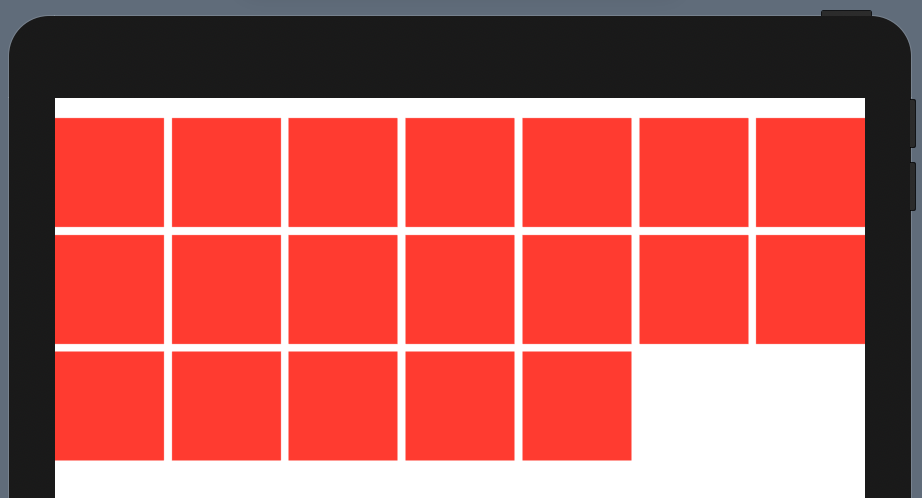
Now, go ahead and try changing the size of the first GridItem from 100 to 200 and see what happens.
现在,继续尝试将第一个GridItem的大小从100更改为200,然后看看会发生什么。

The first column will always be size 200 and the rest will be 100. If there is not enough space to fit all the items then few items will be off screen. This is demonstrated by the following code.
第一列的大小将始终为200,其余列的大小将为100。如果没有足够的空间容纳所有项目,则屏幕上将没有项目。 以下代码演示了这一点。

灵活的网格项 (Flexible GridItems)
Flexible grid items are great when you want to fit several different items based on the total size of the grid. You can provide an item’s minimum and maximum size but it is not required as by default, the size is distributed equally to accommodate as many items as possible.
当您要基于网格的总大小适合多个不同的项目时,灵活的网格项目非常有用。 您可以提供项目的最小和最大尺寸,但默认情况下则不需要,尺寸会平均分配以容纳尽可能多的项目。
To get started with flexible grid items, simply change the columns to add a single flexible grid item as shown below:
要开始使用灵活的网格项目,只需更改列以添加单个灵活的网格项目,如下所示:
The output is shown below:
输出如下所示:

Since we added just a single grid item, we ended up with just one column. Let’s go ahead add several flexible grid items.
由于我们仅添加了一个网格项,因此最终只有一列。 让我们继续添加几个灵活的网格项。
The result is shown below:
结果如下所示:

You get the idea! Now let’s move to adaptive items.
你明白了! 现在让我们转到自适应项。
自适应GridItems (Adaptive GridItems)
Adaptive grid items depends on the size of the screen. This means when you run it on iPhone you may see fewer items as compared to iPad or Mac. Let’s change the columns to use adaptive grid items as shown below:
自适应网格项取决于屏幕的大小。 这意味着当您在iPhone上运行它时,与iPad或Mac相比,您看到的项目可能更少。 让我们将列更改为使用自适应网格项,如下所示:
If you run the app, you will see the following result
如果您运行该应用程序,将会看到以下结果

If you run the same code on an iPad you will see a different result as shown below.
如果您在iPad上运行相同的代码,则会看到不同的结果,如下所示。
I have removed the NavigationView so we can display the items in the main view inside of the side view.
我删除了NavigationView,以便我们可以在侧视图内部的主视图中显示项目。
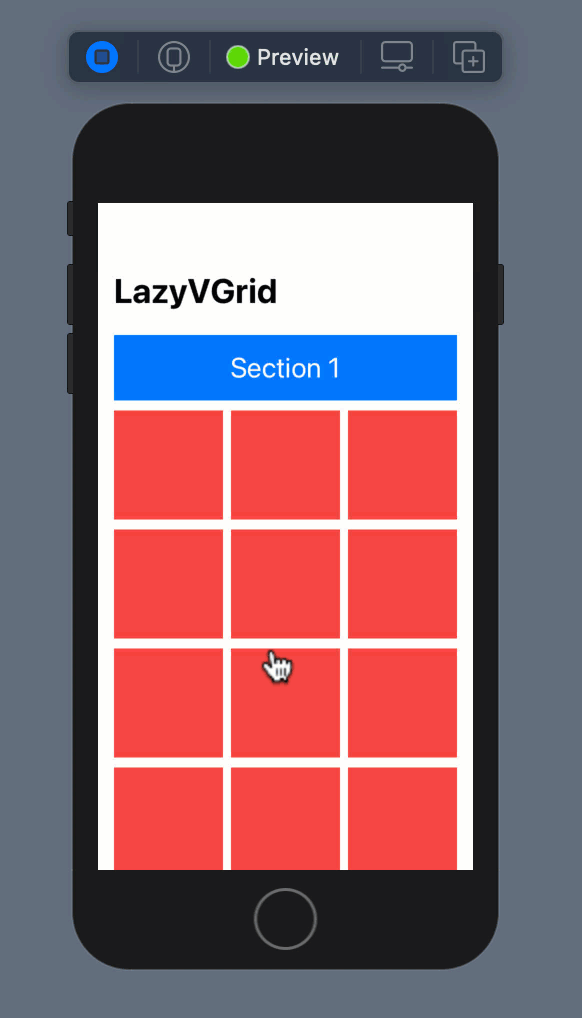
固定视图 (Pinned Views)
Grids are not always flat, sometimes they consists of structural data. Both LazyVGrid and LazyHGrid consists of a featured called PinnedViews. In web programming they are also known as sticky views.
网格并不总是平坦的,有时它们由结构数据组成。 LazyVGrid和LazyHGrid都包含一个称为PinnedViews的功能。 在Web编程中,它们也称为粘滞视图。
Let’s first start by creating flexible grid items as shown below:
让我们首先从创建灵活的网格项开始,如下所示:
Next, we will run multiple loops to create sections and the items inside each section. The implementation is shown below:
接下来,我们将运行多个循环以创建节以及每个节中的项目。 实现如下所示:
The pinnedView property of LazyVGrid is set to .sectionHeaders because we want to display the headers. The Section view calls the headerView function, which returns the header view. The headerView implementation is shown below:
LazyVGrid的pinnedView属性设置为。 sectionHeaders,因为我们要显示标题。 Section视图调用headerView函数,该函数返回标题视图。 headerView实现如下所示:
Go ahead and run the app!
继续运行该应用程序!
Pretty sweet!
太甜了!
In this article, you learned about SwiftUI LazyVGrid. LazyHGrid works in a similar fashion, just horizontally.
在本文中,您了解了SwiftUI LazyVGrid。 LazyHGrid以类似的方式工作,只是水平。
You can download the code here.
您可以在此处下载代码。
If you want to learn more about building SwiftUI applications then check out my course below.
如果您想了解有关构建SwiftUI应用程序的更多信息,请查看下面的课程。
翻译自: https://medium.com/swlh/understanding-grids-in-swiftui-for-ios-14-bad7345a2bde
ios swiftui


 1820
1820


 被折叠的 条评论
为什么被折叠?
被折叠的 条评论
为什么被折叠?
 到【灌水乐园】发言


