


vue.js响应式
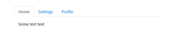
Hello, Lofi Guy here. In this tutorial, I will show you how to easily create responsive tabs using Vue. You will need to create two small components and that is it. The picture below is what the finished tab menu looks like. If you prefer videos and want more details, here is the YouTube tutorial offering just that.
您好,Lofi Guy在这里。 在本教程中,我将向您展示如何使用Vue轻松创建响应式标签。 您将需要创建两个小组件,仅此而已。 下图是完成的选项卡菜单的外观。 如果您更喜欢视频并希望获得更多详细信息,请使用YouTube教程 。
Outline
大纲
Bootstrap: Installing Bootstrap for a few styles
Bootstrap :安装Bootstrap的几种样式
TabNav Component: Creating the menu part of the tabs
TabNav组件 :创建选项卡的菜单部分
Tab Component: Creating the content part of the tabs
选项卡组件 :创建选项卡的内容部分
App.vue: Combining the components to show your tab menu in the browser
App.vue :组合组件以在浏览器中显示选项卡菜单
NOTE: I will not cover detailed project setup in this article, I am starting from a basic Vue app that was just created using vue create tabsand I am using Visual Studio Code.
注意 :我不会在本文中介绍详细的项目设置,我将从刚刚使用vue create tabs创建的基本Vue应用程序开始,而我正在使用Visual Studio Code。
引导程序 (Bootstrap)
We are going to use a little bit of Bootstrap, so install that in the terminal with:
我们将使用一些Bootstrap,因此请使用以下命令在终端中进行安装:
npm install bootstrap
npm install bootstrap
Now open the file called main.js and paste this at the top:
现在打开名为main.js的文件并将其粘贴在顶部:
import ‘bootstrap/dist/css/bootstrap.min.css’;
import 'bootstrap/dist/css/bootstrap.min.css';
Cool, now you have the CSS part of Bootstrap.
太酷了,现在您有了BootstrapCSS部分。
TabNav组件 (TabNav component)
Next, let’s get right into building these tabs. Inside the components folder create a file called TabNav.vue (refer to my video if this early stuff is confusing you).
接下来,让我们开始构建这些选项卡。 在components文件夹中,创建一个名为TabNav.vue的文件(如果这个早期的东西使您感到困惑,请参阅我的视频)。
I am going to give you the code for this component piece by piece and then explain the most confusing parts after the code:
我将逐步为您提供该组件的代码,然后在代码之后解释最令人困惑的部分:
<template></template><script>
export default {
  props: {
    /* Holds all of the tabs data */
    tabs: {
      type: Array,
      required: true,
    },
    selected: {
      type: String,
      required: true,
    }
  },
  methods: {
    setTab(tab) {
      this.$emit('selected', tab);
    },
  },
};
</script>
All Vue components have <template> in order to define the DOM elements and <script> to define the data that your template needs.
所有Vue组件均具有<template>来定义DOM元素,并具有<script>来定义模板所需的数据。
Our TabNav component will have two props and one method, as you see. To explain this component, you first need to understand the props that we will be passed in. They are:
如您所见,我们的TabNav组件将具有两个道具和一个方法。 要解释此组件,您首先需要了解我们将要传递的道具。它们是:
- Tabs: an array of strings defining the names of the tabs 制表符:定义制表符名称的字符串数组
- Selected: a string that is one of the tabs defined in the tabs array. It is the currently selected tab 选定:一个字符串,它是tabs数组中定义的选项卡之一。 它是当前选择的标签
To give you a better idea of how the props are used, the component will look something like this when we use it later:
为了让您更好地了解如何使用道具,稍后我们使用该组件时,其外观将如下所示:
<TabNav tabs={[‘Home’, ‘Settings’, ‘Profile’]} selected={ selected }>…</TabNav>
<TabNav tabs={['Home', 'Settings', 'Profile']} selected={ selected }>…</TabNav>
The setTab method is easy enough, it simply emits an event with a string representing the newly selected tab. We will write the code to catch this event later on.
setTab方法非常简单,它仅发出一个事件,该事件的字符串表示新选择的选项卡。 稍后我们将编写代码以捕获此事件。
Inside of the <template> put:
在<template>放:
<div style="width: 30%">
  <ul class="nav nav-tabs">
  </ul>
  <slot></slot>
</div>
This is just a div element with a style that makes it such that our tab menu won’t be too large. The unordered list element uses Bootstrap styling to make the tab menu look nice.
这只是一个div元素,其样式使它的选项卡菜单不会太大。 无序列表元素使用Bootstrap样式使选项卡菜单看起来不错。
Now, if you are not familiar with Vue, <slot></slot> may be a little confusing. This just means that whenever we use the TabNav component anything we nest inside of it will render there. For example, if we wrote <TabNav>Hello World</TabNav> then “Hello World” would show up inside that div and right after the unordered list.
现在,如果您不熟悉Vue,则<slot></slot>可能会有些混乱。 这只是意味着,只要我们使用TabNav组件,我们嵌套在其中的任何内容都将在那里渲染。 例如,如果我们写了<TabNav>Hello World</TabNav>则“ Hello World”将显示在该div中,并在无序列表之后。
Inside of the unordered list, paste the following:
在无序列表的内部,粘贴以下内容:
<li v-for="tab in tabs" :key="tab" class="nav-item">
  <a class="nav-link" :class="{ active: tab === selected }" @click="setTab(tab)"
    >{{ tab }}</a>
</li>
v-for="tab in tabs" :key="tab" is looping through every string in tabs.
v-for="tab in tabs" :key="tab"遍历标签中的每个字符串。
:class="{ active: tab === selected }" is a dynamic style. If this is the selected tab, then it is set to active (which you will see visually later).
:class="{ active: tab === selected }"是一种动态样式。 如果这是选定的选项卡,则将其设置为活动(稍后将在视觉上看到)。
Every <li> is rendered once for EACH tab. You will see a few more Bootstrap styles used. Also, the @click=”setTab(tab)” is being used to call a method when the tab is clicked in order to set the selected tab in data.
每个<li>都会为“每个”选项卡呈现一次。 您将看到更多使用的Bootstrap样式。 同样,当单击选项卡以在数据中设置选定的选项卡时,将使用@click=”setTab(tab)”来调用方法。
标签组件 (Tab component)
Create another file inside of components called Tab.vue. This will be nested inside of your TabNav to define the tab you want.
在称为Tab的组件内部创建另一个文件。 Vue。 这将嵌套在TabNav内部以定义所需的选项卡。
Inside this file paste the following:
在此文件中粘贴以下内容:
<template>
  <div v-if="isSelected">
    <slot></slot>
  </div>
</template><script>
export default {
  props: {
    isSelected: {
      type: Boolean,
    },
  },
}
</script>
This component takes a prop called isSelected, and if this tab is currently selected it will show the elements nested inside of this Tab component. Otherwise, it shows nothing.
该组件采用了一个名为isSelected的道具,如果当前选择了此选项卡,它将显示嵌套在该Tab组件内部的元素。 否则,它什么也不显示。
应用程序 (App.vue)
Now go to App.vue so that we can set things up to see our changes. Paste this in:
现在转到应用程序。 因此我们可以进行设置以查看我们的更改。 将此粘贴到:
<template>
  <div id="app">
    <TabNav :tabs="['Home', 'Settings', 'Profile']" :selected="selected" @selected="setSelected" >
      <Tab :isSelected="selected === 'Home'" >
        <p>Some test text</p>
      </Tab>      <Tab :isSelected="selected === 'Settings'" >
        <h1>More test text</h1>
      </Tab>      <Tab :isSelected="selected === 'Profile'" >
        <ul>
          <li>List test 1</li>
          <li>List test 2</li>
          <li>List test 3</li>
        </ul>
      </Tab>
    </TabNav>
  </div>
</template><script>
import TabNav from './components/TabNav.vue';
import Tab from './components/Tab.vue';export default {
  name: 'App',
  components: { TabNav, Tab },
  data() {
    return {
      selected: 'Home'
    }
  },
  methods: {
    setSelected(tab) {
      this.selected = tab;
    }
  }
}
</script><style>
#app {
  font-family: Avenir, Helvetica, Arial, sans-serif;
  -webkit-font-smoothing: antialiased;
  -moz-osx-font-smoothing: grayscale;
  color: #2c3e50;
  margin-top: 60px;
  display: flex;
  flex-direction: row;
  justify-content: center;
}
</style>
Inside of the App component we define data with selected inside. Also, we define the method to set that data. You will notice that @selected=”setSelected” is how we listen to the selected event that is emitted from the setTab method inside of TabNav.
在App组件内部,我们定义了内部选定的数据。 另外,我们定义了设置该数据的方法。 您会注意到@selected=”setSelected”是我们侦听setTab内部setTab方法发出的选定事件的方式。
Anywhere that TabNav is used, these same steps will need to be taken. This is deliberate as it allows the component that uses TabNav to define the tabs it wants to use. The component that uses the TabNav handles logic, so it would be considered a SMART component. TabNav and Tab would be considered DUMMY components because they simply display data and do not handle any logic.
在使用TabNav的任何地方,都需要执行这些相同的步骤。 这是有意的,因为它允许使用TabNav的组件定义要使用的选项卡。 使用TabNav的组件处理逻辑,因此将其视为SMART组件。 TabNav和Tab将被视为DUMMY组件,因为它们仅显示数据并且不处理任何逻辑。
Now if you start your server with npm run serve you should see a tab menu that lets you navigate. If not, you better reread this or check out the YouTube video to make sure you didn’t forget anything.
现在,如果您使用npm run serve启动服务器,则应该会看到一个选项卡菜单,可以进行导航。 如果没有,您最好重新阅读该内容或观看YouTube视频 ,以确保您不会忘记任何内容。
结论 (Conclusion)
In this tutorial, you learned how to create a menu of tabs using Vue. If you are new to Vue, this should have given you a basic introduction into creating components (which is the foundation of Vue). I hope that I was able to help you out today. If so, feel free to check out my YouTube channel. If you have any questions, please comment below and I will see what I can do.
在本教程中,您学习了如何使用Vue创建选项卡菜单。 如果您是Vue的新手,这应该为您提供了有关创建组件的基本介绍(这是Vue的基础)。 希望今天能对您有所帮助。 如果是这样,请随时查看我的YouTube频道 。 如果您有任何疑问,请在下面评论,我会做的。
Lofi Guy出去! (Lofi Guy out!)
翻译自: https://codeburst.io/build-responsive-tabs-using-vue-js-58ef7b9598fa
vue.js响应式


 1218
1218

 被折叠的 条评论
为什么被折叠?
被折叠的 条评论
为什么被折叠?
 到【灌水乐园】发言


