


css sass
In this article, I’m going to focus on Sass and how you can use it to organise your CSS and make yourself much more productive.
在本文中,我将重点介绍Sass,以及如何使用它来组织CSS并提高工作效率。
TLDR; Sass is awesome. It’ll save you some time and sanity. Keep on reading for the deets.
TLDR; Sass很棒。 这样可以节省您一些时间和理智。 继续为美女读书。
Being a web developer usually involves several technologies. At a minimum, you probably have a good understanding of HTML and CSS with a sprinkling of JavaScript for good measure. Add to that some back-end knowledge with a server-side framework and a database and you’ve got yourself a Full Stack (see what I did there?).
成为Web开发人员通常涉及多种技术。 至少,您可能对HTML和CSS有很好的理解,并且还撒了一些JavaScript。 加上一些有关服务器端框架和数据库的后端知识,您将获得完整的堆栈(看看我在那儿做了什么?)。
But, each layer of the stack over the years has been augmented slightly. Where SQL-based databases were prevalent in years past, NoSQL equivalents such as MongoDB has risen. From Microsoft, TypeScript has slowly started to make the lives of JavaScript developers much more productive. And, in the CSS world, projects like Sass have started to improve the styling, readability and function of the language.
但是,这些年来,堆栈的每一层都得到了略微增加。 在过去几年中,基于SQL的数据库盛行,而MongoDB等NoSQL等效物已经兴起。 从Microsoft开始,TypeScript逐渐开始使JavaScript开发人员的生活更加高效。 并且,在CSS世界中,诸如Sass之类的项目已开始改善该语言的样式,可读性和功能。
Scss提示 (Scss Tips)
Rather than write endless paragraphs of explanations I’m going to distil SCSS into 3 basics Tips. SCSS, of course, is a very broad topic, but this will serve as a starting point.
与其编写无休止的解释段落,不如将SCSS分解为3个基本技巧。 当然,SCSS是一个非常广泛的主题,但这将作为起点。
Sass comes in 2 flavours, SCSS and SASS. I’ll focus on SCSS since it more closely resembles CSS. See https://sass-lang.com/ for more information.
Sass有2种口味,SCSS和SASS。 我将专注于SCSS,因为它与CSS非常相似。 有关更多信息,请参见https://sass-lang.com/ 。
提示1.嵌套 (Tip 1. Nesting)
In a basic HTML layout, there is a <div class="outer"> tag that contains 2 <div class="inner"> tags.
在基本HTML布局中,有一个<div class="outer">标记,其中包含2个<div class="inner">标记。
To write a style that targets the inner class, in CSS you would write:
要编写针对内部类的样式,请在CSS中编写:
.outer { background-color: blue; }.outer .inner {
   background-color: black;
   color: green;
}
Pretty simple. But, how could this be improved using SCSS?
很简单 但是,如何使用SCSS对此进行改进?
.outer {
   background-color: blue;   .inner {
       background-color: black;
       color: green;
   }
}
At first glance, this looks example like plain old CSS. But, if you were to write this in a CSS editor is would fail because of the nesting. It surprises me that CSS doesn’t include this nesting feature out of the box because the target HTML is nested, but, this is the world we live in.
乍一看,这看起来像是普通的旧CSS。 但是,如果您要在CSS编辑器中编写此代码,则会因为嵌套而失败。 令我惊讶的是,CSS没有开箱即用地包含此嵌套功能,因为目标HTML是嵌套的,但这就是我们所生活的世界。
By applying this nesting technique, not only is your code easier to read, there are some simple enhancements.
通过应用这种嵌套技术,不仅代码更易于阅读,而且还进行了一些简单的增强。
If you needed to rename the outer class to avoid a conflict, achieving this in SCSS is much easier as the relationship hierarchy will be followed.
如果您需要重命名outer类以避免冲突,那么将遵循关系层次结构,因此在SCSS中更容易实现。
To take the concept of nesting further, you can add the & operator. This will essentially “copy” the previous selector and apply it to the nested element.
要进一步嵌套,可以添加&运算符。 这实际上将“复制”先前的选择器并将其应用于嵌套元素。
Take this CSS sample for creating an active and inactive state for a DIV tag.
采取此CSS示例为DIV标签创建活动状态和非活动状态。
.outer {
  background-color: green;
  color: white;
}.outer.active {
  border: blue 1px solid;
}.outer:not(.active) {
  opacity: 30%;
}
Again, another simple example. But, in SCSS this would be:
同样,另一个简单的例子。 但是,在SCSS中,这将是:
.outer {
  background-color: green;
  color: white;
  &.active {
    border: blue 1px solid;
  }
  &:not(.active) {
    opacity: 30%;
  }
}
The exact same result is achieved, but by bringing together the nesting feature with the & operator, we’re able to create much more readable code.
可以达到完全相同的结果,但是通过将嵌套功能与&运算符结合在一起,我们可以创建更具可读性的代码。
技巧2. Mixins (Tip 2. Mixins)
The next feature to focus on are Mixins. If you’re used to reading code then Mixins are analogous to Functions in JavaScript.
重点关注的下一个功能是Mixins。 如果您习惯于阅读代码,那么Mixins类似于JavaScript中的Function 。
Mixins within SCSS are used to inject reusable style segments. An example can be seen below. Let’s say you want to make similar (but not exact) border styles for elements.
SCSS中的Mixins用于注入可重用的样式段。 可以在下面看到一个例子。 假设您要为元素制作相似(但不完全)的边框样式。
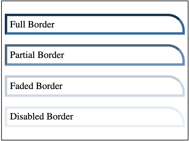
The CSS for this would look a little like
CSS看起来像
.box {
  margin: 1em 0;
  max-width: 300px;
  padding: .3em;
}.box.full {
  border: 4px inset rgba(28,110,164,1);
  border-radius: 0px 28px 0px 0px;
}.box.almost {
  border: 4px inset rgba(28,110,164,0.75);
  border-radius: 0px 28px 0px 0px;
}.box.faded {
  border: 4px inset rgba(28,110,164,0.25);
  border-radius: 0px 28px 0px 0px;
}.box.inactive {
  border: 4px inset rgba(28,110,164,0.1);
  border-radius: 0px 28px 0px 0px;
}
The only value that changes on the border is the Alpha component of the border colour. And if we wanted to change the base colour then it would need to change this in 4 places. Fortunately, SCSS to the rescue.
边框上唯一更改的值是边框颜色的Alpha分量。 如果我们想更改基本颜色,则需要在4个地方进行更改。 幸运的是,SCSS得以营救。
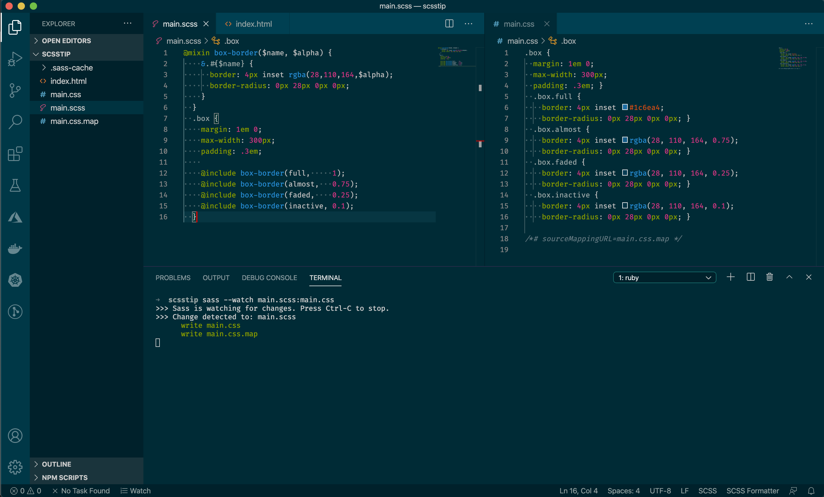
// Create a mixin that defines the border style
@mixin box-border($name, $alpha) {
  &.#{$name} {
    border: 4px inset rgba(28,110,164,$alpha);
    border-radius: 0px 28px 0px 0px;
  }
}.box {
  margin: 1em 0;
  max-width: 300px;
  padding: .3em;
  // Call the mixin to reuse the border style@include box-border(full,     1);@include box-border(almost,   0.75);@include box-border(faded,    0.25);@include box-border(inactive, 0.1);
}
Wow, this is a huge difference in coding style! Not only is this fewer lines of code, but we’ve also created a reusable function that can be included anywhere.
哇,这是编码风格上的巨大差异! 这不仅减少了几行代码,而且我们还创建了一个可重用的函数,可以将其包含在任何地方。
The Mixin that’s defined takes 2 parameters (name and alpha value) and outputs a sub-style which includes the standard border, adjusted using the variable alpha value.
定义的Mixin接受2个参数(名称和alpha值),并输出一个子样式,其中包括使用可变alpha值进行调整的标准边框。
The
&.#{$name}will output to.box.activeand.box.almostbecause we’re combining this with the nesting principles from the previous tip.
&.#{$name}将.box.active输出到.box.active和.box.almost因为我们将其与上一技巧中的嵌套原理结合在一起。
So, if we wish to change the border colour, it’s just in 1 place and all 4 styles will update.
因此,如果我们希望更改边框颜色,则只需在1个位置更改所有4种样式即可。
技巧3.变量 (Tip 3. Variables)
We touched on this in the Mixin section where variables were used to construct border styles. But, variables can be used throughout your files, not just Mixins.
我们在“混入”部分中谈到了这一点,在该部分中,变量用于构造边框样式。 但是,变量可以在整个文件中使用,而不仅仅是Mixins。
When creating consistent styles across your application, variable reuse can come in hand.y
在整个应用程序中创建一致的样式时,可以方便地进行变量重用。
For example, if you same the opacity value to indicate active vs. inactive state. Instead of copying that value throughout your file you can simply define it once and reference it throughout. Then, if the value changes, your entire project will update.
例如,如果您使用相同的不透明度值来表示活动状态与非活动状态。 无需在整个文件中复制该值,您只需定义一次并在整个引用中即可。 然后,如果值更改,则整个项目将更新。
// Define the Opacity
$my-opacity: 0.3;.hello {
  background-color: blue;
  &.inactive {
    opacity: $my-opacity;
  }
}.world {
  background-color: green;
  &.inactive {
    opacity: $my-opacity;
  }
}
Clearly this is a simple example, but, if you’re familiar with more complex languages such as JavaScript then you already have the skillset to utilise this feature to enhance your CSS and make it easier to maintain.
显然,这是一个简单的示例,但是,如果您熟悉更复杂的语言(例如JavaScript),那么您已经具备使用此功能来增强CSS并使其易于维护的技能。
其他特性 (Other Features)
SCSS doesn’t just stop here. Here are a few other examples:
SCSS不仅在这里停止。 以下是其他一些示例:
Helper Functions such as
lightenordarkento adjust colours辅助功能,例如
lighten或darken以调整颜色Partial Files to include reusable mixins throughout your project
部分文件可在整个项目中包含可重复使用的混合
Maps containing dictionaries of values (key/value pairs)
含值的字典映射 (键/值对)
Loops to combine with variables to create consistent styles (eg. 10 levels of blurring)
循环与变量组合以创建一致的样式(例如10级模糊)
- Many, many more … 很多很多……
把它放在一起 (Putting it Together)
So, we’ve highlighted 3 simple SCSS tips you can use to add to your existing CSS. But, how do you actually use these?
因此,我们重点介绍了3个简单的SCSS技巧,您可以将它们添加到现有CSS中。 但是,您实际上如何使用它们?
Unfortunately, browsers don’t understand any of the SCSS features natively and would simply fail to parse your code. To remedy this you need to transpile your SCSS into CSS and fortunately, this is relatively straight forward.
不幸的是,浏览器本身不了解任何SCSS功能,并且只会无法解析您的代码。 为了解决这个问题,您需要将SCSS转换为CSS,幸运的是,这是相对简单的。
To install SCSS (well, the Sass framework) you can use NPM:
要安装SCSS(Sass框架),可以使用NPM:
npm install -g sassThe Sass documentation shows other ways of installing.
Sass文档显示了其他安装方式。
Once installed, you can use the command-line tool to “watch” your SASS files, which will in-turn automatically transform these into CSS.
安装后,您可以使用命令行工具“监视”您的SASS文件,这将依次将它们自动转换为CSS。
All of the mixins, variables and nested styles will be quickly converted into standard CSS. And, if you’ve declared a mixin but not used it (ie: a style library) then this redundant code will be stripped out.
所有的mixin,变量和嵌套样式都将快速转换为标准CSS。 并且,如果您声明了mixin但未使用它(即样式库),那么该冗余代码将被删除。
Additionally, any errors that are found will be helpfully printed so any missing braces or colons can be spotted early before the browser gets hold.
此外,发现的任何错误都会有帮助地打印出来,以便在保持浏览器之前及早发现任何丢失的花括号或冒号。
Using the simply SCSS command line, type something like:
使用简单的SCSS命令行,输入以下内容:
> sass --watch main.scss:main.cssThis will immediately transpire your main.scss file and automatically convert it into main.css which can be used by your browser. Then, the command will wait for any changes so when you next save your file, the whole process will start again.
这将立即main.scss文件,并自动将其转换为main.css ,供浏览器使用。 然后,该命令将等待所有更改,因此当您下次保存文件时,整个过程将再次开始。
And, as an extra feature, a main.css.map file will also be created. This is used by your browser to help debug your styles. When you inspect elements that contain SCSS styles, the browser will show you what line in your SCSS file contained the styles. This is really helpful when trying to diagnose problems.
并且,作为一项附加功能,还将创建一个main.css.map文件。 浏览器使用它来帮助调试样式。 当您检查包含SCSS样式的元素时,浏览器将向您显示SCSS文件中包含样式的行。 尝试诊断问题时,这确实很有帮助。
一个真实的例子 (A Real Example)
Up until now, we’ve focused on some simple tips, but how can these be used in practice? To illustrate, we’ll define a business problem.
到目前为止,我们只关注一些简单的技巧,但是如何在实践中使用这些技巧? 为了说明,我们将定义一个业务问题。
I need to reuse 4 different state themes across many elements. Buttons, panels, labels all need to implement the common styles for both light and dark mode.
我需要在许多元素中重用4个不同的状态主题。 按钮,面板,标签都需要实现浅色和深色模式的通用样式。
Ok, that’s quite a complex problem, but, broken down:
好的,这是一个非常复杂的问题,但是,细分如下:
- Define HTML element components for (button, panel, label) 为(按钮,面板,标签)定义HTML元素组件
- Create 4 different states for each (Active, Success, Warning, Normal) 为每个状态创建4个不同的状态(活动,成功,警告,正常)
- Ensure that each combination of Button and State work in both Light and Dark mode 确保“按钮”和“状态”的每种组合都可以在“亮”和“暗”模式下工作
I’ve created this example which makes use of nesting, mixins and maps to create some clean reusable code.
我创建了这个示例,该示例利用嵌套,mixins和映射来创建一些干净的可重用代码。
// Define a map containing the 4 colours
$colours: (
  "active": blue,
  "success": green,
  "inactive": grey,
  "warn": red
);


// Simple mixin to use for the labels and buttons to create the border and background styles
@mixin _simpleTheme($name) {
  &.#{$name} {
    background-color: rgba(map-get($colours, $name), 0.3);
    border-color: map-get($colours, $name);


    &:focus {
      outline-color: map-get($colours, $name);
    }
  }
}


// Mixin to define the different states for each of the panels
@mixin _panel($name) {
  &.#{$name} {
    border-color: map-get($colours, $name);


    .header {
      border-bottom-color: map-get($colours, $name);
      background-color: rgba(map-get($colours, $name), 0.3);
    }


    .body {
      background-color: rgba(map-get($colours, $name), 0.1);
    }
  }
}


// Button and Label shared styles
.buttons button, .labels span {
  @include _simpleTheme("active");
  @include _simpleTheme("success");
  @include _simpleTheme("inactive");
  @include _simpleTheme("warn");
}


.buttons {
  padding: 1em;

  button {
    padding: .3em;
    border-radius: 5%;
    border: 2px solid black;
  }
}


.labels {
  padding: 1em;

  span {
    padding: .3em 2em;
    border-radius: 5%;
    border: 1px solid black;
    text-transform: uppercase;
    font-style: italic;
    letter-spacing: 1px;
  }
}


.panel {
  border: 1px solid black;
  border-radius: 15px;
  overflow: hidden;
  max-width: 300px;
  margin: 1em;
  display: inline-block;

  .header, .body {
    padding: 1em;
  }

  .header {
    border-bottom: 1px solid black;
    color: lighten(black, 30%);
    text-transform: uppercase;
    font-weight: bolder;
    letter-spacing: 1px;
  }

  @include _panel("active");
  @include _panel("success");
  @include _panel("inactive");
  @include _panel("warn");
}


.light {
  background-color: darken(white, 10%);
  padding: 1em;
}


.dark {
  background-color: lighten(black, 5%);

  &, .panel .header, .buttons button {
    color: darken(white, 5%);
  }
}
Breaking this down, we’ve:
分解来看,我们已经:
- Defined a map containing the 4 states and their corresponding colours 定义了包含4个州及其相应颜色的地图
- Created 2 mixins, 1 for the button/label and 1 for the panel 创建了2个mixin,其中1个用于按钮/标签,另1个用于面板
- Defined some global styles for the components 为组件定义了一些全局样式
- Included the mixins to bring in each style 包括用于引入每种样式的mixins
- Defined the light and dark mode differences 定义了明暗模式的差异
To see this example, check it out on Codepen.
要查看此示例,请在Codepen上进行检查。
Now that this has all come together, these component styles can be reused anywhere and the SCSS is clean and easy to understand.
既然所有这些都结合在一起了,那么这些组件样式可以在任何地方重用,并且SCSS清晰易懂。
Plus, if we need to change any of my colours then they’re all in 1 place.
另外,如果我们需要更改我的任何颜色,那么它们都放在一个位置。
进一步阅读 (Further Reading)
We’ve barely scratched the surface with what you can achieve with SCSS. For more information, I’d recommend checking out the excellent documentation which explains these features and many more.
我们几乎不了解使用SCSS可以实现的功能。 有关更多信息,我建议您查阅出色的文档,其中解释了这些功能以及更多其他内容。
As a pro tip, if you’re using technologies such as Angular, the CLI already includes a built-in SCSS component. When you create your project, simply enable the SCSS mode for CSS and you’ll be able to use all of the tips you’ve learned here.
作为一个提示,如果您使用的是Angular等技术,则CLI已包含内置的SCSS组件。 创建项目时,只需为CSS启用SCSS模式,您就可以使用在这里学到的所有技巧。
Happy Coding.
编码愉快。
翻译自: https://medium.com/swlh/sass-basics-supercharge-your-css-1b72cdf5c01a
css sass


 扫一扫
扫一扫
 1882
1882

 被折叠的 条评论
为什么被折叠?
被折叠的 条评论
为什么被折叠?
 到【灌水乐园】发言


